« July 2012 »
S M T W T F S
1 2 3 4 5 6 7
8 9 10 11 12 13 14
15 16 17 18 19 20 21
22 23 24 25 26 27 28
29 30 31
You are not logged in. Log in
Entries by Topic
All topics  «
3D paperwork
A - Z challenge 5
A - Z challenge 7
A - Z challenge round 4
A to Z challenge round 3
A to Z round 2
A to Z round 6
A-Z round 1
Around the House
Art Challenges
Artist Trading Cards
Backgrounds
Beads
Bible Journaling
Books
Boxes
Collage
Color Challenge
Coloring
cookbook
Die Cuts
Digital Projects
Digital Stamps
Drawing
Dry Embossing
Fabric Stuff
Fantastic Folds
Field Trip
Home Decor
How Does Your Garden Grow?
Hymnal Art
In The Kitchen
In the studio
Jewelry
Lettering
Links
Multi-Technique
Music to Work By
Musings
Nail Art
New Work
Online Class
Other Hobbies
Other Projects
Painting
Paper Embroidery
Paper Piecing
Photo
Pretty Paper
Quilting
Random
reading
Scrap Recovery
scrapbooking
Sewing
Sketch Challenge
Some Backlog
Stamping
Stencils
Stickers
Supplies
Teabag Folding
Techniques
Testing
tips and tricks
Tutorial
Web resources
Welcome to my Blog
Work By My Friends
workflow
Writing
Blog Tools
Edit your Blog
Build a Blog
RSS Feed
View Profile
Group One
In & Out of Studio 3D
Tuesday, 3 July 2012
Fireworks Fingernails
Topic: Nail Art

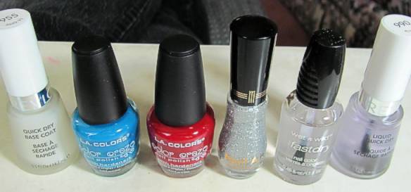
The biggest problem with the Dollar Store nail polishes is their lack of 'staying power'. They began chipping off the nail ends at about 5 days and I just lived with the raggy look too long. But that means I get to play with nail art sooner than if I had used more 'expensive' polish.

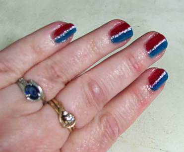
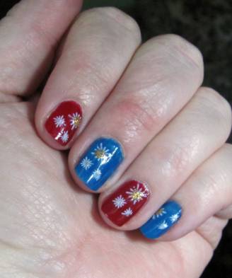
I decided to stay with the red, white, and blue theme but this time I painted every other nail red or blue. I also had picked up a nail stencil kit from the discount bin at the store and thought I'd give that a whirl.

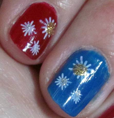
The stencil I chose to use looks a little like fireworks to me and has one large and two small bursts on the design. I used white nail art polish for the stamping and then added a dot of gold glitter polish to the large burst and a dot of silver glitter polish to the small bursts.


It's kind of like rubber stamping on your fingernails, but with polish. If you mess up with the stamping there is no way to fix it but to strip that nail and add all the layers from the base coat through the two coats of color, let it dry and stamp again. I had only one that could have used it but I'm just going to live with the two tiny smudges. After all, this polish does not last that long so I will get to play again soon!

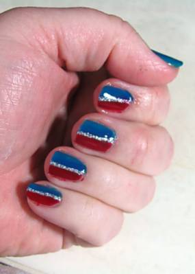
Here's a closeup of a couple of nails.


Now I have my own Fireworks for the 4th!

Ddd


Posted by studio3d@ccgmail.net at 12:01 AM PDT
Monday, 2 July 2012
Twist And Shout
Topic: Quilting

I recently sorted out all the scraps in my fabric stash, setting together pieces that went together and bagging them up with labels. This way I can grab a bag and have an instant 'kit' to play with. Some will need supplemented to have enough for a whole quilt and others will be fine for small projects.

In one of these gallon ziplock bags I had bright pink floral (leftover backing for a grand-child's quilt), bright green (leftover from my current project, and a black with circle flowers in bright colors (backing from my first quilt). I went to a quilt retreat and, in need of a break from a loooonnnngggg project, I dug out this bag and sorted through my collection of quilt ideas for inspiration.

I chose a stripe with a twist (impossible to describe so I'll just show it) to make a wall hanging for my fireplace wall.


The green and pink are sewn together in stripes and folded on the seam. Then the raw edges are sandwiched between wider polkadot stripes. All of the stripes are ironed one direction and the edges stitched down flat. After binding the stripes are all pressed in the opposite direction and a wave is stitched through them to keep them in place. This becomes a 3-dimensional piece.


Awesome, yes???

Ddd


Posted by studio3d@ccgmail.net at 12:01 AM PDT
Sunday, 1 July 2012
Dots and Dashes
Topic: Techniques

When a friend visited from The Netherlands recently, she brought me a gift of a new craft from her country. It is called Hobby Dots. There is a pattern that is placed over your cardstock and you pierce holes through it. Then you have sheets of itty-bitty stickers in different shapes which you transfer to your cardstock, aligning them over the pierced holes. I used the end of my piercing tool to transfer the sticker bits.

I pierced out several from the book she brought me and then realized that the stickers were different shapes than the ones in the book patterns. OK, I just used the same layout and chose on my own which shapes to use. This is my first one:


I did the pattern on a printed cardstock and then used a foil 3D image to fill the frame it created.

Ddd


Posted by studio3d@ccgmail.net at 12:01 AM PDT
Saturday, 30 June 2012
Pastel and Parchment
Topic: Backgrounds

Again with the waxed paper backgrounds! This is the super-pastel brocade one, though you can;t see much of it after mounting the image.

The image is a digital that I colored with my new Distress Markers. I didn't like how 'streaky' it turned out so I layered a scripture printed on vellum over the top. I just wrapped the edges to the back to adhere it.

There was not enough contrast between the background and the focal so I placed a couple of strips of that yummy coral stripe behind the edges.

Ddd


Posted by studio3d@ccgmail.net at 12:01 AM PDT
Friday, 29 June 2012
Long-Legged Beauties
Topic: Backgrounds

This blue and green swirl waxed paper background perfectly suited the digital image I had colored with my new Distress Markers. I added one strip of patterned paper and a greeting stamped on another pattern. All of the pieces are banded with a thin black border.

The floral panel and the sentiment are popped up on foam tape. I added three pearls under the sentiment and another three in the upper left.

Ddd


Posted by studio3d@ccgmail.net at 12:01 AM PDT
Thursday, 28 June 2012
Sand and Sea
Topic: Paper Embroidery

I've been working on this card off and on for months! I started it with no specific swap or challenge in mind and would set it aside to work on one for which I had an assignment. Then I got a swap signup for 'beach/seaside' and I set to work to finish it up.

The shimmery, textured background was sent to me in a supplies swap and suited well for a sandy look. I stitched with rayon threads in bright green for the trees, taupe for the coconuts and tree trunks, and white for the sand and boat. Then I selected irridescent threads in blue for the water and purple for the hills.

I selected one of my pre-stamped phrases on an irridescent green scrap and matted it with irridescent blue to match the folded card base.

Ddd


Posted by studio3d@ccgmail.net at 12:01 AM PDT
Wednesday, 27 June 2012
Slinky
Topic: Paper Embroidery

The next color challenge in paper embroidery was purple and black. I chose to handle this one opposite of the yellow one by stitching with the black thread on the color. I backed it with black dotted cardstock and then used the same purple for the folded card base.


This is really not as blue as it appears. Crazy camera!

Ddd


Posted by studio3d@ccgmail.net at 12:01 AM PDT
Tuesday, 26 June 2012
This Little Light of Mine
Topic: Paper Embroidery

On assignment to make a card with only yellow and black I dug out this pattern for a candle on a stand.

I used a golden tone for the stand. light yellow for the candle and bright yellow for the flame. I used gold Stickles to add a little shine in the flame.


I mounted this on a bright yellow cardstock in keeping with the theme. Surprisingly, for a card with so much black, it does not look really dark.

Ddd


Posted by studio3d@ccgmail.net at 12:01 AM PDT
Monday, 25 June 2012
Clock On A Wall
Topic: Backgrounds

The waxed paper background used today is made with the 'brick' embossing folder. It loses a little bit in the translation with this technique but makes a nice backdrop just the same.

I added some table scrap strips to it and one of them was covered with clocks. So I pulled out a clock stamp and then bordered it up with a decorative die-cut and backed it with a scalloped circle. These are popped up on foam tape.


The sentiment is stamped directly on the background. This is a bit of a risk as the wax resists some inks and causes others to dry very slowly, increasing the danger of smearing. Lucky break when it turned out so well.

Ddd


Posted by studio3d@ccgmail.net at 12:01 AM PDT
Updated: Monday, 25 June 2012 10:02 AM PDT
Sunday, 24 June 2012
Fancy Pants
Topic: Die Cuts

I was going for simple and elegant on this card but I don't think it turned out that way.

Love the background paper. Love the diecut flower. Loved the corner brackets but they may be too large. Loved the pink swirls but they didn't stand out enough so I added white dashed lines and now they stand out too much and the casual lines don't match the formal character of the card. Like the bow - don't love it, just like it.


Possible fixes: use the white pen to turn the dashed lines into solid lines, change up the bow for something more elegant like a rhinestone. Other suggestions?

Ddd


Posted by studio3d@ccgmail.net at 12:01 AM PDT
Saturday, 23 June 2012
Get Well, Mice
Topic: Stamping

"Hey, Mom, will you buy this stamp for me? And since I don't stamp, will you take it home and make cards out of it for me to send out? Please...? It's on sale!"

Now who can resist a plea like that?

So I bought the stamp, brought it home, and made four cards to send to dear daughter so she can send them to friends and family. I must admit, the stamp is cute as can be.

I stamped the image in brown ink so it has a vintage feel and is not so stark as it would be in black. It is colored up with alcohol markers in different color combinations. I cut strips from table scraps as well as some yummy new paper pads I bought at the same time. Each also got the same sentiment stamped in the same brown ink.

Card #1


Card #2


Card #3


Card #4


This image makes a card suitable for adults OR children.

Now I'd better get them off to dear daughter before someone gets sick and she needs them.

Ddd


Posted by studio3d@ccgmail.net at 12:01 AM PDT
Friday, 22 June 2012
Burst Your Bubble
Topic: Backgrounds

I think I've used this embossing folder more in these backgrounds than I ever did as embossing tools. I like that it does not impart sharp edges so the background is more casual.

I used a large block of the background for this first one and added some border strips from the table scraps. Actually, I cut into a brand new piece of paper for the stripes on the left, creating more table scraps in the process. The butterflies are punched from paint sample strips. The sentiment is from the new bin. I think that bin is going to come in very handy.


 I had only a narrow strip of the bubble background left to I used it as one of the decorative stripes in this next card. I added table scraps and a strip of tissue tape over a rose-printed background paper for the layout. Then I pulled out this rose that I colored up LONG ago (its from that old stamp catalog) and popped it up on foam tape. The sentiment strip was pretty eye-catching so I added some leaves of the same cardstock to frame the heart.


MUCH brighter in real life.

Ddd


Posted by studio3d@ccgmail.net at 12:01 AM PDT
Thursday, 21 June 2012
Lay Down In Leaves
Topic: Backgrounds

The sleep mouse is back along with more leafy waxed paper background. This one uses the same folder as yesterday but the coloring was done in more of a fall pallette. Strips of table scraps gives him a place to rest and I think it looks like he just fell asleep in a corner of the yard.


The sentiment is from that new stash I created and I used small scissors to trim it out. This imparts a more relaxed feel as do the rounded corners at the top and the landscape orientation of the layout.

Ddd


Posted by studio3d@ccgmail.net at 12:01 AM PDT
Wednesday, 20 June 2012
Waxing Poetic
Topic: Backgrounds

Still working my way through the pile of waxed paper backgrounds that I made. Today features the two-toned leafy swirls in which I placed red dots for berries.

First up is a layered approach that has a first peek at a sleepy mouse stamp I picked up on clearance. It is colored with alcohol markers and bordered by table scraps. One project I worked on in the studio lately was sorting those ever-increasing table scraps. Even though I use them all the time there always seems to be more! I took out all the smallest ones in solids and light patterns and stamped sentiments on them and put them into a separate bin. Now I can sort through to find one that has the right color/meaning and add it to a card. That is the source of this text.


For this one I stamped the sentiment and a small image directly on the waxed paper background to serve as the feature. I used OWH sketch 111 and then added a third stripe between the two specified. There was not enough contrast between the pieces so I bordered all of them with black marker before popping on the feature panel.


Both of these cards have the same papers but what a difference in character!

Ddd


Posted by studio3d@ccgmail.net at 12:01 AM PDT
Tuesday, 19 June 2012
Think About Flying
Topic: Die Cuts

I love a butterfly with raised wings on a card. Someone sent me this purple butterfly that has been embossed and I had some purple diecut words as well. The background paper I chose had brownish/purple toned flowers on a green background. So I backed the words and butterfly with brown and then added a dark strip at the bottom.


I popped the butterfly wings up on foam and added some green Stickles to the body and antenae. Then I placed three heart-shaped rhinestone stickers on the bottom strip.

Ddd


Posted by studio3d@ccgmail.net at 12:01 AM PDT
Monday, 18 June 2012
Blue On Blue
Topic: Die Cuts

The assignment: make a card that is tone-on-tone blue. I raided the table scraps, the sticker bin and the die cuts stash for parts to use.

I started with a dark blue card base and cut strips from the table scraps to glue on in a tilted strips. Over to top I added a rectangle sticker on an opposite tilt.

Three shaped tags were stamped with the sentiment and mounted with glue dots and a blue brad.


Hey, what's with the camera inserting purple where I put in blue?

Ddd


Posted by studio3d@ccgmail.net at 12:01 AM PDT
Sunday, 17 June 2012
Swoosh!
Topic: Die Cuts

In rummaging around in my scraps I ran across some die cuts I had tossed in a bin for 'later'. First I pulled out a lovely flower piece and used foam as a base under it to burnish and get a rounded shape. Then I pulled out the brown swirls - 5 of them and found the colors went so well with a particular piece of patterned paper that I had.

Adding a pink swirl and a pink patterned strip made it all come together.


I added some doodle lines around the edges, placed foam under the raised parts of the flower petals and a little multi-pearl center to the flower.

Yummy!

Ddd


Posted by studio3d@ccgmail.net at 12:01 AM PDT
Saturday, 16 June 2012
Cold? It's NOT the Air Conditioning
Topic: Paper Embroidery

Still working on 2 Christmas cards a month in paper embroidery.

These cuddly snow people don't show up too well on camera so I bumped up the focus to compensate. I stitched with muted tones on an aqua patterned paper. This got a simple trim and rounded corners accented with white dashed lines. The base card of pearlescent pink also got rounded corners.

I placed a thick clear acrylic sticker on a blue background to match the neckscarf and trimmed around it. This is raised up on foam tape.

Now, I've got 12 Christmas cards ready to go!

Ddd


Posted by studio3d@ccgmail.net at 12:01 AM PDT
Friday, 15 June 2012
All Hands
Topic: Other Projects

My nails started growing back out enough to put on polish. I decided to carry on the summer red, white, and blue theme and substitute out silver for the white. Here's the polish line-up:

Base coat, blue (dollar store), red (dollar store), silver glitter, top coat, quick dry.


And here's the finished product:


Isn't that fun?


They'll look better when they get a little longer.

Ddd


Posted by studio3d@ccgmail.net at 12:01 AM PDT
Thursday, 14 June 2012
Step Right Up
Topic: Other Projects

I made posters for the VBS kick-off party again this year. As you saw in the giant advertising banners a few days ago the theme is based on an amusement park. The kickoff will have a variety of games for the kids to play to earn 'tickets'. These posters will mark these stations.


These are all lettered and drawn free-hand using alcohol markers.

Ddd


Posted by studio3d@ccgmail.net at 12:01 AM PDT

Newer | Latest | Older