Lettering in Ruth
Topic: Bible Journaling
Wow, we are up to week 12 in the year and this series of lettering instruction. This week we are working in Ruth.
Here are the daily lessons:
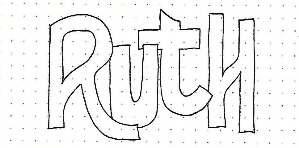
RUTH: Day #1 – Editing Block Letter Shapes – Intro
Having done a lot of work with basic block letters, it’s time to show you more ways to make changes to the form.
For the sample introduction I started by penciling the basic forms and then bounced some up off the baseline, changed some to lower-case, loosened up the tails and crossbars, and overlapped letters. Somewhere along the line they stopped looking like basic block letters at all!
This week we will work on making three entirely new alphabets just by varying height and the width of the elements of the letters.
For now, let’s just start with this one word – but, make up your own version of edited letter forms.
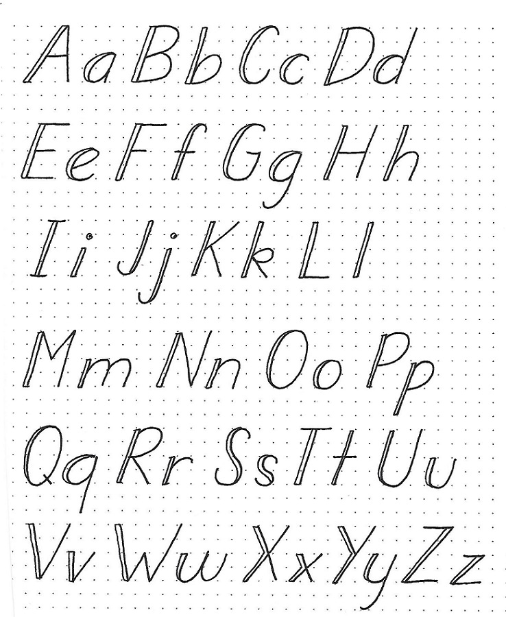
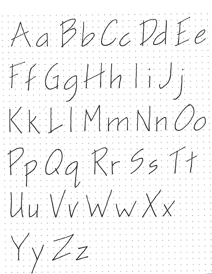
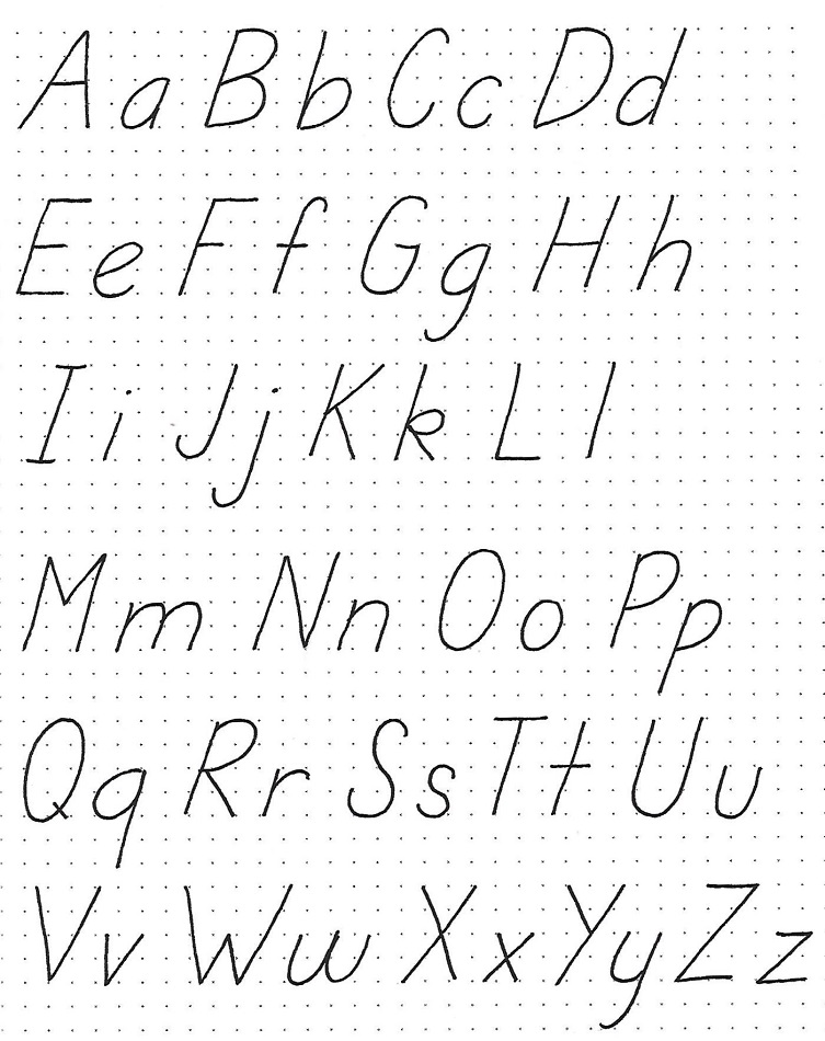
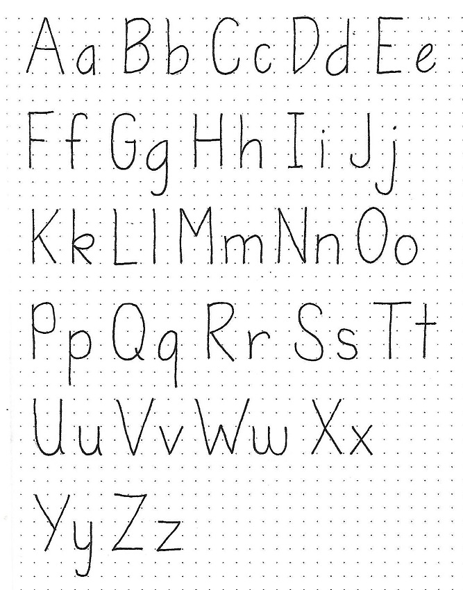
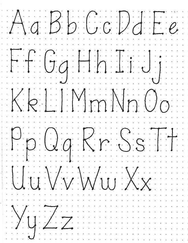
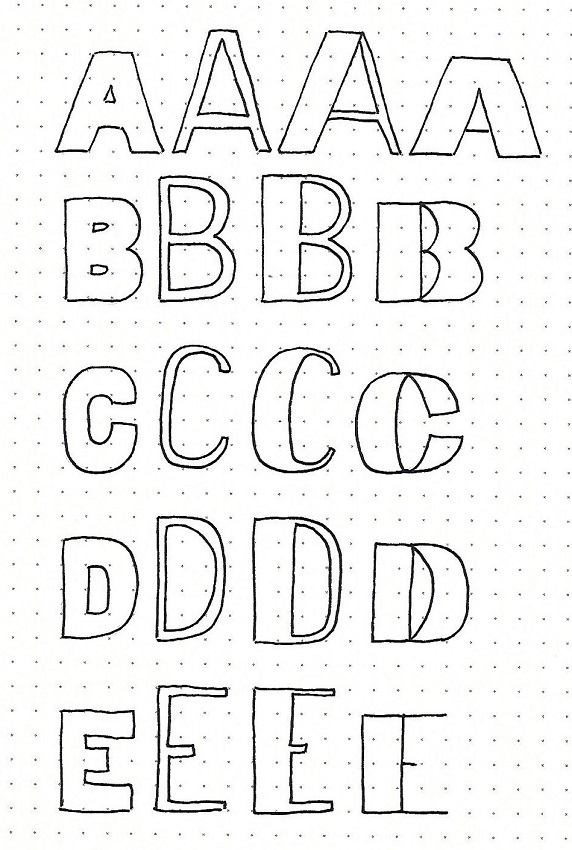
RUTH: Day #2 – Editing Block Shapes – Alpha A-E
Rather than working all the way through one alphabet style and then another and another, we are going to work on making all the style variations on a letter by letter basis.
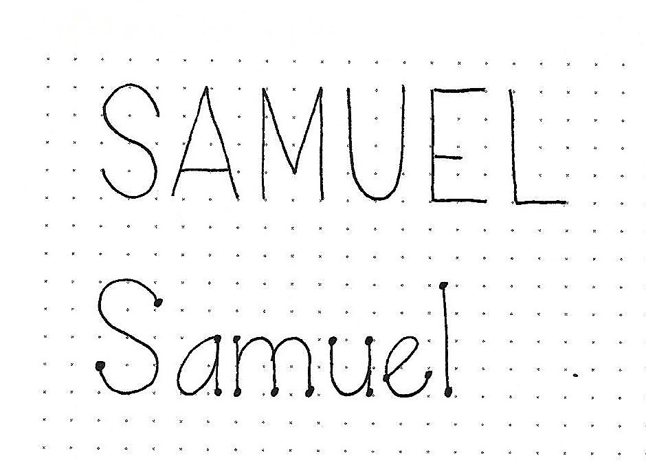
The first letter is the basic block letter we originally learned – 4 units tall, about 3 units wide, elements 1 unit wide. We draw it here to serve as a reference point.
The next letter is 5 units tall, about the same width, and the elements are ½ unit wide. WOW! What a difference that makes. The third version is the same but the left element is widened to 1 ½ units. And the fourth style is back to the 4-unit height, vertical elements are 1 ½ units wide and horizontal elements are a single line.
So different, aren’t they? There are many more ways to change these up. If you want to explore other ideas, just add your new forms on the right.
Today, we are just doing the letters A through E. The rest of the alphabet will be done on days 3 and 4.
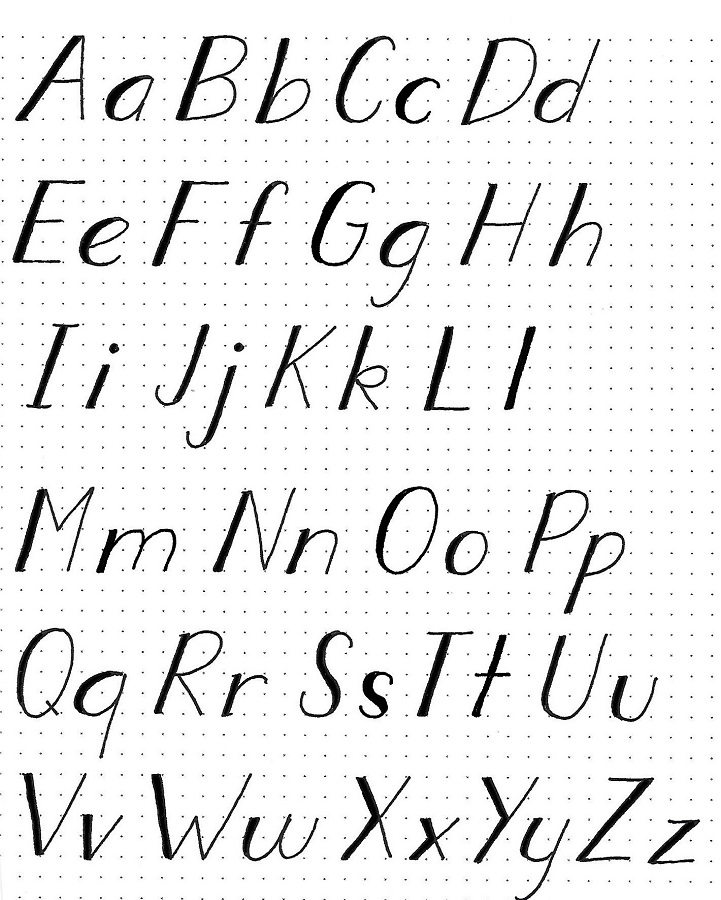
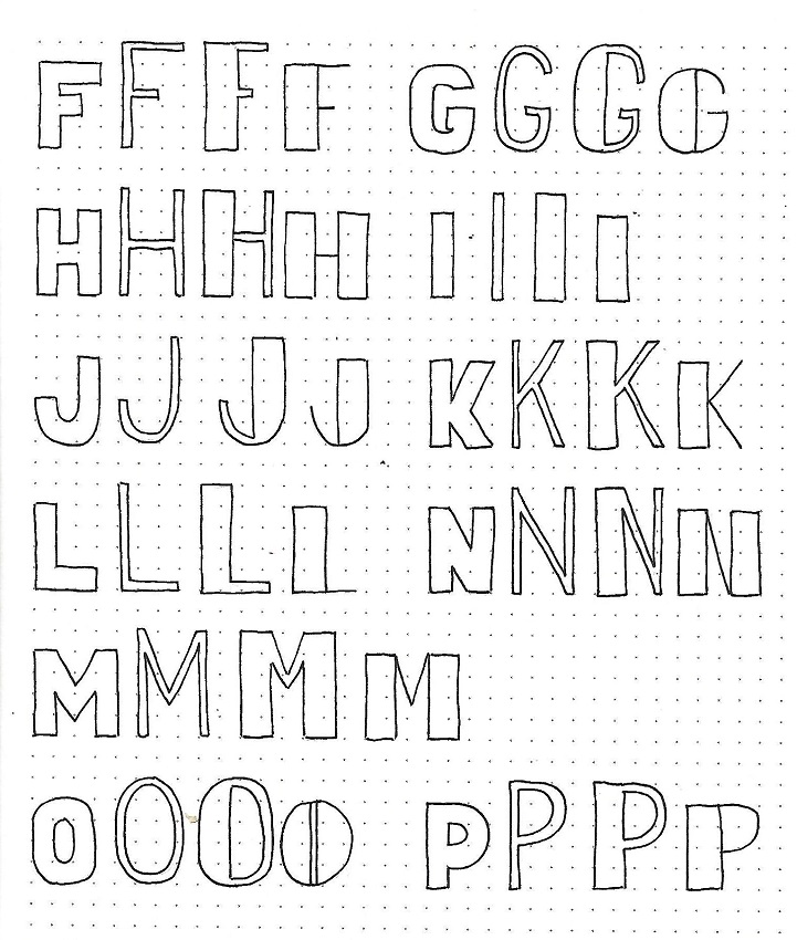
RUTH: Day #3 – Editing Block Shapes – Alpha F-P
We’re back with the next series of letters in edited block letters.
Just as yesterday, the first letter is the basic block letter we originally learned – 4 units tall, about 3 units wide, elements 1 unit wide. We draw it here to serve as a reference point.
The next letter is 5 units tall, about the same width, and the elements are ½ unit wide. WOW! What a difference that makes. The third version is the same but the left element is widened to 1 ½ units. And the fourth style is back to the 4-unit height, vertical elements are 1 ½ units wide and horizontal elements are a single line.
We will finish this project tomorrow.
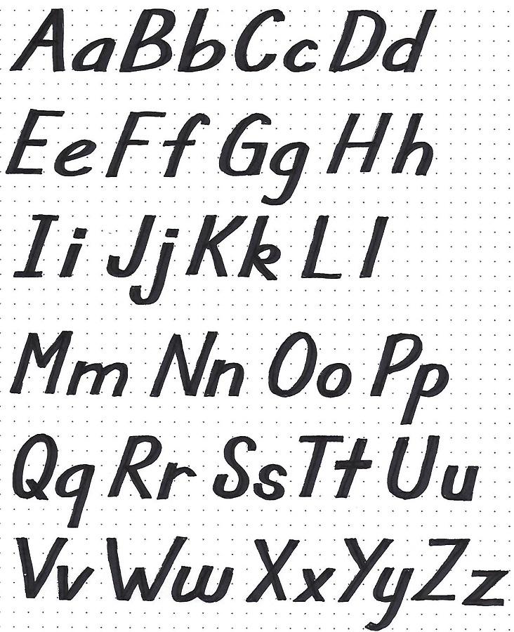
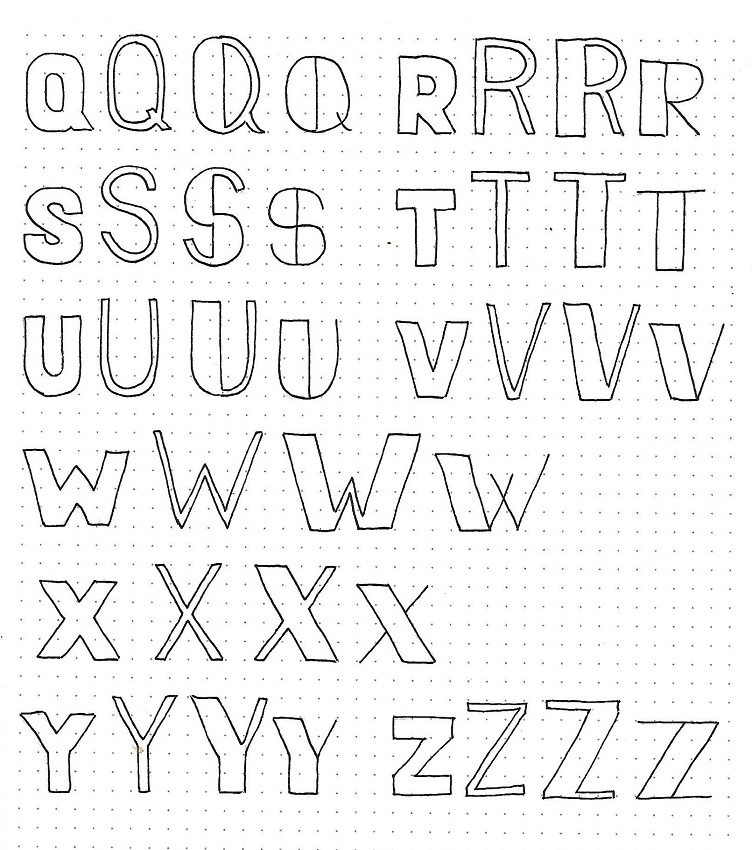
RUTH: Day #4 – Editing Block Shapes – Alpha Q-Z
And today we have the final series of letters in edited block letters.
Once again, the first letter is the basic block letter we originally learned – 4 units tall, about 3 units wide, elements 1 unit wide. We draw it here to serve as a reference point.
The next letter is 5 units tall, about the same width, and the elements are ½ unit wide. WOW! What a difference that makes. The third version is the same but the left element is widened to 1 ½ units. And the fourth style is back to the 4-unit height, vertical elements are 1 ½ units wide and horizontal elements are a single line.
Have you been adding any other forms?
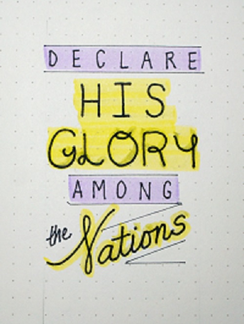
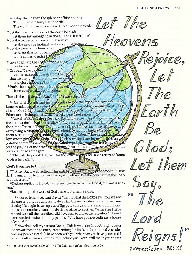
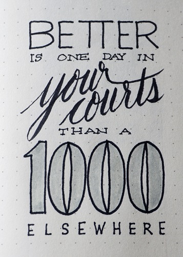
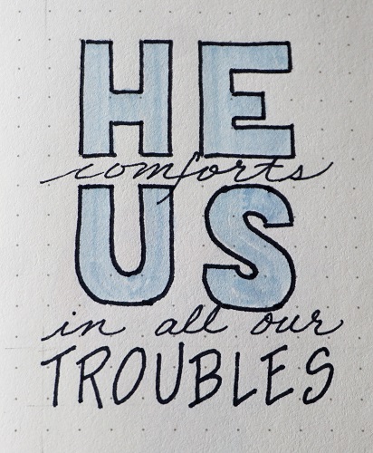
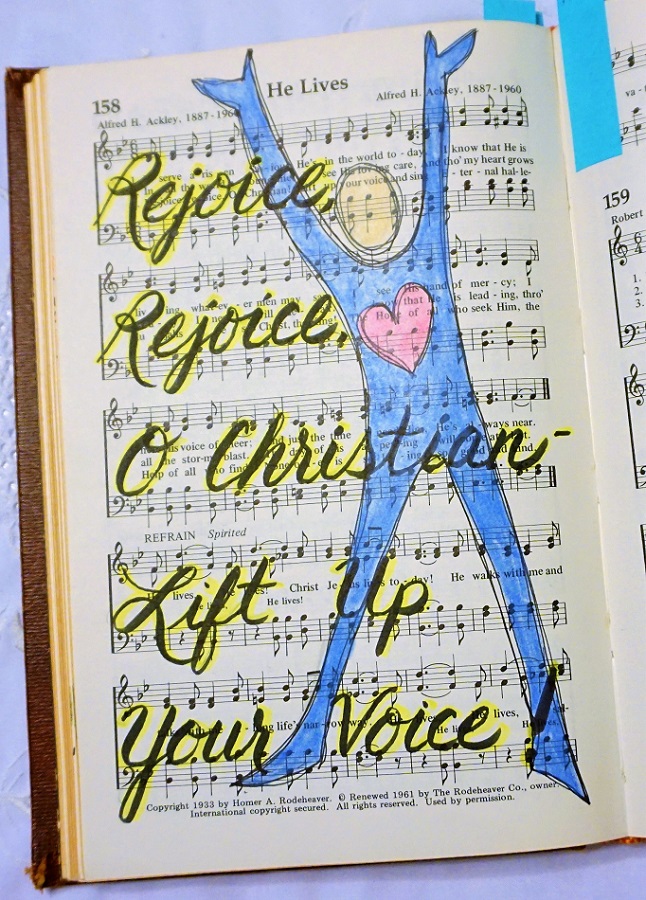
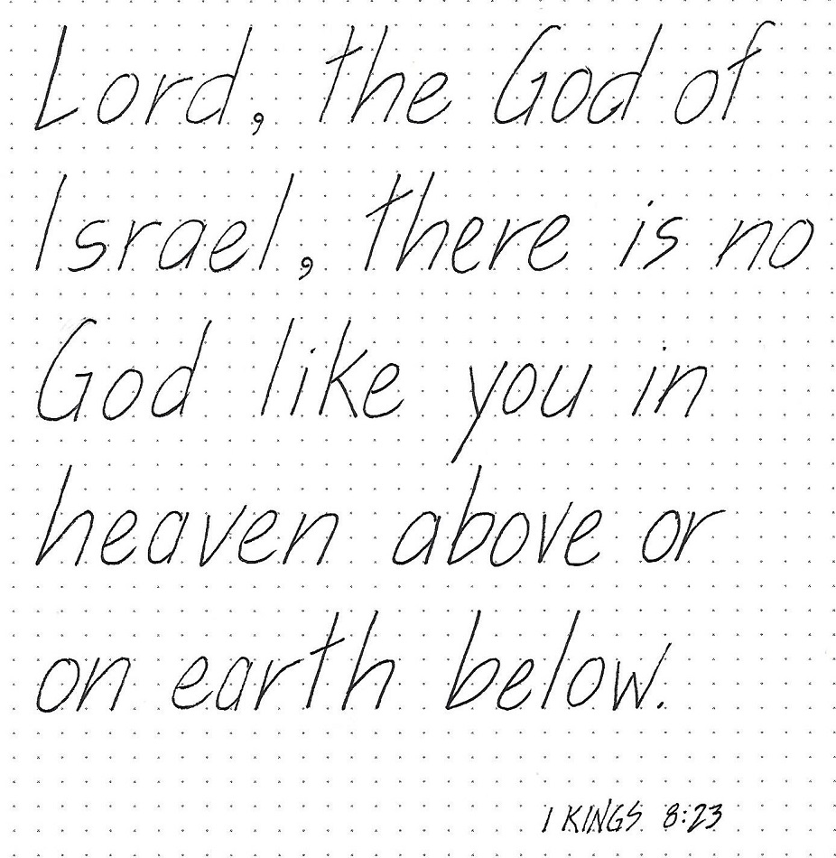
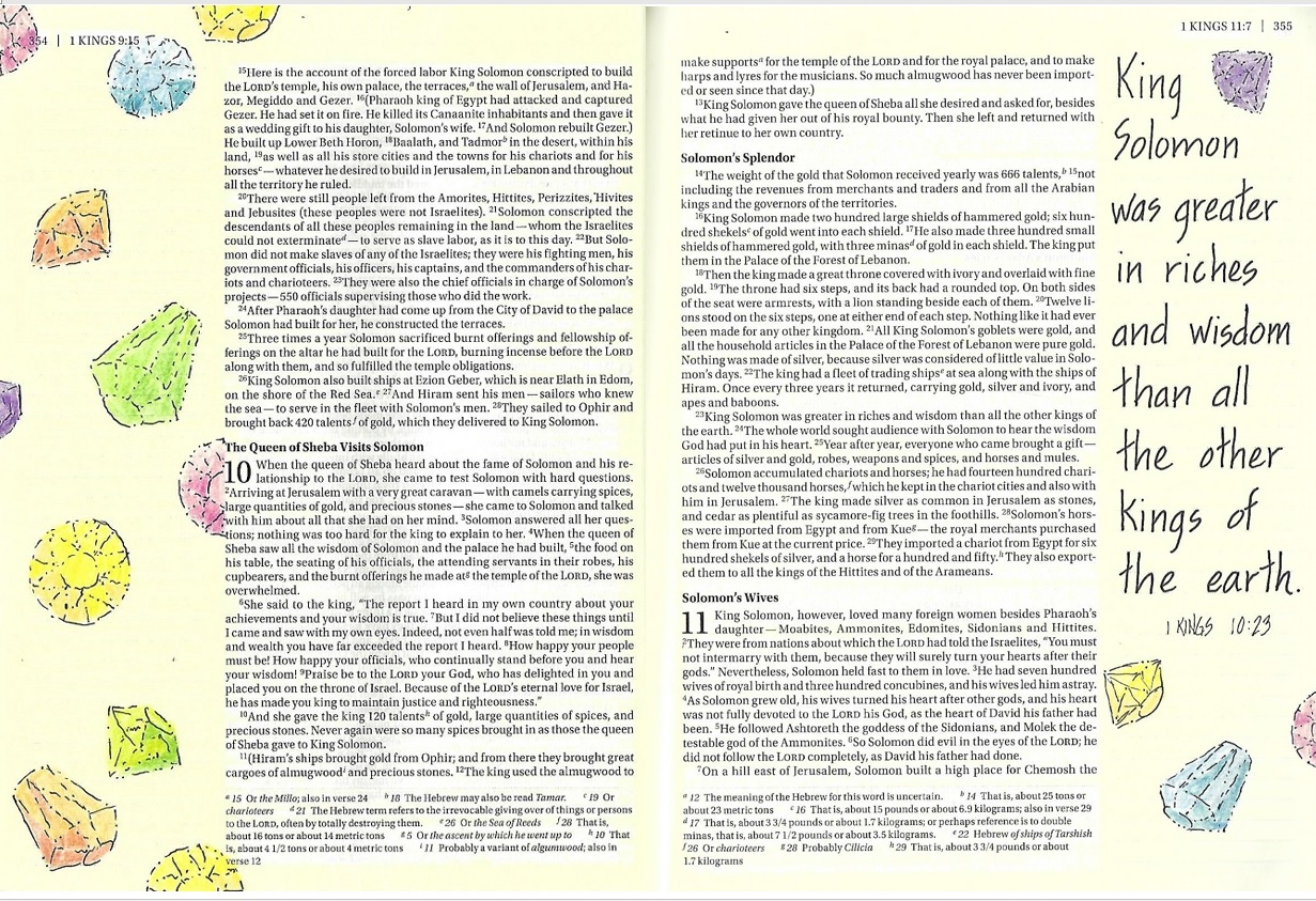
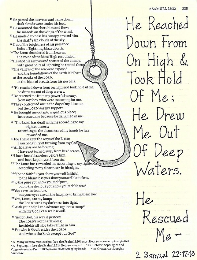
RUTH: Day #5 – Edited Block Shapes – Bible Page
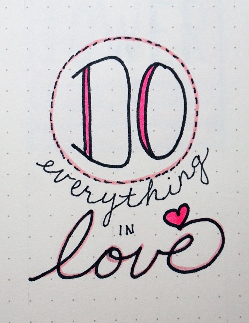
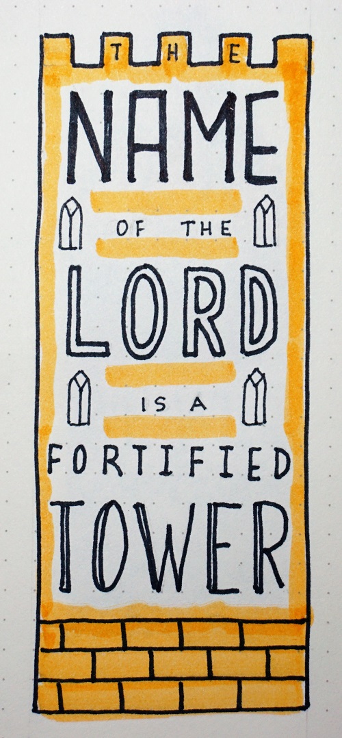
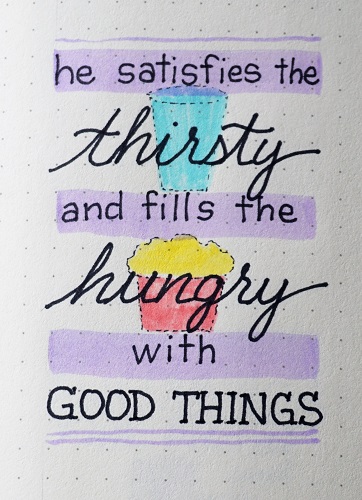
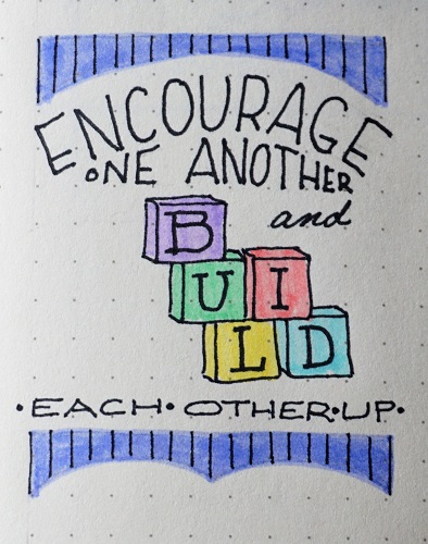
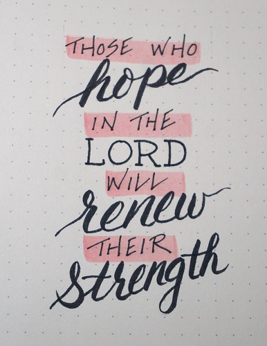
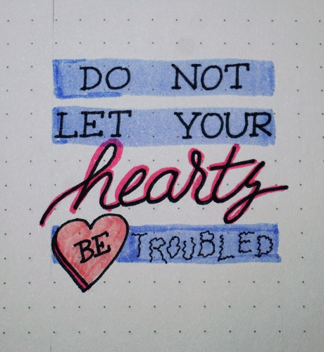
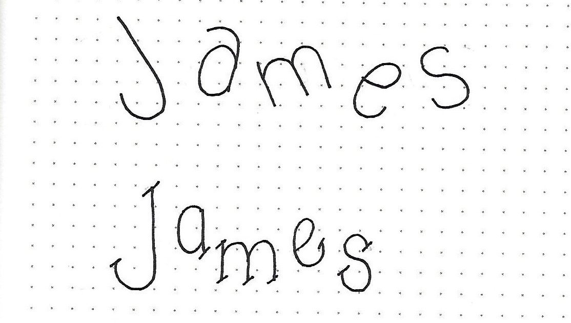
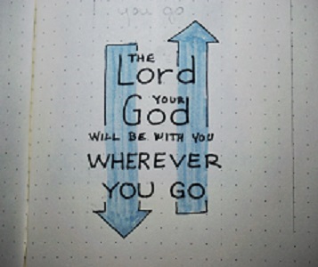
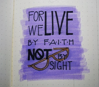
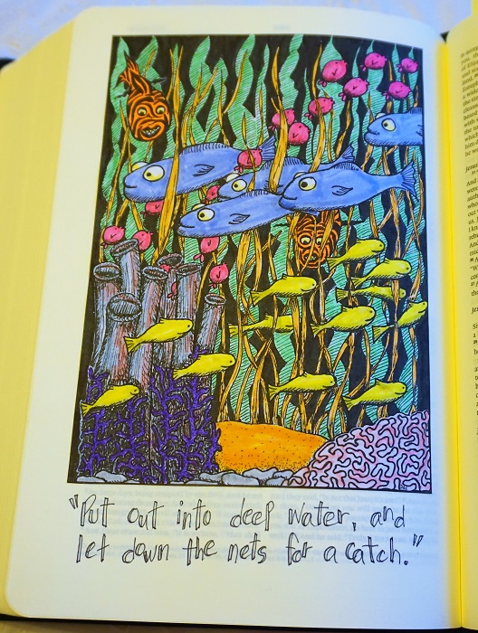
In your Bible today, working in the book of Ruth, combine several versions of the edited block letters. I did some skinny, some wide, and even brought in those with slashed edges from prior lessons. Also, in the mix are some basic round letters and a bit of script handwriting. Use whatever mix of styles YOU are comfortable with.
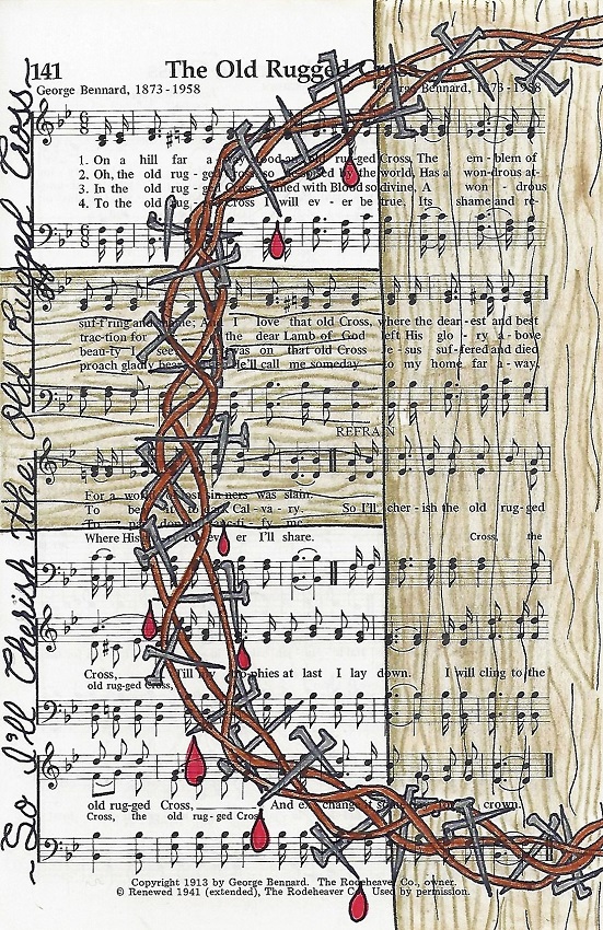
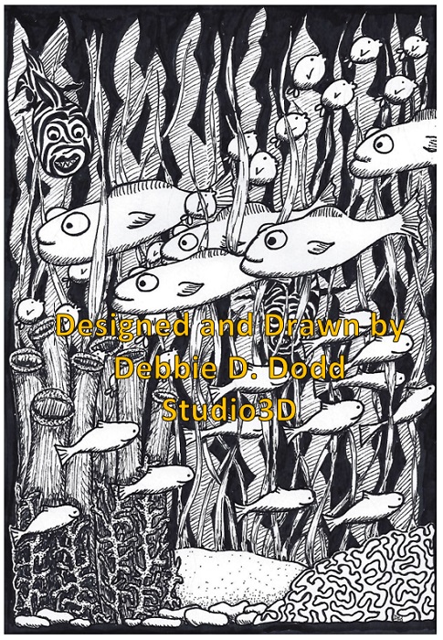
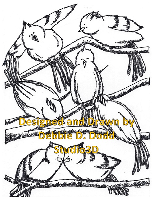
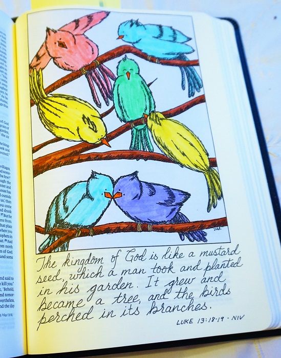
So what ties it all together? The way the words interlock together and the consistent colors throughout. I combined my text block with the peacock from the Drawing Room lesson for this week in the same colors.
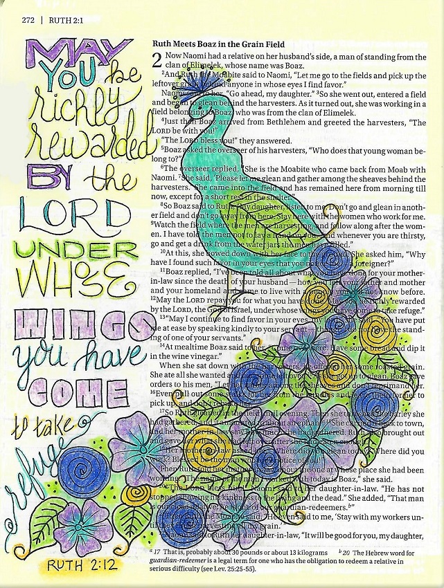
Oh, how I love that peacock!
Ddd
Posted by studio3d@ccgmail.net
at 1:00 AM PDT