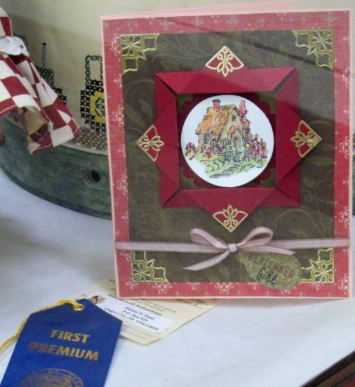
« September 2011 »
S M T W T F S
1 2 3
4 5 6 7 8 9 10
11 12 13 14 15 16 17
18 19 20 21 22 23 24
25 26 27 28 29 30
You are not logged in. Log in
Entries by Topic
All topics  «
3D paperwork
A - Z challenge 5
A - Z challenge 7
A - Z challenge round 4
A to Z challenge round 3
A to Z round 2
A to Z round 6
A-Z round 1
Around the House
Art Challenges
Artist Trading Cards
Backgrounds
Beads
Bible Journaling
Books
Boxes
Collage
Color Challenge
Coloring
cookbook
Die Cuts
Digital Projects
Digital Stamps
Drawing
Dry Embossing
Fabric Stuff
Fantastic Folds
Field Trip
Home Decor
How Does Your Garden Grow?
Hymnal Art
In The Kitchen
In the studio
Jewelry
Lettering
Links
Multi-Technique
Music to Work By
Musings
Nail Art
New Work
Online Class
Other Hobbies
Other Projects
Painting
Paper Embroidery
Paper Piecing
Photo
Pretty Paper
Quilting
Random
reading
Scrap Recovery
scrapbooking
Sewing
Sketch Challenge
Some Backlog
Stamping
Stencils
Stickers
Supplies
Teabag Folding
Techniques
Testing
tips and tricks
Tutorial
Web resources
Welcome to my Blog
Work By My Friends
workflow
Writing
Blog Tools
Edit your Blog
Build a Blog
RSS Feed
View Profile
Group One
In & Out of Studio 3D
Saturday, 3 September 2011
Seven Up
Topic: Stamping

A while back I was using a shadow stamp on card projects and stamped up a bunch extras in a variety of pastel colors on white cardstock. So, in a push to use them all up, I pulled out some other stamps and treated them in similar ways.

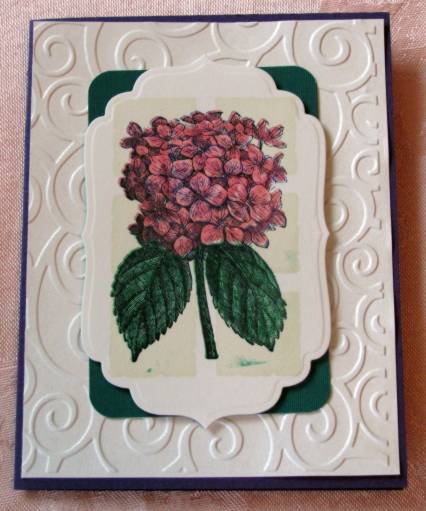
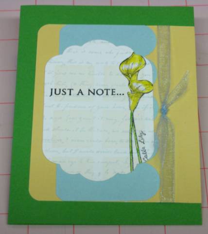
First I stamped over all of them using a script background in coordinating colors. Then I used a tall flower stamp on the right side of the blocks. I have a set that offers 4 different flowers. So I used each of them twice, except for the lily. Then each of them was colored with watercolor markers and cut out with a nestabilities die - using a variety of them. Finally, each got a text stamp.

I then pulled out base cards, background papers, and ribbons in suitable colors and set about assembling the following--

With the lily stamp I colored in yellow, layered with green, yellow and blue and added a sheer blue ribbon:

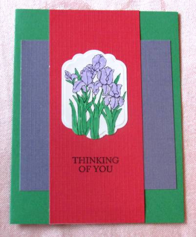
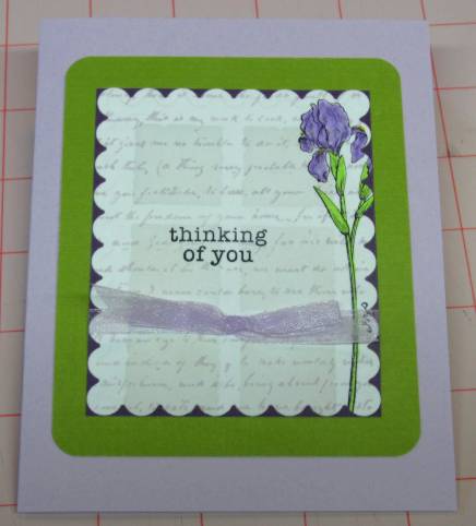
This Iris was colored with light purple, cut with a scallop die, layered with dark purple, lime green and light purple. It got a sheer purple bow:

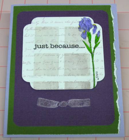
The second iris was colored with a blue-violet marker and has a darker shadow stamp background. A faux bow on the purple cardstock layer balances out the image panel which is popped up on foam tape. The green layer is torn on the right to soften the layout and this is finished off with a violet card base:

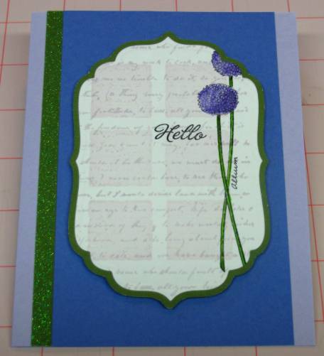
Next is the Allium. The first is a blue-violet version which has a thin green border peeking out from the image panel. This is popped up on foam tape over a blue panel and bordered with a glitter-green strip on the left. The base card is pastel violet:

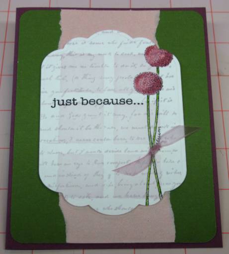
The secons Allium was colored with a raspberry coloring so I added a shimmery pink torn panel behind it to reinforce the palette. A sheer ribbon is knotted through slits on either side of the stems before popping it up over the pink/green layer. Dark red-violet card base on this one:

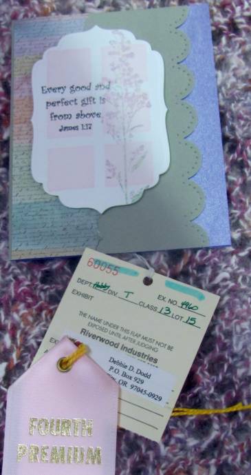
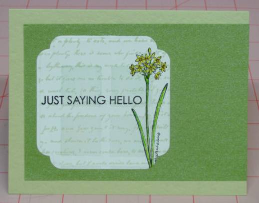
These final flowers are labeled paperwhite narcissus which one presumes would mean they should be 'white'. However, that would be boring! So I made them yellow and orange. The first I gave a simple layout since the flower itself is more detailed. A borl text stamp adds some weight to the panel to anchor it. Both the backing and the base card are in tones of spring green:

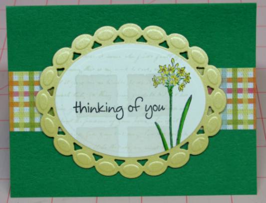
The second paperwhite also got a horizontal treatment (it just worked out that way). I got a new nestabilities die with a cool 'beaded' edge that the ovals die fits precisely. I used it on a shimmery yellow cardstock and popped both on foam tape over a grass-green card base and a strip of playful plaid:

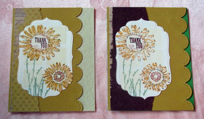
Isn't it fascinating how much the look changes from one card to another with different shapes and colors?

Ddd


Posted by studio3d@ccgmail.net at 6:00 AM PDT
Friday, 2 September 2011
Asian Stitches
Topic: Paper Embroidery

ASSIGNMENT: Make a stitched card with the theme GLOBETROTTING. I chose to make my card Asian in support of Japan.

I used a collage rubber stamp on white cardstock and colored in a few areas with watercolor markers. Then I pricked out areas as I went along and stitched in with the appropriate threads.

For the medallion I stitched in red over the yellow coloring. Then I stitched heavily in the ferns with lime green. The dragonfly is stitched with irridescent violet in two tones.

I used a printed tissue, crushed and flattened, over light purple cardstock base and added the stitched panel on top.

Here is a close look at the stitching on the dragonfly. You can see I did just a few lines on each wing and then stitched sections into the body.

And off it went to its new home in England, so I guess the card itself is a globetrotter!

Ddd


Posted by studio3d@ccgmail.net at 6:00 AM PDT
Thursday, 1 September 2011
Four Dogwoods
Topic: Stamping

ASSIGNMENT: make cards illustrating what you like best about SPRING in your home area. (Yes, I am very late in posting these, though they were completed in April!)

For me, the best thing about Spring is the flowering of the trees. I love the magnolias, the plums, and the dogwoods most of all. As it happens, I have a dogwood clear stamp and I chose to use it four ways (because I don't like being repetitive) because I don't like being repetitive (LOL).

For the first I stamped three times on white cardstock, blocking out the text on two of them. They were colored with watercolor markers and then I used a square punch to cut them out, changing the orientation so they would look like different branches. Then I rounded two corners of each and hit all the edges with Old Paper distress ink on a foam applicator. These were then attached to a butter yellow cardstock strip. I selected a cream base card and stamped over the whole face using a flowering branch stamp and Old Paper distress ink. It was a little stark so I used an aquabrush to color in the blooms and branches which melted the ink color into these areas. I mounted the image strip and then rounded the two outer corners. Here's the result:

Yes, it IS yummy! But I kept going. I selected another white cardstock and stamped all around the outside with the dogwood stamp to create a frame and then colored it with watercolor markers. I used a nestabilities labels die to cut out the center and the next larger one to emboss a frame around the cutout. I used Old Paper distress ink to tint the whole frame and mounted it to a cream card base using 3d glue dots around the inside and regular glue dots at the outer edges. I stamped text onto white cardstock and cut this with the next smaller nestability die and tinted it with the same distress ink. Here's a look:

Ooooh! Aaaaah! But we're not done yet.

Next I stamped the dogwood only twice onto white cardstock and blocked the text out on both. Then I colored with the watercolor markers. This I cut with a large scallop oval Nestability dieand tinted with Old Paper distress ink on a foam applicator. I selected a cream card base and used a Cuttlebug embossing frame folder on the front of it. I stamped the text and used a watercolor marker to add vines all around the edges. Then I mounted thedogwood panel using foam tape. Are you ready for this???

Lovely, no? And one more...

This time I stamped the dogwood three times in an arch and colored with watercolor markers. I cut this into a panel and rounded the corners before using the Old Paper distressink on the whole thing. I chose another cream card base and ran this thru the Cuttlebug with the Script foldes. I burnished it lightly to flatten the embossing a bit and then used the distress ink to very slightly color the raised portions. I added the stamped panel with foam tape and then rounded all four corners of the card.

So there you have it. One image stamp, one background stamp, four markers, one distress ink pad, two nestabilities sets, two embossing folders, two punches, four cream card bases, one yellow strip.... four awesome cards for Spring.

Ddd


Posted by studio3d@ccgmail.net at 6:00 AM PDT
Wednesday, 31 August 2011
J is For Jazz
Topic: Paper Embroidery

Another card for the alphabet paper embroidery series...

J is for Jazz because I couldn't think of anything else for J that I had a pattern for! I embossed the white paper first and then pricked out the design (by Joke de Vette) onto it. I stitched in a variety of bright colors to illustrate the jazz theme.

After rounding two corners I mounted it on a background of green glitter cardstock using foam dots and glued this to a yellow-orange card base.

I found some acrylic button letter stickers to spell out JAZZ and used a Sharpie marker to turn them into musical notes for the text.

Ddd


Posted by studio3d@ccgmail.net at 6:00 AM PDT
Tuesday, 30 August 2011
Life Is Sweet
Topic: Scrap Recovery

I liked that sentiment so much yesterday that I used it again today - this time on bee hives instead of a jar of honey.

The se hives were colored with watercolor markers and cut with Nestabilities. I used the next larger die to cut a backing of shimmery gold and mounted on foam tape over the green background paper. The greeing is stamped at the upper right shich requires that the image be offset from center.

A pink shimmery card base matches the flowers and rounded corners lighten the mood.

Ddd


Posted by studio3d@ccgmail.net at 6:00 AM PDT
Monday, 29 August 2011
Simply Layered
Topic: Scrap Recovery

When the image is complicated or includes the greeting in the image it is often wise to just do some simple layering with plain or patterned papers. This is how today's cards were constructed

This seed package image is large enough to stand on its own as a card front. I simply layered onto yellow card then a purple glittery card base. The flowers in the center are sticky-backed punchouts I received as a gift.

This image featured a placard being held up by the bear. I stamped the text inside. The image was then close-trimmed and the corners rounded. After layering onto shimmery green cardstock I tied a ribbon knot around it. This is layered onto a cream card base.

Finally, This image and greeting stamp just seemed to go together! I used a Nestability to cut out the image and then trimmed the top and bottom points off. It looks a little more playful like this than with the points which looked formal. The striped paper matches the heart and is also whimsical. Rounded corners on the pink stripe and the green card add to the casual feel. The yellow card base matches the flowers.

Ddd


Posted by studio3d@ccgmail.net at 6:00 AM PDT
Sunday, 28 August 2011
A Little Bit of Focus
Topic: Scrap Recovery

Some stamped images are pretty small. These can be trimmed out with a punch or a Nestabilities die to create a small focal point. This is the case with today's cards, both colored with watercolor markers.

The iris image was received in a swap. I cut it with Nestabilities and embossed the edges. Two simple panels and a cardbase create layering and the simple greeting is stamped.

I used a square punch to trim out the sunflowers below and rounded the corners with a punch. Mounted at the top of a long panel I then stamped a greeting added a silk flower and tied a ribbon knot. The panel, with its rounded corners, was popped up on foam dots over a glittery blue cardstock and then added to a bright yellow card base.

Ddd


Posted by studio3d@ccgmail.net at 6:00 AM PDT
Saturday, 27 August 2011
Cutouts
Topic: Scrap Recovery

The three cards today all use edge cutting to make the focal image stand out. All are colored with watercolor markers.

First up is a lily. I made a background element with sticky-backed cardstock by using the border punch on two adjacent sides. I stamped on the left corner and mounted the flower on the right before adhering all to a green card base.

The purple birdhouses also got a scalloped edge panel and a stamped greeting. Changing the text to a script makes a big impact on the feel of this card. I used a fine line black marker to give both of the birdhouses a post to stand on and then colored them in with marker.

The wheelbarrow image was split along the top edge to separate the front from the back of the cart. The front layer is on foam dots and the back layer is glued flat to the background. I used glue dots to adhere paper flowers in and around the cart and gave them rhinestone centers. The greeting at the top is stamped.

Ddd


Posted by studio3d@ccgmail.net at 6:00 AM PDT
Friday, 26 August 2011
Special Features
Topic: Scrap Recovery

I wanted to work on shading techniques and chose three specialty images from the catalog to work with. These all use copic markers.

The first is a Halloween image featuring two jolly pumpkins. I kept the setting very simple, a torn green paper at the bottom of a dark brown card base. The pumpkins needed something to anchor them so I stamped grass clumps on the green. The text greeting is also stamped.

Next up is a card for New Years! Simple coloring and layering. It does use some awesome glittery yellow cardstock, though.

More of the glittery yellow cardstock in this wedding card, too. I really like how the shading came out on this image. It was a challenge to make the suit look black and the dress look white while shading both and adding dimension.

Ddd

Posted by studio3d@ccgmail.net at 6:00 AM PDT
Thursday, 25 August 2011
Shapely Stamps
Topic: Stamping

The things linking these two cards is that they are both stamped and both cut with Nestabilities and I didn't like how they started!

This first image was stamped on white cardstock. That was much too stark so I used copic marker to tint it yellow. Then I colored in the metallic base. After I cut it out with Nestabilities the birdhouse seemed to just float so I toned the edges with distress ink. I layered over printed cardstock with a scalloped edge and stamped the greeting at the bottom (love how the scrolly brackets mimic the swirls on the cage). Finally, I used a fine line marker to draw a chain for the cage to hang from.

That was certainly easier than this next one. I started this image with the 'thumping' technique but chose colors too far apart to look right (wine and purple) and the leaves were too bright. I tried to recover it by coloring over the whole flower head with a pink marker but it was too close to the original wine so I lost a lot of definition. I colored over the leaves with a softer green with the same effect. Hmmm, now I have overall color but few lines - so I used the stamp positioner to line up the image and stamped with black over the top and it now looks like it would have if I had just stamped the image and colored it in!

Well, not one to waste an effort, I used the Nestability die to cut it out and layered over a green card with rounded corners and over a shimmery white card with an embossed texture. A purple card base links back to the original 'thumping' even though it is a distant memory by now.


Ddd

Posted by studio3d@ccgmail.net at 6:00 AM PDT
Wednesday, 24 August 2011
Border Paper Trio
Topic: Scrap Recovery

Look, it's more of the borders from the fun floral/grid paper. I used it as backing for three cards with images from the stamp catalog.

First up is a charming teapot and teacup set. I colored them to match using watercolor markers and trimmed with a craft knife. The greeting is stamped onto the backing paper (that grid background is wonderful for keeping the text straight). This got a yellow card base.

Next up is a sweet little angel on the wing. She looks so lighthearted it was logical that her greeting would just say 'enjoy'. A red card base matches he dress as well as the rick-rack border on the printed paper.

Finally, the little garden lady. The scrap of paper was smaller for this so I stamped a greeting at the top and offset it behind the lady. paper flowers across the bottom add balance and interest. Each of them got a little red heart center. The blue and red layers of the background pull colors from the patterned paper.


Ddd


Posted by studio3d@ccgmail.net at 6:00 AM PDT
Updated: Wednesday, 24 August 2011 6:49 AM PDT
Tuesday, 23 August 2011
Thumping Sunflowers
Topic: Stamping

This was actually my first experiment with the 'thumping' technique. But I didn't really care for them so they got set aside till I could figure out how to 'fix' them. Notice, these are done over the 6x shadow stamp (one in whisper sage, one in whisper vanilla). The flowers are a combination of clear stamps from two different sets. The larger blook actually has 'thank you' text all through it but the coloring technique obscures it.

To 'fix' the images I used a fine line black marker and added 'sketch' marks around the blooms. I used the same marker to highlight the THANK YOU text in the center of the large bloom. I added stamped stems from another set to anchor the flowers. NOW I can work with them. I used a Nestabilities die to cut the panel shape.

I used a matching golden cardstock on both and used the scallop punch at the right edge. The first card has a tone-on-tone star paper with a torn edge for added interest. This card has a celery green card base.

The second card has a torn edge brown tone-on-tone paper and the card base is green to pick up the color of the stems.

Ddd


Posted by studio3d@ccgmail.net at 6:00 AM PDT
Monday, 22 August 2011
Time to Live
Topic: Stamping

I recieved two of these clock images in a swap - one is stamped in black and the other in dark brown. They were quite stark on their white backgrounds so I cut to size, rounded the corners, and used distress ink on them with a foam applicator. Ah, much better.

I chose the same brown printed paper to back them and pulled out the matching addage tickets as well. And then we diverge...

For the first I tore the edge of thebrown paper and layered it over cream cardstock. I stamped several antique keys, stamped a greeting at the top, and added handwritten text to the addage ticket.

For the second one I distressed the edges of the brown paper and layered with a golded star print (scallop punched edge).

Ddd


Posted by studio3d@ccgmail.net at 6:00 AM PDT
Sunday, 21 August 2011
Something For the Kids
Topic: Scrap Recovery

I colored up a couple of cards designed to be sent to children. These are non-specific greetings rather than for a birthday or other holiday. Sometimes a kid just needs a 'shout-out' to remind them somebody is thinking of them. Both are from the stamp catalog and colored with watercolor markers. Both alsofeature the scallop punch.

I used a craft knift to trim around the clown and used bright green and red to make it festive. I thought the scalloped edge could remind one of the big-top tent and mounted the clown off the top edge for interest. The greeting block is stamped.

On the giraffe pull-toy I worked more on shading to make it look 3-dimensional. After trimming with the craft knife I used some of the scraps from the grid/border paper and stamped a greeting sideways along one edge. The scallops go on the edge this time over a blue card base.

After everything was assembled I drew in a towing string for the toy across several layers.

Ddd


Posted by studio3d@ccgmail.net at 6:00 AM PDT
Saturday, 20 August 2011
Oh Baby, Baby, Baby
Topic: Scrap Recovery

You guessed it - three baby cards. One for a boy, one for a girl, and one to be used for either. All are cut from the stamp catalog and colored with watercolor markers.

Fot the Boy card I colored up a little buggy in blue and yellow, working especially on shading. I cut it out square and rounded the corners, then combined three separate stamps to print the greeting. After layering on yellow and blue I added the little bunny - from the stamp catalog.

The baby girl card combines two images from the catalog. I colored them to match and mounted directly onto a muted rose cardstock over a yellow card base. The greeting was combined words from three stamp sets and the clothesline is drawn in with marker.

The bassinet image seemed to float in the grey area of cardstock so I added a horizontal line, which helps. I used a repeating word stamp from a See-D's set and stamped repeatedly to fill the upper right corner. After mounting on a pale yellow card base I added the other bunny from the stamp catalog.

Ddd


Posted by studio3d@ccgmail.net at 6:00 AM PDT
Friday, 19 August 2011
Celebrate Three Birthdays
Topic: Stamping

These three cards were made with images received in a swap. I colored them all with watercolor markers.

First up is a package and a stamped greeting (which came to me that way). I did add lines under the present to anchor it. The bow is actually from the stamp catalog as the present originally came with a flower (!) on top. I layered with a range of pink cardstocks.

Then we have a range of sweet cake temptations. This also came with the sentiment so I just cut it in a block, rounded the corners and layered with matching pink and blue.

Of the three, I like this one best. These cakes came stamped one beside the other - boring spacing, no focus. I used a square punch to liberate them from their neighbors and a corner punch to relax them a bit. They were intentionally punched off center for interest. A band of green shimer anchors them to the blue cardstock. A greeting was stamped onto the folded card base.

In the end, they are still three cakes lined up in a row, but now they have a little party goin' on.

Ddd


Posted by studio3d@ccgmail.net at 6:00 AM PDT
Thursday, 18 August 2011
Giant Focals
Topic: Scrap Recovery

I had a couple of items from the stamp catalog that were HUGE. Though totally different from one another I am featuring them together today - based on size (well there has to be SOME reason to combine projects)... oh yeah, they're both colored with watercolor markers, too.

The first is an elegant arch twined with roses. I pulled some of the color into the background so it would not appear to be 'floating' quite so much. The scallop punch makes another appearance and I used a scropture stamp in the white space.

The next card actually has two items from the stamp catalog on it. The rose background is a background print without a true focal point. I used a script background stamp to stamp over the top of the colored image which softened the look but it still didn't have focus.  So I colored up a floral frame and stamped in the center of it with a scripture. This is popped up on foam tape for some dimension.

After mounting on a folded white card base I used a fine line black marker to run doodle lines at the top and bottom.

Ddd


Posted by studio3d@ccgmail.net at 6:00 AM PDT
Wednesday, 17 August 2011
At the Fair
Topic: Multi-Technique

Opening day at the fair yesterday and I came away with awards on 13 of the 15 items I entered! The only two things I did not place with were a pen and ink drawing and my newest quilt. Considering that I have been quilting less than a year I am not surprised on that front.

I did get a second place in the wall hangings division and that was quilted.

I got a first place on my beaded bracelet.

The rest of the winners were all in paper crafts. I got a first place with my paper teapot.

The remainder of these are in the rubber stamping division.

This birthday card got a first place.

My Christmas card got a third place ribbon.

I also got a third place on this embossed stamping.

This embellished card took fifth place.

Also a fifth place on this general 'greeting card' (ignore the neighbor's red ribbon laying on top of it).

The card I made with my hand carved stamps (along with the stamps themselves) won a first place.

This 3D card won a first place.

Also a first place for this watercolored card.

Another first place for this stamping with string art.

And, finally, a fourth place for this card in the 'other' category (doesn't meet the definition for any of the other categories).

WOW! I feel like I won the lottery! This was so much fun I will definitely enter again.

Ddd


Posted by studio3d@ccgmail.net at 6:00 AM PDT
Tuesday, 16 August 2011
Six Pack
Topic: Supplies

I got some awesome printed cardstock in a pack that was printed with bold graphic flowers in sparkly paint AND the background was a grid. Oooooh, I DO like me some grid! There was a fun border printed along one edge which was also patrially in sparkles.

Since these were 12 x 12 I was able to get several card full fronts from each sheet and have some lovely scraps to play with later. Using the pieces with the bold flowers, I stamped them with a variety of scripture stamps (Stampin' Up)and backed them with bright green, white, or dull blue. So simple.

This was the best part of the cardstock pad - which I got on steep discount as the cover of the pad was damaged. SCORE!

Ddd


Posted by studio3d@ccgmail.net at 6:00 AM PDT
Updated: Tuesday, 16 August 2011 7:15 AM PDT
Monday, 15 August 2011
Redemption
Topic: Techniques

The other day I showed a couple of cards that I didn't particularly like and indicated I would try to do something else with them. So here they are.

BEFORE:

AFTER:

This didn't actually require much. I realized that the biggest fault with it was the contrast. I used a foam applicator and applied distress ink to the tickets and all the corners of the card to bring the tones into a common color pallette. NOW I like it.

Here is the other card...

BEFORE:

Are you ready for this? AFTER:

Well, THAT'S certainly a change! I used Glossy Accents to seal three Tim Holtz Fragments to the image then cut around them. I changed to a green folded card base and used glue dots to adhere the fragments. The scripture is a Stampin' Up stamp.

Ddd


Posted by studio3d@ccgmail.net at 6:00 AM PDT

Newer | Latest | Older