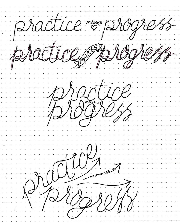
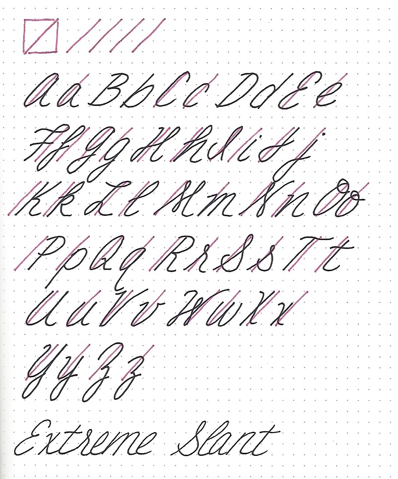
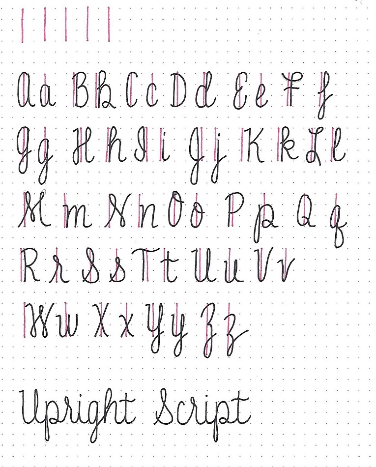
Topic: Bible Journaling
Okay, the ongoing debate – do we call this book Song of Solomon or Song of Songs? It depends on what translation one is reading from! Both are acceptable. Now, on with the lettering:
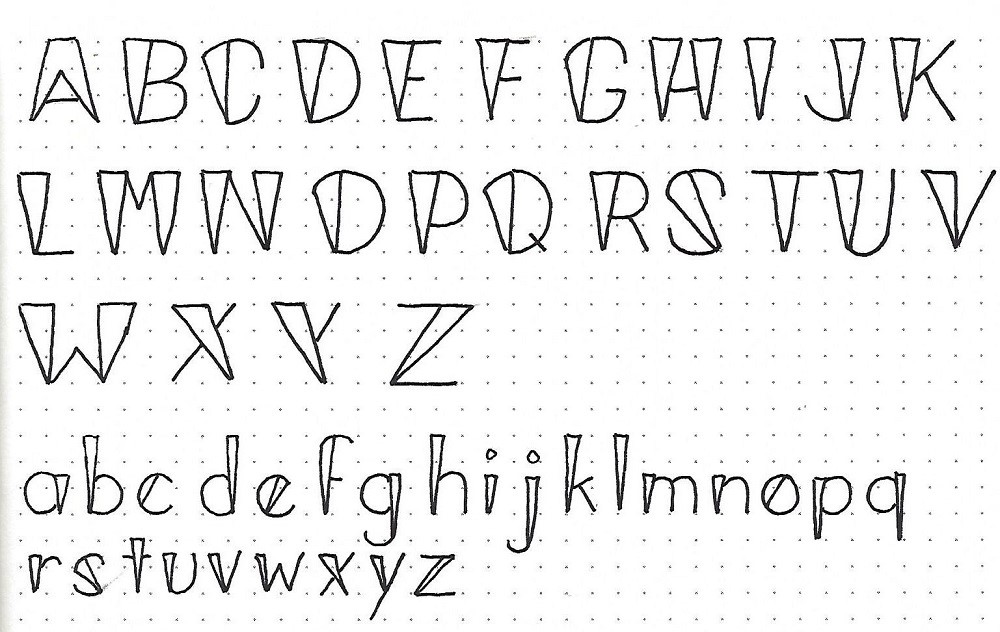
SONG OF SONGS: Day #1 – Half Blocks – Intro
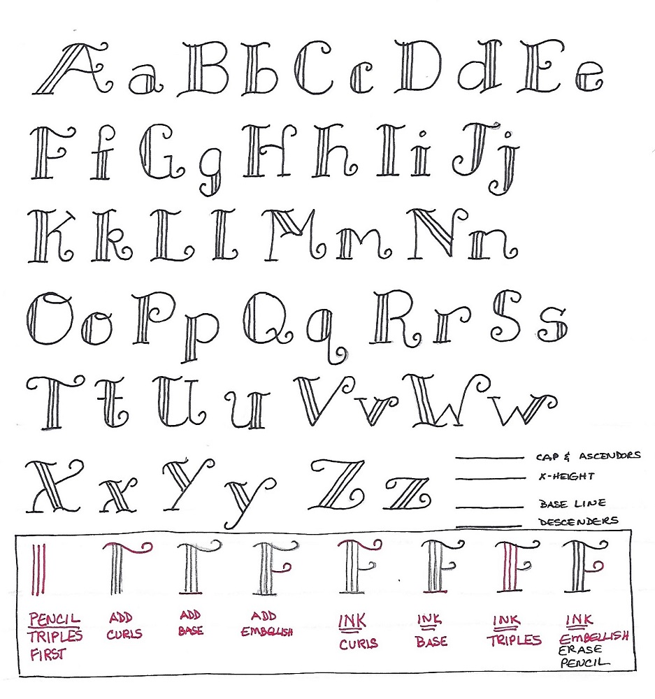
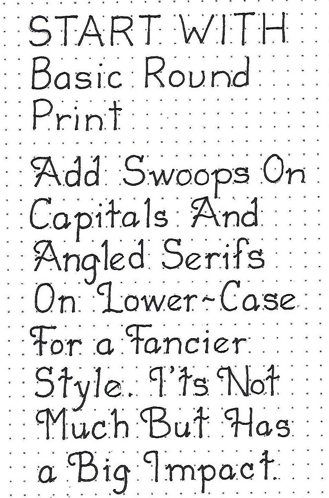
The fonts we will learn this week are what I call ‘half blocks’. They are kind of a cross between a block letter and a basic oval print with serifs. The x-height is over half the total height of the capitals.
Note that the loose ends of the ‘basic oval’ portion end in a curl (like last week’s letters) and the serifs have added little bits on them. The capital letters have four graduated dots alongside them and the lower-case have three dots. These are always along one side or the other of the block portion of the letter.
The letters can be colored in a number of ways which we will explore throughout the week.
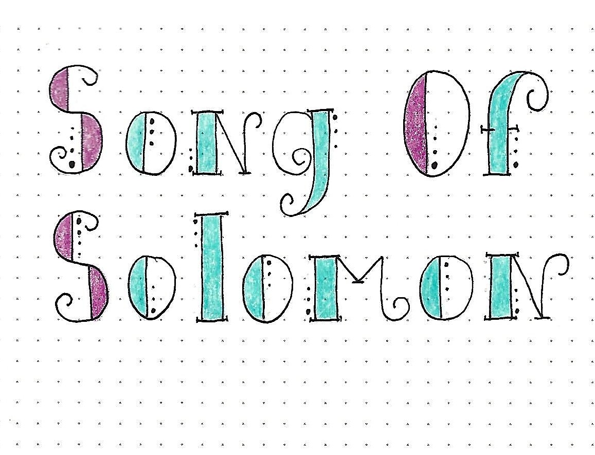
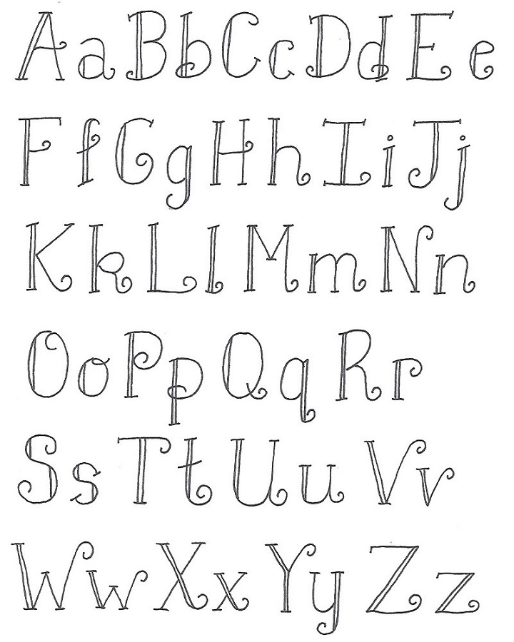
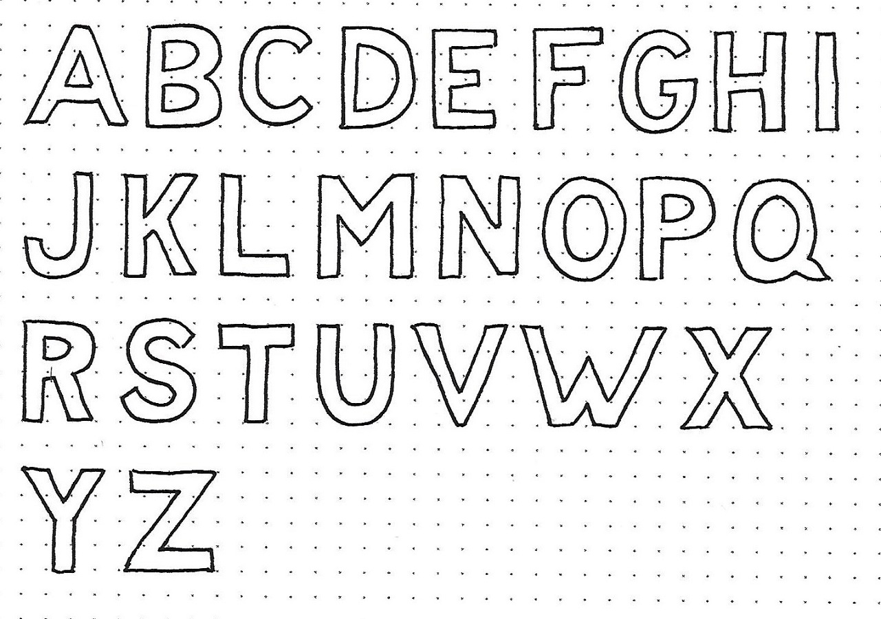
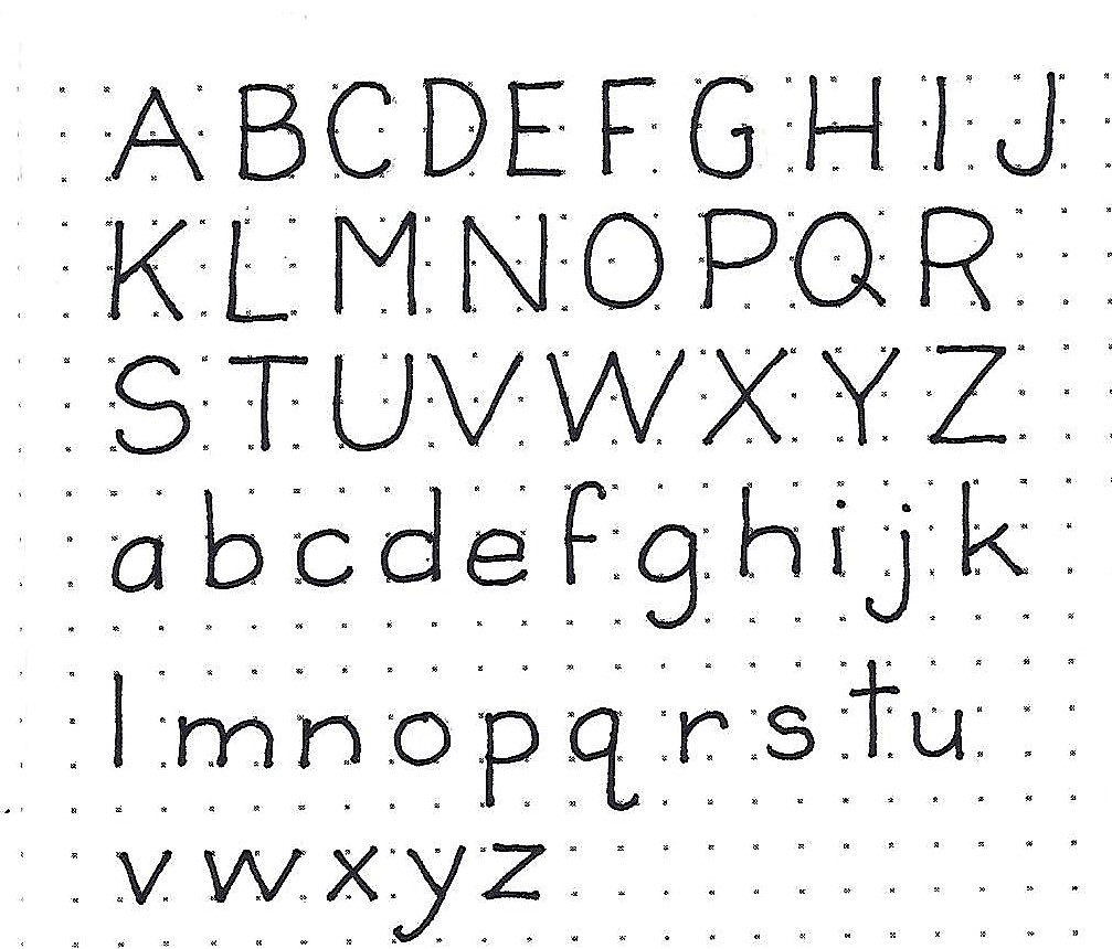
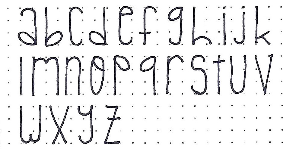
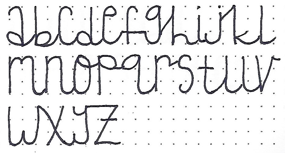
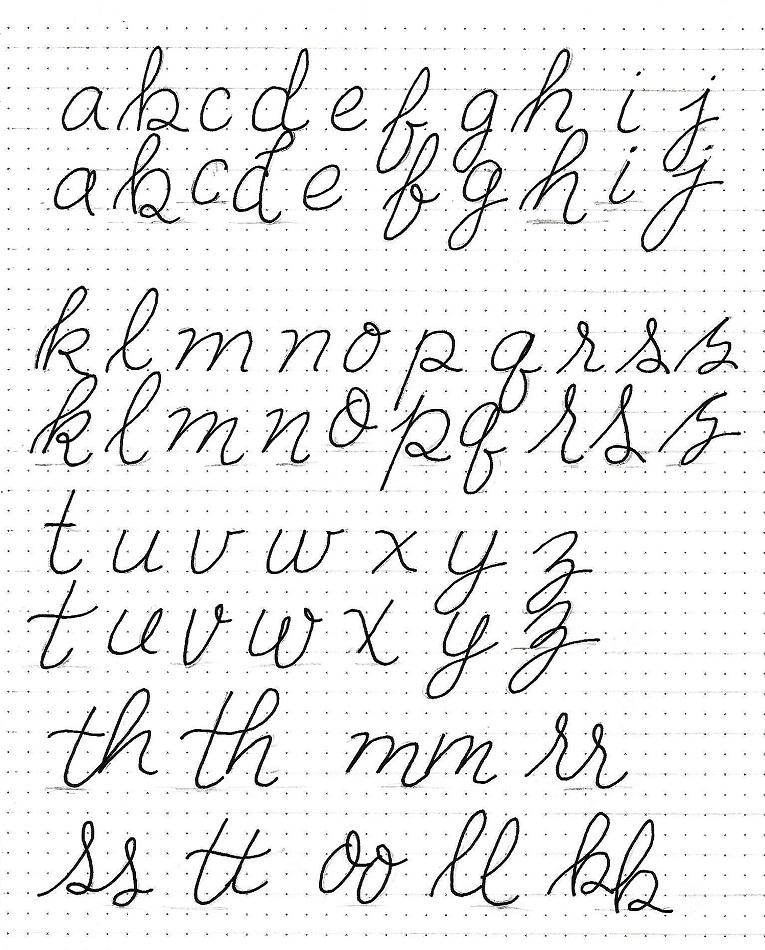
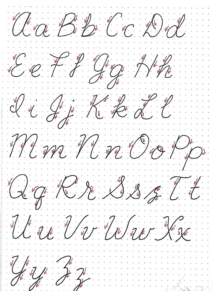
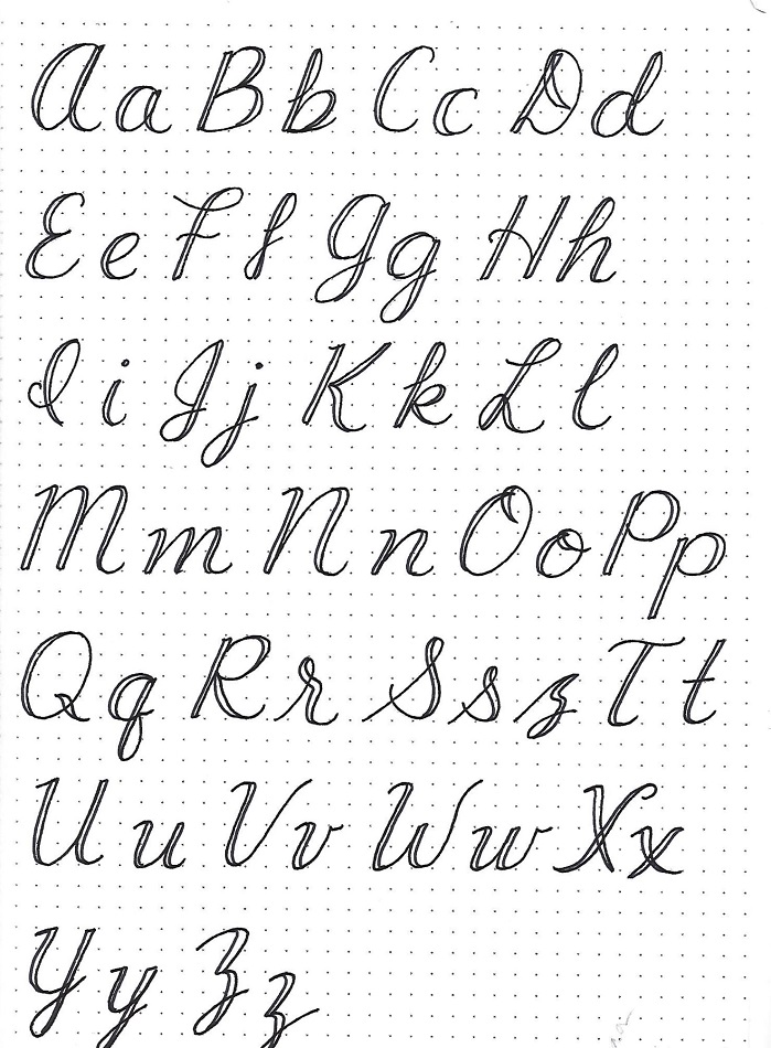
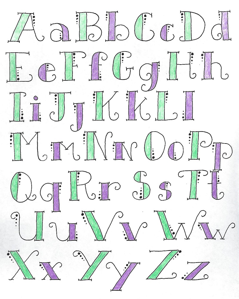
SONG OF SONGS: Day #2 – Half Blocks – Alphabet
Here is the full alphabet for the half blocks. Note the finishing curls on the single lines, the extensions on the serifs and the dots next to the block side of the letters.
I colored these to distinguish between the upper- and lower-cases.
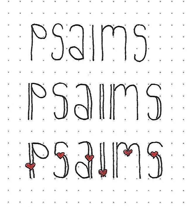
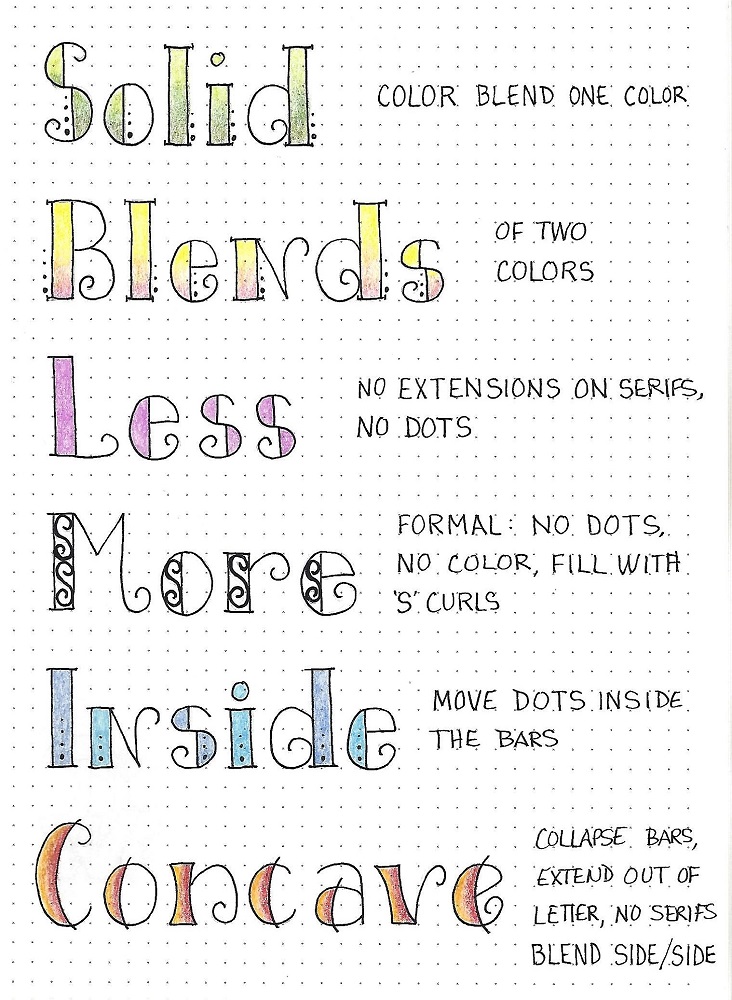
SONG OF SONGS: Day #3 – Half Blocks – Décor Options
There are a lot of ways to customize these letters. A few are shown below:
1) Use two values of the same color to fill in a blend from top to bottom, with darker on the bottom.
2) Use two colors to create a blend from top to bottom. As before, use the darker color on the bottom.
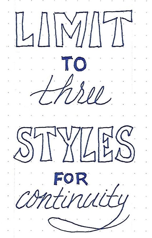
3) Less decorating: Leave off the extensions on the serifs and don’t add the dots.
4) Leave off the dots and the color. Fill the block portions with ‘S’ curls to look like wrought iron.
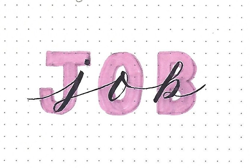
5) Move the dots inside the block portions. A coloring option is to use two hues and alternate letters.
6) Collapse the blocks and extend the internal lines outside the letter confines. Blend color side to side.
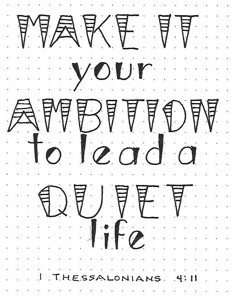
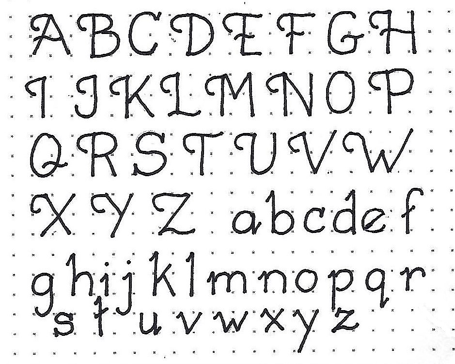
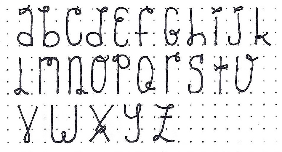
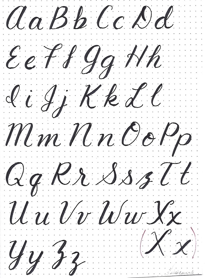
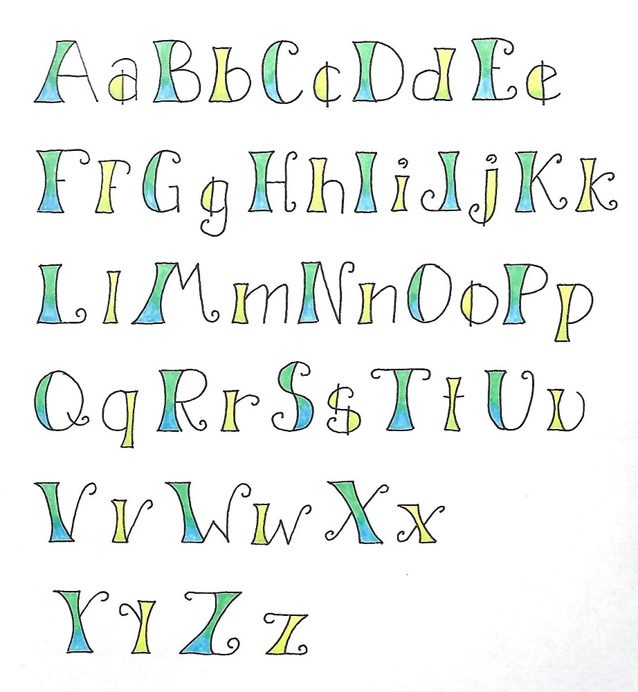
SONG OF SONGS: Day #4a – Half Blocks – Concave
This alphabet was introduced at the end of yesterday’s lesson. It does not have the dots or the serifs and we have collapsed the block portions into concave bars.
In the alphabet shown only a few of the lines are extended outside the confines of the letters. Note that you can play with the ending curls, too. See how you like them compared to the first alphabet.
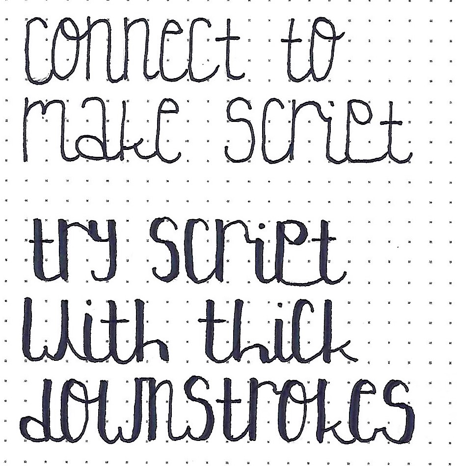
SONG OF SONGS: Day #4b – Half Blocks – Casual
Here is a more informal version of the half block letter. Note that the bars are still collapsed but instead of the extensions outside the letter confines we get very loose with the basic oval portions. See how they cross over into the bars in a very casual manner.
When you are using this alphabet in a written piece and have two of the same letter together in a word, find a way to change the form of one of the letters so they look more spontaneous.

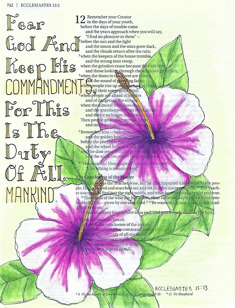
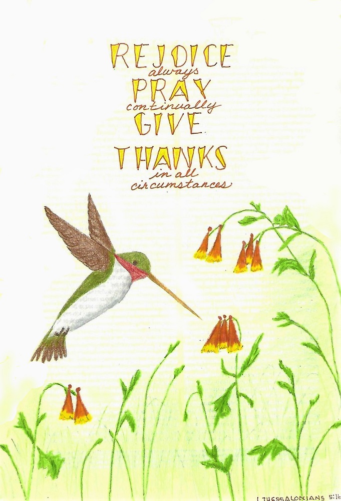
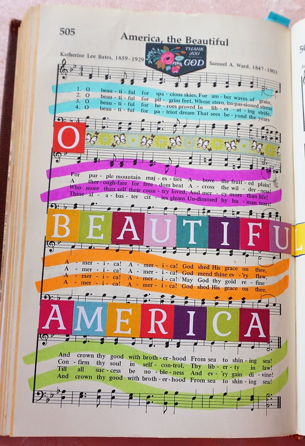
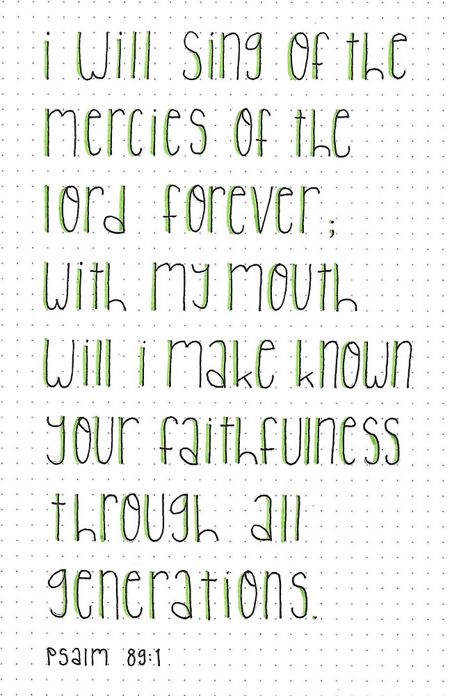
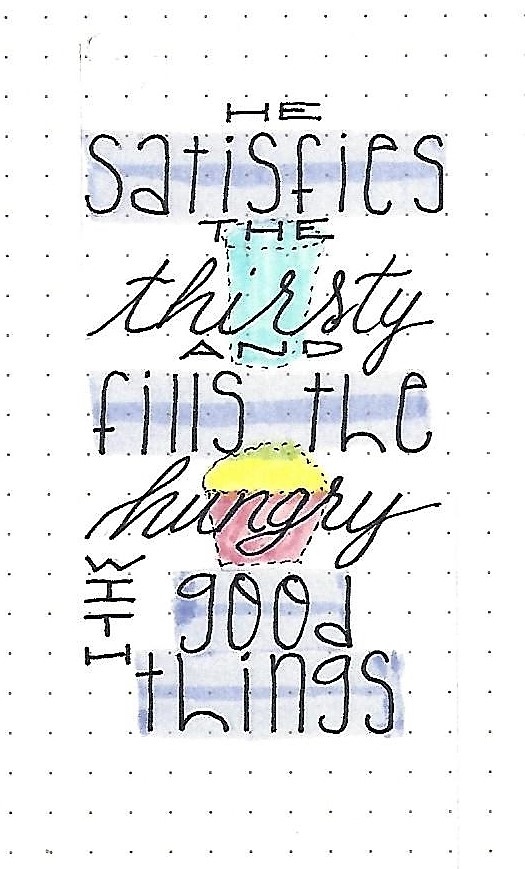
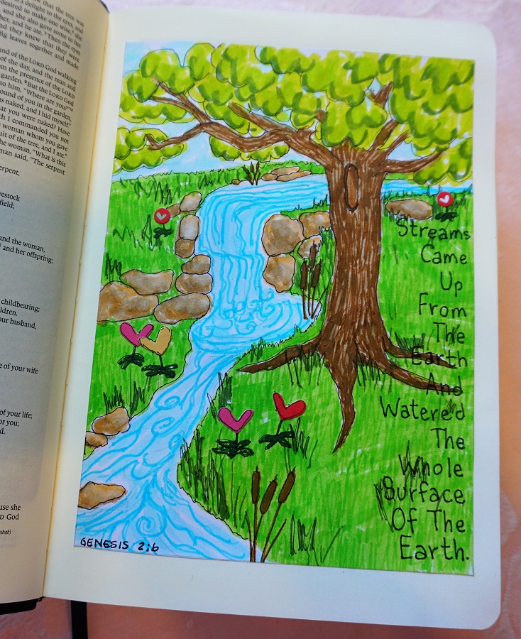
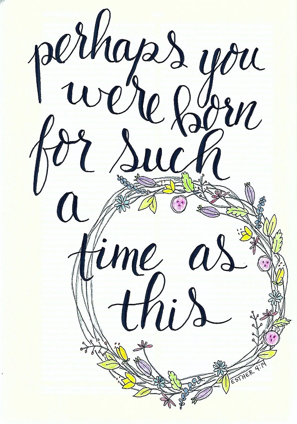
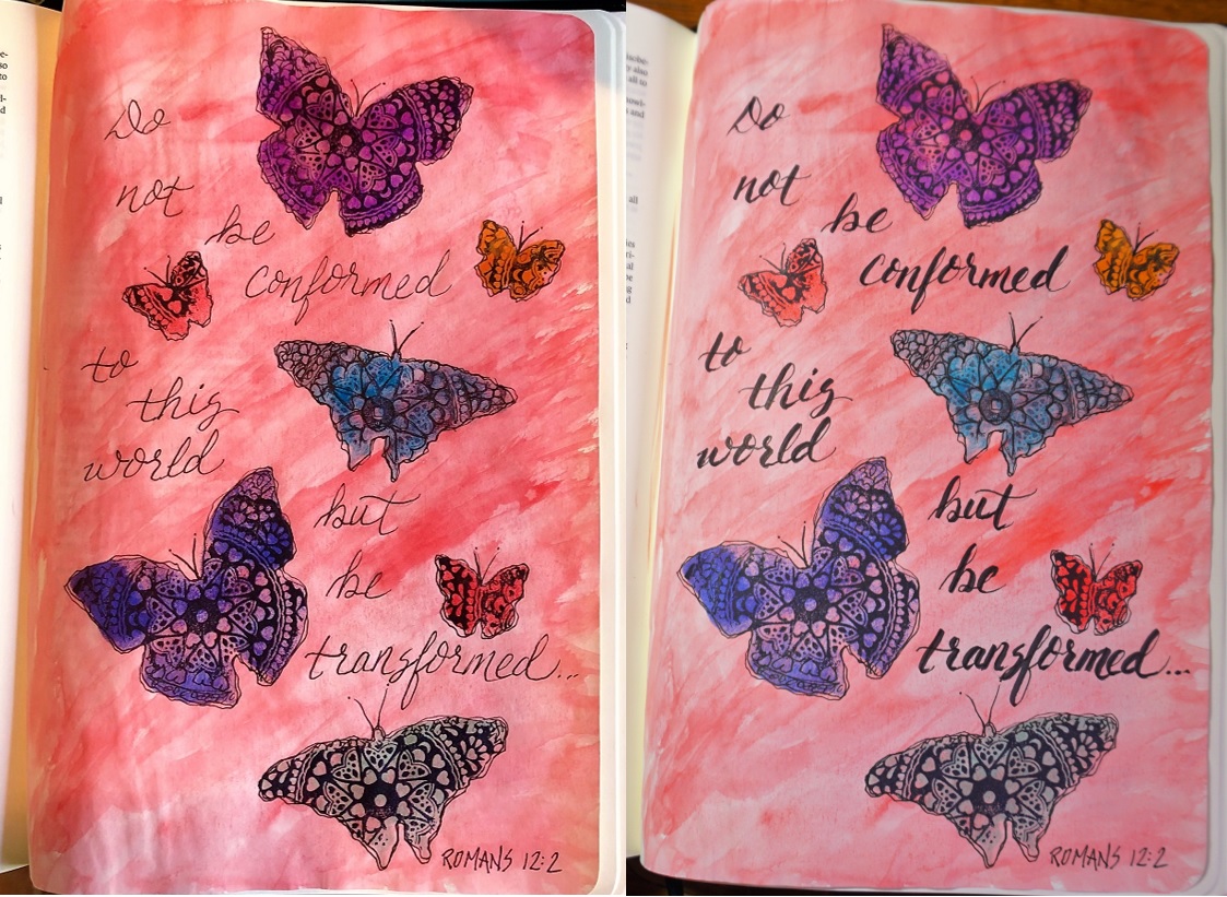
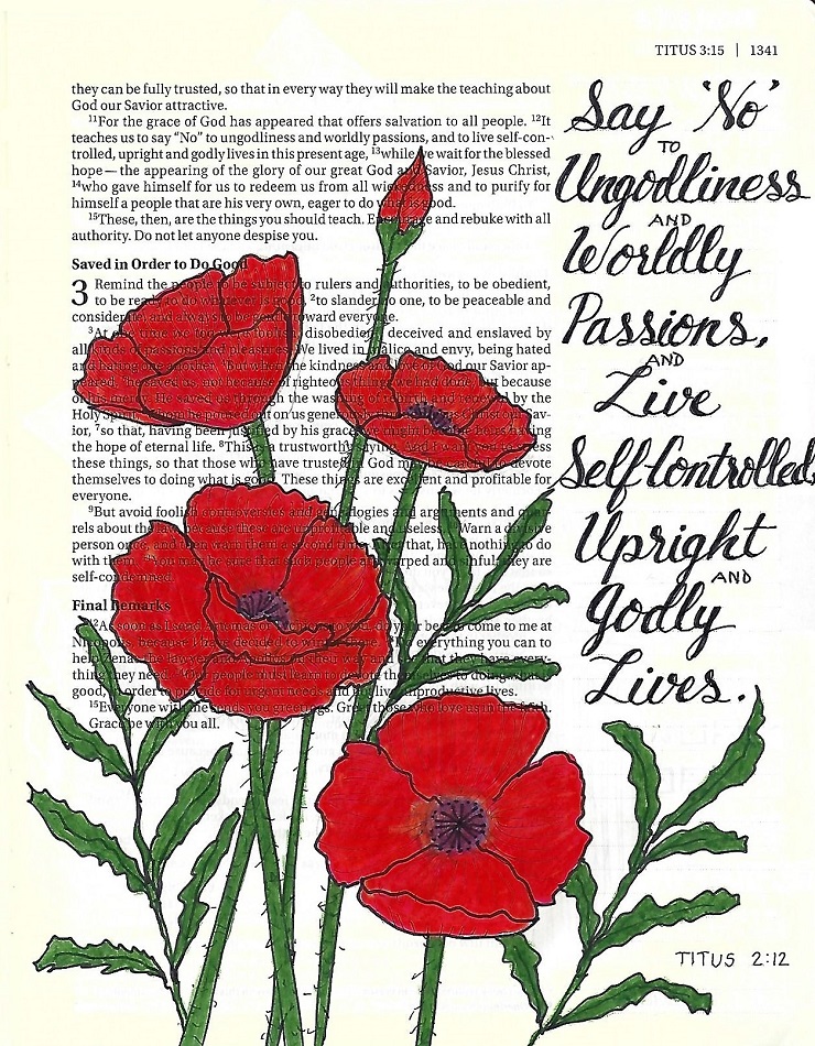
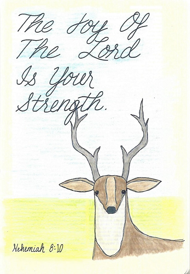
SONG OF SONGS: Day #5 – Half Blocks – Bible Page
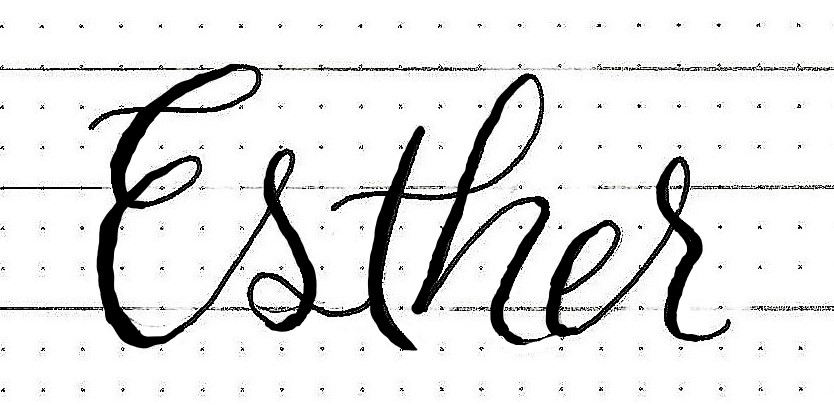
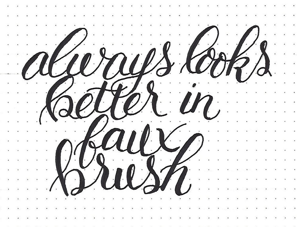
For this Bible page I used the original half block alphabet all in caps and moved the dots to be internal decoration. This was combined with a faux-brush script to maintain a formal look.
The blend of yellow to green within the letters echoes the coloring of the lily of the valley from the weekly Drawing Room tutorial.
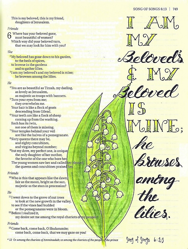
I’ve always been a little confused by this book of the bible, but there is beautiful imagery to journal.
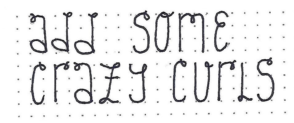
Ddd