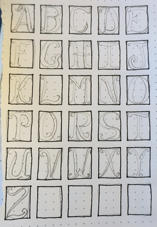
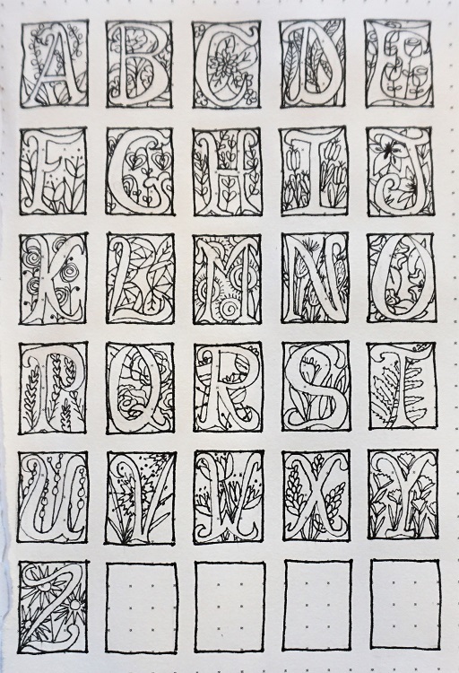
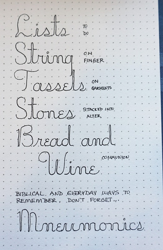
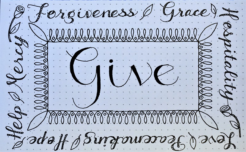
Topic: Bible Journaling
This week it was my turn again to teach classes on lettering. I totally hacked a font I found online for this one.
Here is the lesson plan:
MONDAY
Monday, we start working with a new font. I hope you’ll like the one I chose this week. Not only is it freewheeling and forgiving, but you get to do all the improvising you want!
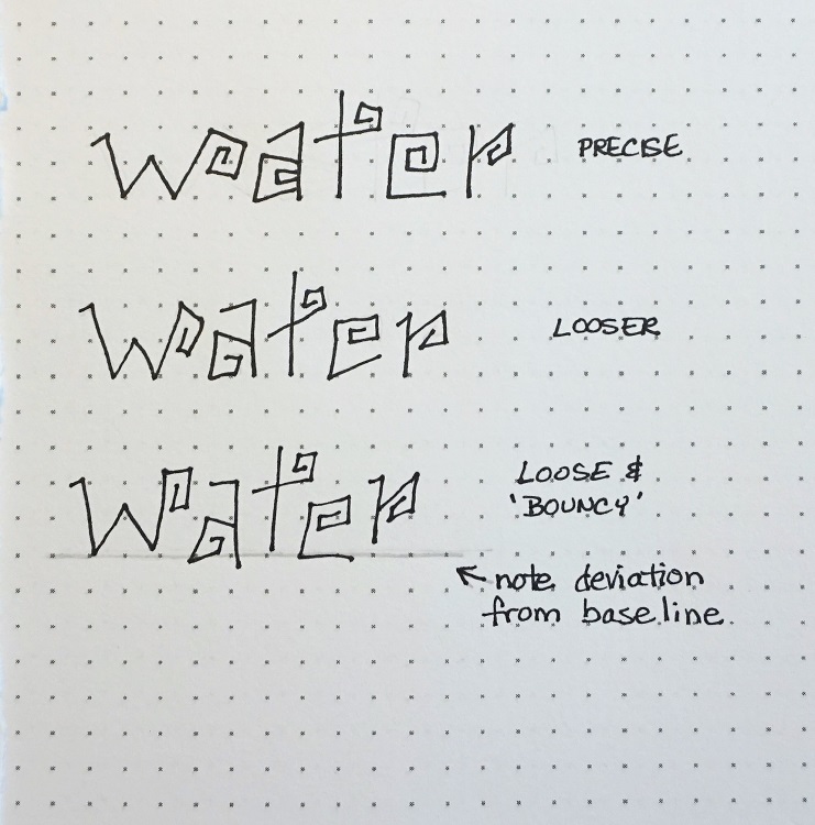
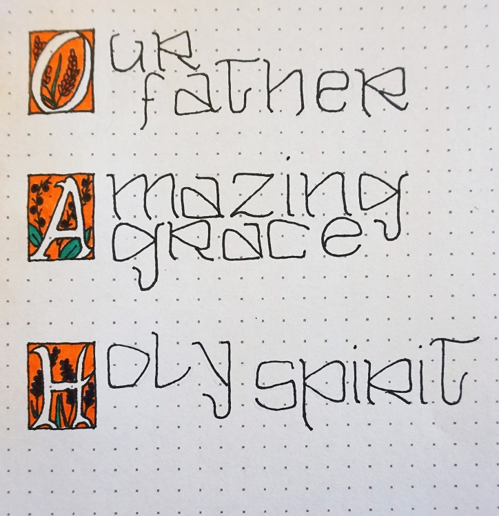
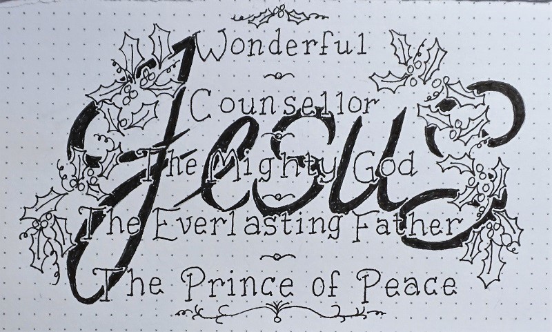
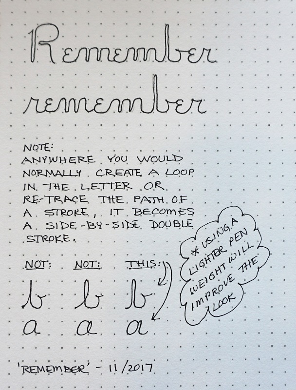
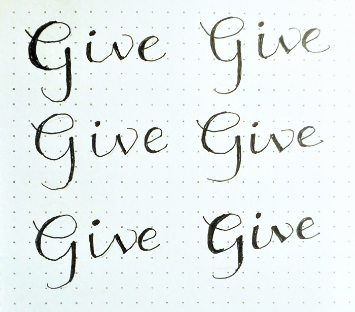
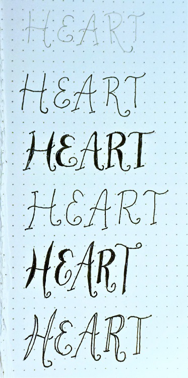
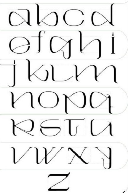
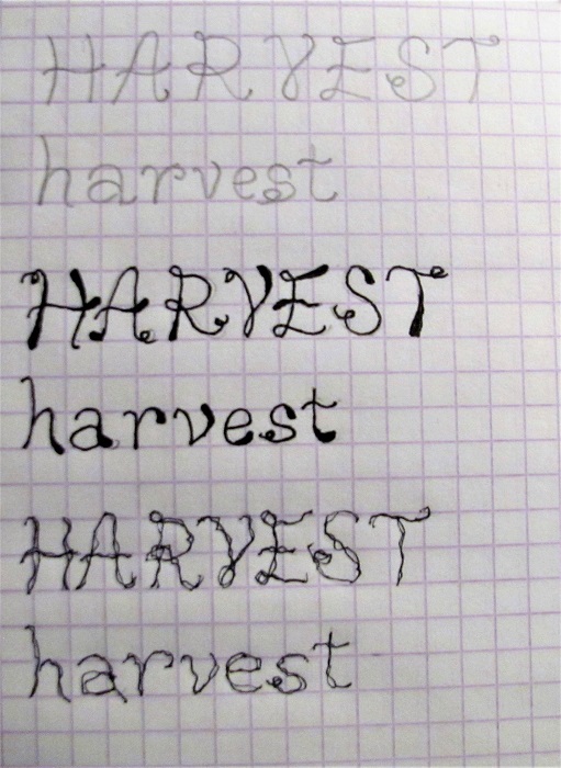
In the sample shown you’ll note that every letter has some squared-off pinwheels. I first did the word of the week where all the letters are a standard height.
Then I tried to work a little looser with a bit of variation in the letter height – not much, just a smidge.
Then I kept that looser styling but also let the letters fall a bit above or a bit below the baseline.
As you look between these three words, you’ll note that there are some variations in the actual letter forms. Remember, you get to improvise!
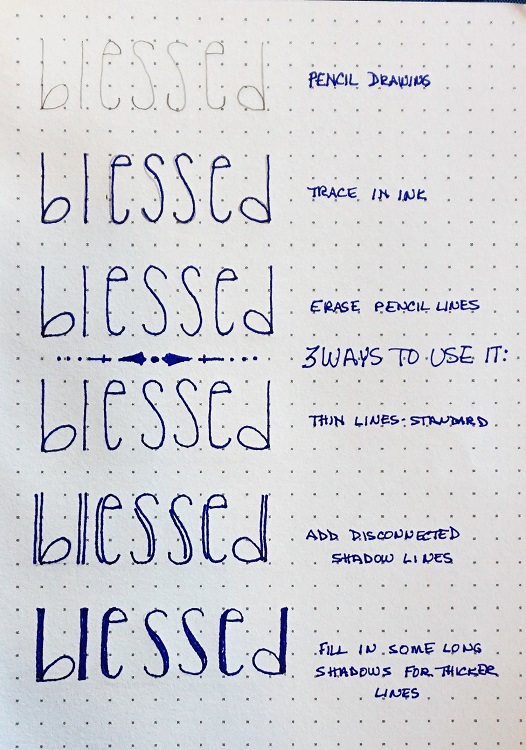
As always, draw your letters in pencil first, trace in pen and then erase the pencil lines.
TUESDAY
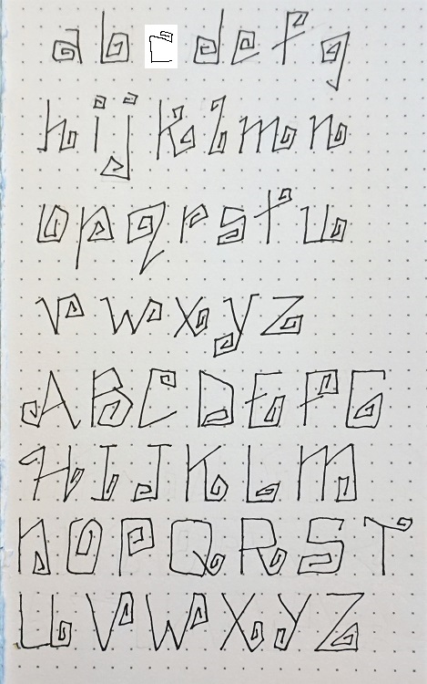
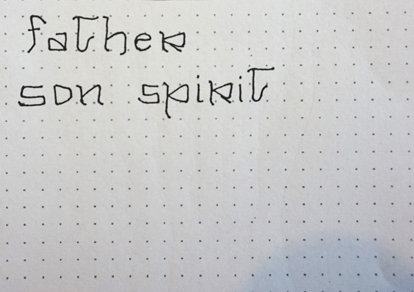
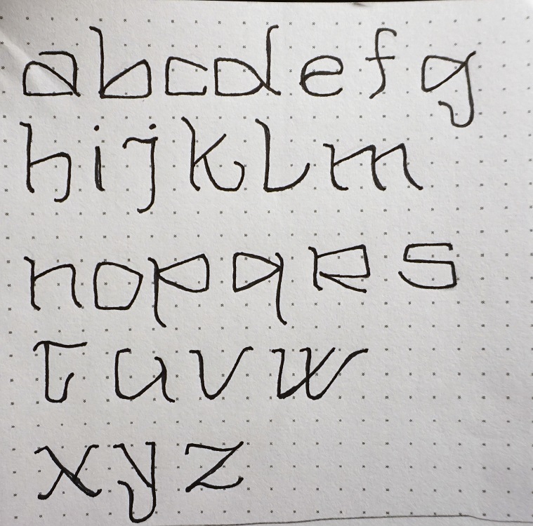
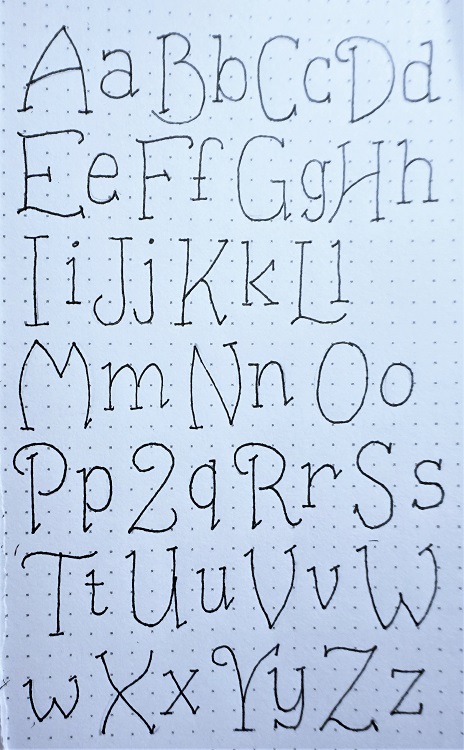
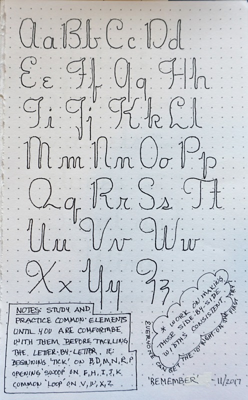
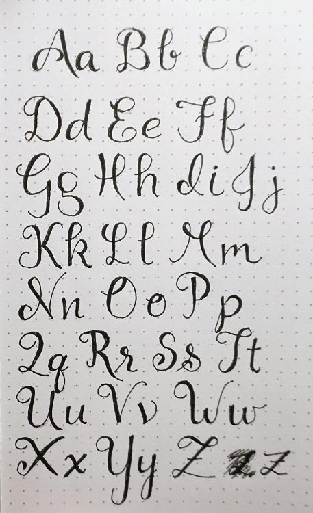
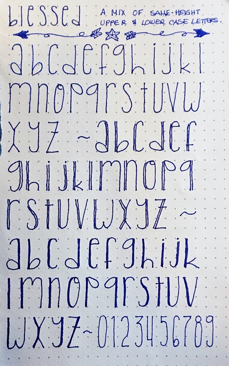
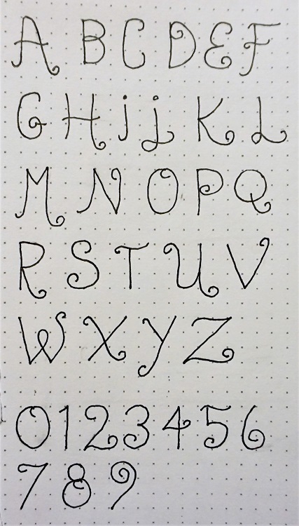
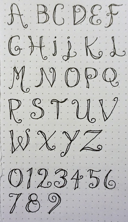
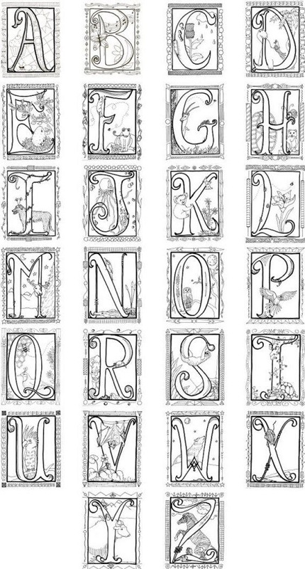
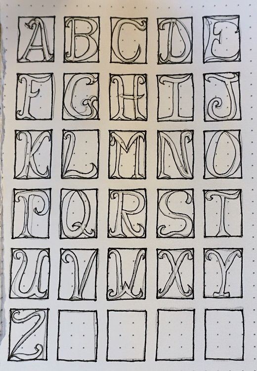
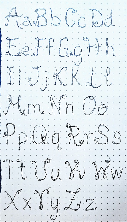
Today, we’ll draw up the alphabet, both upper and lower case, in the new font using pencil first.
Although you’ll note that every single letter has a pinwheel somewhere, remember to make these letters your own. Have fun with this. You can see where I digitally edited the C so it did not look like an O, E or G!
Trace over your alphabet with ink and then erase the pencil.
WEDNESDAY
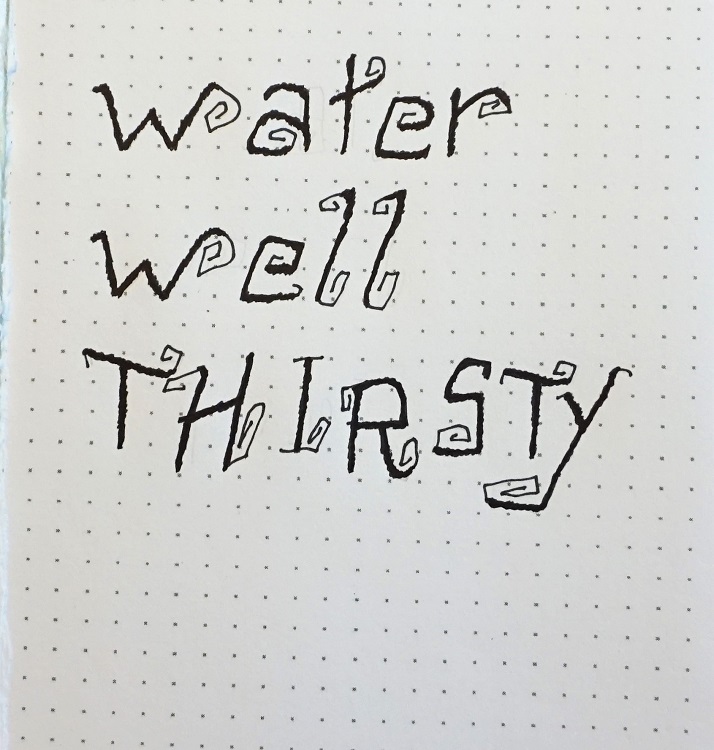
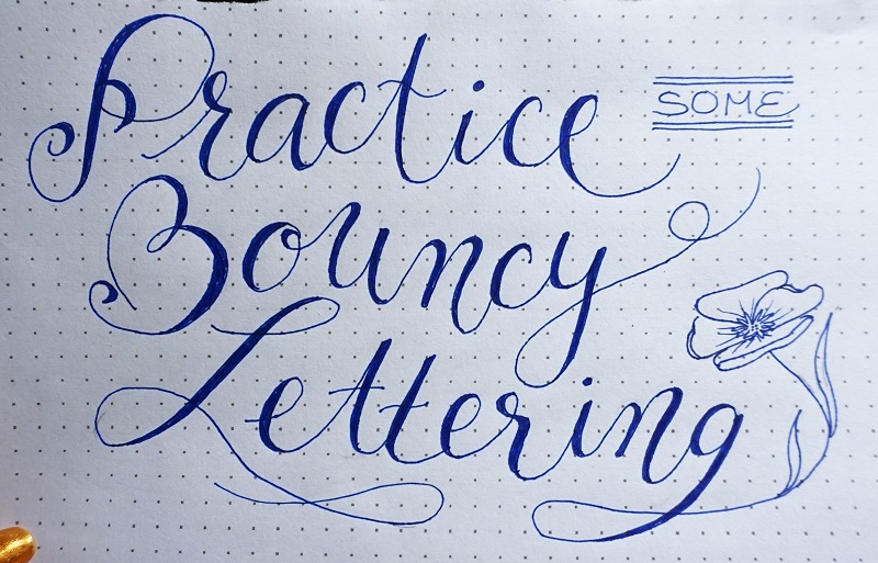
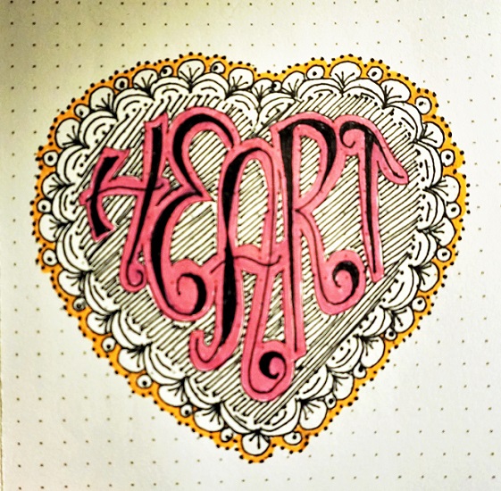
For the Wednesday activity, use your new font to write some words relating to water. Try using both upper and lower case. Vary the slant and the baseline of the letters. This is called ‘bouncing’.
Remember to draw in pencil, trace in ink and then erase the pencil.
When you’ve written the words, use your pen to thicken the main parts of the letter forms by scribbling over them (not over the pinwheel areas). Your letters should look solid with rough edges, not smooth.
THURSDAY
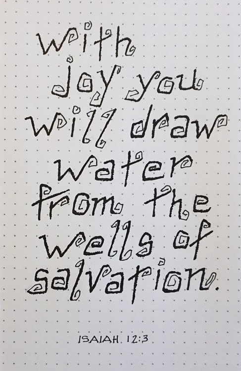
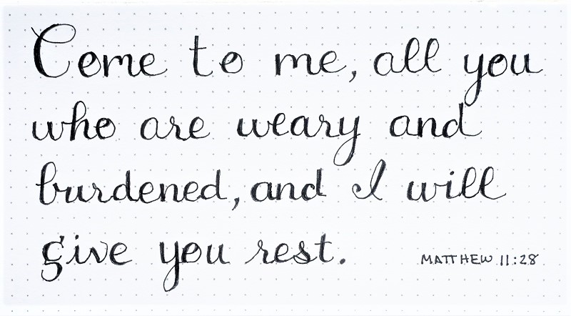
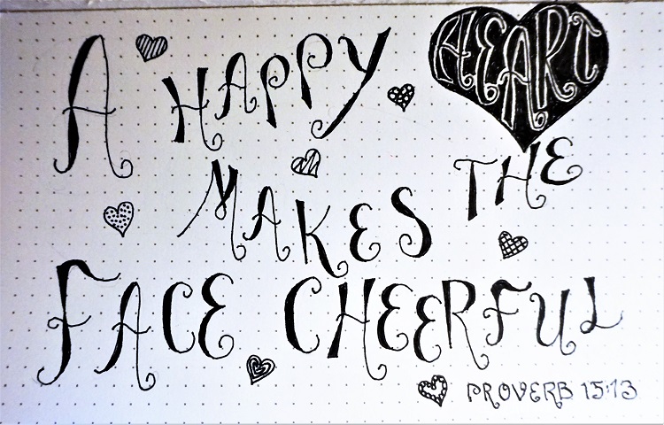
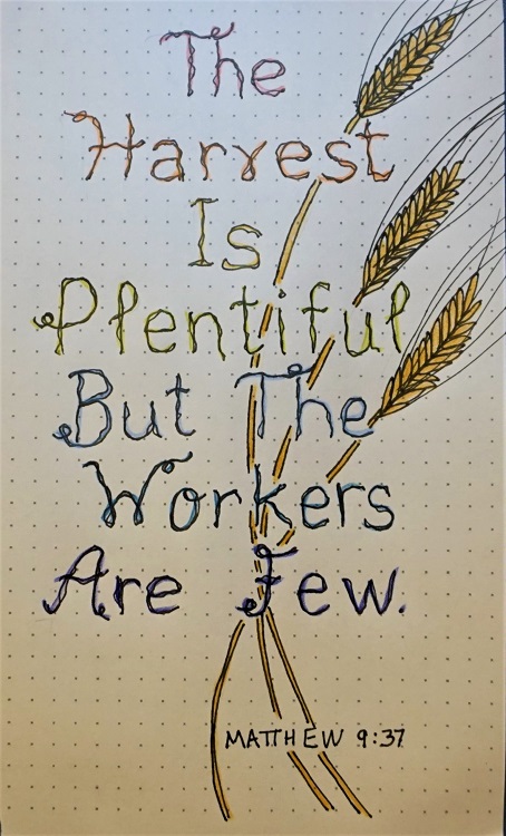
When it's Thursday, we select a scripture with the focus word in it and use new font to write it out on paper. So let's go find a scripture with a 'water feature! (I do a keyword search in www.biblegateway.com to find verses. They let you choose the Bible translation you want.)
Bounce your lettering up and down from the baseline and improvise your letters a bit. You can see that some of my lowercase ‘t’s have the curl going up and some down. Scribble-thicken the main letter forms.
As always, draw in pencil, trace in ink and erase the pencil.
FRIDAY
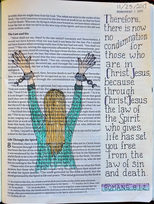
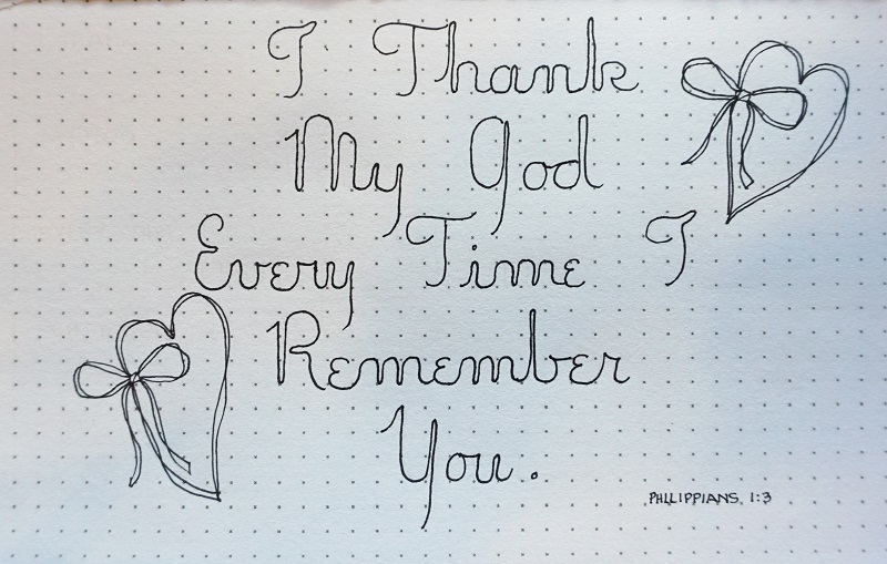
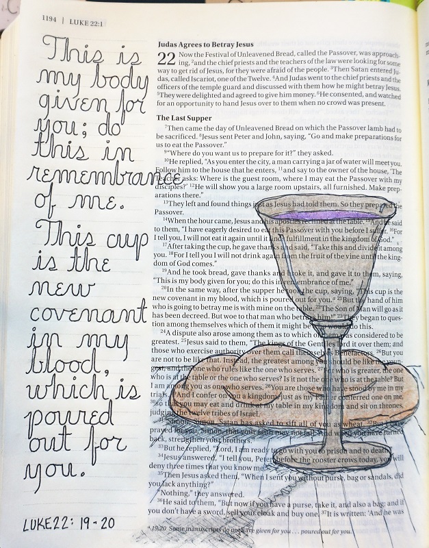
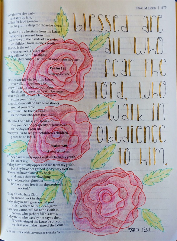
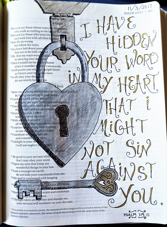
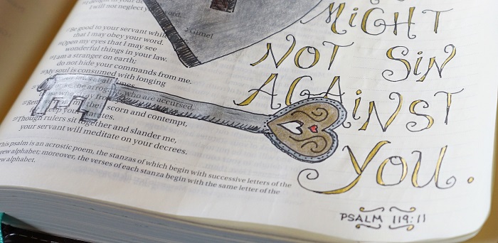
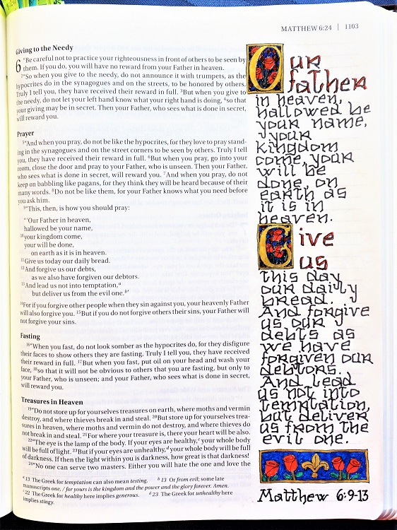
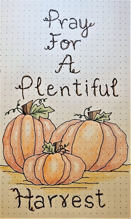
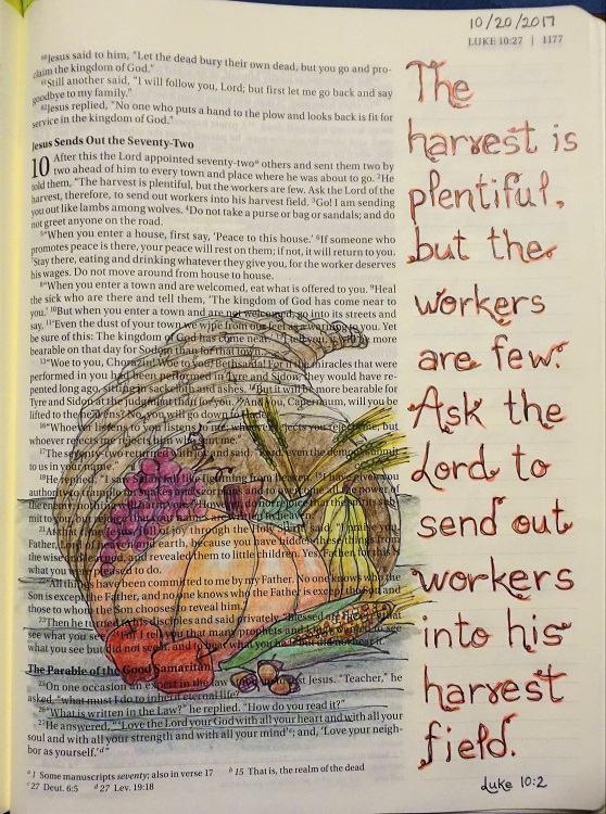
It’s Friday and today we take the font to our Bibles.
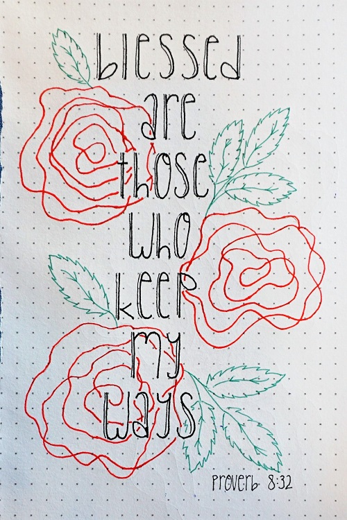
Select a scripture to journal that has ‘water’ in it. Letter in pencil, add ink and erase the pencil. Also, do this for any illustration you might wish to add to the page BEFORE you add color. Color can lock the pencil lead to the page so it cannot be erased and it may show in the background behind your beautiful colors.
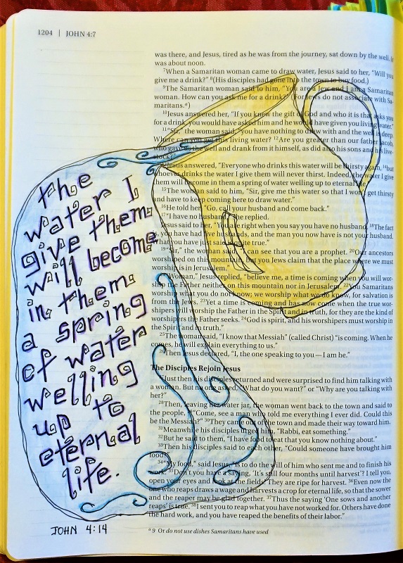
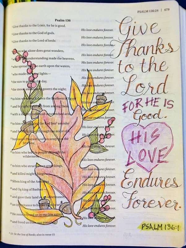
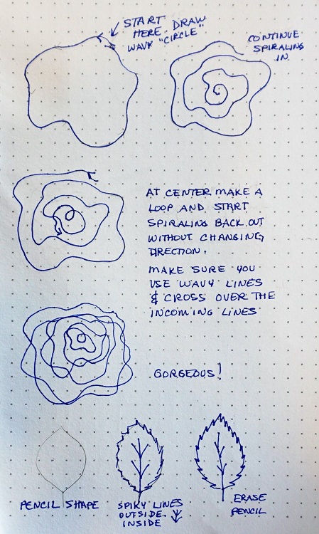
I did my work on John 4:14. I got the idea for my illustration from a blog called Doodle 101 at https://1arthouse.blog/doodles-101/. She makes drawing SO simple!
When I was a freshman in college (1972), I was taking an art class in the Home Econ department as a pre-requisite to all the future classes that would use basic design skills (fabric design, interior design, clothing design, etc.) At one point, when we were in the midst of learning lettering styles with pen and ink, the instructor was called out of town for a week and left me in charge of the classes to teach lettering. Seems that I had a firm grasp of the knowledge and skills needed. Who knew that so many years later, I would find myself teaching lettering again?
Ddd


