The Glory Of the Lord - Lettering Lesson
Topic: Bible Journaling
I was the leader for the Lettering Lodge on the Creative Bible Journaling Facebook site this past week.
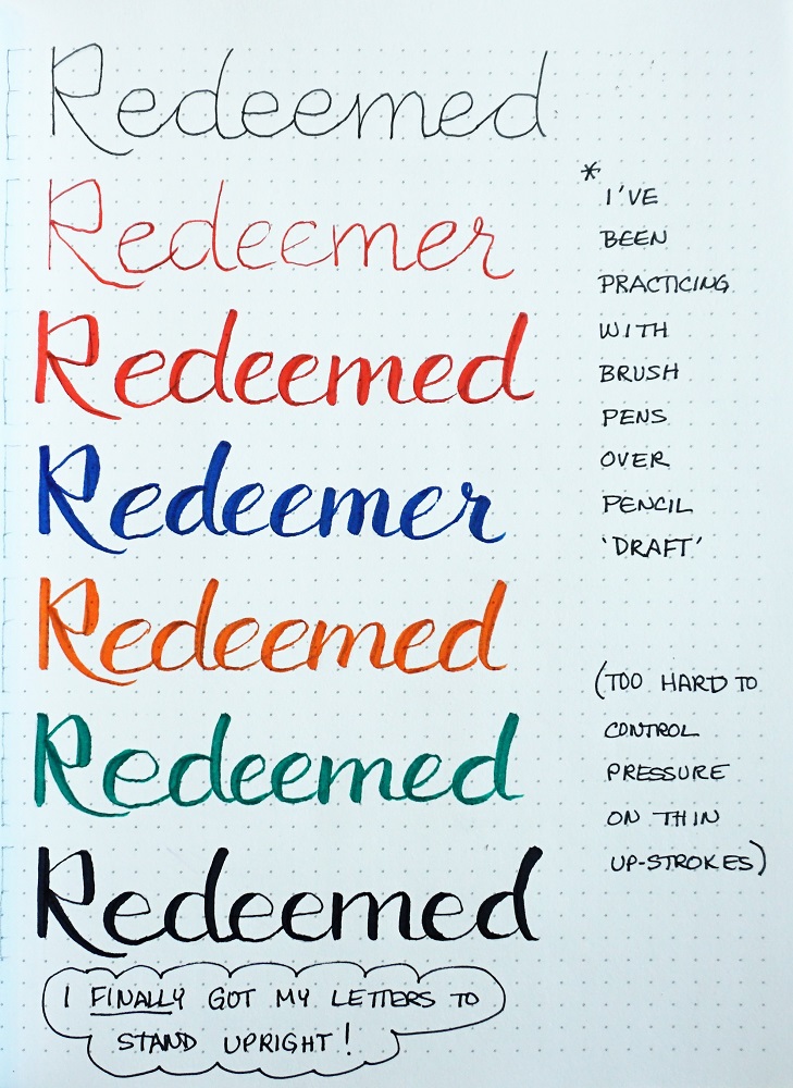
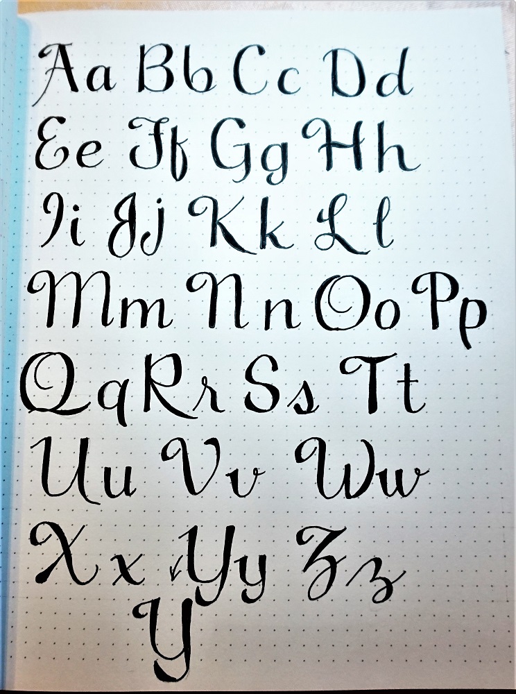
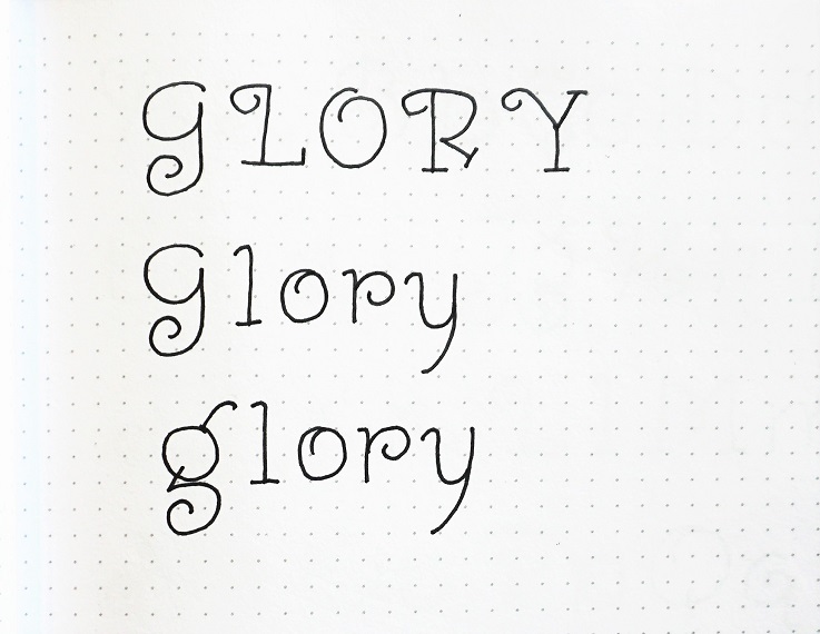
I chose a curly font that only came in upper-case and went looking for a lower-case thathad a similar feel to it. I then manipulated letters from each to make them a good pairing and assigned the focus word 'Glory' to it.
Here is the lesson plan:
MONDAY
The whole concept of the Glory of the Lord is so awe-inspiring it is almost overwhelming. We’re going to focus on that this week as we explore and use this new font.
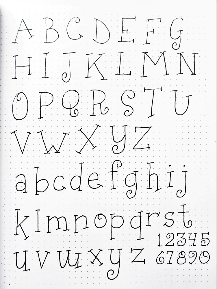
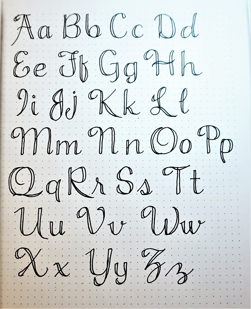
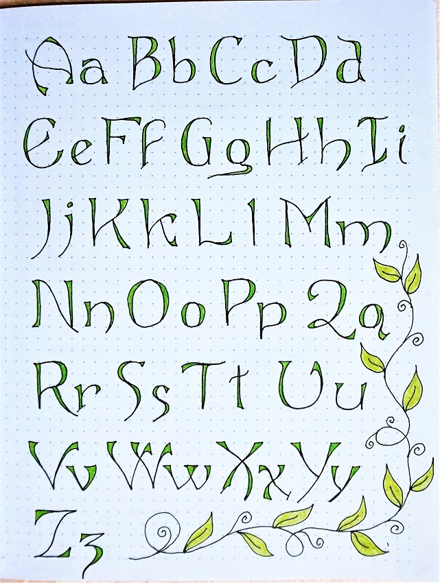
There are deep curls in both the upper- and lower-case letters. These are actually two separate fonts that I combined and then edited to make them more alike in their characteristics.
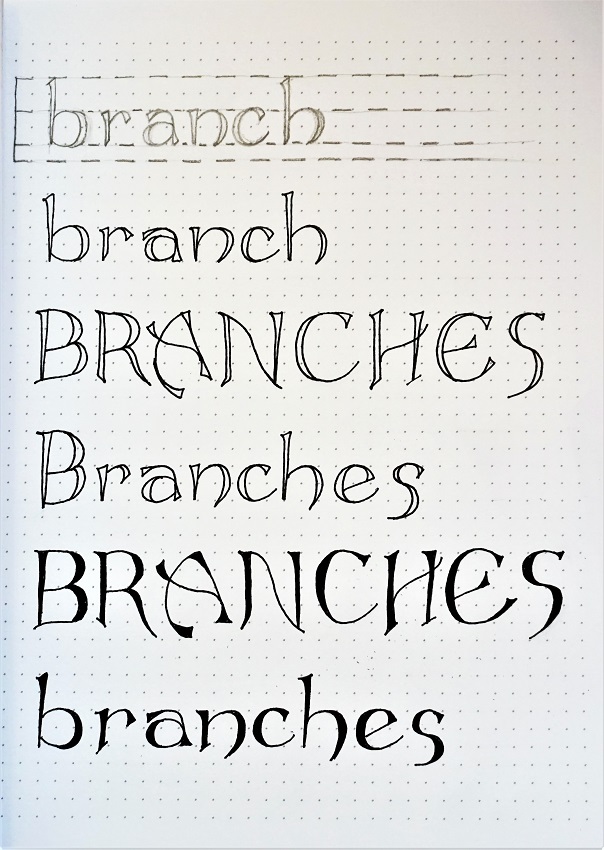
Pencil your letters first, then ink them and erase the pencil.
Let’s celebrate the glory of the Lord with our work!
TUESDAY
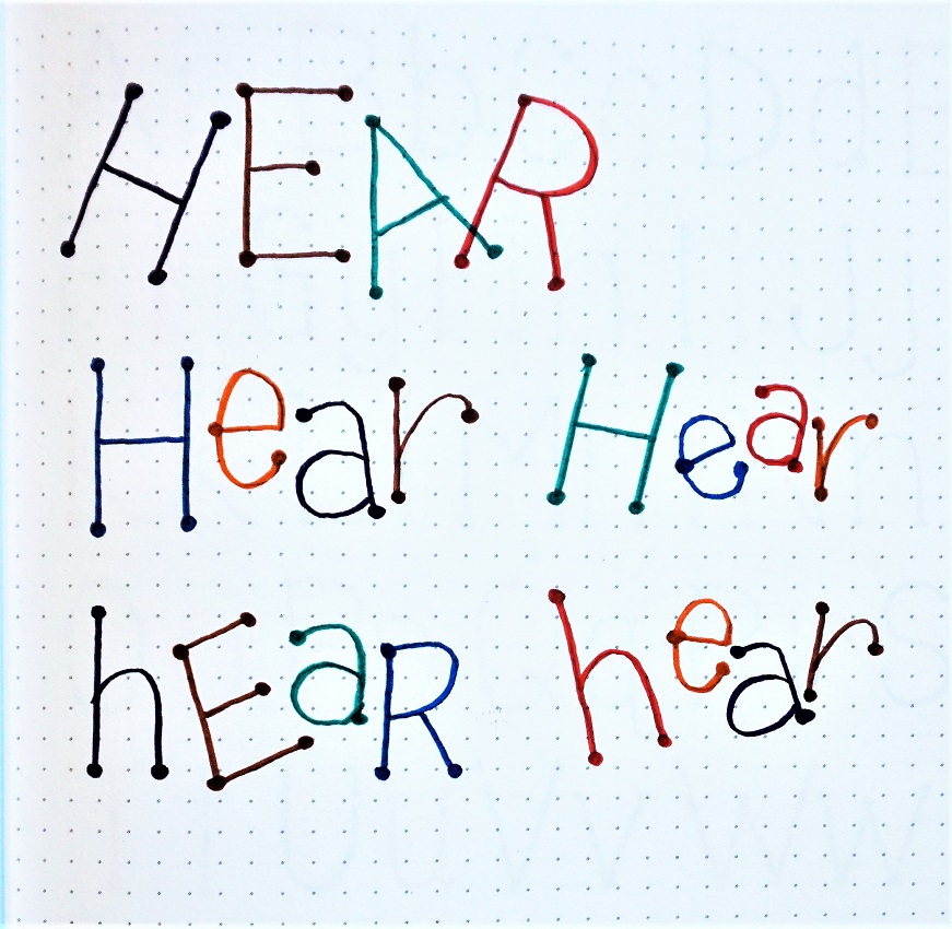
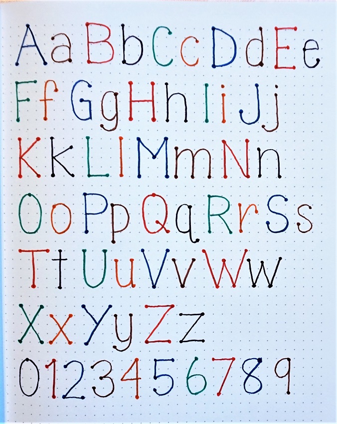
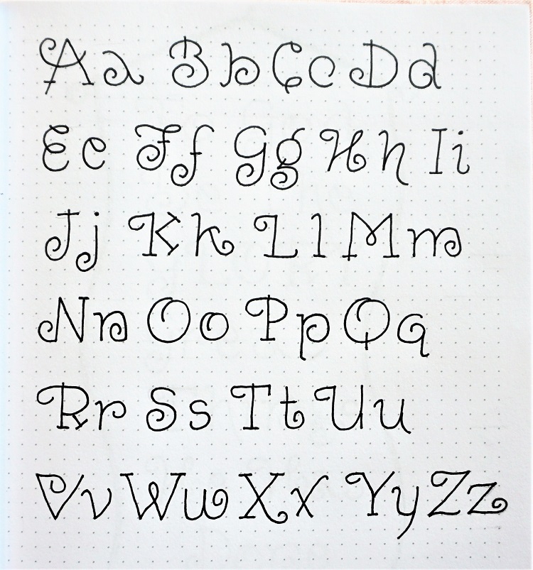
Here is the whole combined alphabet for the Glory font. Don’t these letters just give you a little thrill?
Practice the elements that are in common (the initial curl on the F, K, L, P, R, T, U, Y, Z) watch for the little extensions on the letters B, D, J, P, R, T. There are similar legs on the K and R. The same curl on O and Q.
When you practice these elements first you will make it easier to form your letters consistently.
Work in pencil until you like all your letter forms, then ink and erase the pencil.
Because these letters are so busy, keep them firmly on the base line. Bouncing them around will make them more difficult to read.
GOOD MORNING, WEDNESDAY!
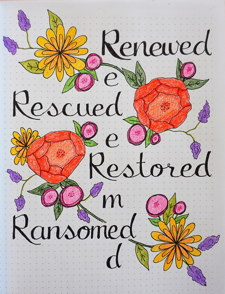
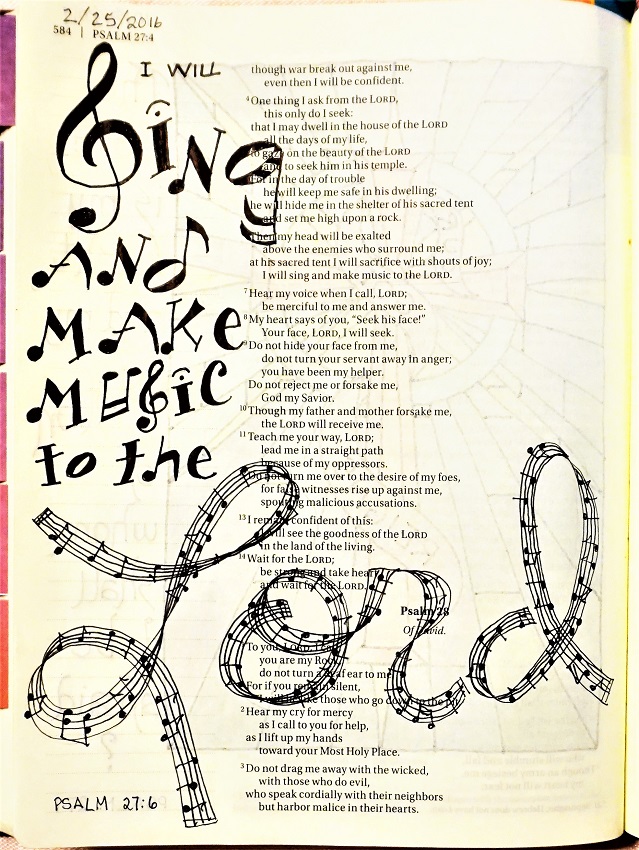
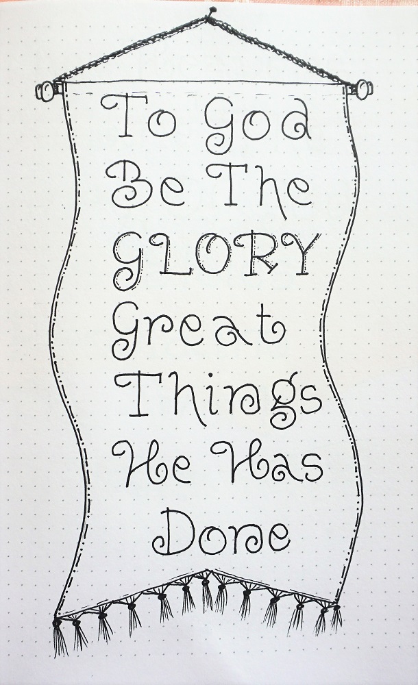
Let’s use our new font to write some song lyrics containing the word ‘Glory’.
I find that using the initial capitals on every word adds continuity.
I decorated mine like a hanging banner, complete with tassels!
Just like on my lettering, I use the Pencil-Ink-Erase sequence on my pictures.
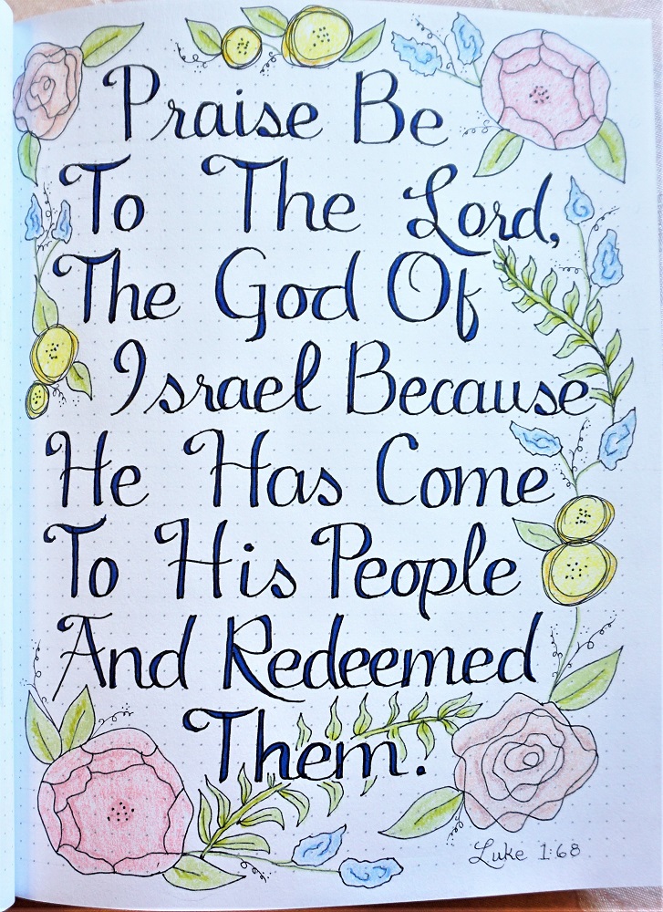
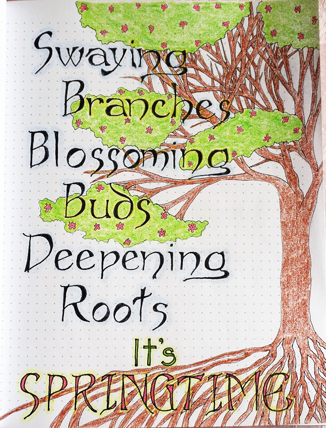
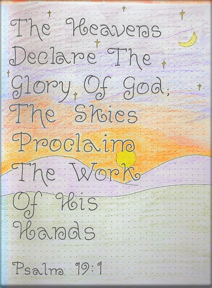
For our THURSDAY lesson we’ll practice by writing a verse on paper with our new word font.
I chose Psalm 19:1 and used colored pencils to blend a sunset since the verse refers to the skies.
Are you finding it easier and easier to form these letters after you’ve done them so much? That is the goal!
IT’S FRIDAY!
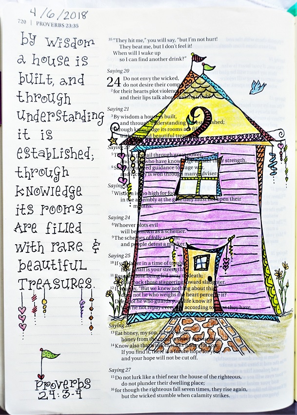
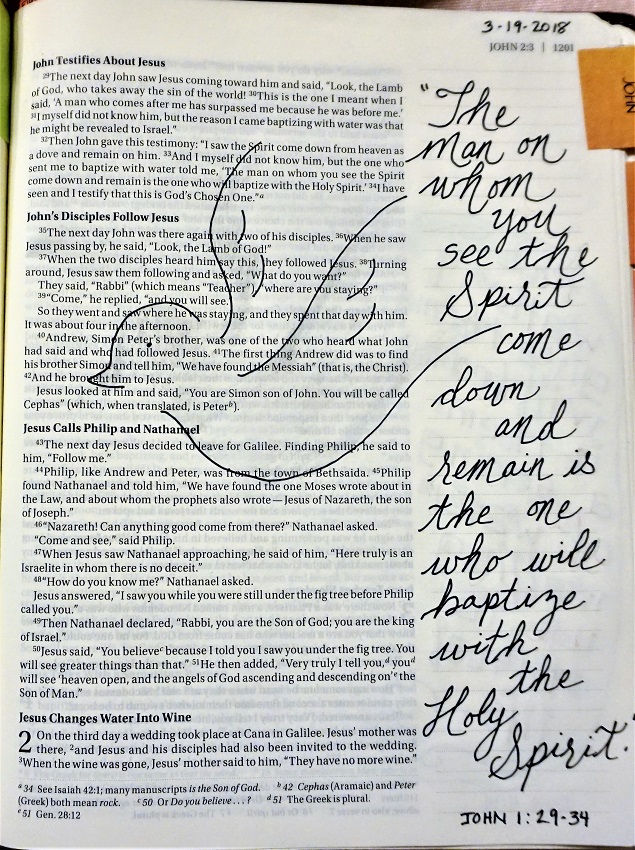
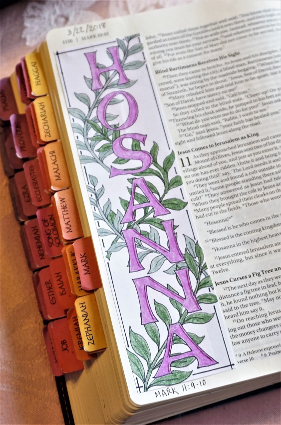
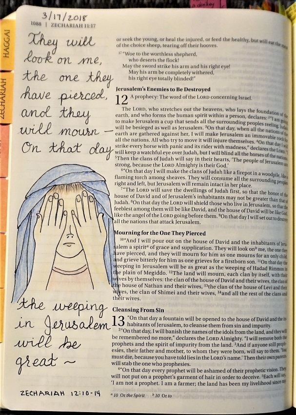
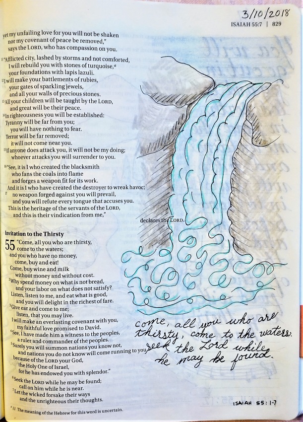
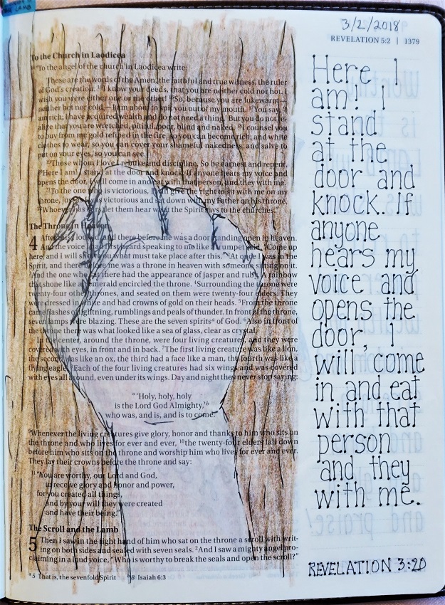
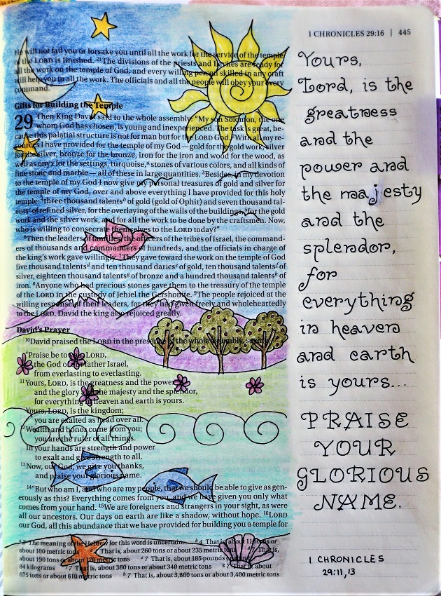
It’s the day we move on to using the Glory font in our Bibles. The thing I noticed was how much curlier the letters look in small size like this!
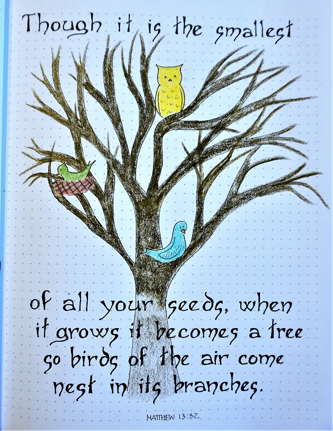
I borrowed the idea for the illustration from Joanne Fink’s book. One of the artists had something very similar for the creation story.
I hope you use this font in your Bible, too.
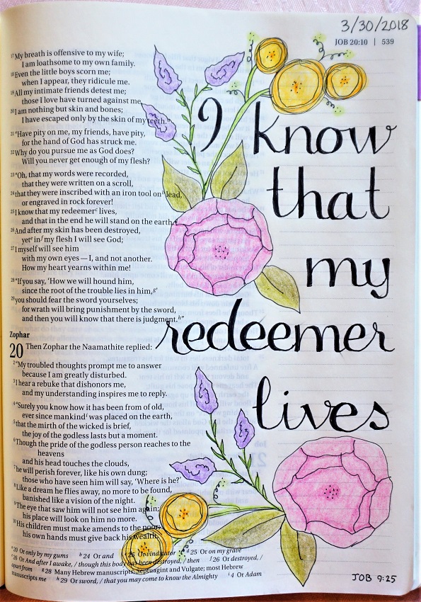
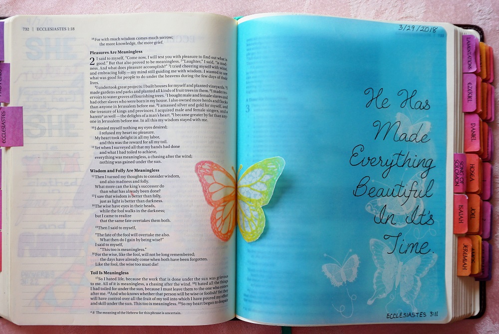
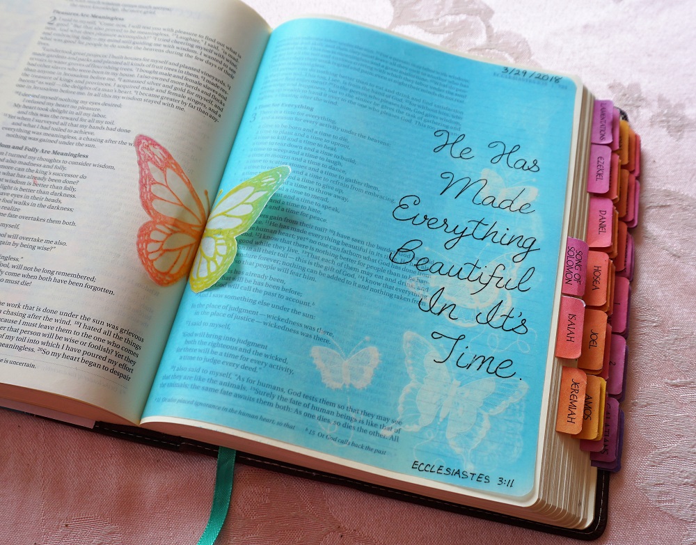
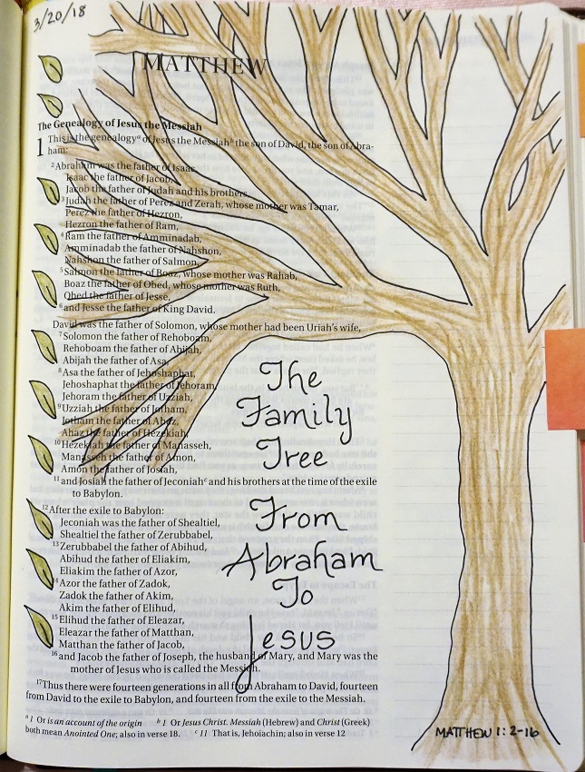
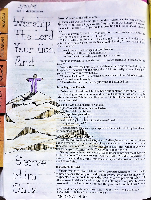
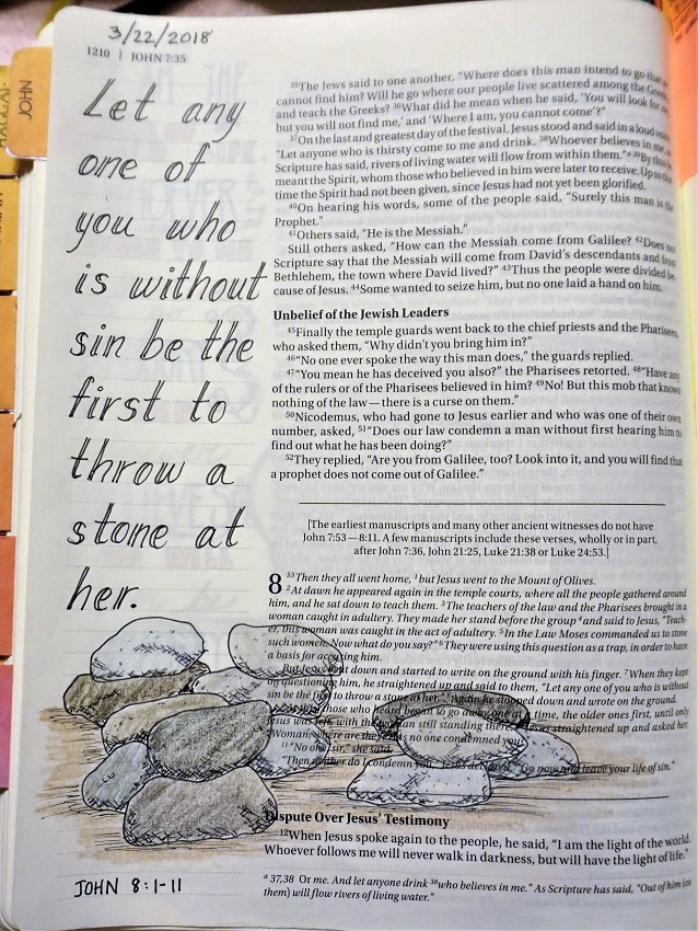
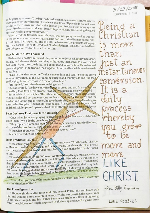
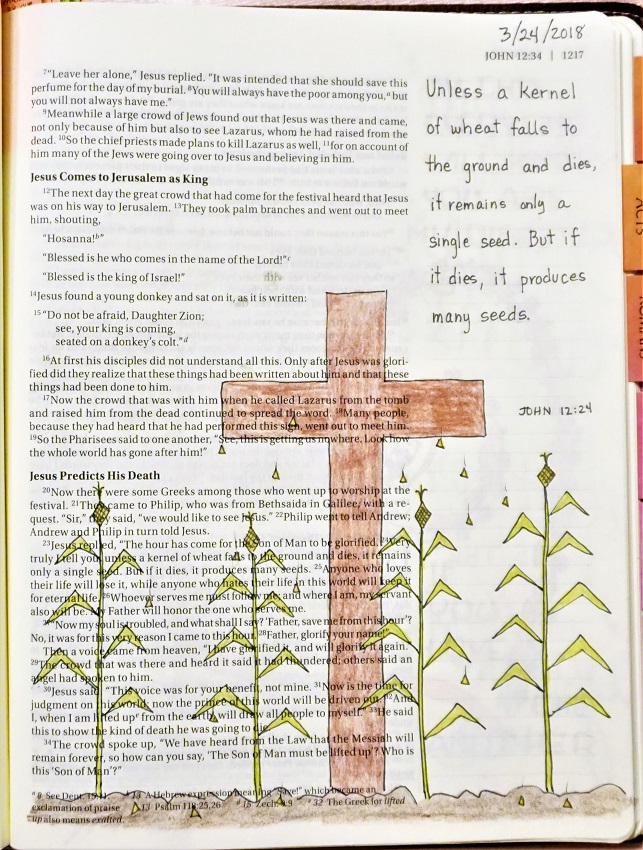
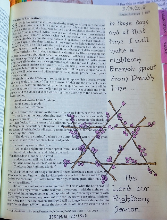
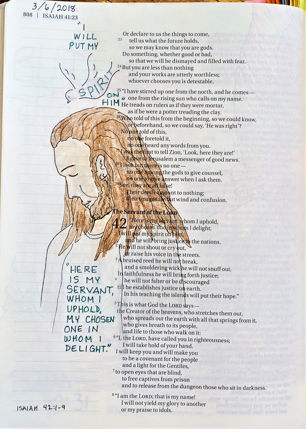
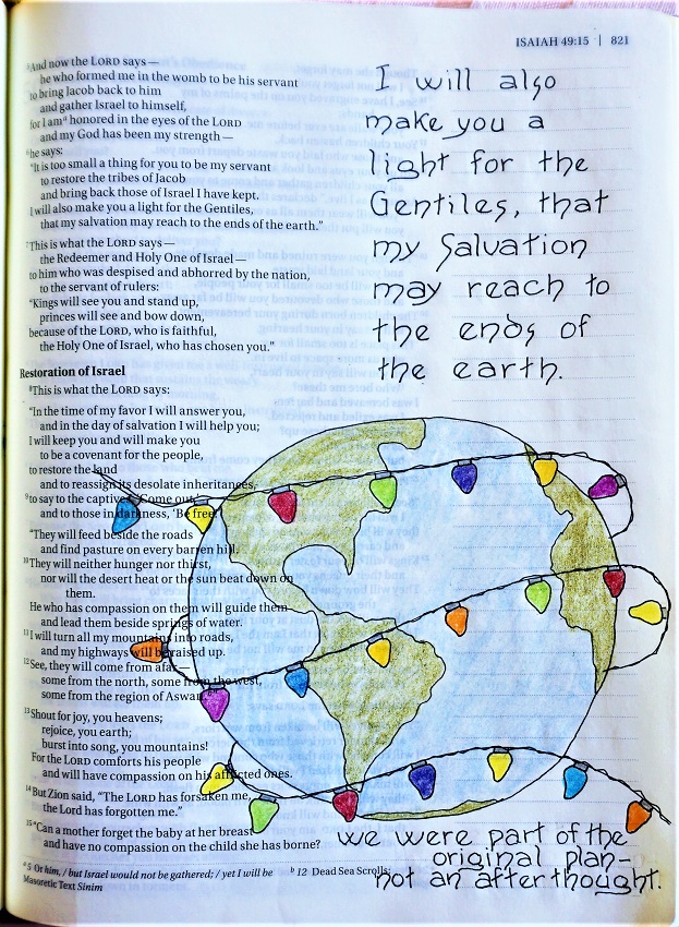
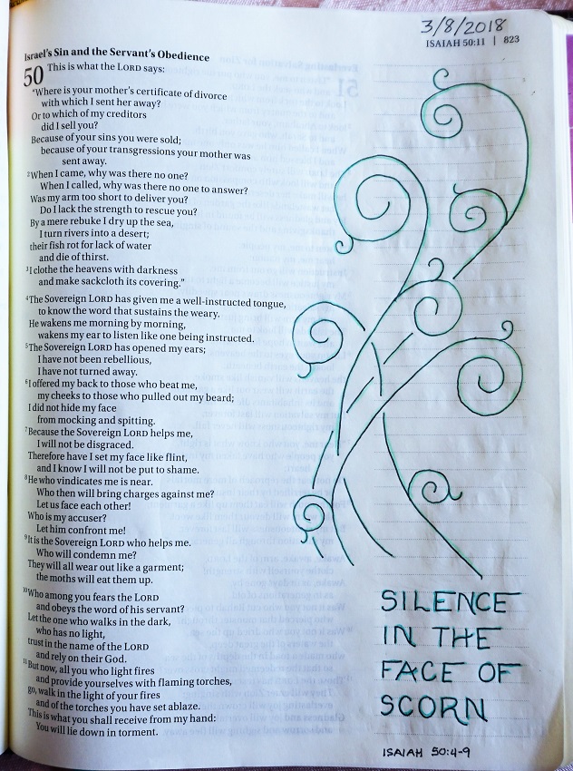
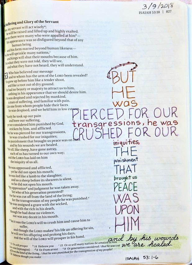
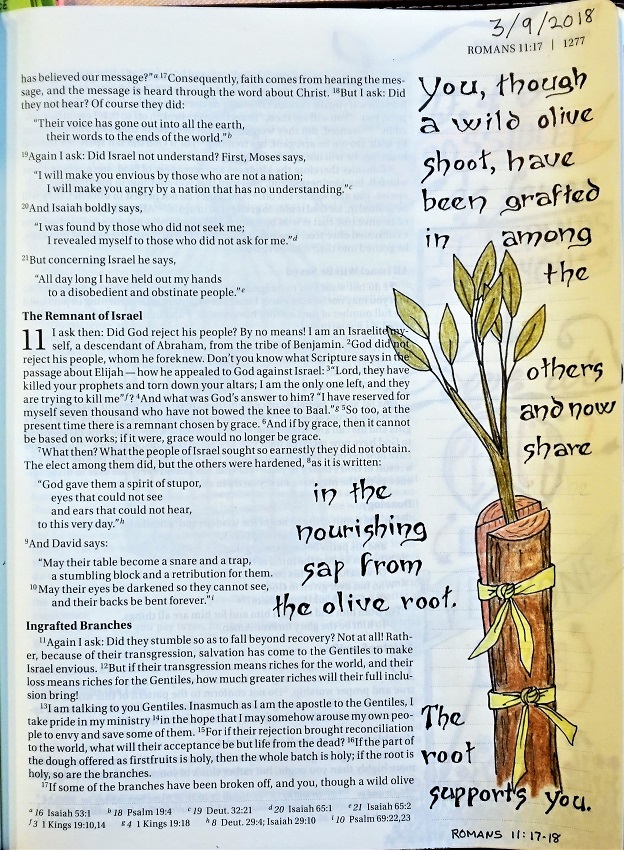
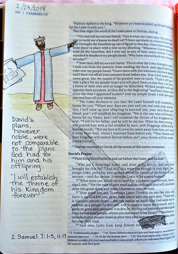
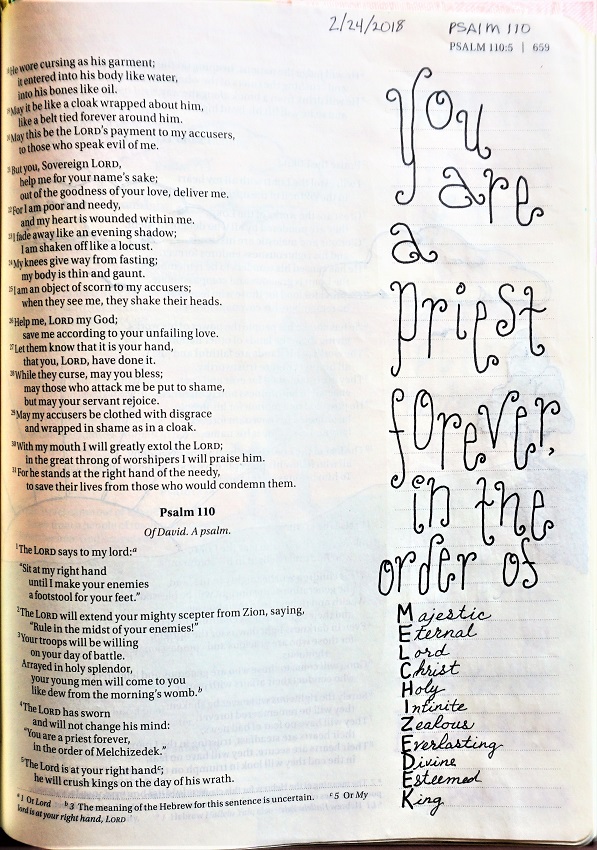
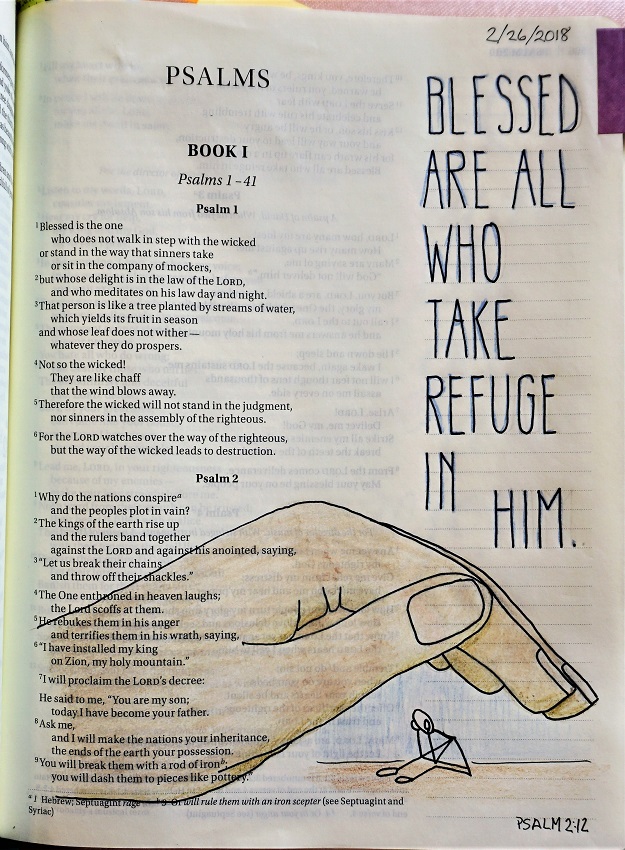
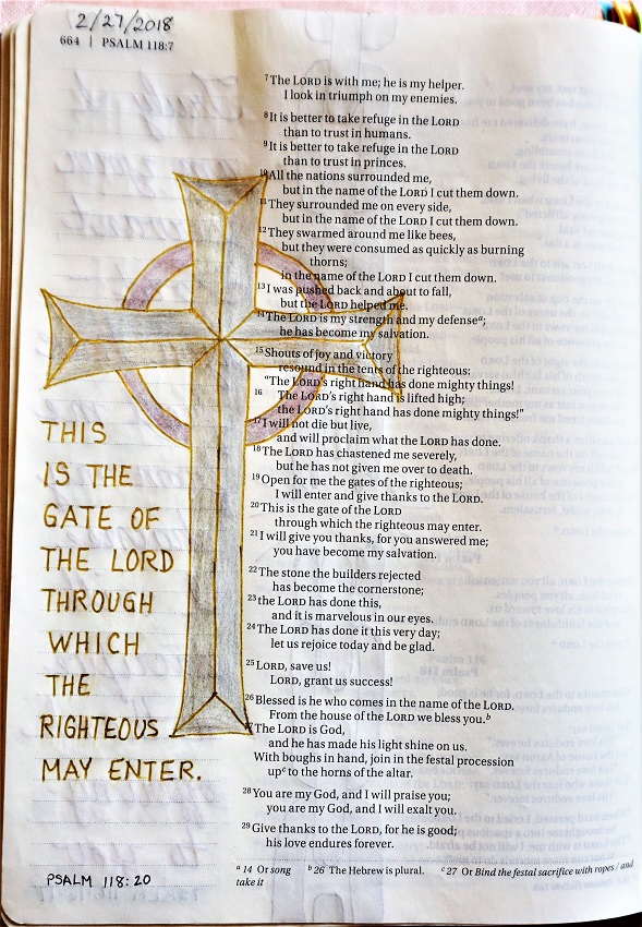
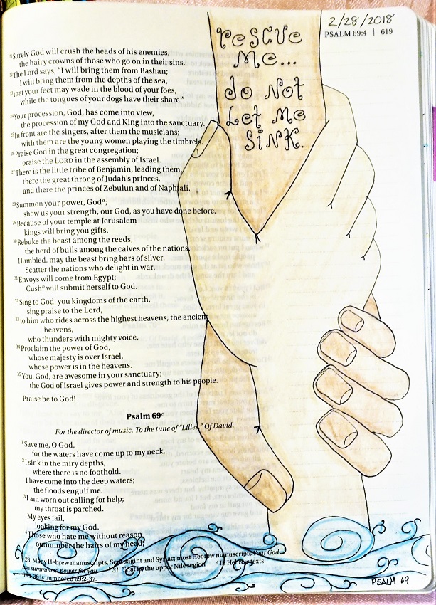
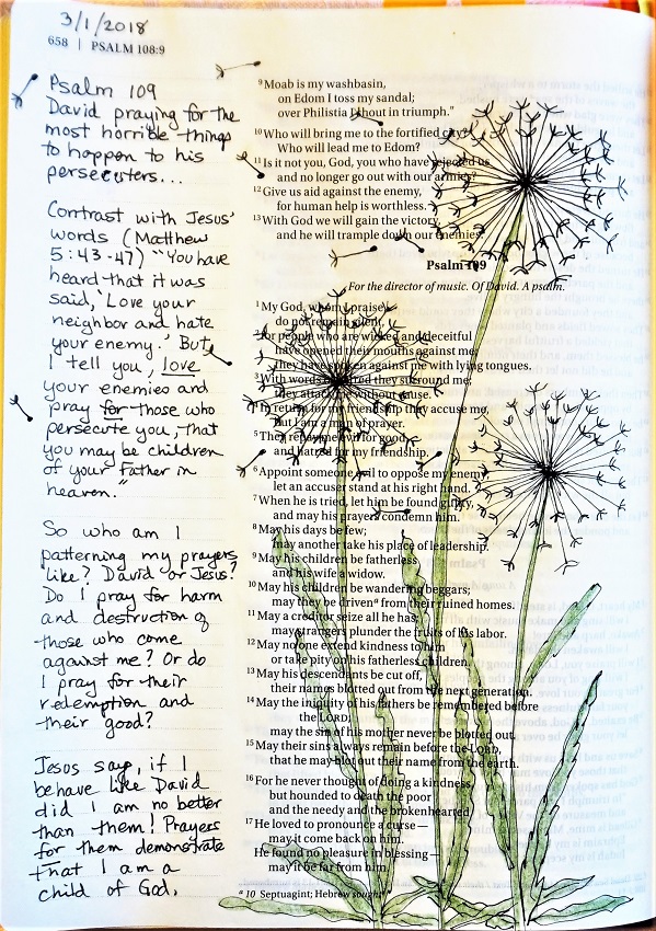
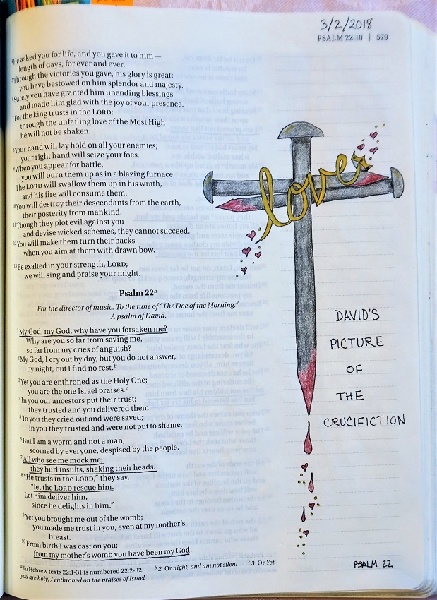
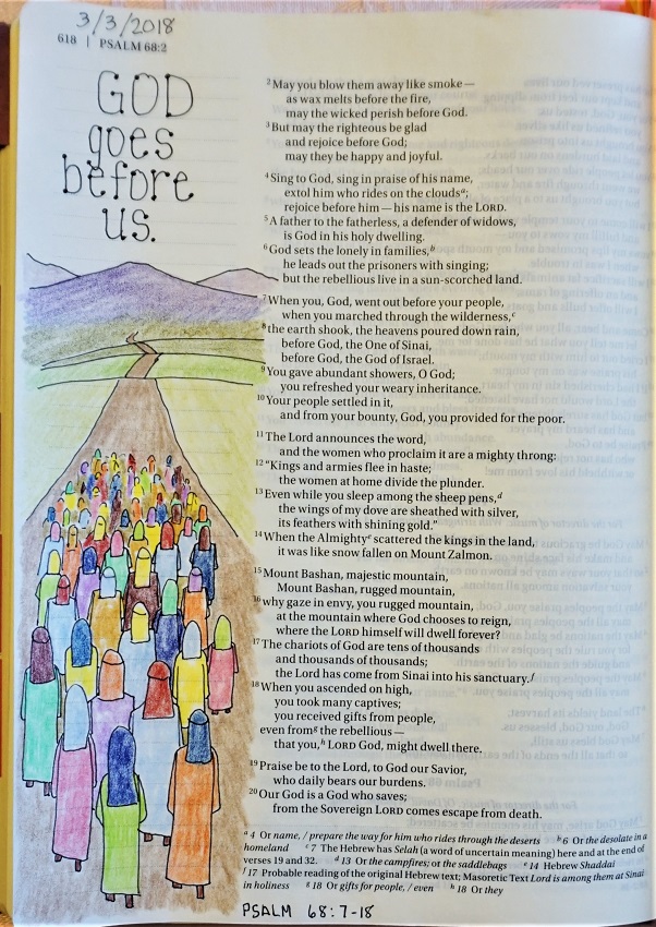
You'll note in the pages I did for Lent this week that I used this font even more.
Ddd
Posted by studio3d@ccgmail.net
at 9:05 PM PDT