Topic: Bible Journaling
As the year draws to a close so does the Cover to Cover lettering project. And we finished theprocess with the book of John.
These are the lessons:
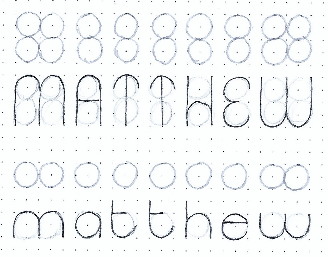
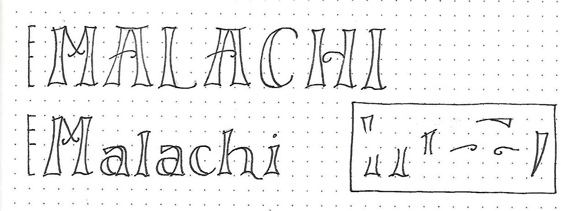
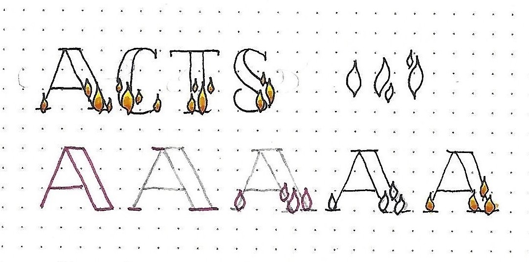
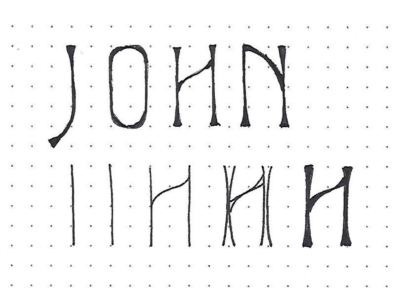
JOHN: Day #1 – Elite – Introduction
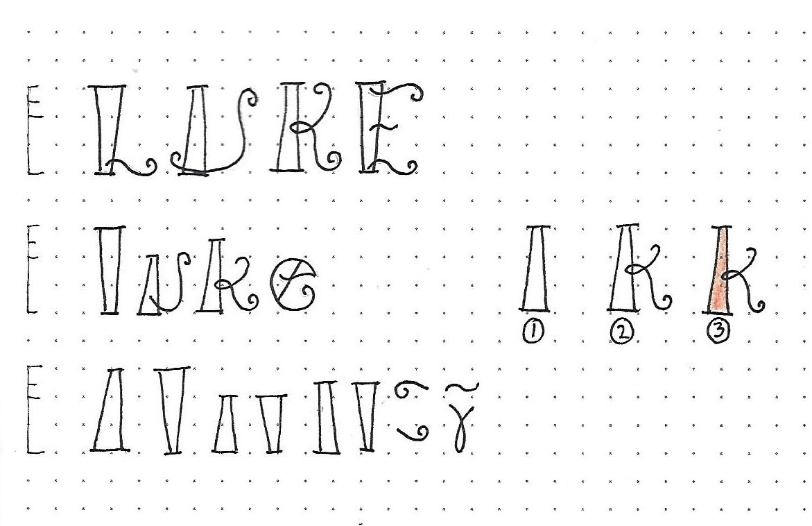
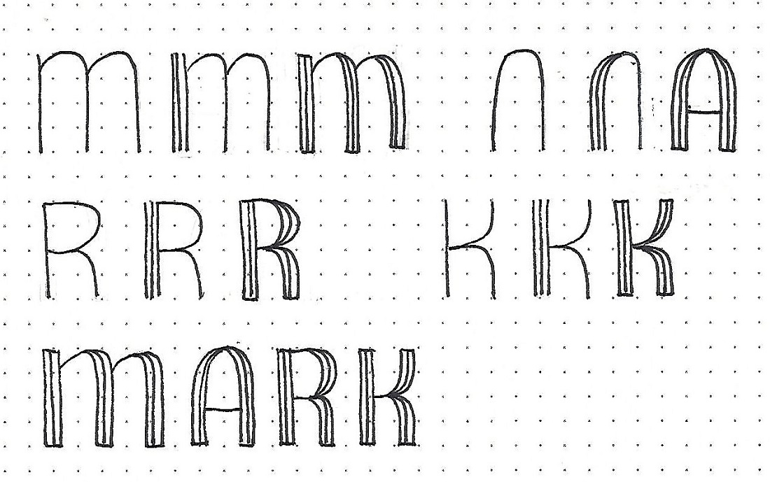
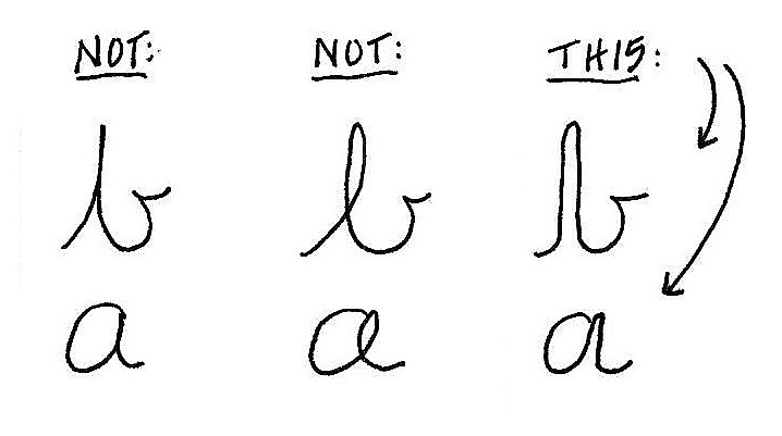
The font this week is all-caps and elegant. The stems on this tall, graceful style are flared at all the ends of lines and thickened at the interior of curves. Crossbars are angled as well as curved.
The lower part of the graphic shows the steps to constructing the letters. First, establish the stems of your 4-unit letters. Add any crosspieces. Flare the ends – the flares are much longer and smoother than a triangle serif. Fill between the lines.
Practice this construction method on the c2c book of the week – JOHN.
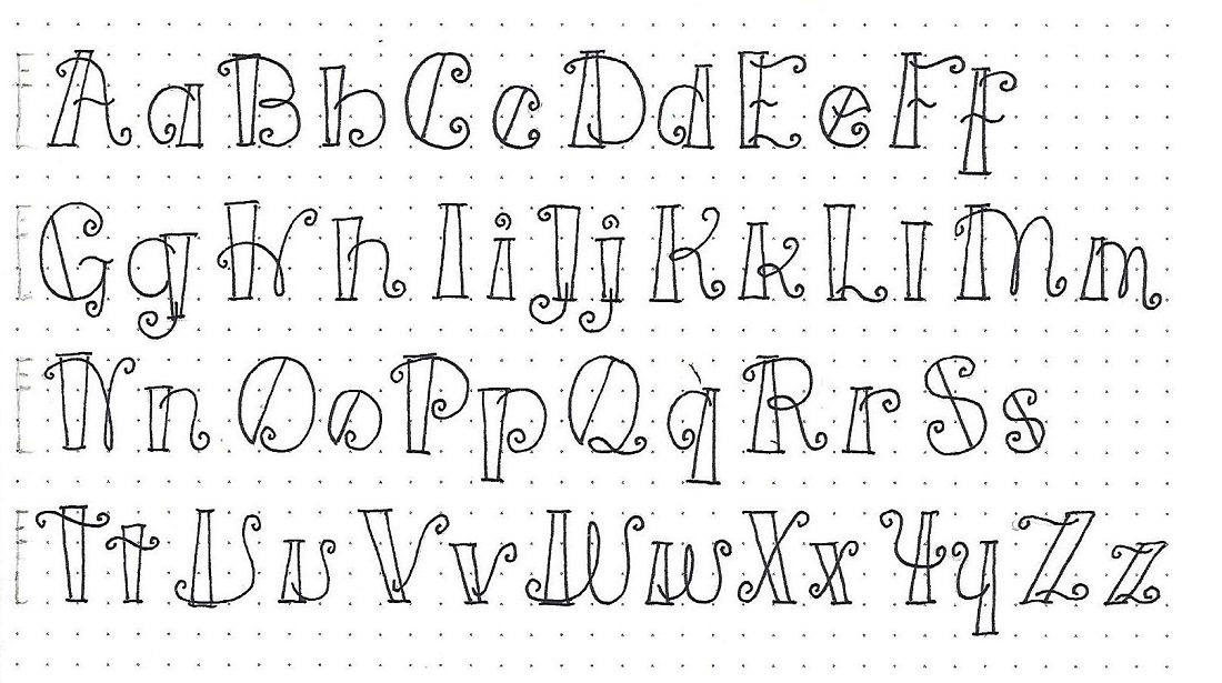
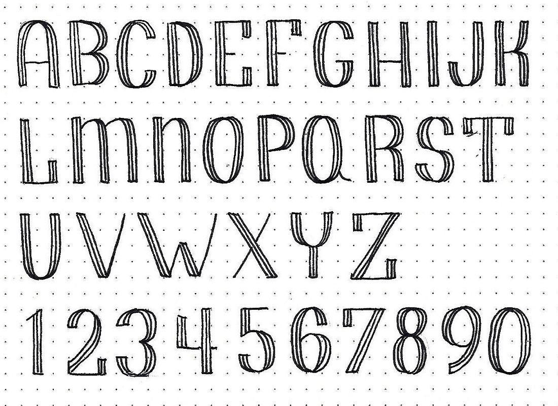
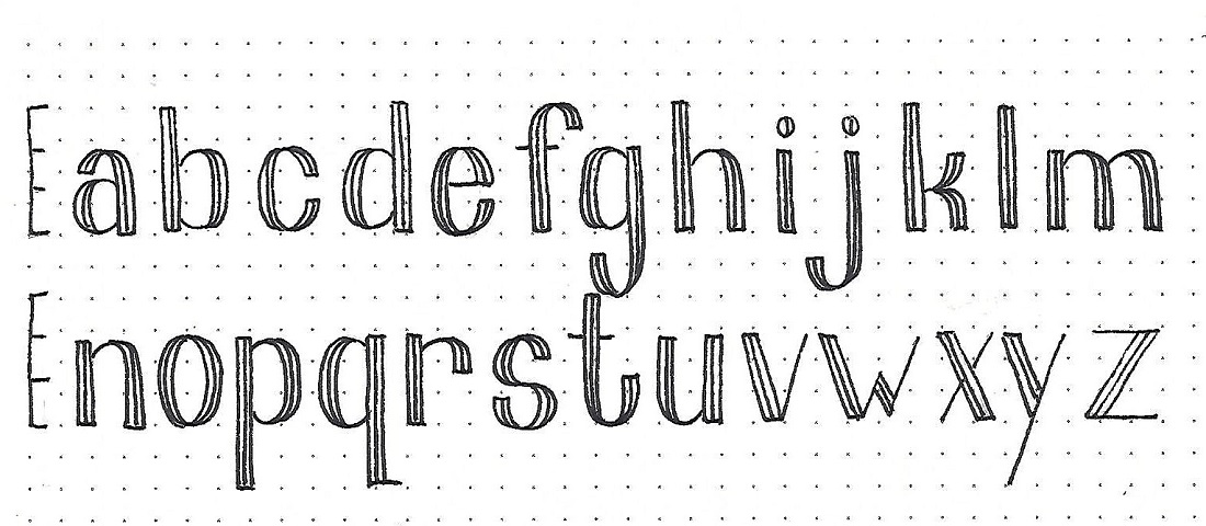
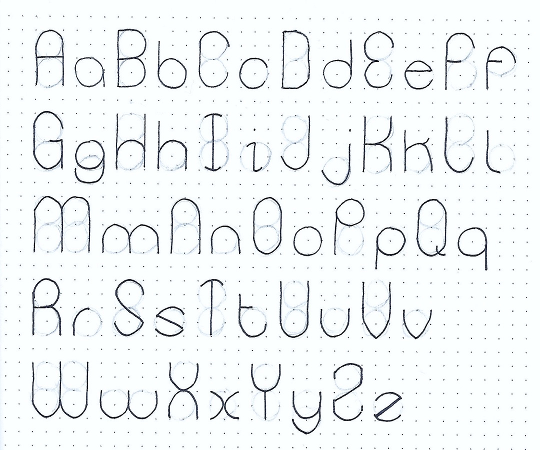
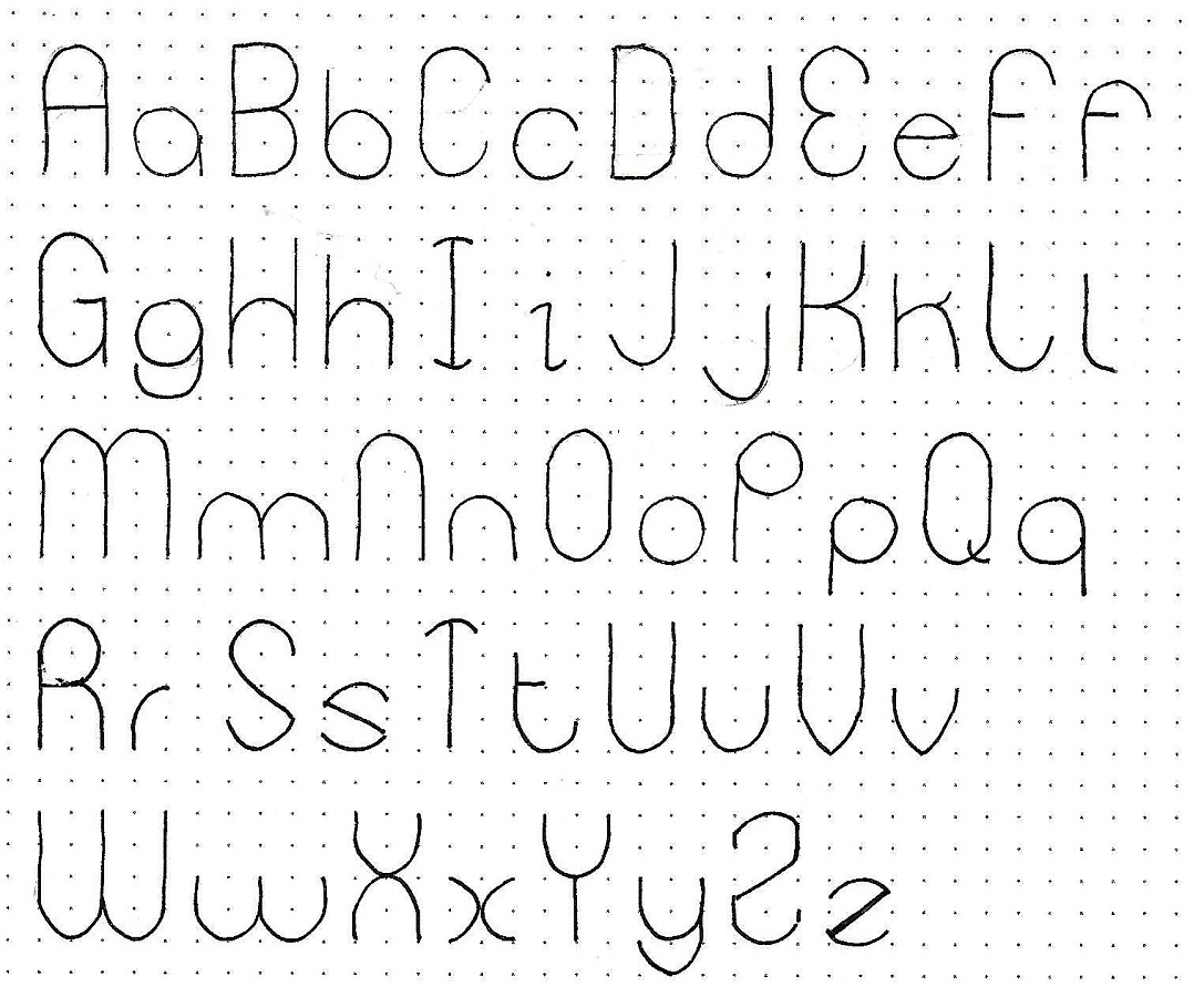
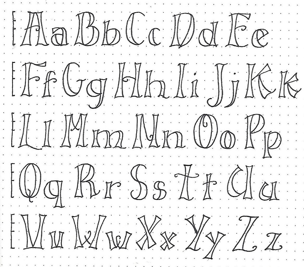
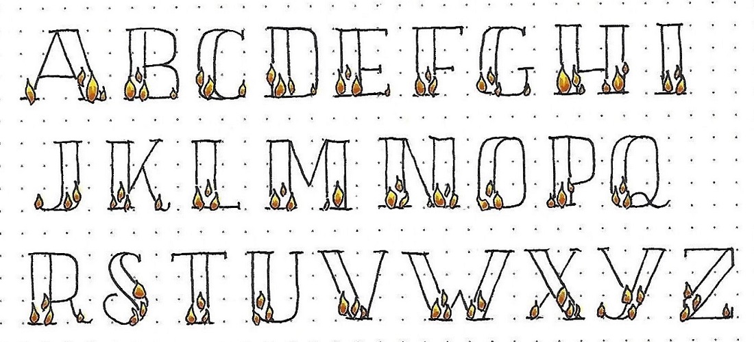
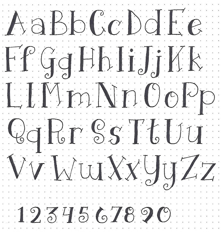
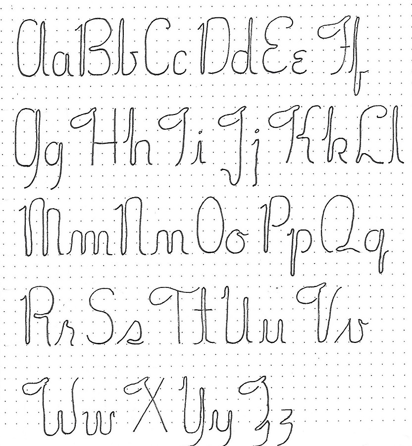
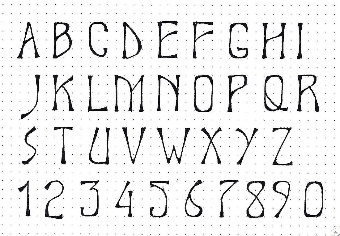
JOHN: Day #2 – Elite – Alphabet
Especially note the thickened internal curves on letters like the B C D G O P Q R U. Also note the filled sharp angles on the M V W and Z. These same styling elements are used on some of the numerals.
Make guidelines for a 4-unit letter height and write your alphabet using the same steps to construction that we learned yesterday.
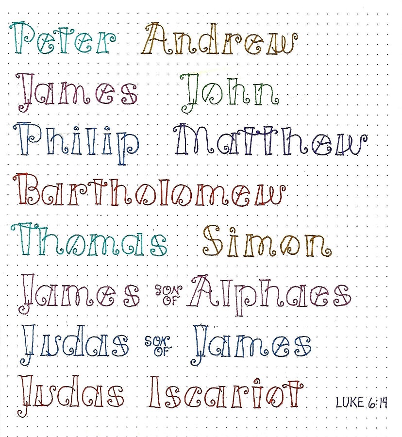
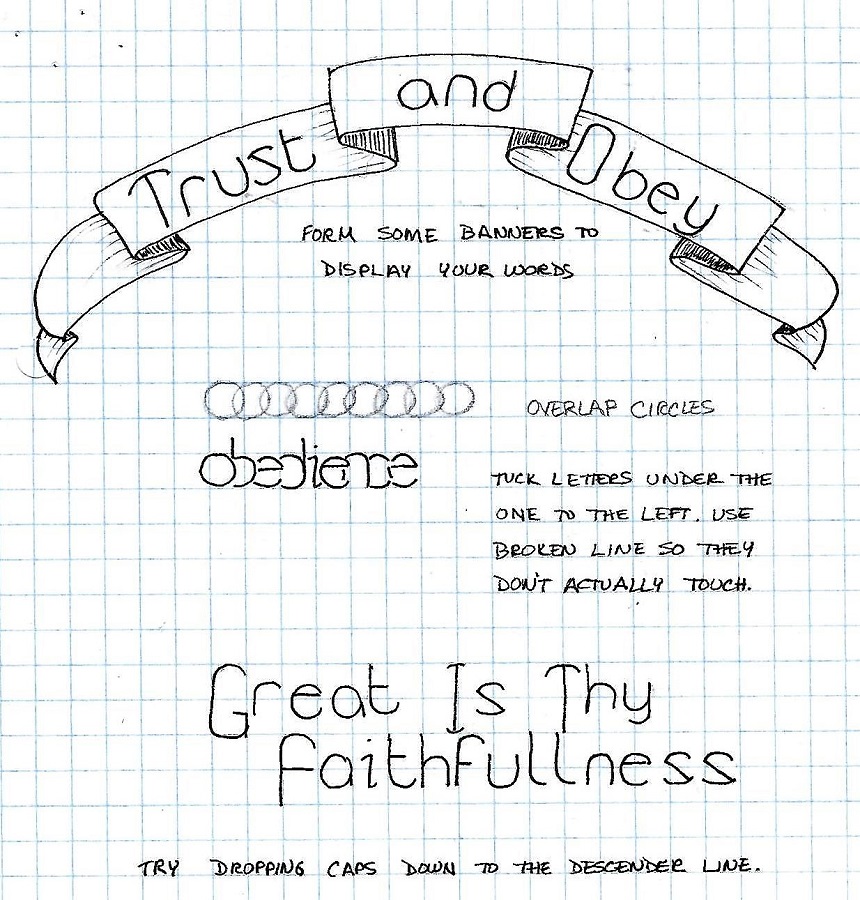
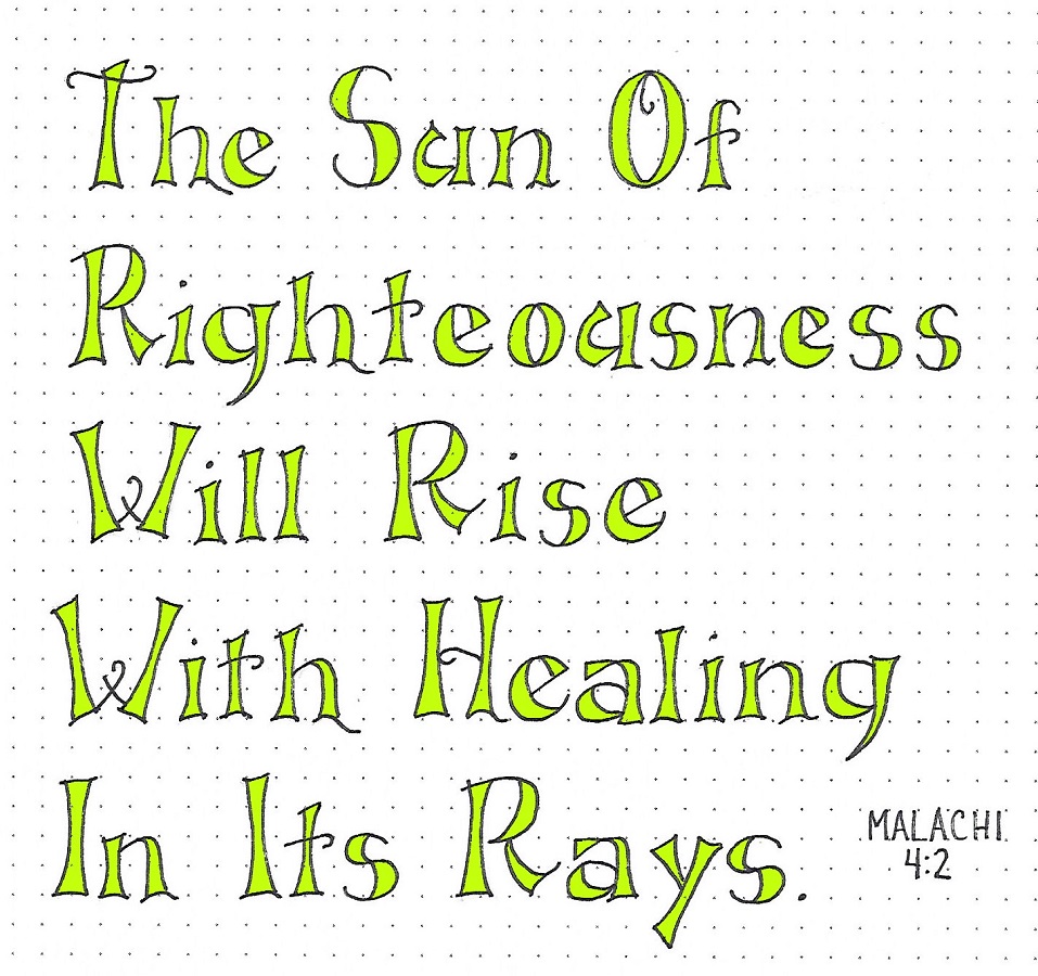
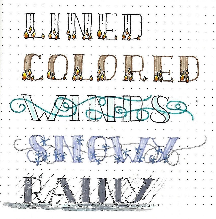
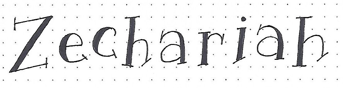
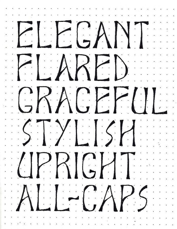
JOHN: Day #3 – Elite – Word Play
Today we will practice using the Elite Font to write some words descriptive of the style. This practice will help you get comfortable with letter spacing.
Use the same construction methods we’ve been employing all week.
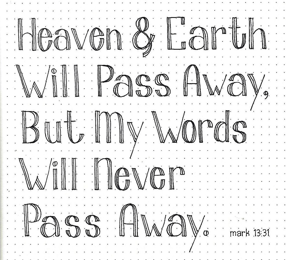
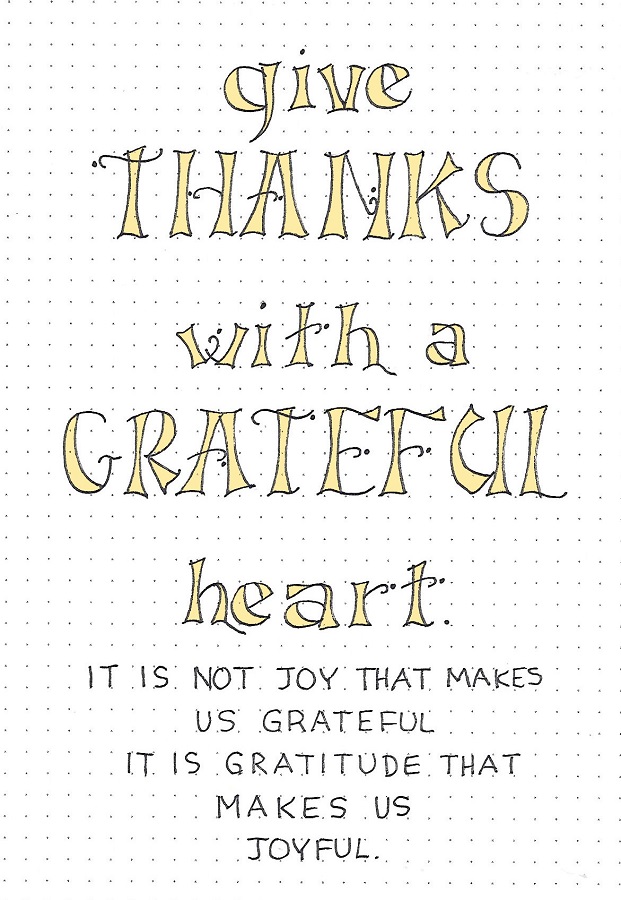
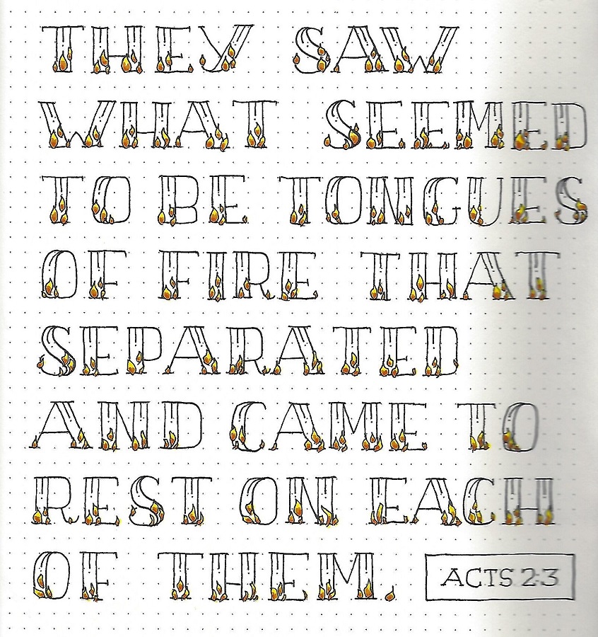
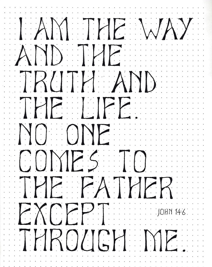
JOHN: Day #4 – Elite – Scripture Writing
Today we are moving on from simple word lists to writing a block of text – a scripture this time. This moves us from letter spacing to word spacing.
Same methods for construction apply. If you want to challenge yourself, try centering each line.
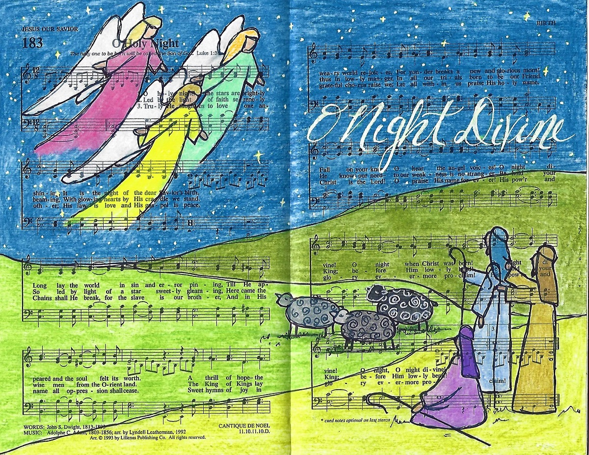
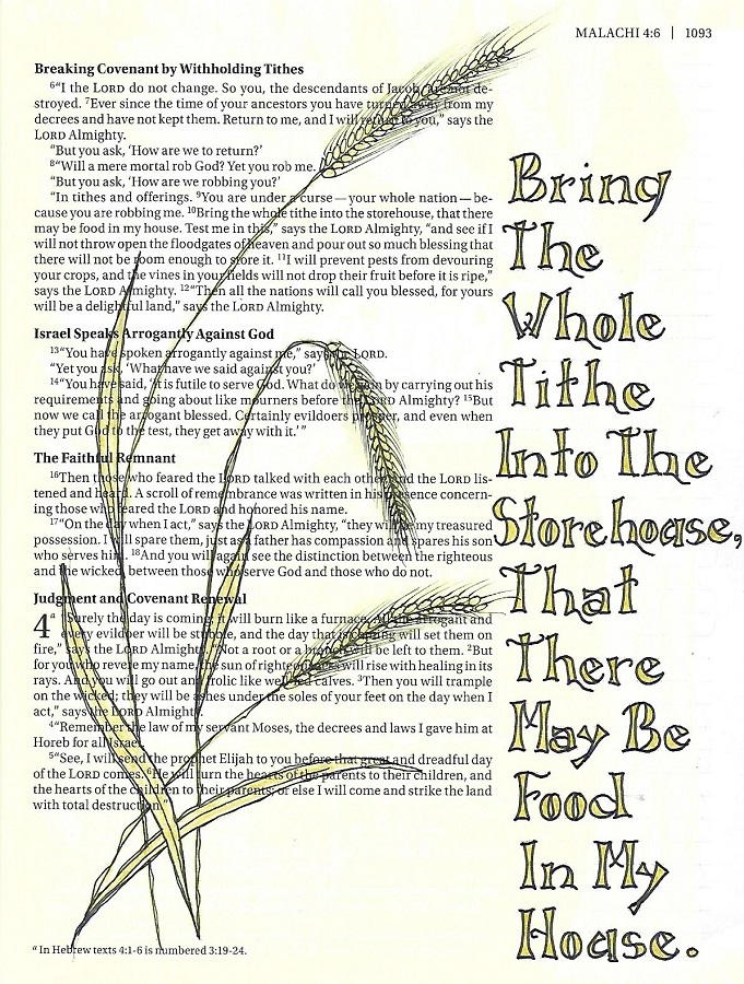
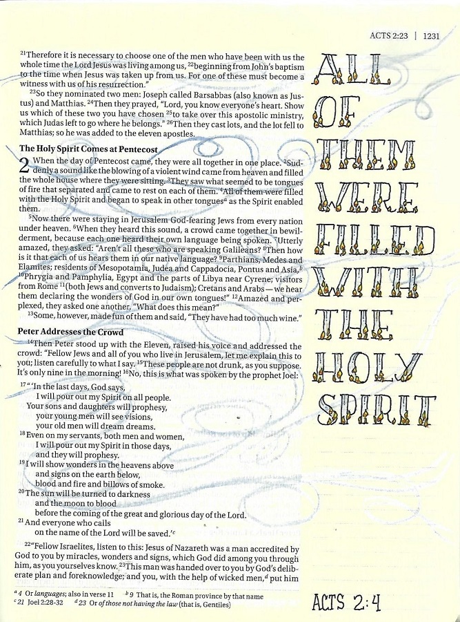
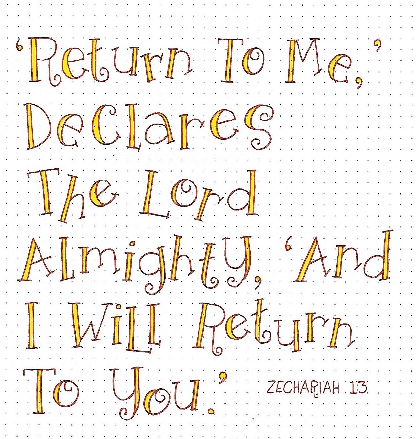
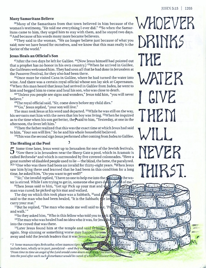
JOHN: Day #5 – Elite – Bible Page
Today we advance to using the Elite Font in our bibles. You’ll want a short scripture or phrase as you can only practically get one word per line. If you do have a longer scripture, use the Elite font for important words and find a simple script or italic font in a smaller scale for the rest.
Height-wise, this fits nicely in two lines of the margin markings. However, it is advised that you move to a thinner tipped pen. Use the same construction methods and you’ll do just fine.
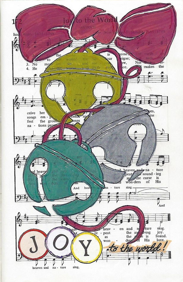
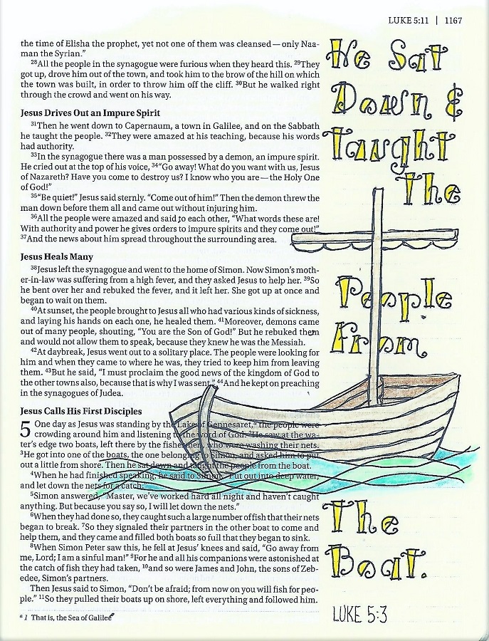
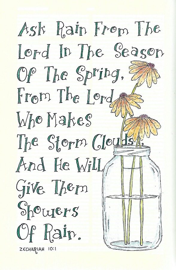
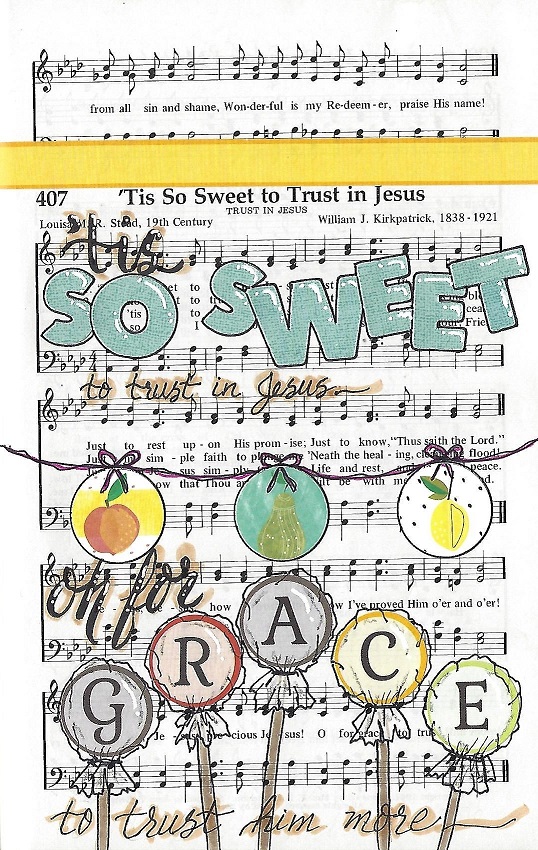
I combined my text with the Well tutorial from the Drawing Room.
Yes, I will continue lettering in my bible and in my journaling in the new year. Even I don't know what form it will take, though. I will not be teaching online lessons in 2020.
Ddd