Topic: Bible Journaling
Bouncing letters based on a serif print is what is on the table this week. Here are the lessons:
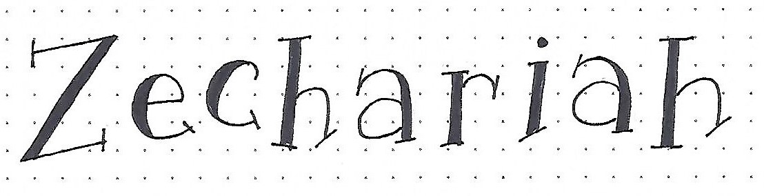
ZECHARIAH: Day #1 – Toss Up – Introduction
At first glance, this font does not look very organized or rule-oriented. In reality, there is a definite plan for the size, shape and placement of the letters. Sometimes we just choose to bend the rules.
The letter height is 4 units. The size of the x-height is between 2 and 3 units (it varies by letter). All of the letters have ONE thickened stroke and the thickness of that stroke is consistent from letter to letter. All stroke ends have serifs. For the most part, the thick strokes’ serifs sit more squarely while the single stroke’s serifs are mostly angled.
Have fun writing this word while you wait for the full alphabet.
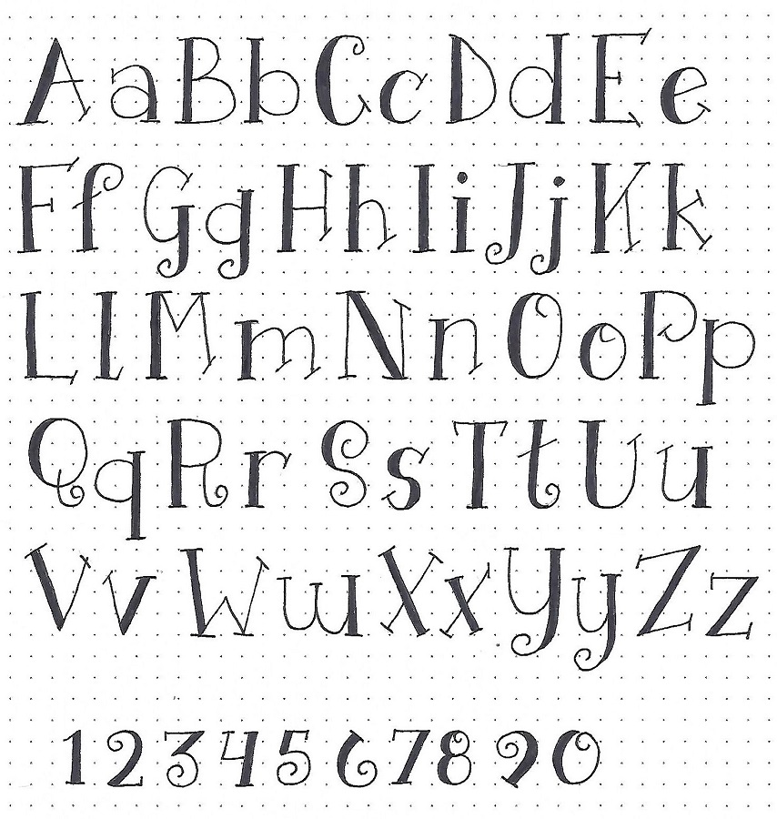
ZECHARIAH: Day #2 – Toss Up – Alphabet
Yesterday we were introduced to the general rules for this alphabet: The letter height is 4 units. The size of the x-height is between 2 and 3 units (it varies by letter). All of the letters have ONE thickened stroke and the thickness of that stroke is consistent from letter to letter. All stroke ends have serifs. For the most part, the thick strokes’ serifs sit more squarely while the single stroke’s serifs are mostly angled.
Now you get to see the full-meal-deal. You’ll note that many of the letters end in curls, which we did not see yesterday. Also, the letters were presented in their ‘tossed’ state on that one word. Here in the alphabet they are all sitting nicely on their baseline. This will allow you to learn the letter shapes and relative sizes more easily. We’ll get back to tossing them tomorrow.
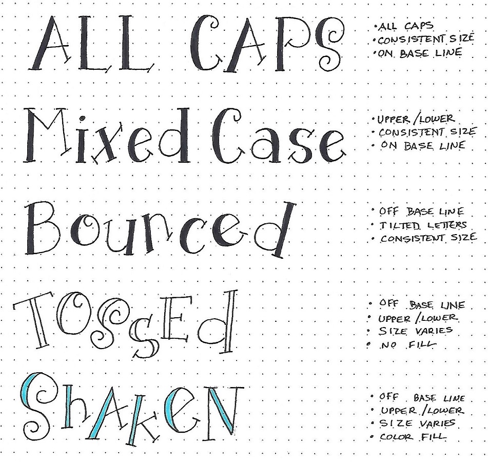
ZECHARIAH: Day #3 – Toss Up – Options
Now that we understand how the letters relate to one another in a ‘normal’ sense, we’re going to start breaking the rules a few at a time. Just make incremental changes – you want there to still be enough consistency to make it understandable as a style that hangs together.
Things I don’t change: keeping the thickened lines a consistent width and making sure letters have the appropriate serifs.
Try out these options for practice.
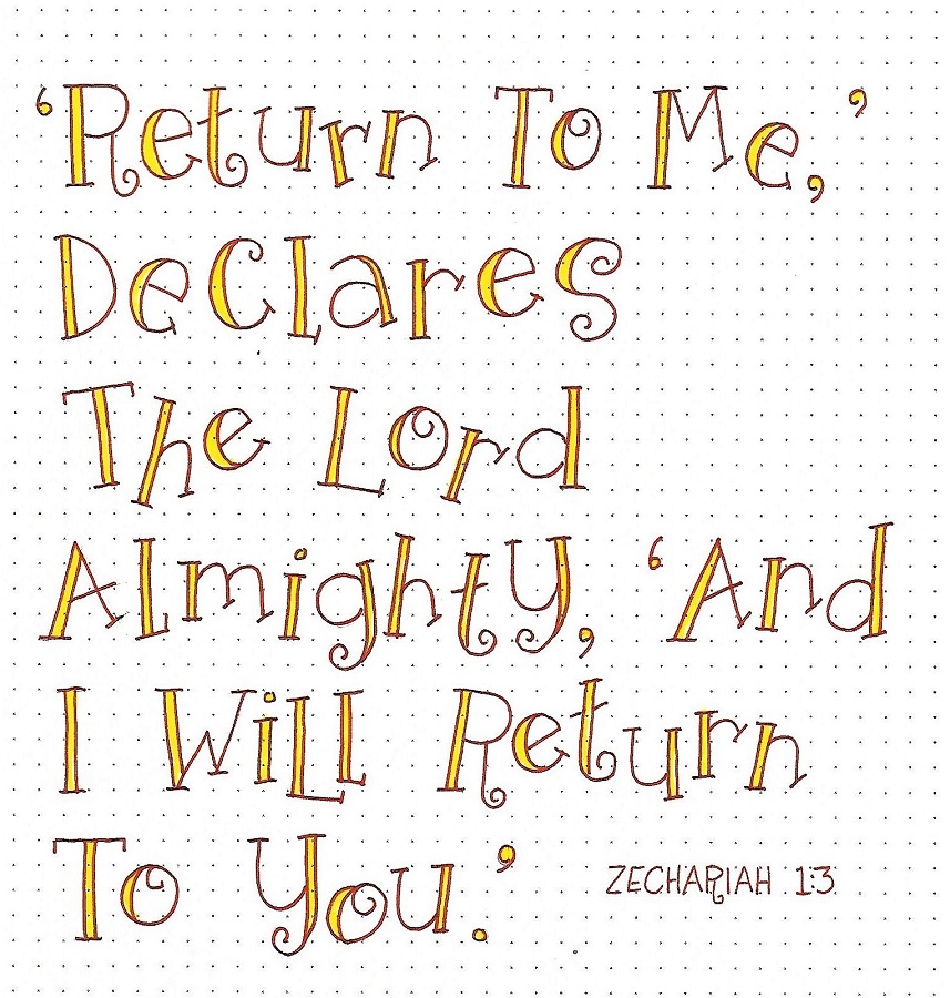
ZECHARIAH: Day #4 – Toss Up – Scripture Writing
Today we’re going to write a scripture from Zechariah on paper for practice in applying some of the options we learned about yesterday. So, what did I change on this piece?
Upper/Lower case Off baseline
Tilted letters Size varies
Color outline Color fill
That’s a lot of changes and yet, it all hangs together because of those few consistencies (line width, serifs, curls).
Write up your own scripture piece, incorporating as many options as you wish.
ZECHARIAH: Day #5 – Toss Up – Bible Page
And now we get to use the Toss Up Font in our bibles. (I used it in my ESV Interleaved, which is why there is no scripture background). I used the same options as yesterday except there is not a colored outline on the letters.
I combined my lettering with aDrawing Room lesson on the Mason Jar.
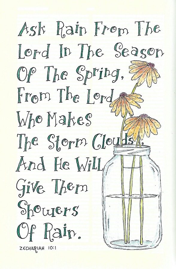
Did you know the drawing lessons are free to all? Go to Creative-Bible-Journaling.com and look for the menu called Drawing Room. LOTS of tutorials there.
Ddd
