Lettering in 2 Corinthians
Topic: Bible Journaling
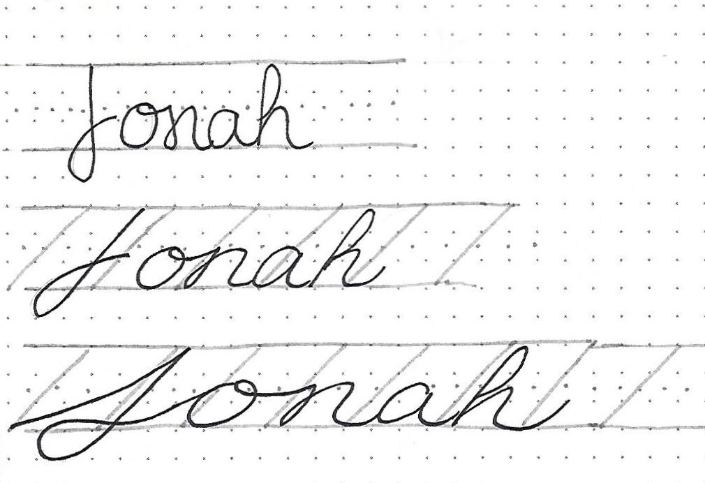
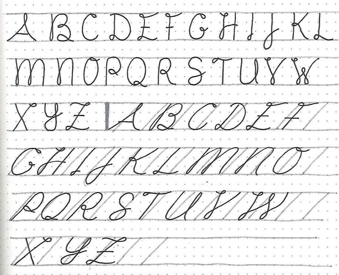
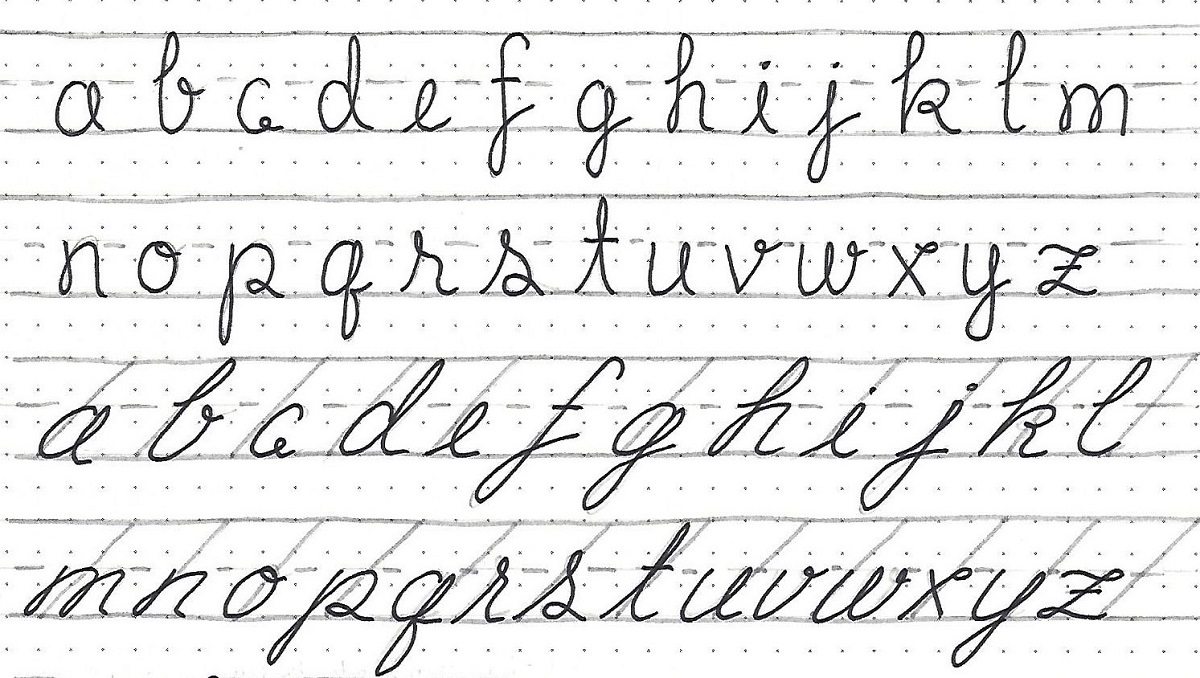
On to 2 Corinthians with the lettring lessns. Ready?
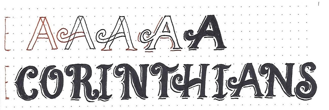
2 CORINTHIANS: Day #1 – Signage Font – Intro
This is another font that looks complicated but is actually easy, although time consuming. To get you going on this style we start with a step-by-step guide.
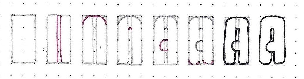
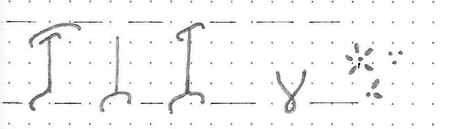
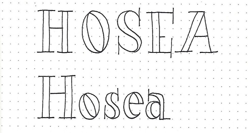
1) Working with 4-unit letters, draw (in pencil) the basic block letter.
2) Add the curls for that letter.
3) Give the letter the indicated triangle serifs. Except for the A and the H the left side of the letter also gets a pointed protrusion at the mid-line.
4) Add broken shadow lines to the left and bottom of all elements.
5) In the letter and fill. Erase pencil.
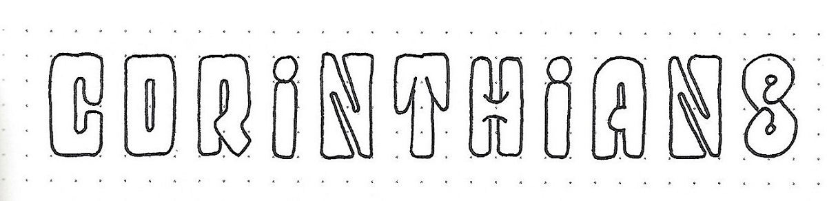
Use these steps to complete all the letters in the book name. I did not label this as 2nd Corinthians since there are no numbers in this font.
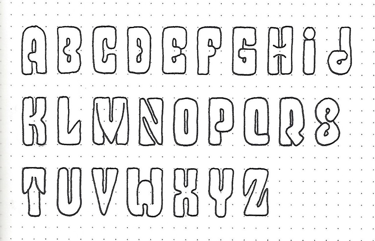
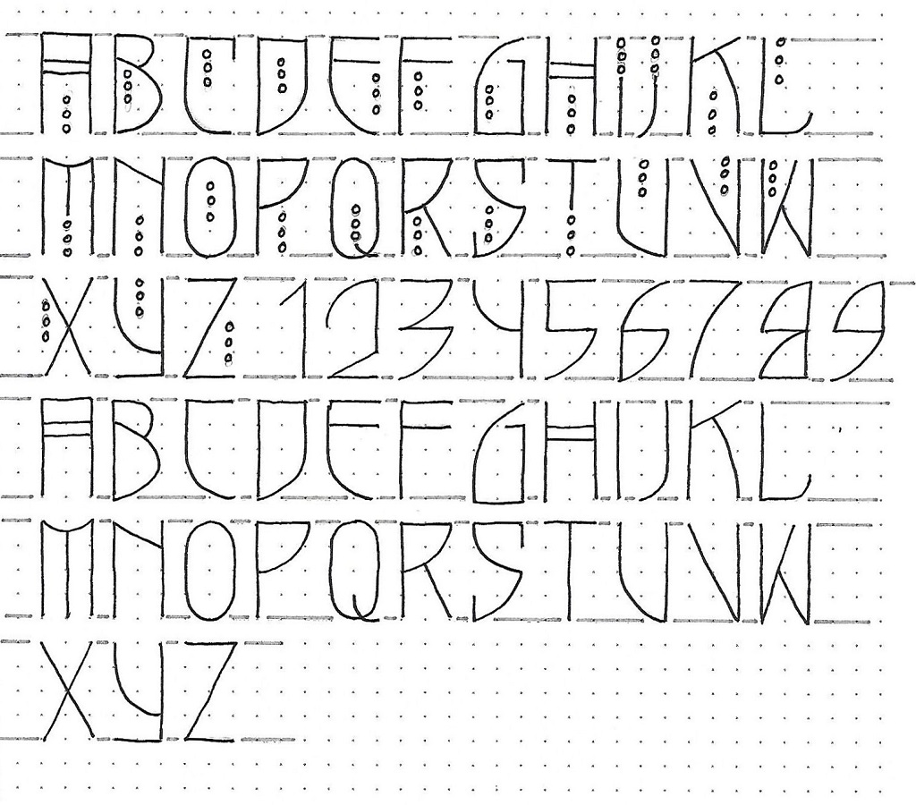
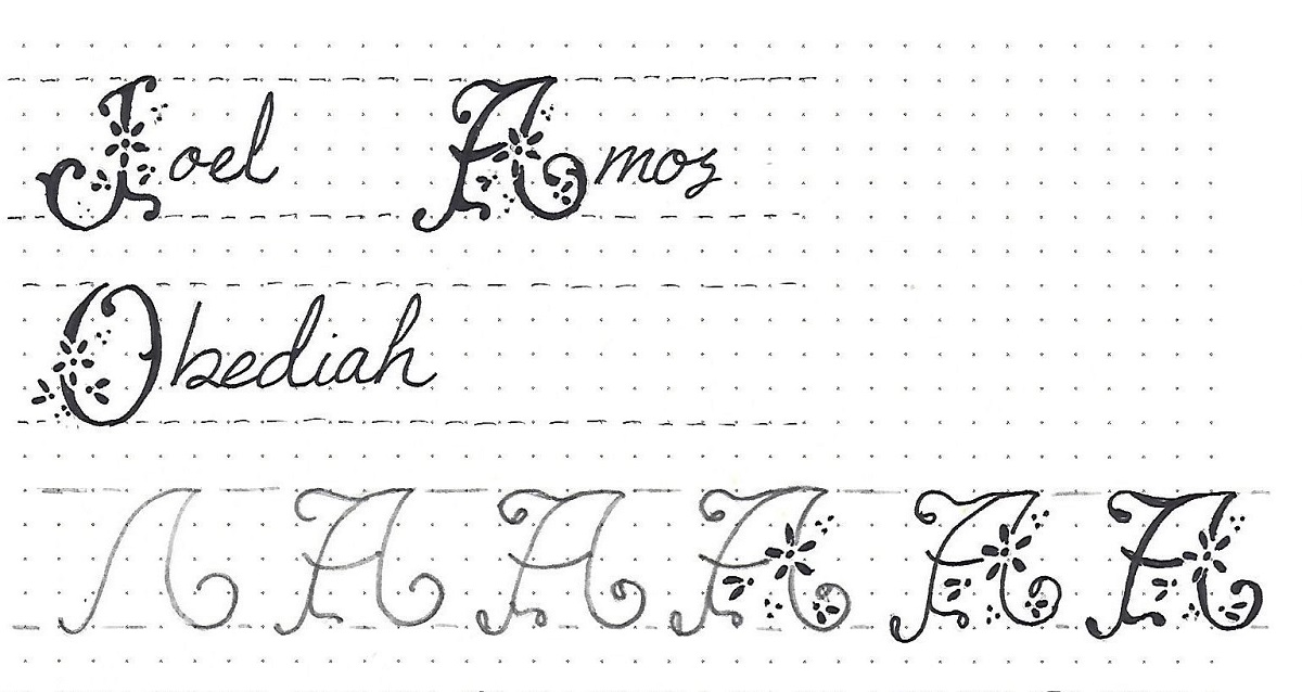
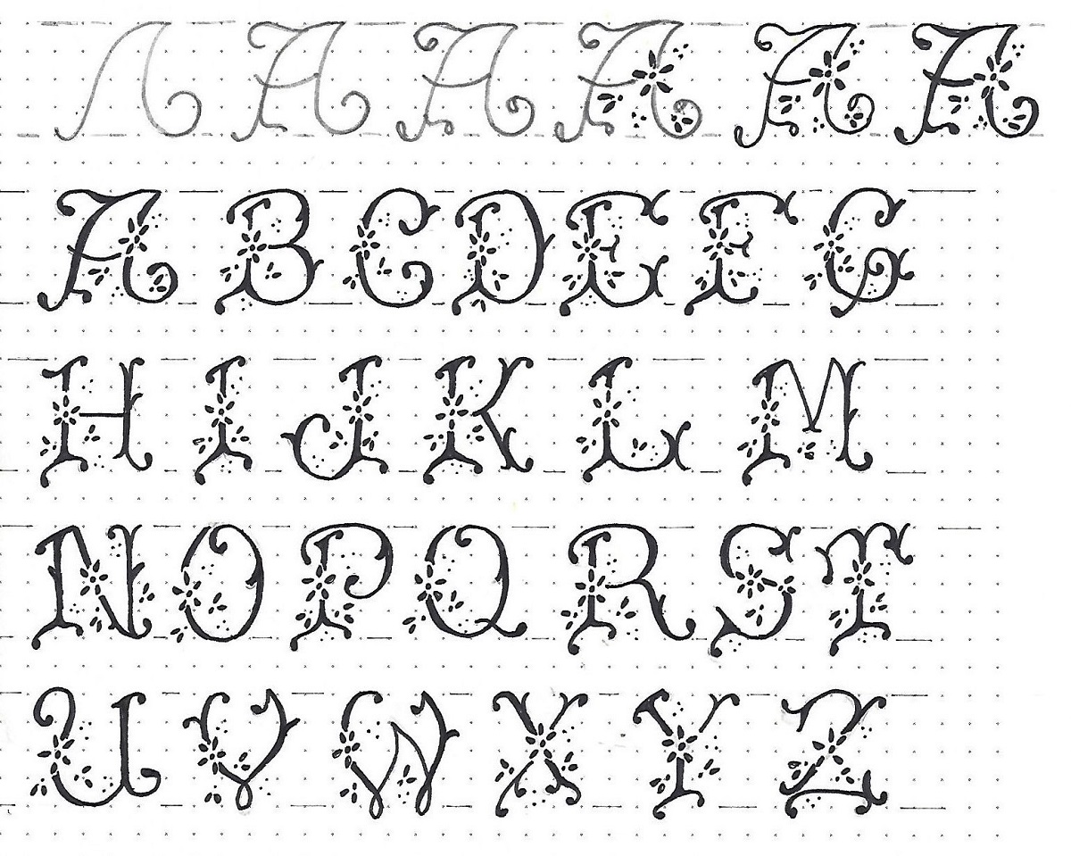
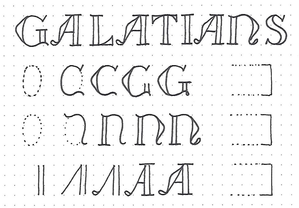
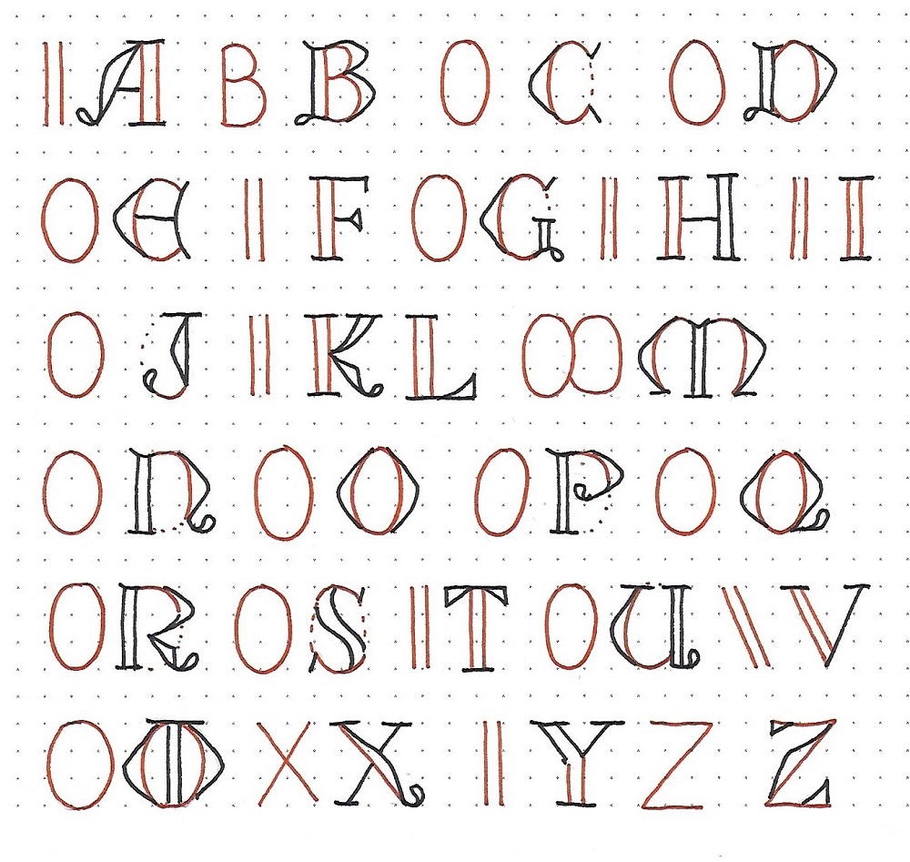
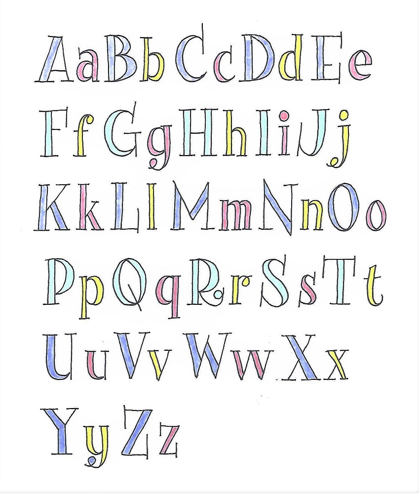
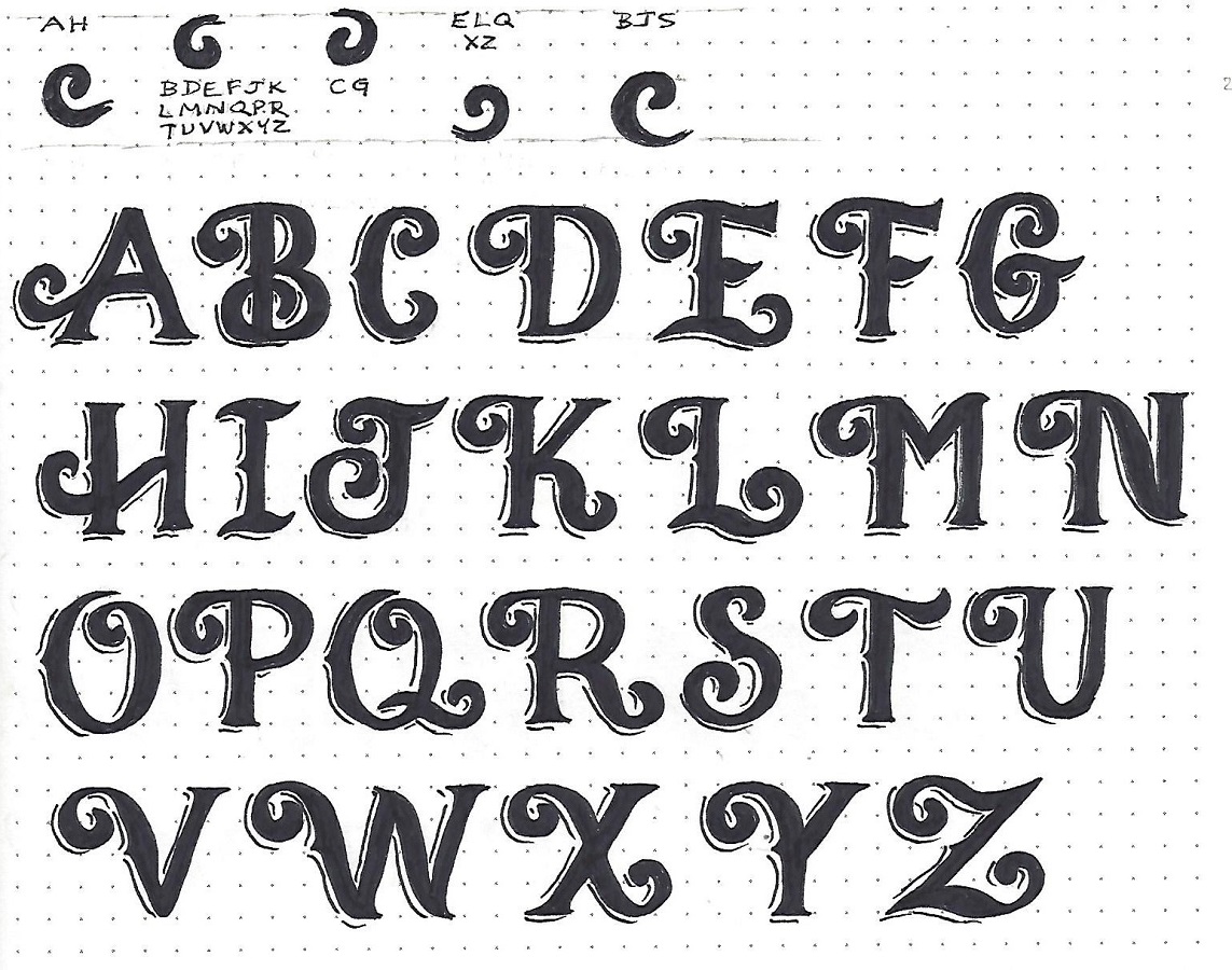
2 CORINTHIANS: Day #2 – Signage Font – Alphabet
Before tackling the full alphabet, I want you to practice the common curl formats. They are similar but vary in their placement, orientation and size. I have indicated the letters that each curl will be used on. Scan through the alphabet and identify them.
Make some guidelines 4 units high and mark the midline at 2 units. The latter will indicate where your left protrusion is placed and will also assist in getting the correct size for the curls.
I make each letter completely in pencil down to the last detail before moving on to the next letter. Then I scan the entire alphabet for consistency and. Finally, I ink the whole page.
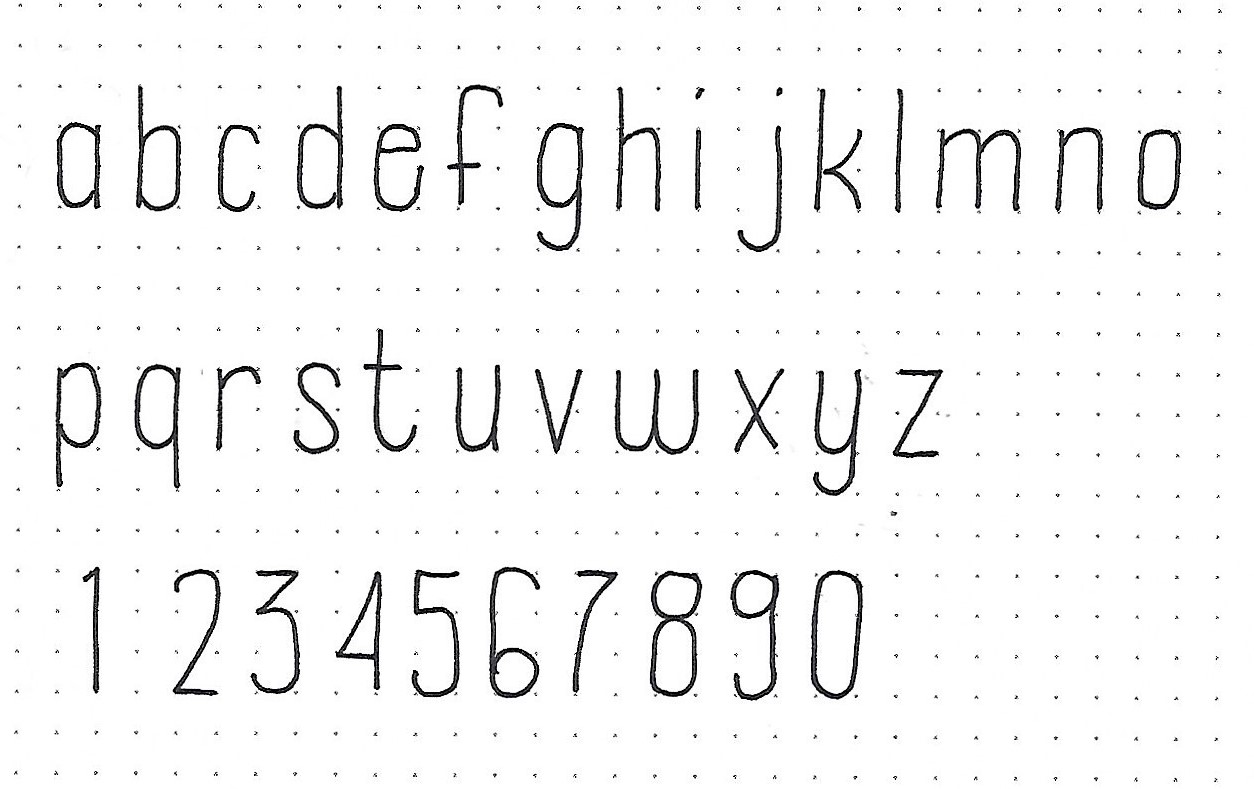
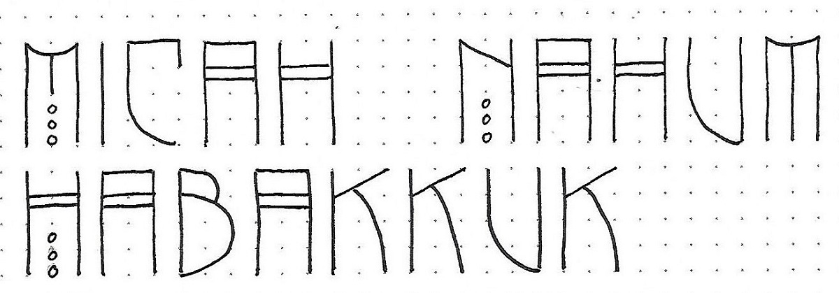
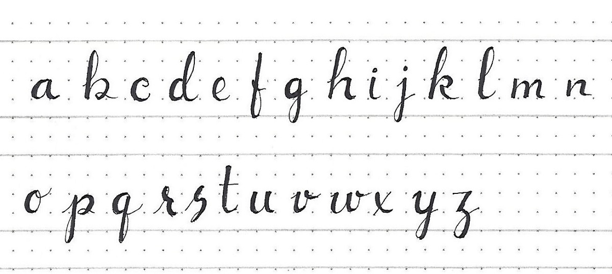
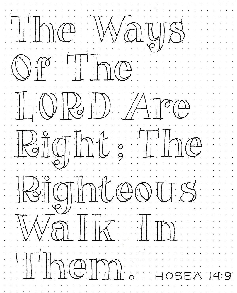
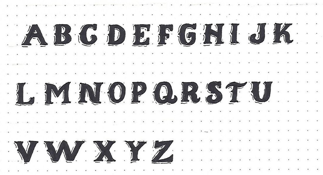
2 CORINTHIANS: Day #3 – Signage Font – Lower Case
The lower-case for this style is still all caps. But these do not have curls on them and they are half the height of the upper case.
Follow the same steps to design your letters as with the upper case. These letters still have the serifs, left-side protrusions and broken line shadows.
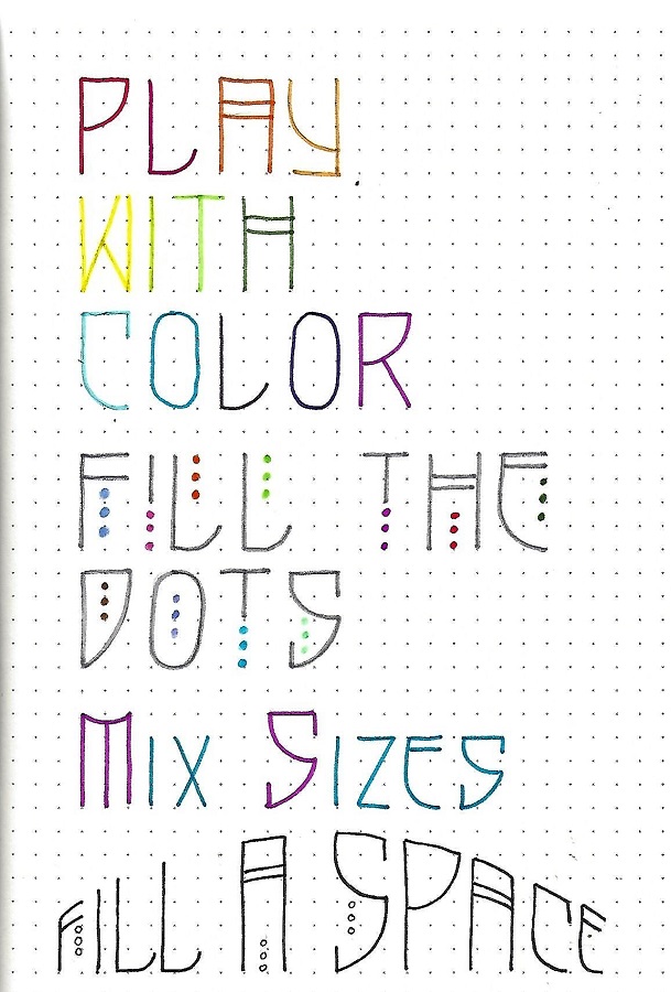
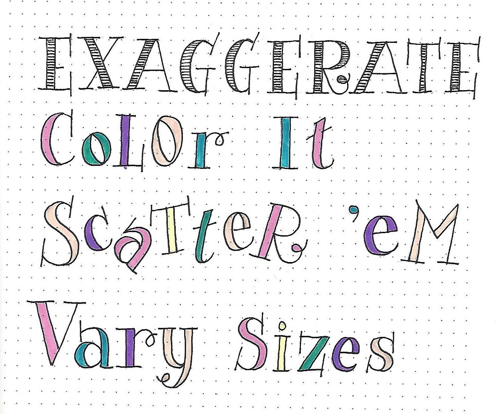
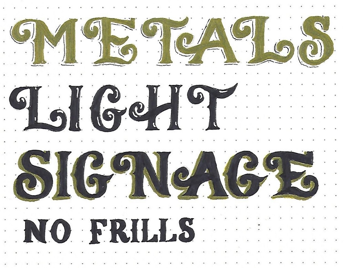
2 CORINTHIANS: Day #4 – Signage Font – Options
With just a few changes you can spice up your letters for a whole different feel. Use the samples below to try out some options.
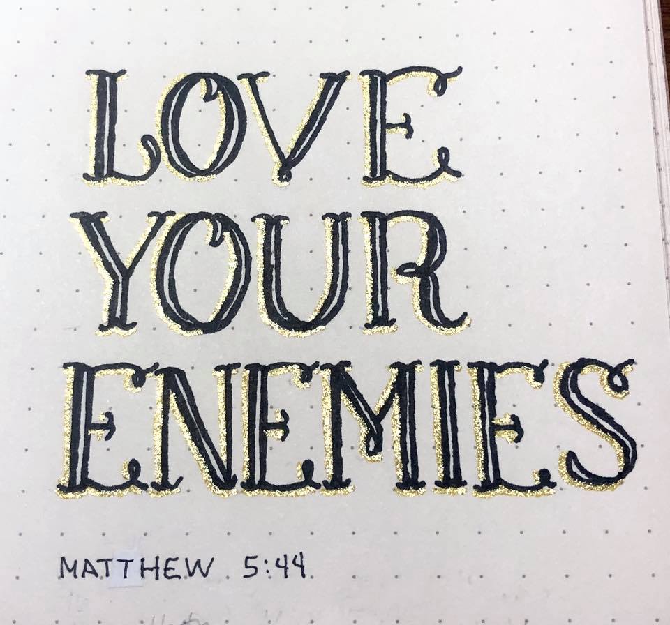
1) Trace and fill your letters with metallic pen (perhaps gel pen?). Use a very fine black pen for the broken lines. You can’t tell on this scan, but the gold metallic pen is colored over with glitter gel pen.
2) Do not add any broken lines. Instead, use white pen to add small highlights to the upper right of the elements. This adds dimension.
3) Instead of thin broken lines, use a thick metallic shadow on the left and bottom.
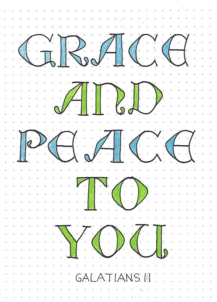
4) Use the lower-case letters without any shadow lines. This almost has a western feel to it.
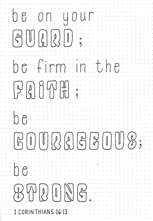
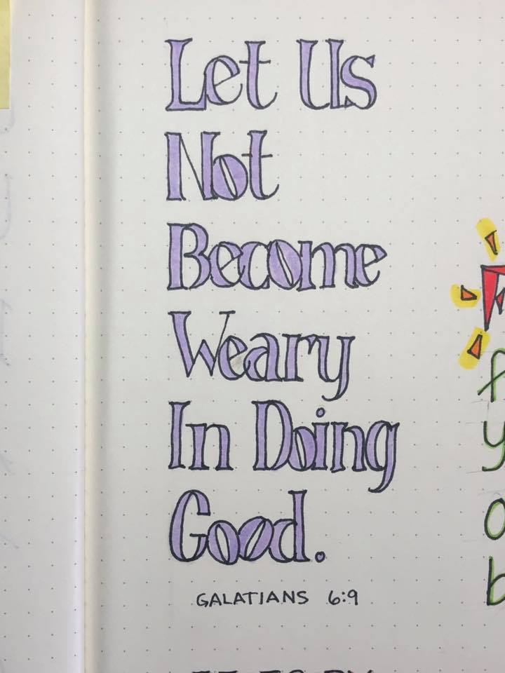
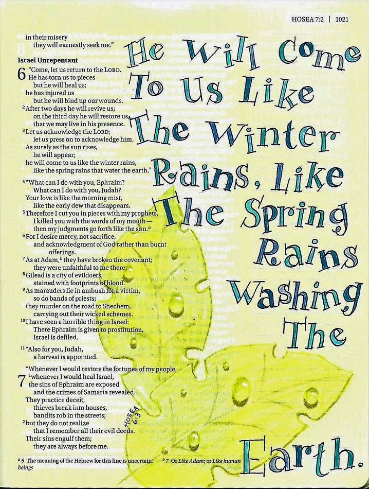
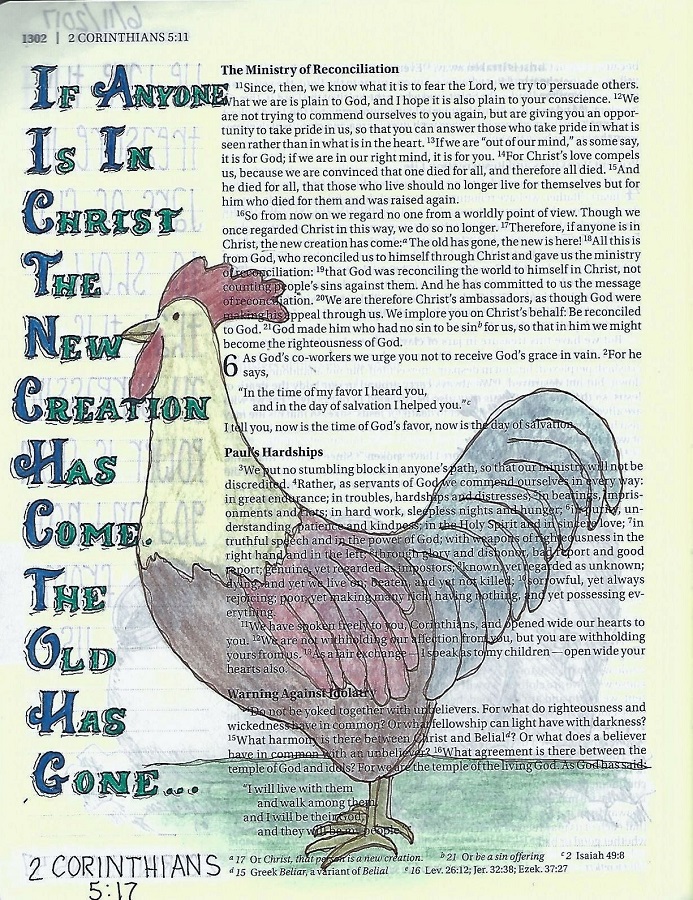
2 CORINTHIANS: Day #5 – Signage Font – Bible Page
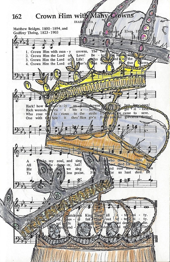
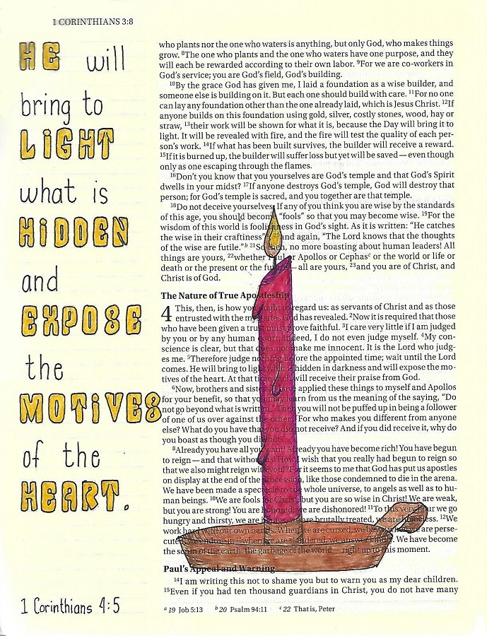
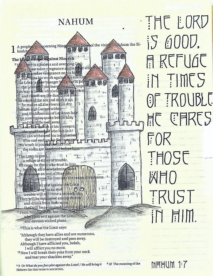
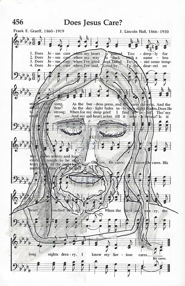
When using the Signage Font in my bible, I used upper- and lower-case together. The upper-case is filled with blue glitter gel pen and the lower-case with green. This was to reflect the colors in the illustration.
The illustration is frcolored with metallic colored pencils.
I have been having so much fun finding fonts to teach.
Ddd
Posted by studio3d@ccgmail.net
at 12:01 AM PDT