« March 2019 »
S M T W T F S
1 2
3 4 5 6 7 8 9
10 11 12 13 14 15 16
17 18 19 20 21 22 23
24 25 26 27 28 29 30
31
You are not logged in. Log in
Entries by Topic
All topics
3D paperwork
A - Z challenge 5
A - Z challenge 7
A - Z challenge round 4
A to Z challenge round 3
A to Z round 2
A to Z round 6
A-Z round 1
Around the House
Art Challenges
Artist Trading Cards
Backgrounds
Beads
Bible Journaling
Books
Boxes
Collage
Color Challenge
Coloring  «
cookbook
Die Cuts
Digital Projects
Digital Stamps
Drawing
Dry Embossing
Fabric Stuff
Fantastic Folds
Field Trip
Home Decor
How Does Your Garden Grow?
Hymnal Art
In The Kitchen
In the studio
Jewelry
Lettering
Links
Multi-Technique
Music to Work By
Musings
Nail Art
New Work
Online Class
Other Hobbies
Other Projects
Painting
Paper Embroidery
Paper Piecing
Photo
Pretty Paper
Quilting
Random
reading
Scrap Recovery
scrapbooking
Sewing
Sketch Challenge
Some Backlog
Stamping
Stencils
Stickers
Supplies
Teabag Folding
Techniques
Testing
tips and tricks
Tutorial
Web resources
Welcome to my Blog
Work By My Friends
workflow
Writing
Blog Tools
Edit your Blog
Build a Blog
RSS Feed
View Profile
Group One
In & Out of Studio 3D
Saturday, 2 March 2019
Colored Pencil Blends - Part 2
Topic: Coloring

As promised, this is part two of the colored pencil blending lesson. This time we were to use one set of three pencils to color the same image multiple times. Then we used a variety of blending techniques and materials to test out their various effects.

I had a rubber stamp that I used as the article to color upon.

Here is my sample sheet.


Amazing what a difference these make.

Ddd


Posted by studio3d@ccgmail.net at 1:00 AM PST
Friday, 1 March 2019
More Colored Pencil Explorations
Topic: Coloring

I continued with the lessons in colored pencil to work on blends for shadows. We were to try out different and unexpected hues for light, mid-tone and shadows.

I was astonished at how these blends transformed one another of the colors. Actually, all of them worked to one degree or another. You can begin to see how one shadow color or another would work better for the lighting of a different time of day or a different source of light.

Here is my sample sheet. (the numbers reflect those on my pencil set)


Tomorrow, I'll share part two of this lesson.

Ddd


Posted by studio3d@ccgmail.net at 1:00 AM PST
Thursday, 13 September 2018
Color Me Happy
Topic: Coloring

I finally got around to doing the homework for lesson 2 of the Colored Pencil Jumpstart class by Sandy Allnock at Art-Classes.com

This lesson entailed making color wheels in warm and cool tones. We selected all the colors from our sets of color for the first (top) ones and then we used only the Yellow, read and blue from the top wheel and blended them to create the bottom wheels.


For the second project we used the full sets we had used in the first exercise but overlapped them to create another color where they intersected. I labeled these with the color they most matched in the set as I might like to go directly to that pencil instead of blending it from scratch.


The third exercise had us select a color (center hex) and then do blends around the outside using analagous, complementary and complements of the analagous colors. I didn't finish this as I was kinda 'colored out' by this time.


By now, I hope your realize that the camera 'lies' about the color of things. This makes photographing artwork a challenge and sometimes you just have to 'let it go' and know that the original work is what is true and most important.

Ddd


Posted by studio3d@ccgmail.net at 3:57 PM PDT
Saturday, 11 August 2018
Drawn To Color
Topic: Coloring

I signed up for a colored pencil class online a while back and then got involved with the watercolor challenge in July. I finally got back to the class lessons and completed the homework for lesson 1.

This first involved using ALL of the pencils on a hex-chart to show their relationships. I colored FOUR charts so I could see what the differences were when used on white, tan, grey and black.


Then there was some coloring with the three primary colors in five different pressures andblending those same 3 colors with varying pressure.


And finally, I worked on layering the same colors in different orders to see what different colors resulted. There were three exercises with different pressure.


Sorry the photo is so poor on this one, but you get the idea.

I have watched the videos for lesson two but not begun the actual homework yet.

Ddd


Posted by studio3d@ccgmail.net at 12:01 AM PDT
Tuesday, 22 November 2016
Rainbow Pencils
Topic: Coloring

Since I bought my set of 72 Prismacolor pencils I have kept them in their original order in the tin, carefully removing individual pencils to color with and returning them to the same slot when done.

The drawback to this was that each of the three trays was a 'step up' from the next smaller set of pencils so had a full range of colors. Each had a few greens, a few reds, a few yellows...

To color a tree, for instance, I might pull and use greens from al three trays and it was difficult to compare tones and tints to find the ones I wanted.

I broke down and pulled all the pencils out of the trays and arranged them by chroma. The first two trays are the rainbow rundown: red, orange, yellow, green, blue, indigo, violet. The third tray contains the two metallics (gold and silver) the white and black and all the browns, warm greys and cool greys.


This arrangement made them so much easier to work from.

I'll show tomorrow the Bible journalling page I worked from this new pencil lineup.

Ddd


Posted by studio3d@ccgmail.net at 12:01 AM PST
Monday, 19 September 2016
Storming the Castle
Topic: Coloring

I reviewed my colored pencil drawing of the castle from August 27 and I found that the tones across the board were too similar. There just wasn't enough contrast.

So I pulled out the colored pencils again and set to work intensifying and working on shading and shadows.

I'll give you a side by side so you can see the changes:


I'm much happier with it now.

Ddd


Posted by studio3d@ccgmail.net at 12:01 AM PDT
Saturday, 27 August 2016
Castles On My Mind
Topic: Coloring

I don't know if I mentioned that I recently bought myself a set of 72 Prismacolor colored pencils. I've only worked with student grade pencils and watercolor pencils but I wanted to try the wax based pencils of a professional grade.

I did a landscape sketch out of my head and transfered it to colored pencil paper.

When selecting colors for a landscape you need to have choices in greens and blues. I did a lot of layering to get variety in the trees and grasses and it was then that I realized that the 72 colors I had were not that many more than a box of 64 crayons!

Here is my picture:


My favorite part of this is the trees in the distance. This is actually where I started:


I am actually very pleased with the reflection as well. I struggle with representing water but this time it turned out really well.


The whole drawing had a lot of tooth to it so I used aPrismacolor colorless blender on the whole thing. It improved it a lot.

I may still do some refinement on this to bring in more contrast since it is a little flat.

Ddd


Posted by studio3d@ccgmail.net at 10:19 AM PDT
Monday, 15 December 2014
3D Flower Thank You
Topic: Coloring

I had a stack of images left over from that day with no power a couple of months back. I decided to use them up by combining them with table scraps left from the crafting sessions with my granddaughters.

Since I had several of this image of a flower in a frame I cut three of them into layers (background, leaves and flower, flower only, and flower center. These were shaped with a ball tool over foam and them mounted in layers using foam tape.

I used this image over a dotted background enhanced with two similar colored strips of table scraps.


I added a Thank You sticker in gold.

Ddd


Posted by studio3d@ccgmail.net at 12:01 AM PST
Updated: Monday, 27 October 2014 7:56 PM PDT
Thursday, 11 December 2014
Changing Your Stripes
Topic: Coloring

Also on SplitCoastStampers I found a suggestion to do the stamp etching with color. I actually did the illustration in black and then added the color in stripes over it. I used two colors for the flower and two for the leaves.

I pulled colors from the illustration to make up the background, including a black stripe.

When I ran across the stamped sentiment I knew it would be perfect for this card. I then added black dots along the edges of the green background to echo that on the sentiment.

I added a faux stitching line to the illustration and popped the sentiment up on foam tape.

Ddd


Posted by studio3d@ccgmail.net at 12:01 AM PST
Updated: Thursday, 23 October 2014 4:55 PM PDT
Wednesday, 10 December 2014
What's My Point
Topic: Coloring

I was trolling through SplitCoastStampers for techniques and came across one on coloring with 'pointillism'. This uses dots of color - applied with alcohol markers - instead of the traditional blending.

I chose one of the new stamps from a Hot Off The Press set and used three greens, four pinks/reds and one gold for the flower and leaves. I used three blues for the background.

I selected many papers for the background, matching them to various parts of the illustration.

The sentiment was stamped on golden to go with the flower centers and bordered with maroon. The sentiment and illustration are popped up on foam tape.

I used a fine marker to add a double line border on the illustration.

Ddd


Posted by studio3d@ccgmail.net at 12:01 AM PST
Updated: Thursday, 23 October 2014 4:54 PM PDT
Saturday, 18 October 2014
Two Toile
Topic: Coloring

Some time ago I was given a packet of black and white papers to use in crafting. About half of them were actually 'cream' instead of white which I liked better. One pattern (4 or 5 sheets) is a toile print that looks like antique fabric or wallpaper. There are only two sections of it that are whole scenes.

I cut out these two areas and colored them with the lightest colors in the Distress Markers set. When I was done they were still a bit bright and looked pretty fresh instead of looking antique like I wanted.

Then it occured to me that a whitewash might knock back the color and decided to use the Picket Fence "Distress Stain". This was perfect for muting the colors.

For the cards I layered them on two papers, did a little pen work with a fine black marker and added some tissue tape with script.


They were both finished with a blue-grey stamped sentiment popped up on foam tape.

Ddd


Posted by studio3d@ccgmail.net at 12:01 AM PDT
Thursday, 19 December 2013
Polar Expressions
Topic: Coloring

The bear is back! And he brought the Christmas trees with him!

I used the same formula for stamping these scenes as I did when I stamped them on watercolor paper before. These three stamped on plain cardstock were colored with alcohol markers, though. I colored all of them at the same time until I was ready for the scarves. Blue for the bear and snow blended with a colorless blender, then the trees and ornaments. The noses and feet got a little cool gray.

For the first bear I gave him a scarf of yellow and orange. He was diecut and backed with a text paper of winter words. I added a strip of coordinating plaid and bordered everything with rust. I cut a couple of the words from the same background and used it as the sentiment.


The next bear's scarf was orange and green. this led to a green background and more of the rust bordering. I chose a dotted paper strip to echo the ornaments on the trees and added a gold peel-off greeting.


And then we get really chilly! With a two-toned purple neckscarf thish guy wanted some cooler colors for bordering and backing. I used some of the snowflake paper with purple borders and added just a small strip of green to pick up color from the trees. A clear sticker provides the sentiment.


All popped up on foam tape, these little bears look quite at home in the snow.

Ddd 


Posted by studio3d@ccgmail.net at 12:01 AM PST
Wednesday, 18 December 2013
Brrrrrrr
Topic: Coloring

There is so little coloring on the images today I probably should have found a different topic label for them. I did get lots of practice coloring white, though!

A very small image of a snowman was stamped on plain white cardstock. He had shading marks drawn in so I used those as a guide for adding some light blue. I used a colorless blender to soften the edges and then used soft pink and green to color the hats and scarves. A little brown for the twig arms was next. On some of them I colored blue for the snow and on a couple the snow has melted off the ground and he stands on grass.

I found some awesome snowflake paper for a background and added pink punched snowflakes and green bordering. I used a variety of diecuts, greeting styles and layouts for 4 cards.


For the ones with grass underneath I switched to green holly backgrounds. The first uses a mint teal bordering and pink snowflakes.


And the last uses shimmery rust bordering on the card base, mint teal on the feature and some patterned snowflakes. I added a sticker sentiment that has a little glitter on the text.

All of the features are popped up on foam tape and the snowflakes are all only glued at the center for some dimension.

Ddd


Posted by studio3d@ccgmail.net at 12:01 AM PST
Tuesday, 17 December 2013
A Trio Of Good Tidings
Topic: Coloring

Oh, those little singing girls are back! This time, though, they've come in watercolored velvet and all in matching outfits. They really are a choir.

I used the ink from Distress Markers to watercolor these three images. Then I used a black marker to turn their 'smirking' mouths into singing mouths and each of them came out a little different. Guess they're all singing different parts.

The first girl is on the 'Mer' part of her Merry Christmas greeting (LOL). I used a coral 'bubble' background paper and a single strip of a solid.


I changed up the diecut shape for this one and lightened the background color. It was too busy for a peel-off greeting so I went ot a plastic sticker. This girl is singing the 'son' part of her message.


This little girl is obviously singing 'JOY'. A coral floral paper with some of the 'bubble' paper frames up the dircut perfectly.


With the background papers allfeaturing the coral side of the coloring duo I used a muted purple as the bordering on all three cards to match the trims on her outfit.

Ddd 


Posted by studio3d@ccgmail.net at 12:01 AM PST
Monday, 16 December 2013
Here We Come A Caroling
Topic: Coloring

This little 'caroling' girl came with a Chrismtas set, though she does not have a single element on her to identify her with the season. Apparently children are not expected to sing at other times of the year!

I created three cards with her colored in alcohol markers. The first uses a not-traditional color palette of gold and coral pink. I used a diecut for the feature and added a thin border of shimmer coral. What a miracle when I found this gradient dot in one of my recently used 6 x 6 pads. The color was perfect! I just added a golden strip and a gold foil greeting.


The next coloring moves more toward the traditional but with a touch of lime in the green and a touch of orange in thered. Very close to fall colors so maybe she is caroling for Halloween. This coloring allowed me to use these variants in the background as well and I even used a mint green in the bordering. I finished this one with a gold peel-off greeting.


Yes, I finally did go strictly traditional in coloring: Christmas red and Christmas green. All the bordering is srtaight-up red and I even found an old paper that was red and green plaid. A red foil greeting with an antique font is the finisher.


THAT should appease the traditionalists!

Ddd 


Posted by studio3d@ccgmail.net at 12:01 AM PST
Sunday, 15 December 2013
In The Pink
Topic: Coloring

I like a little variety in my poinsettias so I decided to do up a set in pink. On the other hand, I'm not fond of the faded yellowed look of those petal tips so mine are not realistic - prettier, just not realistic!

I started out with a pale to medium range of pinks and some leaf to lime greens for the leaves. A pale blue was the way to go for the background. I I used a strip of pink stripe over the greenand added a sentiment in clear sticker.


After that I upped the intensity of the darkest pink and showed more of the lime green in the leaves. This called for more lime in the background green. I kept the pink stripe but used a rub-on for the sentiment.


I went back to the original set of pinks but drew the darkest out further from the center. Yeah, I'm liking this. I kept the same layout but freshened it up with a stripe that echoes the colors and makes me think of ribbon candy. The sentiment on this one is also a rub-on.


Anc, finally, the coloring just as the last one (since I found what I really liked) with a little pink plain background. As I was bordering and trimming the feature block I suddenly stopped before the last trim and realized it would be the perfect place for a silver peel-off sentiment!


Now this big block of four stamps can go back into storage until next Christmas.

Ddd


Posted by studio3d@ccgmail.net at 12:01 AM PST
Saturday, 14 December 2013
Velvety Petals
Topic: Coloring

Three rich reds make up the velvet petals of this poinsettia. I controlled the bleeding of the red by not coloring up to the borders until the very last when all the other ink was dry. Both cards use the same two greens for the leaves but sport different values of blue background.

The first is the lighter blue. I found a scrap of red cardstock that had been run throught the Cuttlebug with the distressed stripes folder. This matched the lightest red from the image so well I fairly makes the blooms glow. I used blue bordering pieces and added a red foil greeting.


The second card is even simpler. I used a green background to echo the leaves and a yellow strip to pull out color from the flower centers. Blue bordering echoes the background in the feature and a red foil greeting nods to the flower colors.


Next time we'll be 'in the pink'.

Ddd


Posted by studio3d@ccgmail.net at 12:01 AM PST
Friday, 13 December 2013
Drunken Birds
Topic: Coloring

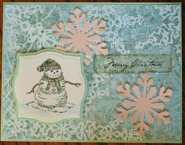
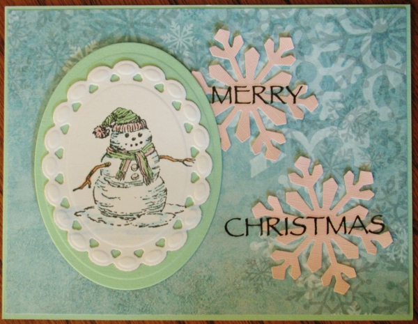
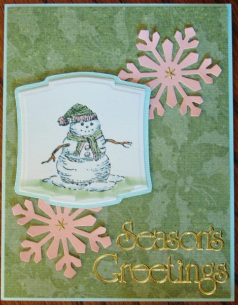
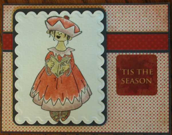
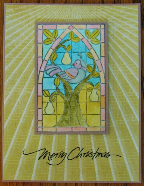
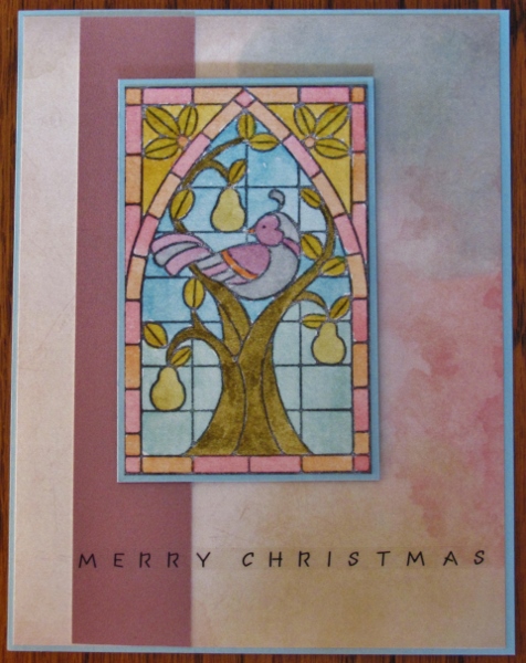
You've probably noticed by now that the cards you saw earlier in watercolor painting are now appearing in alcohol marker coloring. I have a limited number of Christmas stamps so I did a little marathon stamping session and made multiple impressions of each on a watercolor pad with Archival black ink and then on plain cardstock with Momento Tuxedo Black. The two inks are each designed to work with a specific coloring medium with out smearing or bleeding.

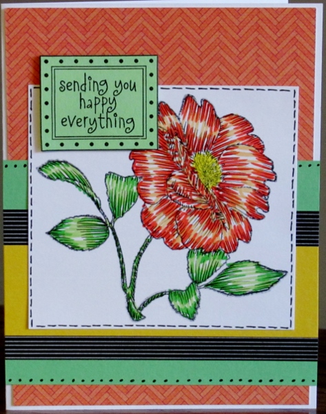
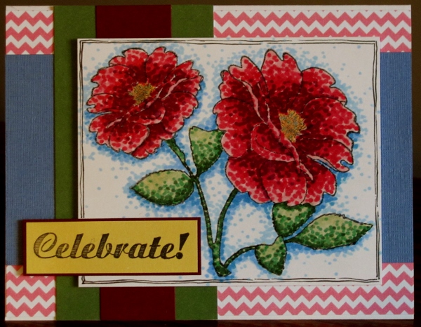
I colored up most of the watercolor images first and now I'm working on the multiple images in alcohol inks. As usual, I am using a combination of Copic, Bic Mark-It, Spectrum Noir and PrismaColor.

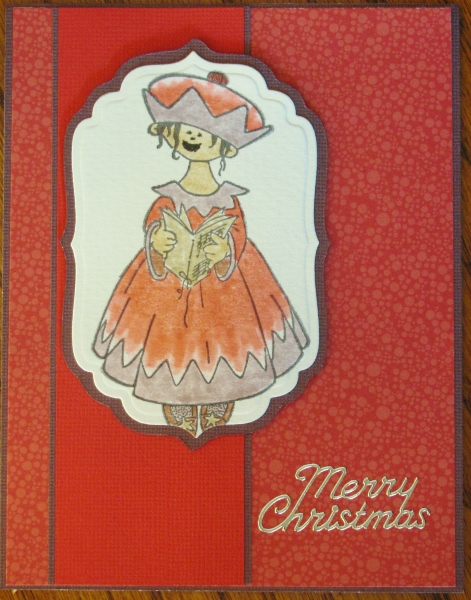
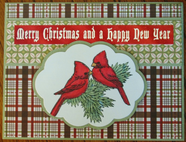
For the shading on this first set of cardinals I tried a method I had used before hoping to control bleeding with the reds. To do this type of shading you use a pale blue first to color the shaded areas. Then you color over the whole image with the feature color and get automatic shading. I used the same method in the pines but I should have used a color from the opposite side of the color wheel like a light orange. 

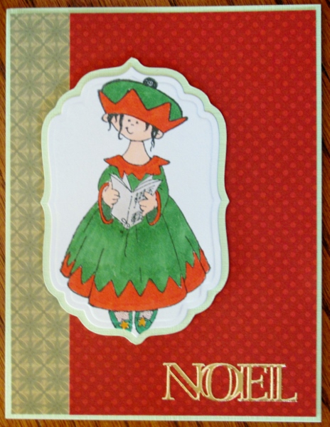
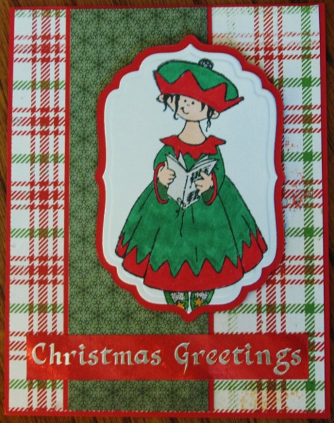
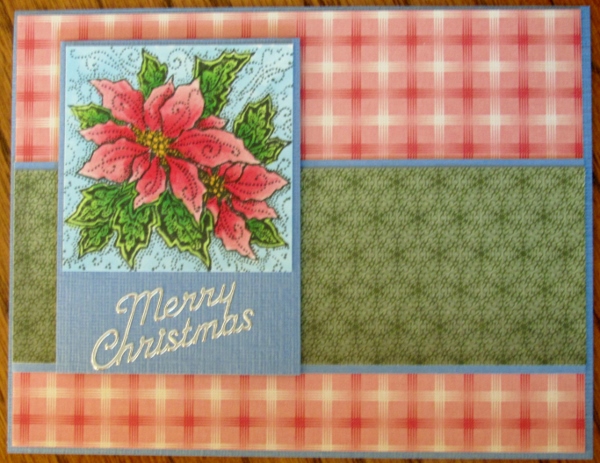
I used a diecut for the image and this one got plaid paper and a foil red greeting.


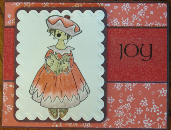
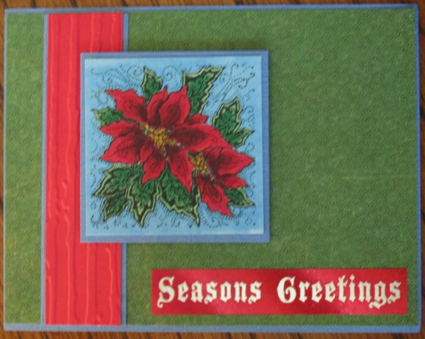
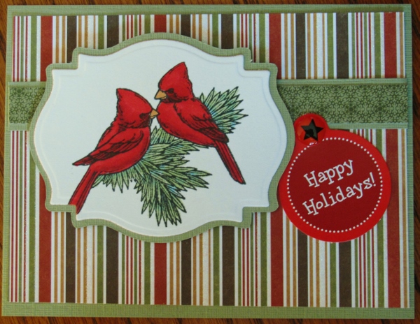
Back to the regular coloring method for the birds, using three reds. I used a different die cut shape and a striped background with glitter. The sentiment is a cardstock tag from who-knows-where and I covered the hole with a puffy acrylic sticker.


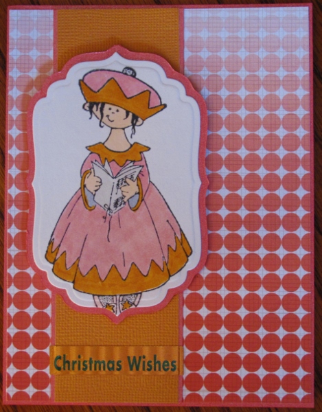
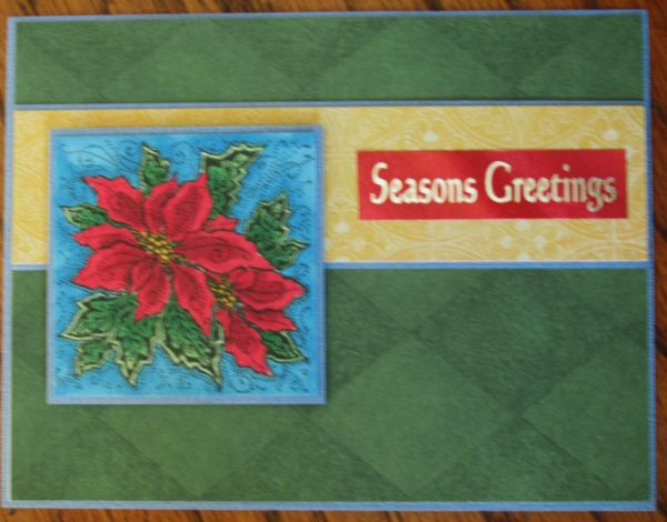
The coloring on this one is the same as the last. I fancied it up with a different diecut and a more solid background. A single strip of the glittered stripe and three sentiment pieces ( clear sticker, puffy acrylic, and clear thick acrylic sticker) finish it off.


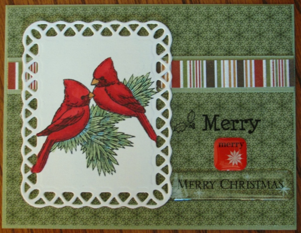
The borderin on all of these is sage to match the coloring of the pines.

Ddd 


Posted by studio3d@ccgmail.net at 12:01 AM PST
Thursday, 12 December 2013
All I Want For Christmas
Topic: Coloring

I bought this stamp several years ago thinking I would like it a lot. I like it very little! I never know how to color it but it looks so lame left in black and white. Many elements do not 'read' well unless they are colored to define them.

So I used pale alcohol markers to color the tree and other greenery and then do spot coloring throughout the rest of it.  I trimmed it out and bordered it in black.

Then I selected a very pale batterned paper for the backing and bordered that with black as well. It was still a little plain so I added a casual smappeting of gold stars along two borders and one in the panel (J*Y).


I was not happy with the definition in the tree image with gifts on the left side so I covered it over with a 'Frost Fairy' shimmer sticker. Much Better!

Ddd


Posted by studio3d@ccgmail.net at 12:01 AM PST
Wednesday, 11 December 2013
Encore Edition
Topic: Coloring

I used the same stamp as yesterday but on watercolor paper. This time I colored it with Distress Markers and an aquabrush. I colored both panels at the same time to allow the paint to dry. the main difference is the first one did not get as dark of impression so it has a more casual look to it.

I took advantage of the casual look and found some patterned paper with a yellow burst on it. With careful centering and cutting I was able to make it look like the sun streaming in behind the window. I bordered with glimmer mauve and added a rub-on sentiment.


The next uses a printed paper with a watercolor look to it that echoes the colors in the feature. I added a single strip of mauve glimmer paper and bordered it all in pale blue. The sentiment is a clear sticker.


Both cards have the feature popped up on foam tape.

Ddd


Posted by studio3d@ccgmail.net at 12:01 AM PST

Newer | Latest | Older