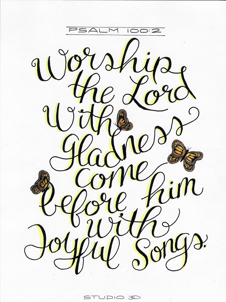
« March 2019 »
S M T W T F S
1 2
3 4 5 6 7 8 9
10 11 12 13 14 15 16
17 18 19 20 21 22 23
24 25 26 27 28 29 30
31
You are not logged in. Log in
Entries by Topic
All topics  «
3D paperwork
A - Z challenge 5
A - Z challenge 7
A - Z challenge round 4
A to Z challenge round 3
A to Z round 2
A to Z round 6
A-Z round 1
Around the House
Art Challenges
Artist Trading Cards
Backgrounds
Beads
Bible Journaling
Books
Boxes
Collage
Color Challenge
Coloring
cookbook
Die Cuts
Digital Projects
Digital Stamps
Drawing
Dry Embossing
Fabric Stuff
Fantastic Folds
Field Trip
Home Decor
How Does Your Garden Grow?
Hymnal Art
In The Kitchen
In the studio
Jewelry
Lettering
Links
Multi-Technique
Music to Work By
Musings
Nail Art
New Work
Online Class
Other Hobbies
Other Projects
Painting
Paper Embroidery
Paper Piecing
Photo
Pretty Paper
Quilting
Random
reading
Scrap Recovery
scrapbooking
Sewing
Sketch Challenge
Some Backlog
Stamping
Stencils
Stickers
Supplies
Teabag Folding
Techniques
Testing
tips and tricks
Tutorial
Web resources
Welcome to my Blog
Work By My Friends
workflow
Writing
Blog Tools
Edit your Blog
Build a Blog
RSS Feed
View Profile
Group One
In & Out of Studio 3D
Tuesday, 5 March 2019
Lesson 7 in Drawing 101
Topic: Drawing

Lesson 7 in the class Drawing 101 is again working on toned paper (as are all the rest in this series).

We were provided with a photograph to draw with the concentration on light and shadow. This one was of a padlock on an old door.


I liked my drawing so much that I scanned it and printed on plain paper in a reduced size. The I trimmed and added it to my interleaved bible and lettered a verse with it.


I really like this bible for glueing in full-page art.

Ddd


Posted by studio3d@ccgmail.net at 1:00 AM PST
Monday, 4 March 2019
Lettering in Joshua
Topic: Bible Journaling

It was time for another lettering lesson in the progressive series I started January 1. This week the focus was on the book of Joshua.

Here are the daily lessons:

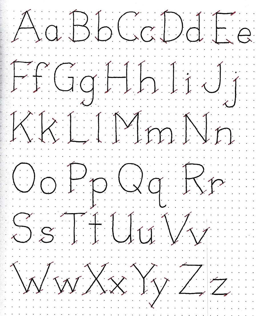
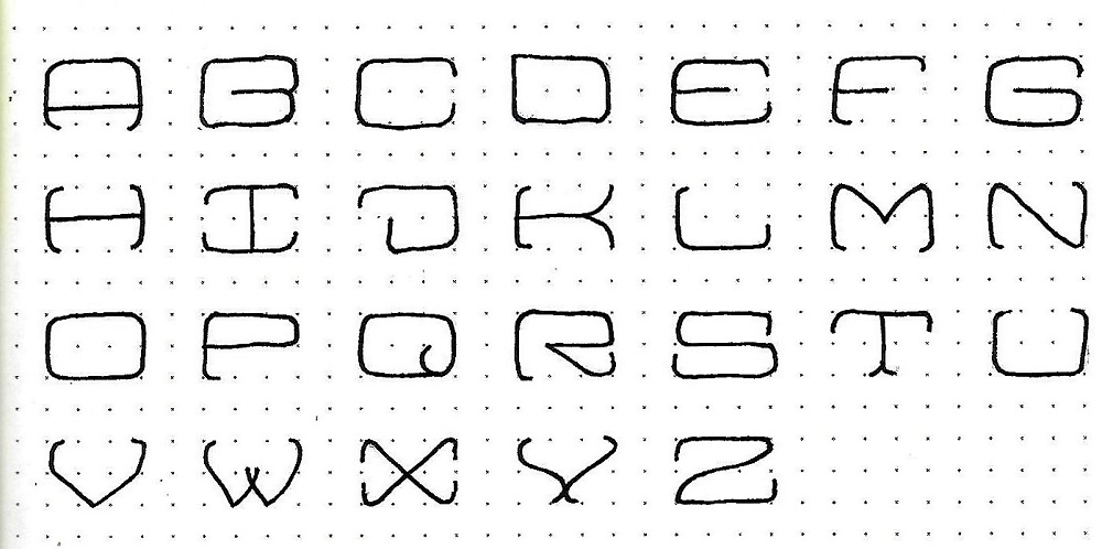
JOSHUA: Day 1 – Block Lower Case – Intro

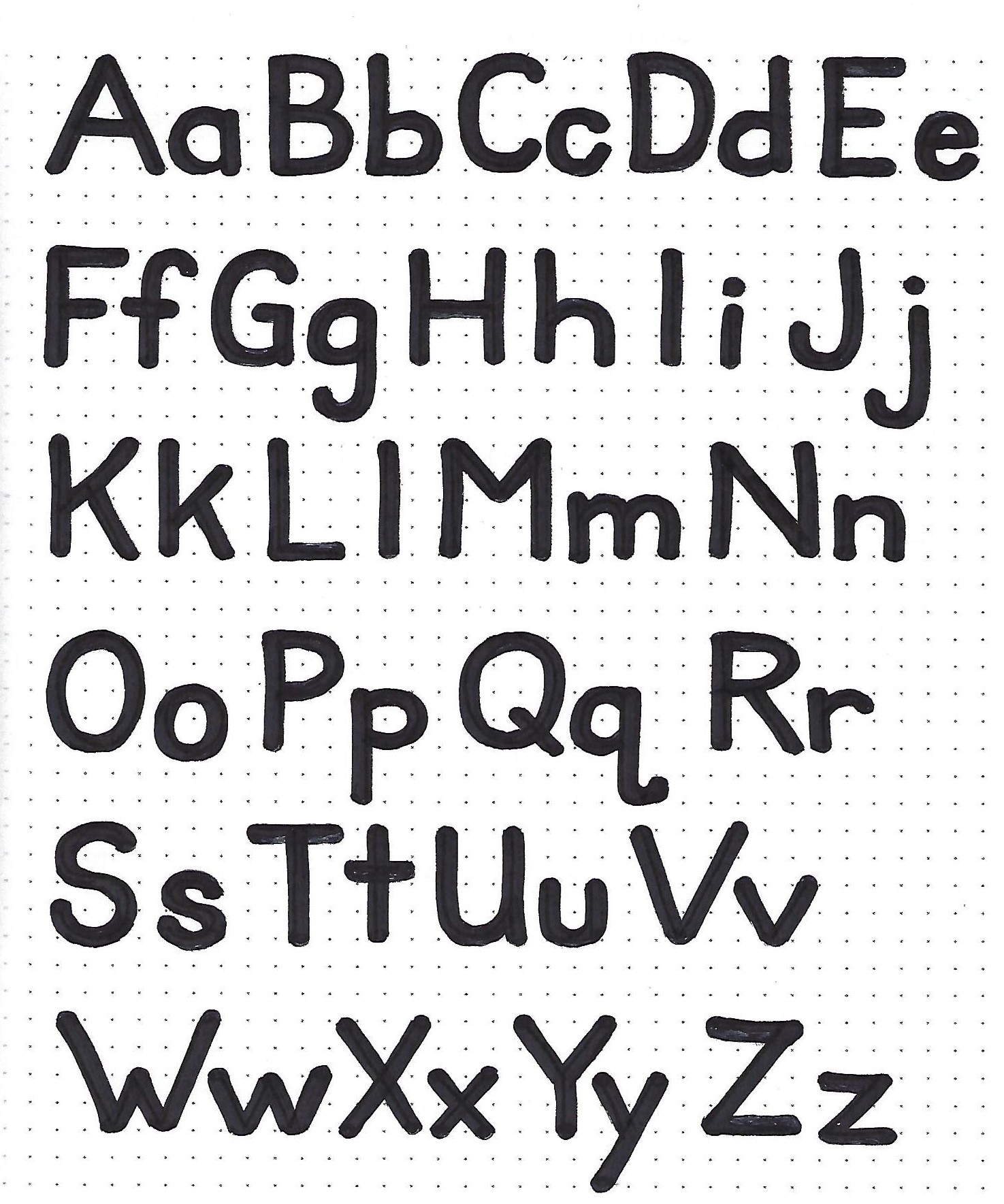
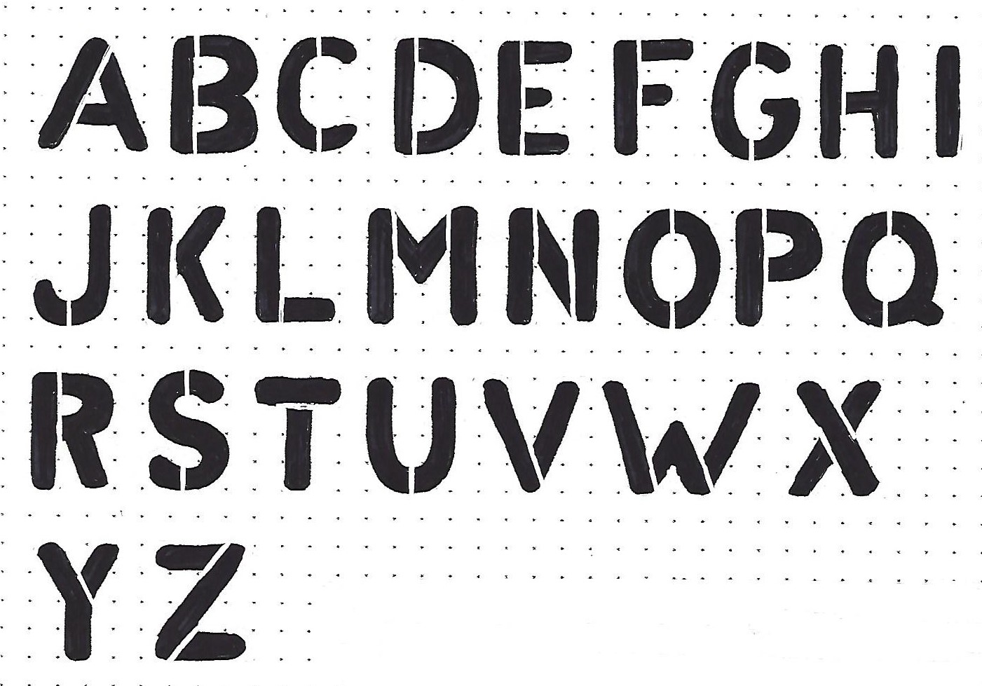
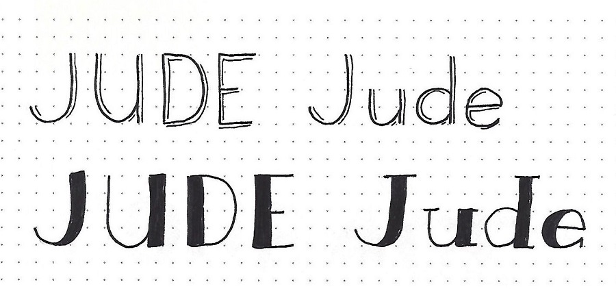
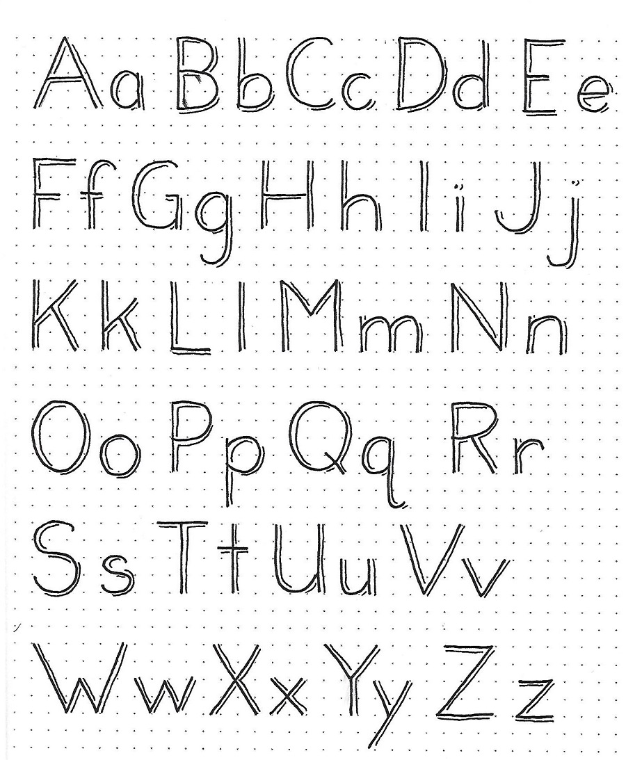
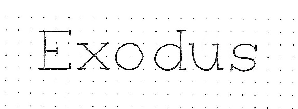
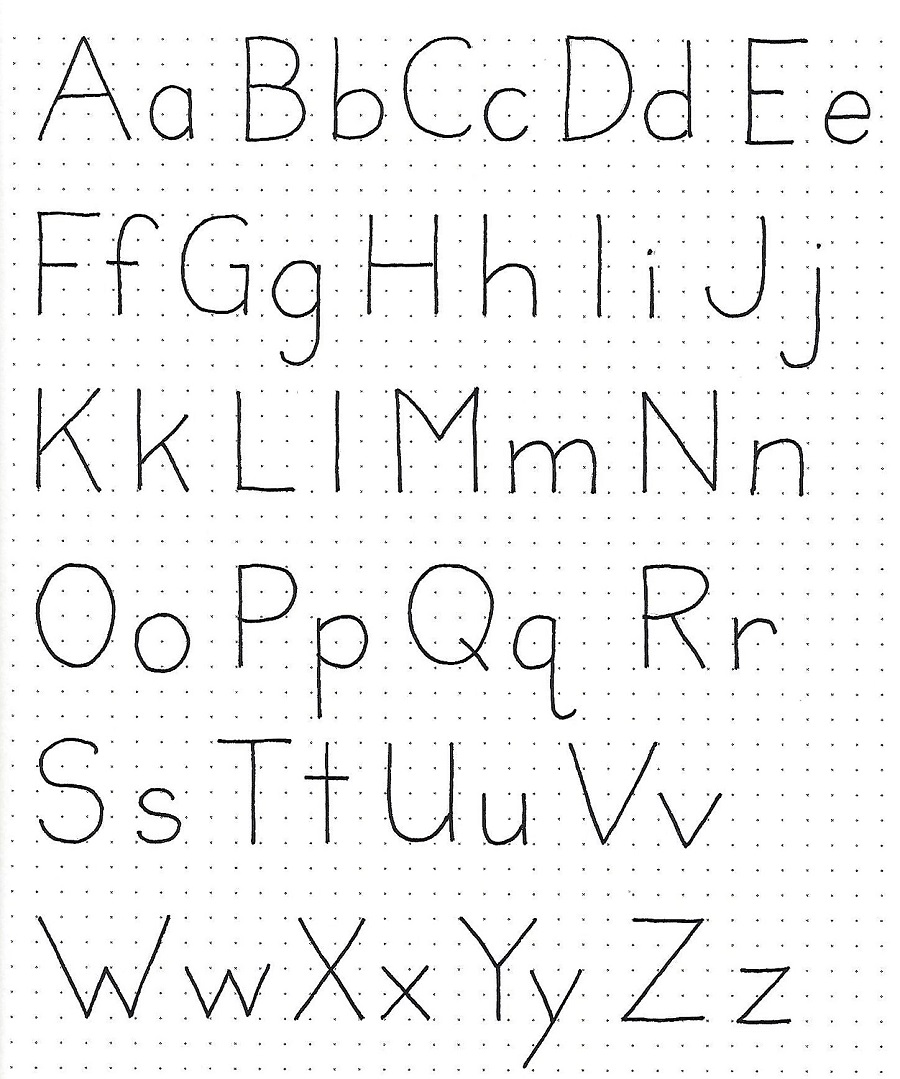
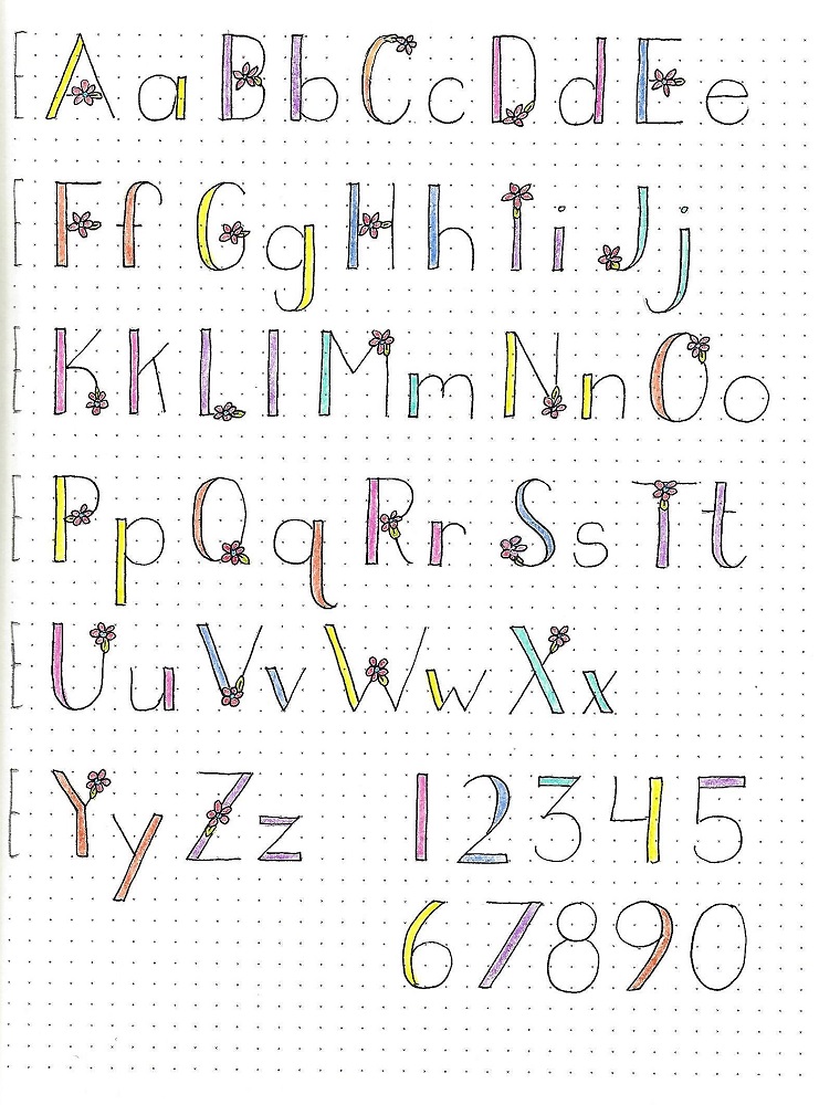
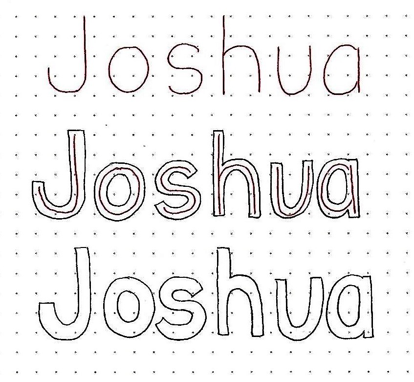
This week we are going to add to the block lettering in several ways. First up will be to create a lower-case alphabet. We’ll practice this process today using just the single word, ‘Joshua’.

In pencil, lightly draw out the word in a basic print as shown on the first line. Then draw an equal width on all sides of these lines. Ink the outline only and erase the pencil guides.

When I am using lower-case, I don’t make the elements as wide as when using all-caps. The lower-case letters are obviously smaller and have tighter internal spaces. Making the elements narrower gives some breathing room on the insides of the letters.


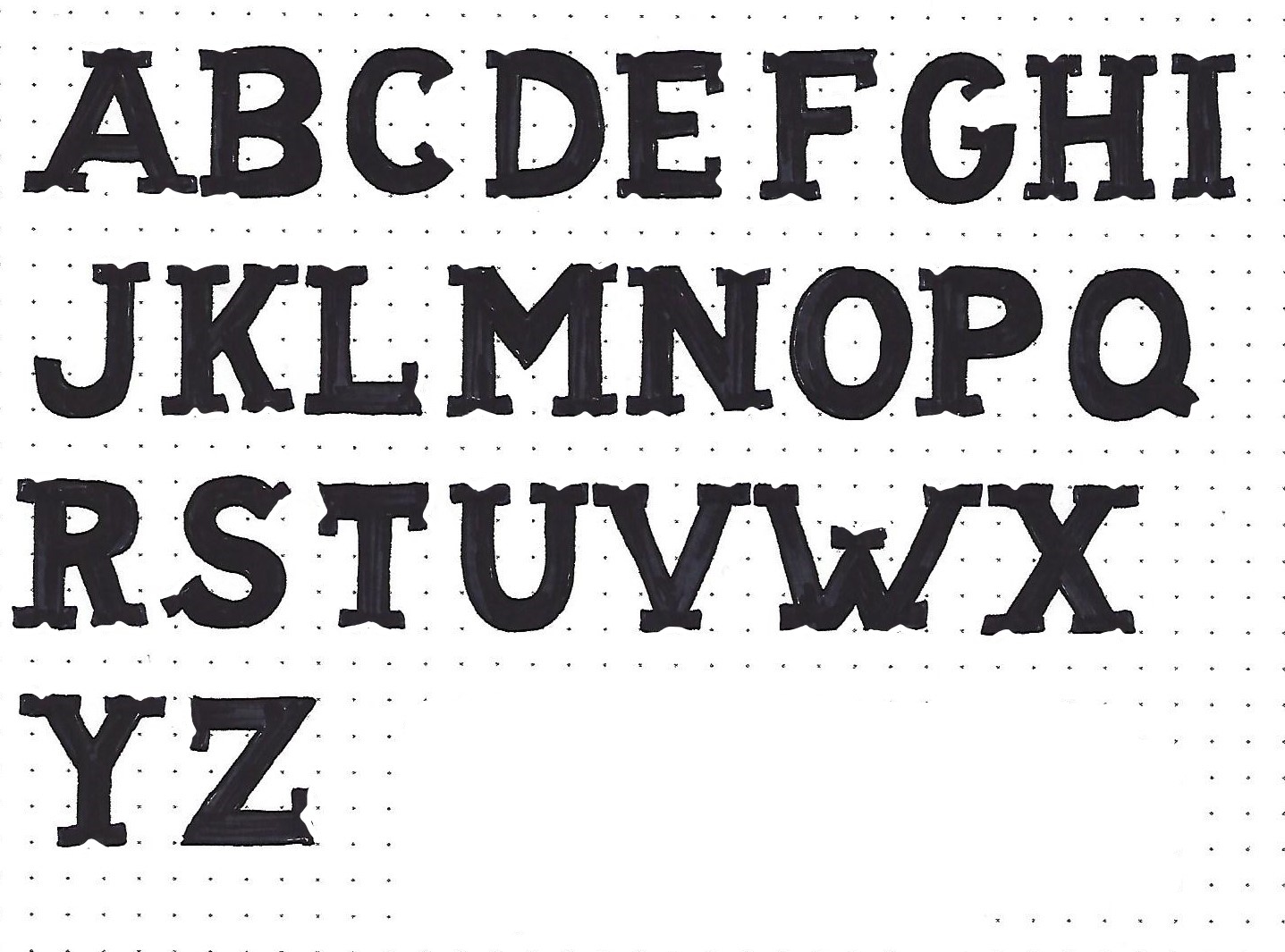
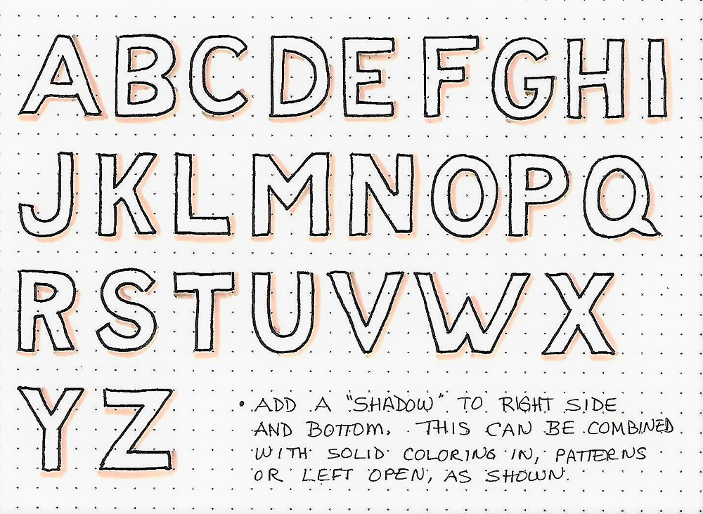
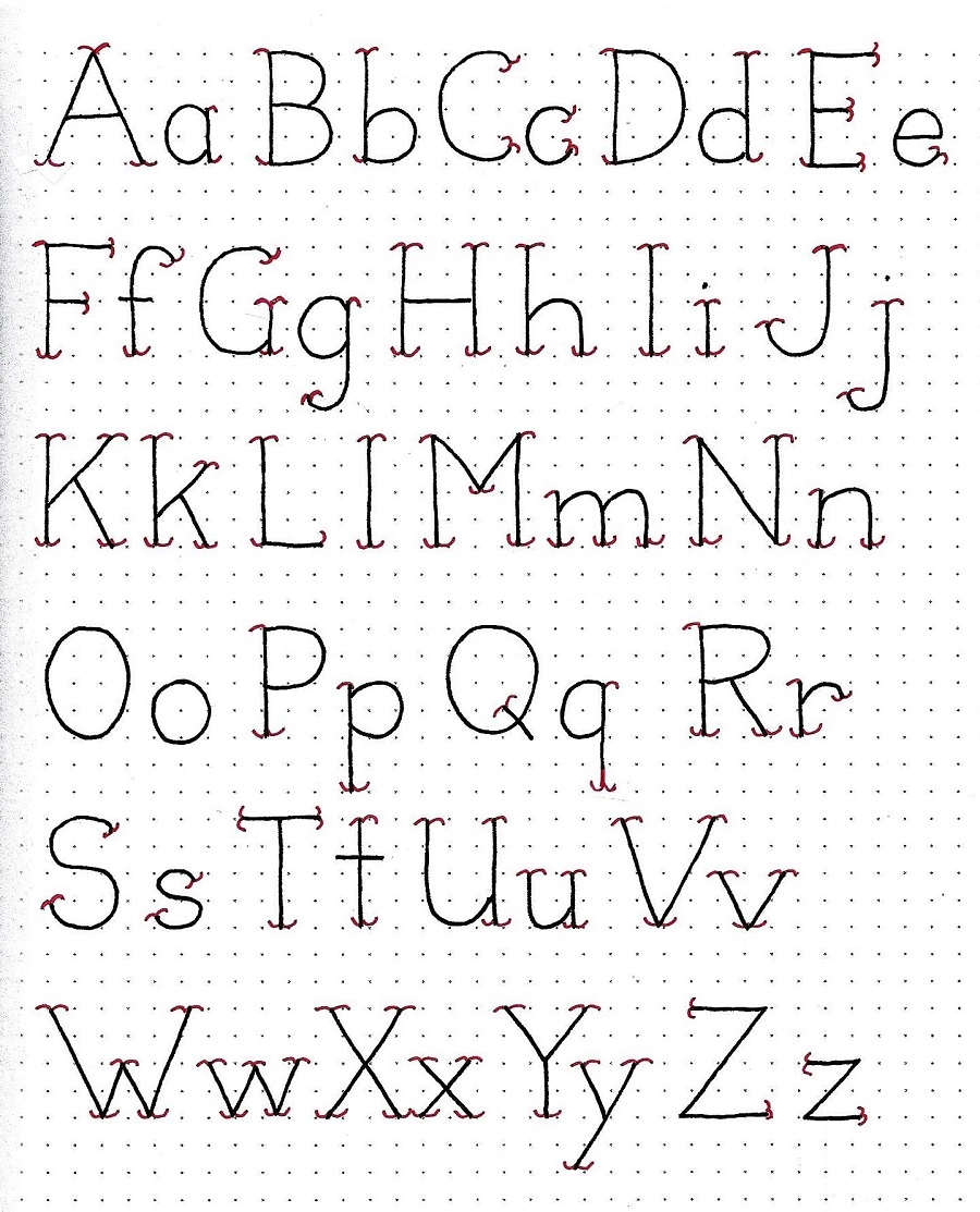
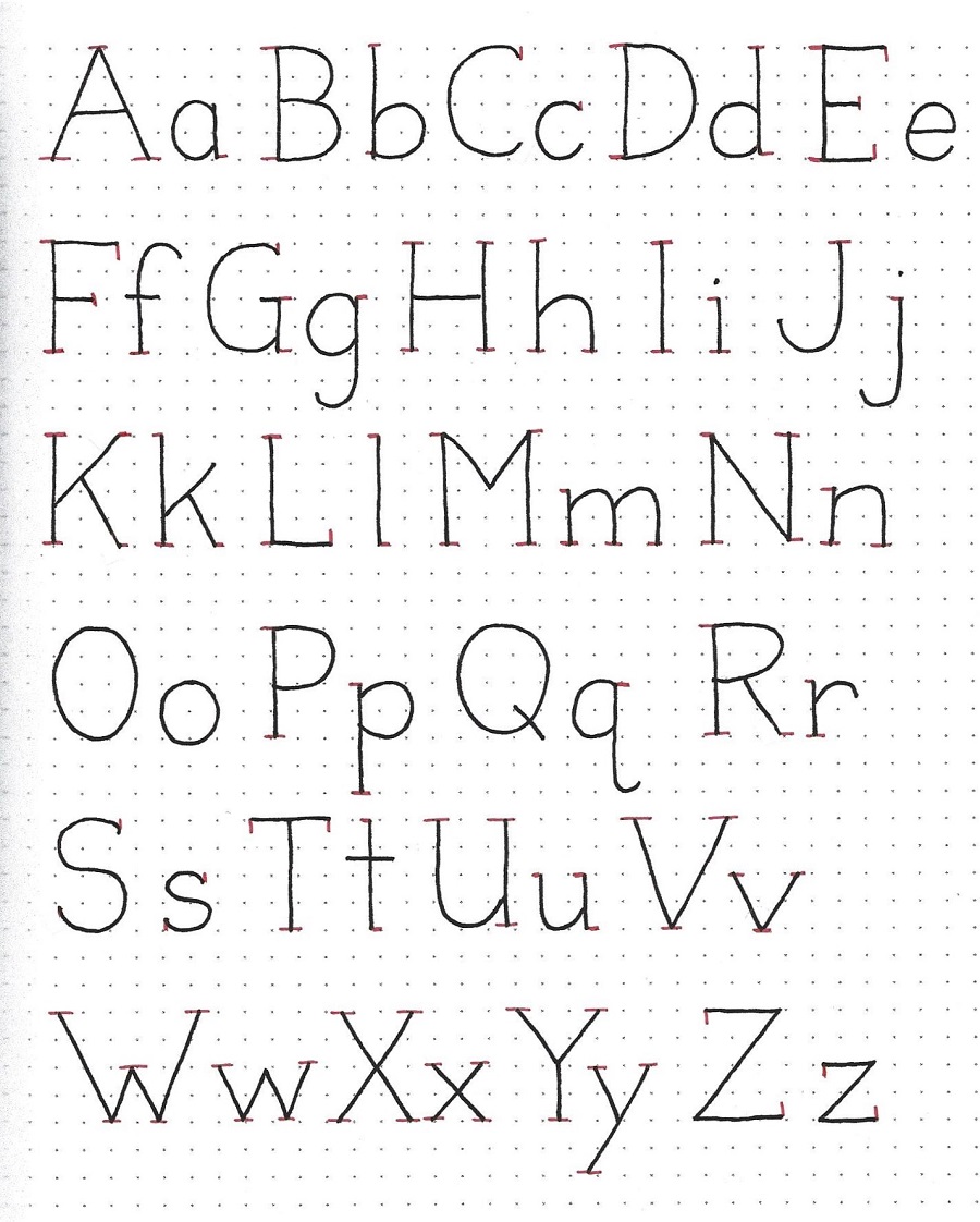
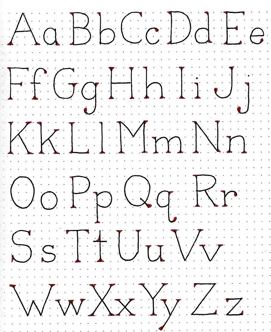
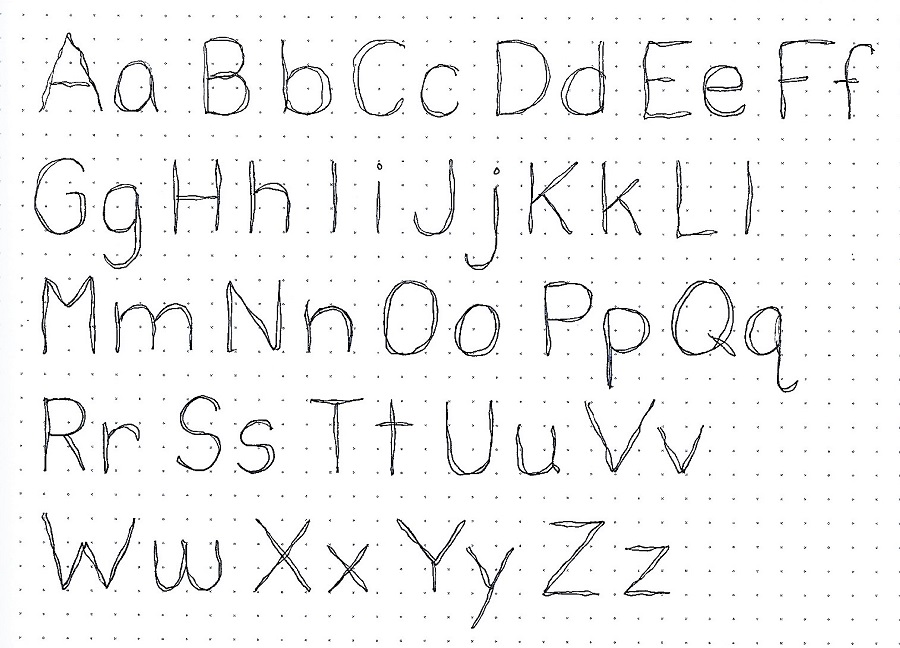
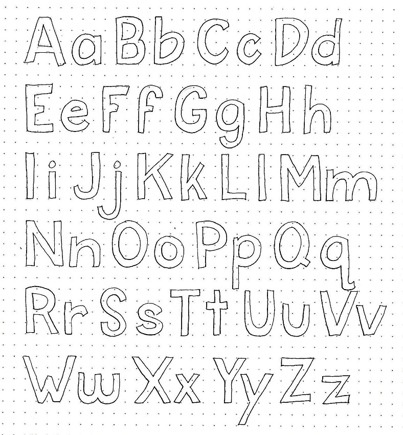
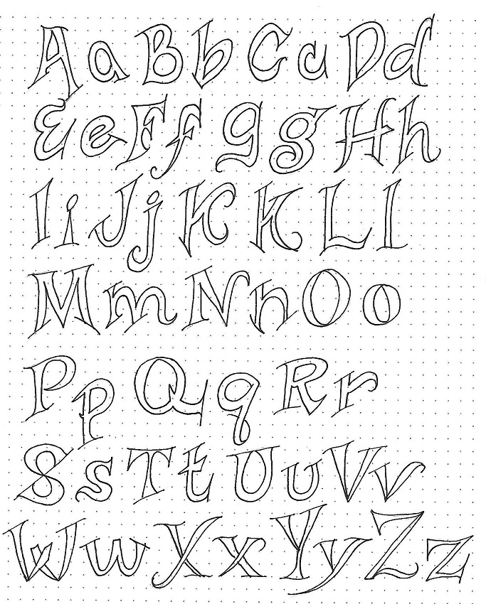
JOSHUA: Day 2 – Block Letters in Dual Case – Alphabet

Use the technique introduced yesterday to create a full alphabet for the upper- and lower-case block letters. The final alphabet will be personal to you because it is based on your initial writing of the basic round print letters.

What we are doing by using this method is helping you to develop your own personal style. You’ll note that my alphabet is not perfectly formed. This is okay with me because it is just a reminder sheet on how to construct the letters. I am not trying to match an ‘ideal’.


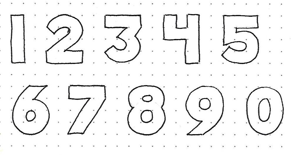
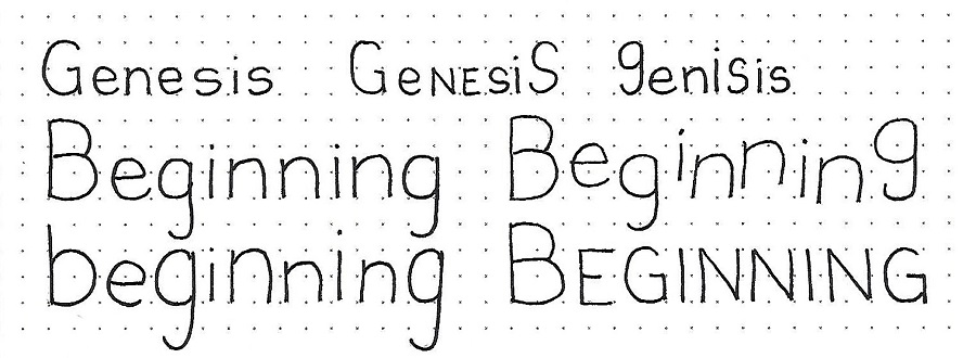
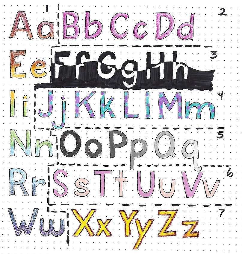
JOSHUA: Day 3 – Color Fills – Exploration

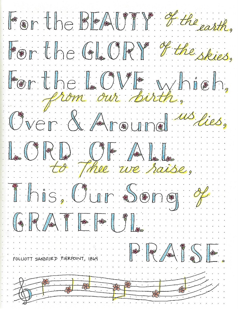
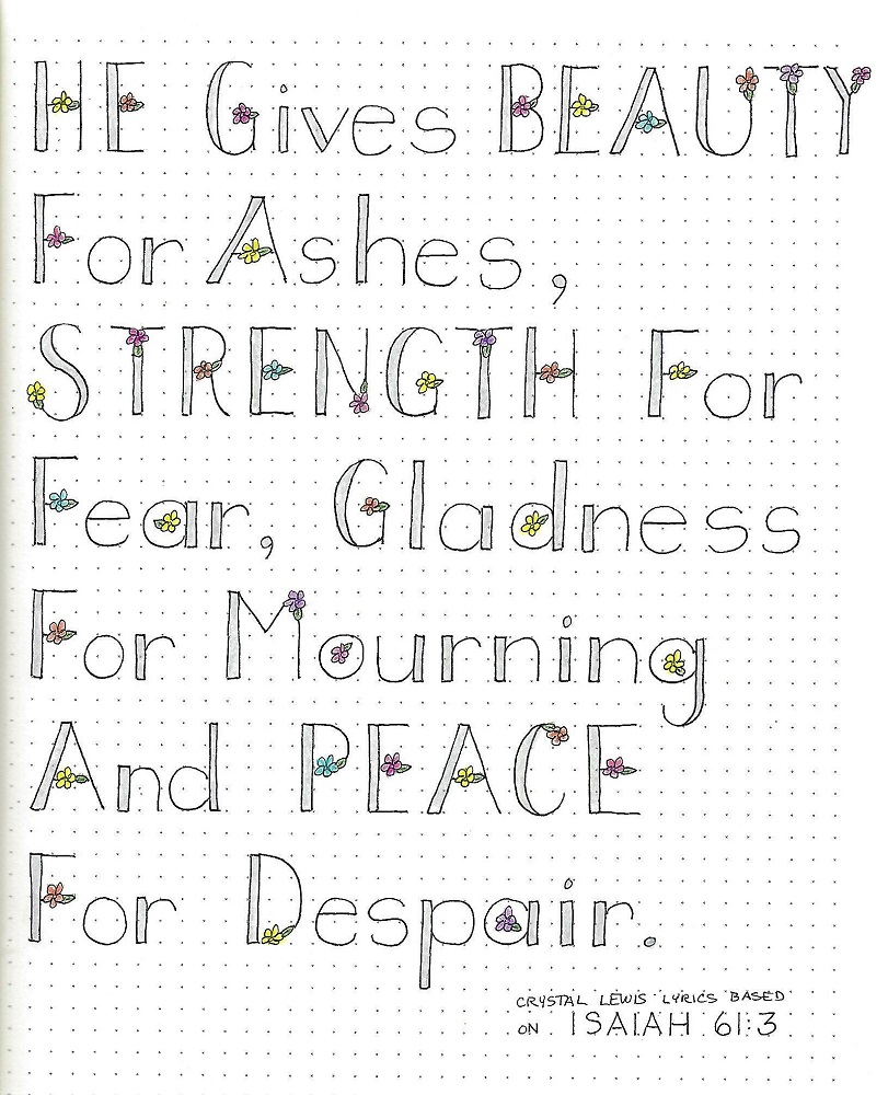
It’s time to play with color! I love this part of the process. Today we are going to write up another sample page of block letters (or you can make a photocopy of an alphabet you’ve already done) and experiment with a variety of color options. I did all of my samples in colored pencil.


1)      1- Down the left side practice blending colors on your letters. Although you could do these letters with any two colors you wished, I did mine in the rainbow – blending two colors on each line: red-orange, orange-yellow, yellow-green, green-blue, blue-indigo, indigo-violet.

2)      2- Use two tones of the same color to make the letters dimensional. Darker shade goes on the bottom and left of elements and is blended with lighter shade covering the remainder of the letter.

3)      3- Draw a wavy line right through the word. Color the letters above the line and the background below the line.

4)      4- Choose two contrasting colors to apply dots on every other letter. My caps have turquoise dots on purple letters and the lower-case have purple dots on turquoise letters.

5)      5- Six shades of the same gray were used to color successive letters.

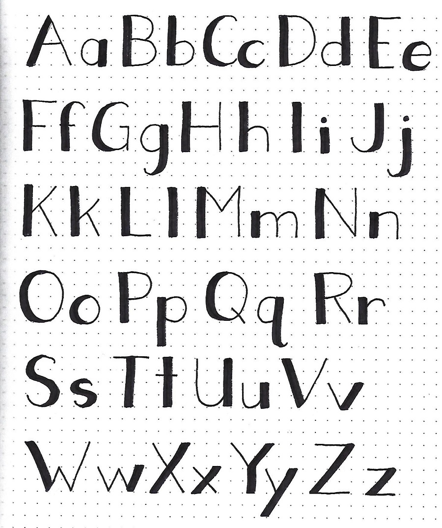
6)      6- Alternating solids were used to color these letters.

7)      7- Dark colors (red and orange) were used to outline the letters and a bright (yellow) used to fill in.


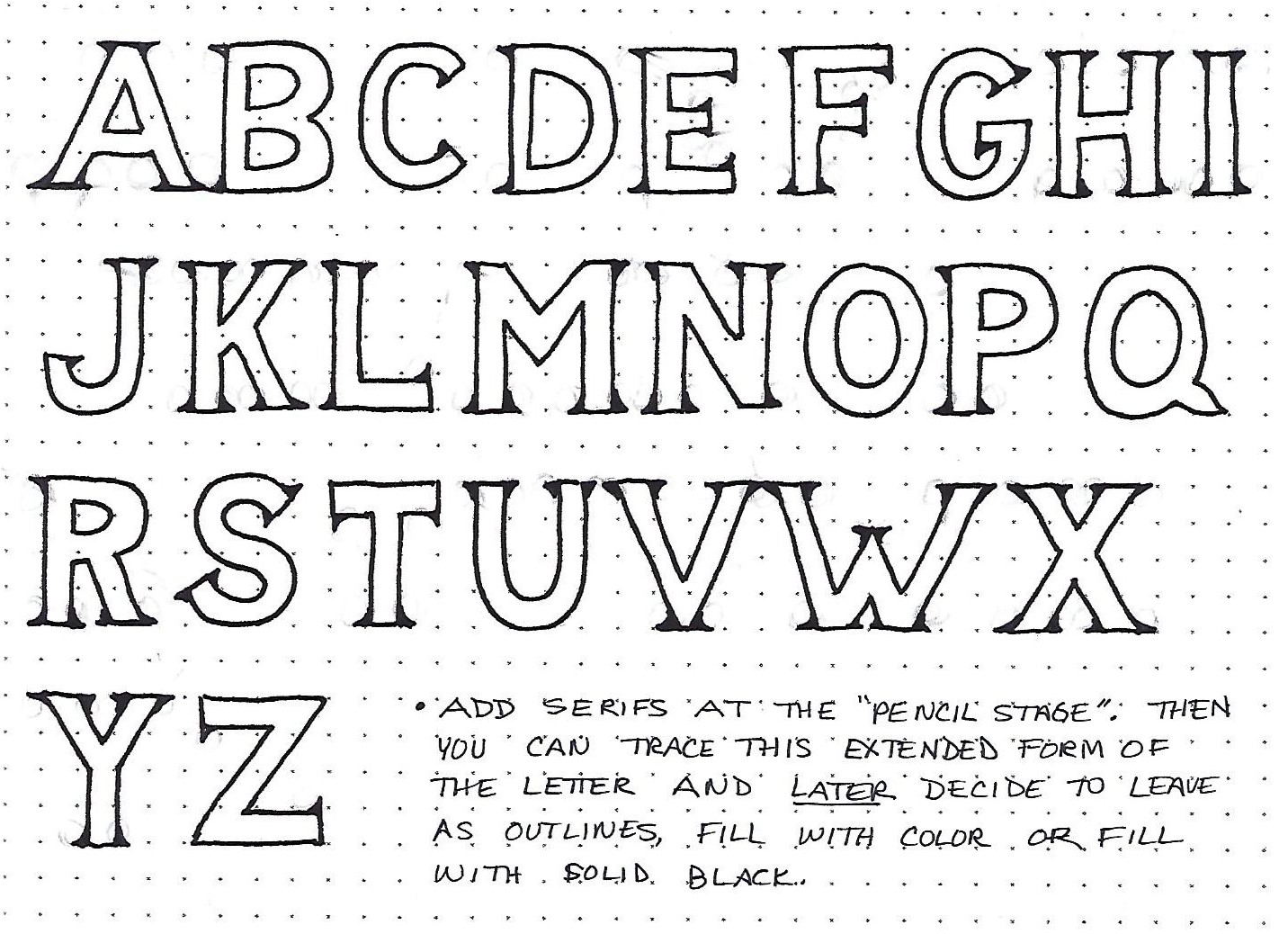
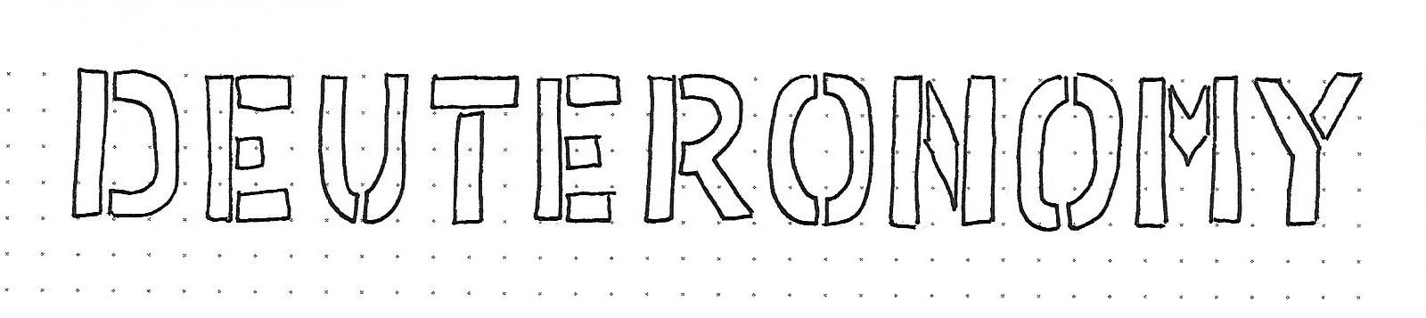
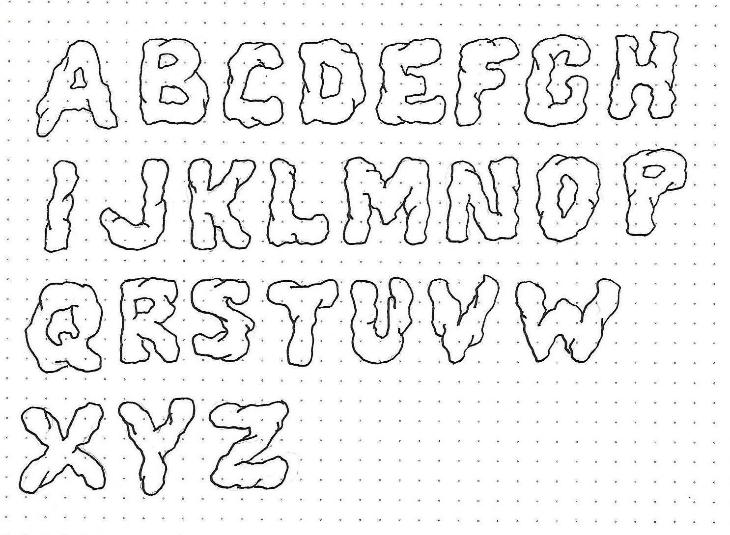
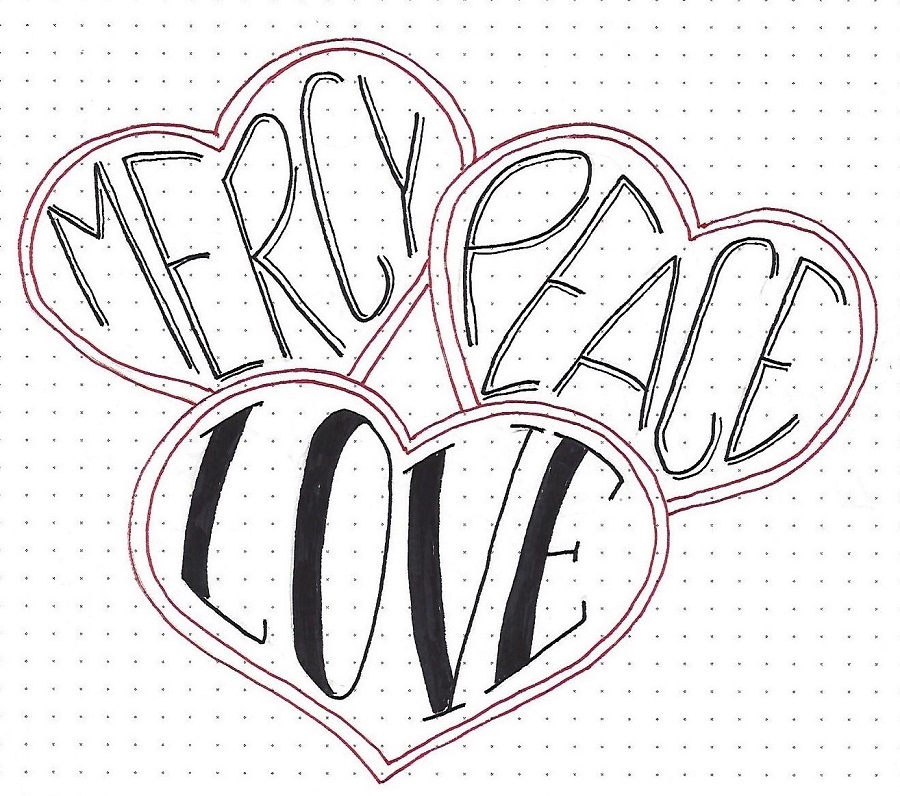
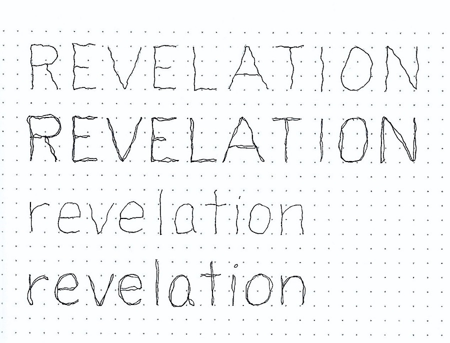
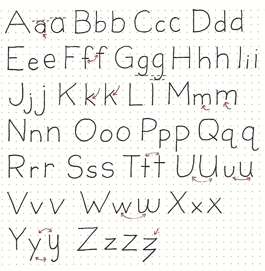
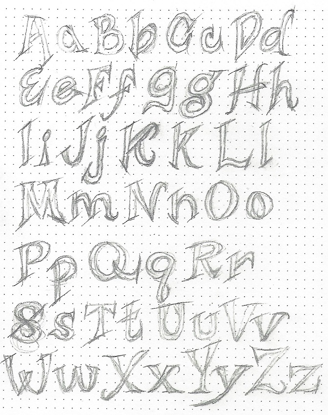
JOSHUA: Day 4a – Your Own Alphabet – Design

Things are about to get really exciting! It is time to cut loose and design your own alphabet.

I’m going to have you start with the basic block alphabet we learned this week. But on a new piece of paper, use your pencil to sketch lines that extend and expand in exciting ways around the basic forms. Draw an A in single lines, make it a bit wonky, draw the lines that make wider elements, change the ends to angles, add stylish serifs. . . If you don’t like where it went, erase and do it again! You can see I drew over and over mine, making incremental changes until they were very close to what I liked.

Look over the whole sheet. Are there any letters that don’t seem to fit in? Now is the time to change them. Do you see elements that are repeating? Look for other places to incorporate those for a more cohesive look.

Now go on to the next page of graphics (labeled Day 4b)


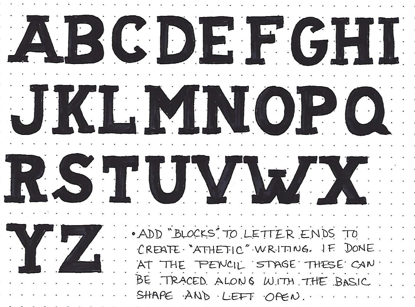
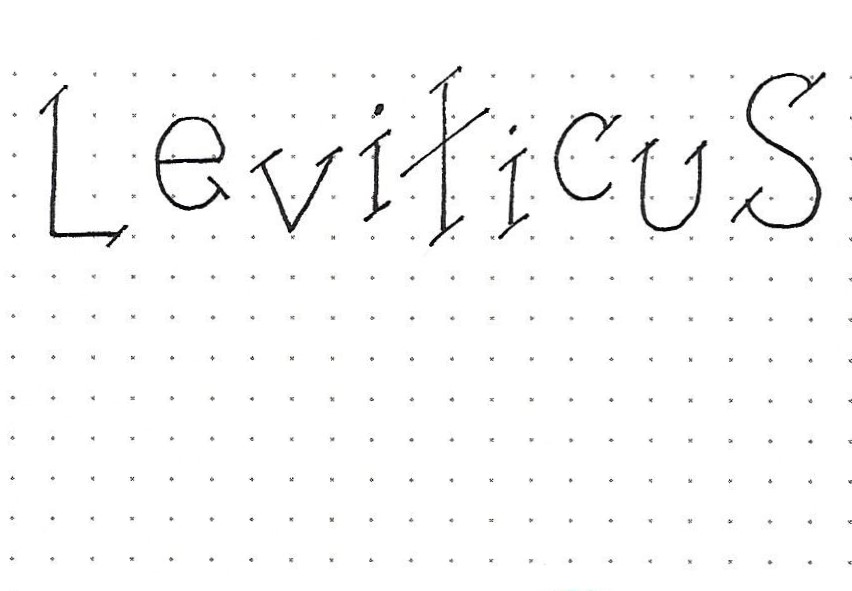
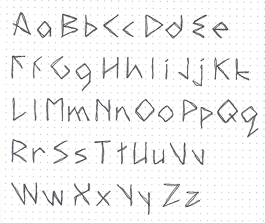
JOSHUA: Day 4b – Your Own Alphabet – Finalized

Use ink to outline all your letters, making final adjustments as needed. Then erase your pencil. You did it!

If you created a funky alphabet like I did, it would look great if the letters were allowed to rise above and sink below the baseline when using them on a project. Use your new alphabet to write your full name, fitting the letters into shapes to create word art.


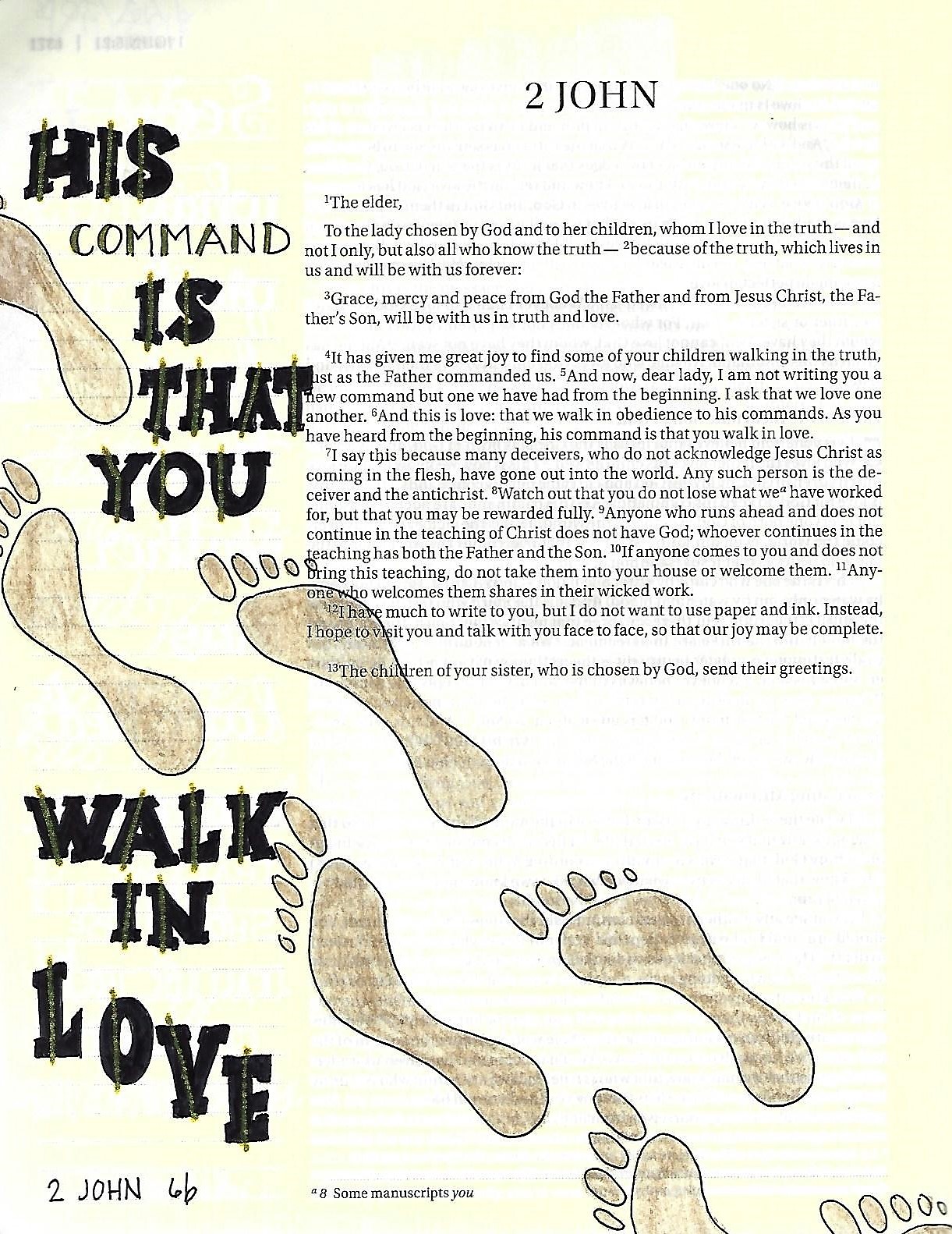
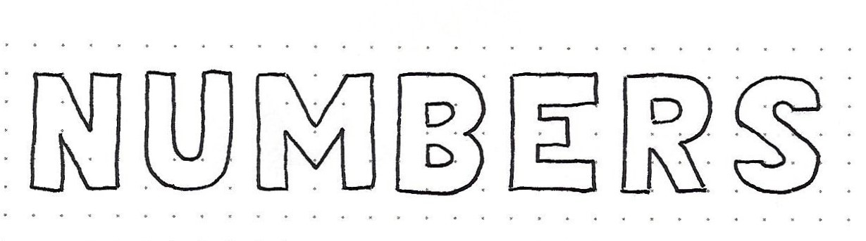
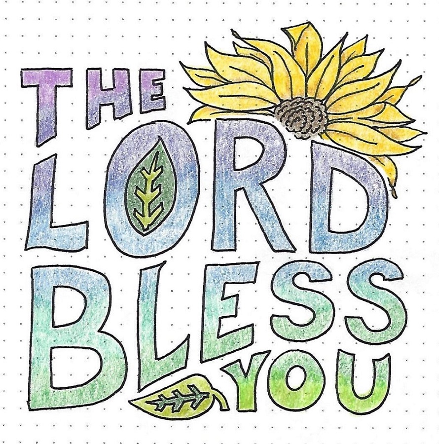
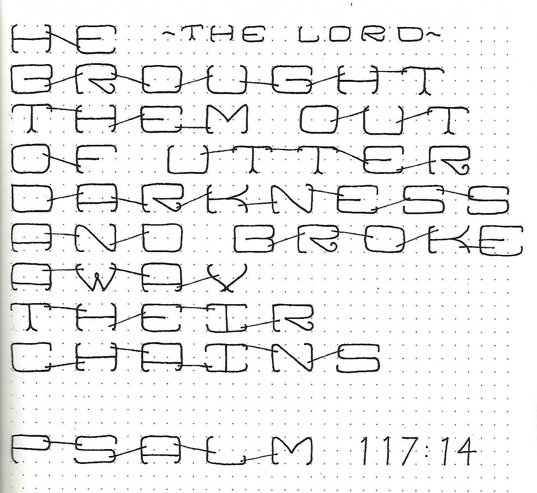
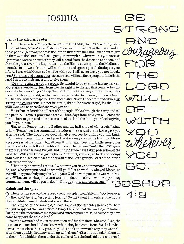
JOSHUA: Day 5 – Building Blocks – In Your Bible

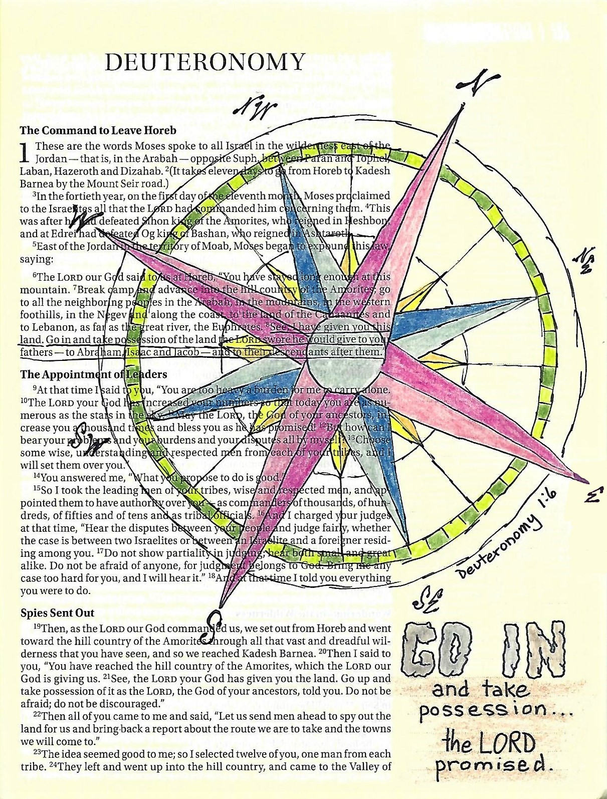
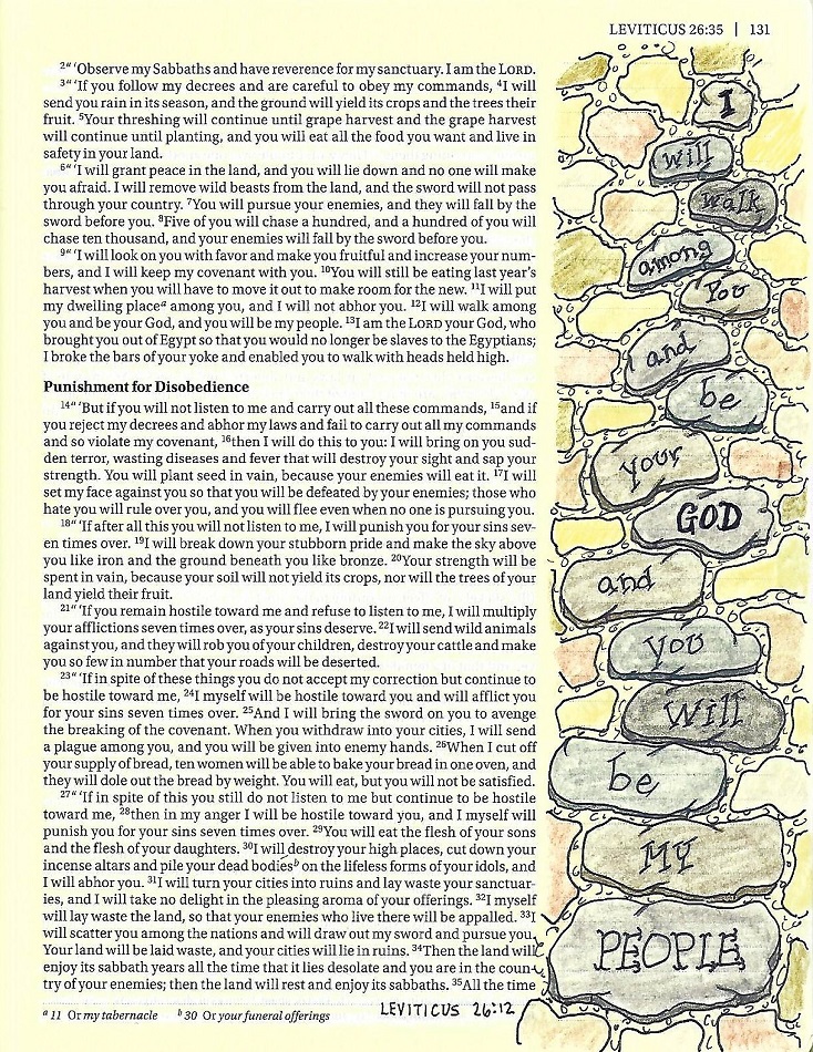
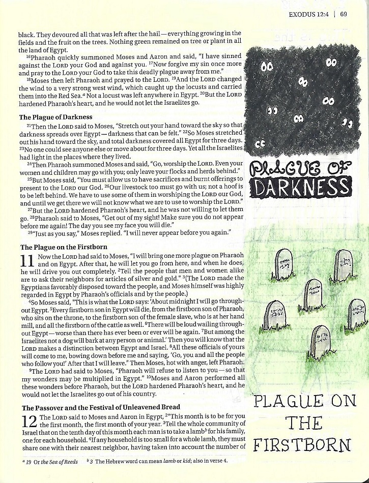
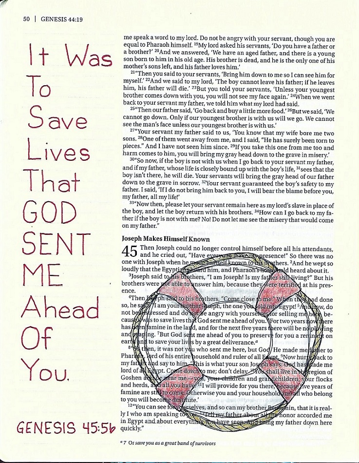
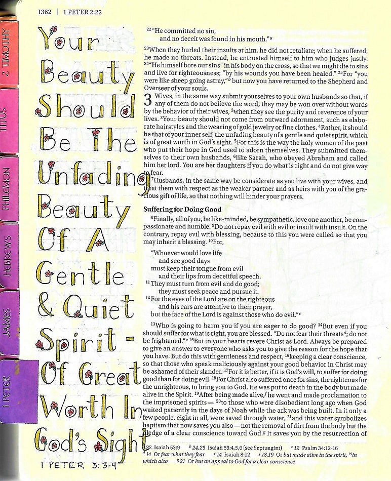
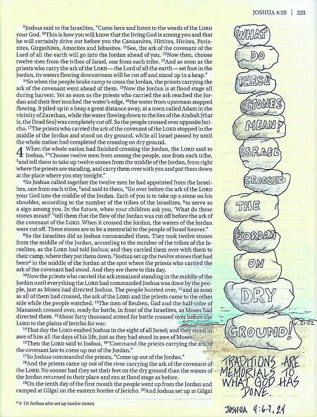
Today we will combine any of the block lettering techniques learned to date (basic blocks, shadowed blocks, lower-case blocks, colored blocks, original alphabets) for use on a Bible page in the book of Joshua. I used mine with the Drawing Room lesson on ‘Rocks’ to illustrate the story of creating a memorial to the miracle of crossing the Jordan on dry land. That verse had exactly 12 words to fill the 12 stones!


Another lesson completed.

Ddd


Posted by studio3d@ccgmail.net at 1:00 AM PST
Sunday, 3 March 2019
Singing an Old Song
Topic: Hymnal Art

I have been doing more artwork to illustrate songs in my hymnal.

In the history of this hymn we learn that some of the lyrics are referencing Jacob's ladder. Knowing that, I got a picture in my head of climbing a ladder to get closer to God's kingdom, through the cross. 

The angels are mentioned in the lyrics as well. 

Other than the lettering (which is brush marker) and the line-art (black Prismacolor pens) the illustration is completed in colored pencils.

Ddd


Posted by studio3d@ccgmail.net at 1:00 AM PST
Saturday, 2 March 2019
Colored Pencil Blends - Part 2
Topic: Coloring

As promised, this is part two of the colored pencil blending lesson. This time we were to use one set of three pencils to color the same image multiple times. Then we used a variety of blending techniques and materials to test out their various effects.

I had a rubber stamp that I used as the article to color upon.

Here is my sample sheet.


Amazing what a difference these make.

Ddd


Posted by studio3d@ccgmail.net at 1:00 AM PST
Friday, 1 March 2019
More Colored Pencil Explorations
Topic: Coloring

I continued with the lessons in colored pencil to work on blends for shadows. We were to try out different and unexpected hues for light, mid-tone and shadows.

I was astonished at how these blends transformed one another of the colors. Actually, all of them worked to one degree or another. You can begin to see how one shadow color or another would work better for the lighting of a different time of day or a different source of light.

Here is my sample sheet. (the numbers reflect those on my pencil set)


Tomorrow, I'll share part two of this lesson.

Ddd


Posted by studio3d@ccgmail.net at 1:00 AM PST
Tuesday, 26 February 2019
Continuing Homework for Drawing 101 Class
Topic: Drawing

I've moved on to lesson 6 in my Drawing 101 class (artclasses.com) and it was on light and shadow.

I used toned paper and drew with graphite pencil and white pastel (for samplers), white colored pencil (for still life) and white gel pen (highlighted edges on still life)

Our first assignment was to take some items we had drawn in lesson one and use shading to make them dimensional. I did a few cubes spheres and cones on my first sheet:


Then a few cylinders and combined shapes on the second sheet. These sheets are both cut off as my paper was larger than the bed of my scanner.


The final project for lesson 6 was to draw an assigned still life from a photo supplied to us. I used a grid system to transfer the outlines.

I didn't like the fugitive nature of my white pastel pencil on the samplers so I switched to a white from my set of colored pencils.

After I had drawn and shaded the outline remained and I did not like it along the highlighted areas. So, I used a white gel pen over the pencil lines, smudging with my finger where it was too stark.


I guess that makes it 'mixed media'!

Ddd


Posted by studio3d@ccgmail.net at 12:34 PM PST
Friday, 22 February 2019
Continuation of Block Lettering Versions
Topic: Lettering

Hope you're not tired of this series yet because we have a l-o-o-o-g way to go yet. I promise it will be worthwhile, though.

1,2,3 JOHN: Day 1 – Block Serifs – Introduction


We had so much fun with serifs on the basic round print several weeks ago that I wanted to repeat those options on the basic block print.

Since we are covering three books this week, we have three words on which we can get a taste of each of the three serif styles.

Start by writing out the words (and numbers) in the basic block print. To the first line add triangle serifs.

To the second line add basic serifs, which come in the form of blocks. When we drew the letters with lines, the serifs were lines. Now with the letters as blocks the serifs are blocks as well.

On the third line of text we turn the edge of the block serifs to the ‘flying bird’ form and, voila, you get ‘western’ letters.


1,2,3 JOHN: Day 2 – Chisel Serif Block Print – Alphabet


To create the chisel serif block print, begin by writing out the full alphabet of the basic block print in pencil. Pencil in triangle serifs as indicated. Note that some of these are half-serifs and some are full serifs, depending where on the letter they fall (see the difference in the tops of the H and the M and in the bottoms of the E and the T as well as the two separate feet of the N.)

Trace the letters along with the outline of the serifs using ink and then erase the pencil. You can decide at this stage if you want to leave the letters open or ink then in or fill them with color.

I like to leave my sample alphabets open as I can then clearly see the structure of the letters. When I am using them in a project, I can finish them off in any way I choose.


1,2,3, JOHN: Day 3 – Blocky Block Serifs – Alphabet


We discussed on day one this week the guideline for these blocky serifs – if the letter is lines then the plain serif is a line; if the letter is blocks then the serif is blocks.

One thing that was not pointed out is that the blocky serifs should be the same width as the elements of the letters. You will note that this sample sheet does NOT follow that rule. I tried to create the serifs digitally in paint software and I have much less control when drawing with the mouse!

This is the style of writing you will often see on athletic wear (sports jerseys).

Begin by writing out the basic block alphabet in pencil. Then pencil in the block serifs (doing a much neater job than me). Ink the outline of the letter, encompassing the serif, and then erase the pencil.

Again, you can choose to fill your letters like these or leave them open. Many sports letters are outlined in one color and filled with another (representing the team).


1,2,3, JOHN: Day 4 – Western Serifs – Alphabet


The western serif is an easy transition from the blocky serif, simply indent the block serifs with the flying bird shape.

You will begin by drawing out the basic block letters in pencil. Then add the block serifs and, finally, add the indentations. (Again, mine were done digitally so they lack finesse. Yours will, of course, be shining examples of what I should have done.)

When you have completed all your wing shapes, outline the letters in ink and erase the pencil. Then fill with ink or color.


1,2,3 JOHN: Day 5 – Block Print Serifs – Bible Page


Every week we complete the lesson plan by using the new lettering style in our Bible. We have three choices this week from the various versions of serifs on block lettering. Use any of these options to write out a scripture from 1st, 2nd or 3rd John.

On your page, sketch out the letters lightly in pencil, correct until they are exactly as you want them, trace over the pencil with pen and then, when the ink is dry, erase the pencil.

I made my block print more casual and added the basic block serifs. After inking them in solid ink, I used a gold glitter gel pen to draw a single vertical line through each letter. This adds a further element of creativity and demonstrates how you can make this lettering your own.


Done with another week!

Ddd


Posted by studio3d@ccgmail.net at 12:16 PM PST
Friday, 15 February 2019
Progression of Lettering Styles
Topic: Lettering

We are, this week, tackling week 7 of building on lettering styles.

DEUTERONOMY: Day 1 – Enhanced Blocks – Intro

This week we will learn three ways to adapt the basic block lettering to create other creative styles for our Bible journaling.

The sample word below is a taste of day three – making stencil letters.

Start with all of the word written out in pencil using the basic block letters we learned last week. Then draw in a little break where the letter parts change direction.

Ink in the letter and erase your pencil outlines. You may choose to leave the letters open as they show here or fill them in solidly with ink or color.


DEUTERONOMY: Day 2 – Rounded Blocks – Alphabet

The first full alphabet we will cover this week is the rounded block.


Use pencil to write out basic block letters in both upper- and lower-case letters. I have done the sample with narrower elements that the alphabet we learned on last week. Work still for a consistent line width. The next step is to draw a circle at the end of every line ending. Keep the circle contained inside the line so it does not make the letter taller than the original pencil marks. Then trace around the letter, in ink, using the rounded ends instead of the squared off ones. Erase pencil and fill in solid.


DEUTERONOMY: Day 3 – Stencils – Alphabet

The stencil alphabet goes back to being an all-caps lettering style. We got a taste of this on day one.


Start with all of the alphabet written out in pencil using the basic block letters we learned in week 6. Then draw in a little break where the letter parts change direction. Note that the H only has one break in my sample. You can choose to add a second break on the right side. Also note that the Q does not break at the tail, even though it is a direction change.


Ink the outline of the letters and erase your pencil outlines. You may choose to leave the letters open or fill them in solidly with ink or color as shown.


DEUTERONOMY: Day 4 – Solid Rock – Alphabet

This is similar to a novelty style that was taught here in July 2018.


Begin by drawing out your basic block lettering alphabet in pencil. Convert your smooth outlines to lumpy, bumpy ones and draw in a few ‘cracks’ extending inward from a few of the dips. It is okay if your letters look a bit misshapen. Trace the outlines and cracks in ink and erase your pencil marks.


·         These make great letters to write stacked words by starting your text at the bottom and making sure all the words above rest directly on the letters below

·         Shading these darker along the bottom of each element and a little in the cracks give a great look of dimension

·         You can also draw a lumpy shadow under and to one side of all the elements to make them look more solid

·         Drawing the letters so they touch each other, and even overlapping a bit, will seal them together as words better


DEUTERONOMY: Day 5 – Fancy Blocks – In Your Bible

The ‘Solid Rock’ version of the block letters was used sparingly on this page in Deuteronomy.


Your assignment is to use one of the enhanced block styles learned this week on a scripture in your Bible in Deuteronomy.


That's it for another week

Ddd


Posted by studio3d@ccgmail.net at 12:06 PM PST
Friday, 8 February 2019
Numbers of Lettering Styles
Topic: Lettering

Continuing on with my series on progressive lettering development, I have a set of lessons based in the book of Numbers in the Bible.

Day 1 – Block Letters – Introduction

We are moving now into an entirely new letter form – the basic block. We will only be working with an upper-case.


Note that all of the letter parts are the same width, whether they are verticals, horizontals or angled and whether they are straight or curved. On the sample I made these elements one unit wide which works well with a letter height of four units. The letter widths will vary as you can see with the M below.


Be sure you are working in pencil throughout the design and layout stages and only ink your letters after they are exactly the way you want them.


Just as we did with the basic round letters, we will be exploring a variety of ways to customize this basic style over the next few weeks. So, work now to develop good form so you have a good base from which to branch out.


Day 2 – Block Letters – Alphabet


This is the full alphabet for the basic block letters (capitals only).  Just as with yesterday’s sample this is a four-unit letter height with one-unit elements.


Strive for consistency in your letter forms. The hardest letter to achieve is the S with its double curves, though that seems to be a common problem with most alphabets. This is one of the reasons it is important to start with pencil and only ink after everything looks like you want.


You do still have some leeway in the basic forms. I think I may have gotten the W a bit too wide and I note that the Q is the only letter that has a non-blunted end. Try correcting these in your own alphabet, or offer them as options on your page so you can choose between forms if you like when using the alphabet for a project.


This afternoon, we have a bonus page for you! Since you may wish to write your scripture reference in the same block lettering as the rest of your project, you’ll need to have the numbers in the block style.


I have provided 1-9 and 0 for you in the basic block. Write these up as a reference and then, as we go through the lessons on enhancements, edits and embellishments you can apply the same rules to the numbers as we do to the letters.


If you don’t like the exact style these are drawn, please feel to edit your set to suit yourself.


Day 3 – Shadowed Blocks – Alphabet

Here we are with our first option. Today, write up a full set of block letters, ink them and either leave them open as this shows or fill them in solid (your choice).


Once you’ve done that, use a highlighter to make a drop-shadow on the right and bottom of all letter parts These marks should be about ½ the width of the letter elements as it will make your letters look like they are standing up off the page. If you have a hard time visualizing these shadow placements try this: take two identical copies of your alphabet and hold them layered together up to a window. Slide the top copy to the left and up (1/2 the width of the letter elements). The lower layer will show up from behind indicating where the shadow lines should be, just trace them onto the top copy!


Sorry that my scanner did not like highlighter so it washed it out a lot. In reality the shadows are day-glow orange!

****************************

NOTE: before you begin, test your pens and highlighter together to make sure the inks are compatible. You don’t want to get all solid letters and then have the highlighter smear your ink. Eeeek!

********************************************


Day 4 – Shaped Block Letters – Word Art

Today, I want you to take a short phrase and create word art with it. This is similar to what we did in week 5 with the words contained in hearts but the result will look more free-form.


Start by creating shaped boxes where the words will go. For instance, I penciled in the first wedge shaped box with a curved bottom going upward as it went to the right. I used block letters to write in the word ‘the’, letting the edges and ends of the letters follow the curve of the box.


Below that I drew a second box with an arched top and a flat bottom. The outline of the box has an offset from the previous one so the letters don’t touch. The next word was lettered inside this box. The same was done for boxes three and four, changing the curves to create interest. See how the top of the U even echoes the curve on the bottom of the S.


Where I had vacant spaces, I filled in with illustrations. Then I filled in my letters with a gradient of colored pencils.


I hope you will try out this technique.


Day 5 – Shaped Blocks – In Your Bible

Today we will use the shaped block letter technique studied yesterday and create word art in our Bibles.


I combined my block letters with some basic round letters from earlier lessons as well as some handwriting script and other styles learned over time. You can use as many or as few styles as you wish, although the block and the basic round should be among them. Note that I adapted the ‘styling’ of the basic block capitals to create some words in lower case!


Look at how much text you can include without it looking cluttered or messy. Keeping some things consistent will help in this realm: a) repeat your styles in more than one place, b) color repeated styles consistently, c) nest shapes and letters together, d) vary the size of words.


In my sample, I combined this scripture with the sunflower from this week’s Drawing Room.


So in 6 weeks we have learned a total of 11 versions of lettering. SO much more to come: 1, 2 and 3 alphabets per week. Hope you are enjoying the journey.

Ddd


Posted by studio3d@ccgmail.net at 9:01 AM PST
Friday, 1 February 2019
Hymnal Art
Topic: Hymnal Art

Because I didn't have enough artwork going on around here... haa haa haa... I decided to do some art journaling in an old hymnal I had here. I'm not sure what future jrojects may look like but I really was pleased with how this one turned out.

I wanted to do a very familiar hymn, but when I turned to it's page it only filled the bottom of the sheet. I covered the chorus of the previous song with scrapbook paper and used it to make a new title for the hymn in brush lettering. I used a dry rummer adhesive to hold the paper down.

I drew in three flowers with leaves and colored them with markers. Then I added a butterfly to the lettering and a black thick outline around the outside edge of the scrapbook paper.


There will be more of this going on!

Ddd


Posted by studio3d@ccgmail.net at 2:36 PM PST
Lettering Series - Week 5
Topic: Lettering

Can you believe it? In just 4 weeks we have learned 7 basic and enhanced lettering styles! This week we will actually learn 3 more. And since it is all done in a progressive manner - one little step at a time - the process is easy and stress-free.

Now on to week 5

Day 1 – Adding to the Round Print – Introduction

This week we are going to make more changes to the basic round print to create three new alphabets.

Start by writing the book name ‘Jude’ in the basic round print learned in week 1. On one set, add a single line off to the right side and the bottom of all lines. We are calling this the offset line.

On the next set, widen the main downstroke (just on one side) and fill in with dark ink.

Then make another set like the second and add simple serifs like we learned in week 3.

Just do the single word in all three styles for today. Tomorrow we will begin to see how these look in full alphabets.


Day 2 – Offset Line Print – Alphabet

Here’s alphabet one for the week. Write out the basic round alphabet we learned in week 1 and then add a single offset line on the right and bottom of all lines. Notice that the ends of the lines to not overlap nor do they touch.

Watch for where you can put tiny lines like under the bottom curve of the a, d, u and at the upper left of the m and n.


Day 3a – Thick Single Line – Alphabet

There will be two alphabets today! First, write up the basic round print from week 1. Add a thickened line to one of the verticals on each letter. If that thickened line has a curve, taper so the curve ends up skinny, not wide.

Remember, there is only ONE thickened line on each letter.


Day 3b – Thick Single Line with Serif – Alphabet

How similar this looks to the previous alphabet, right. Well, it certainly starts out that way. So, draw up the basic round print, thicken one vertical line like we did yesterday and then, add serifs like we learned to do in week 3.

See how easy it is to make new lettering styles? 

Day 4 – Shaping Words to Forms – Word Art

Our lettering does not always have to be lined up in neat rows across the page. Are you ready to bust out?

We are going to use the three versions of lettering that we learned this week and fit them into shapes. I decided to reference Jude 1:2 – “Mercy, peace and love be yours in abundance.” The natural shape for me was the heart.

I drew three hearts in pencil, overlapping them a bit. Then I drew the words in pencil, using the basic round print while stretching and shaping them to echo the outlines of the hearts. Then I inked the letters and, finally, added the variants from this week’s lessons: offset lines, thickened lines and serifs.

The last step was to outline the hearts and erase the pencil.

You can do this with all sorts of shapes (houses, clouds, flowers, leaves)


Day 5 – In Your Bible

Despite the teaser on word shaping yesterday, when I used this week’s lettering in my Bible, I went to the simplest form and lined it right up on the straight sidebar. HA!

But this seemed to suit the simple message of the scripture which I combined with the dove from the Drawing Room and some stick people, lifting one another up.

Use any of the alphabets and/or techniques we studied this week to add journaling to your Bible in the book of Jude.


End of Week 5

Ddd


Posted by studio3d@ccgmail.net at 2:23 PM PST
Friday, 25 January 2019
Lettering Series - Week 4
Topic: Lettering

Week 4 of the progressive lettering lessons

Day 1 – Serif Options – Introduction

In week 1 we learned a basic round print with letter shape options. Week 2 we built on that alphabet by introducing a looser styling. Week 3 saw the introduction of two basic serifs. Now here we are at week 4 and we are going to look at some less conventional serifs.

These serifs are used in a more casual manner. We are working through the cover2cover journaling program with CBJ and find ourselves in Leviticus. If there is any book in the Bible that could NOT be described as ‘casual’, this is it! So, I wanted to lighten things up a bit with the lettering – not be so ‘rule’ oriented.

The first style begins, again, with the basic round print. But when we get ready to add the serifs, they are a angled stroke and a little longer than the standard short-stroke serif.

In keeping with the lighter feel of this style, it is a good one to let the letters vary a bit in size and/or bounce them up off the baseline. Let them play.

We’ll continue using the P-I-E method of lettering. If you have forgotten that, please go back and read the introductory materials in the Lettering Unit.


Day 2 – Serif Options – Alphabet 1

This is the full alphabet for the first casual serif option, based on the basic round print from week one.

This casual style is comprised of a single slash in place of the straight short-line serif. You’ll note the informal look of this alphabet. Here’s some good news; the placement of the slashes is entirely your choice! If you think I’ve used too many, just eliminate the ones you don’t care for. Experiment! If you want to go even more informal, try using double slashes in place of the singles.

Although we talked about this being a good font to let the letters play a bit, in your reference alphabet sheet, it is best to use standard sizes and keep them sitting in a row.

Continue to use the P-I-E method of lettering:  Pencil-Ink-Erase.


Day 3 – Serif Options – Alphabet 2

Here is another casual style of adding serifs to your basic round print. These look like little bird wings. You’ll note that there are some places that have only one wing (‘B’, ‘b’, ‘D’, ‘d’, ‘E’, ‘F’, ‘g’, ‘L’, ‘M’, ‘m’, ‘N’, ‘n’, ‘P’, ‘p’… you’ll find the rest.

Just start by writing out the basic round print alphabet and then use this reference to place your full or half bird wings.


Day 4 – Serif Options – Word Play

Today I used a crossword-style layout to write up words that cover the main themes of Leviticus. I used the bird-wing serif on the vertical word ‘regulations’ and the slash serif for all the words describing what is being regulated.

Find a way to play with your lettering, too. Often, I do sheets like this because they allow me to get a lot of practice with the upper-case. In normal writing, we spend a lot more time on lower-case so this kind of practice is valuable. This also help in training yourself to get your letter sizes consistent. I did mine in a single space (unit) wide and two spaces (units) high.


Day 5 – Serif Options – In Your Bible

In my Bible journaling I tend to gravitate toward commands, prayers and promises. Today is no exception.

In the midst of ‘laying down the law’ to the Israelites, God made promises to them on what they could expect if they kept the law (Leviticus 26:12) and if they disobeyed. His promise to walk with the obedient is framed on my page with the ‘Stone Footpath’ from the Drawing Room. For most of it I used the slash version of the serif options from this week’s lesson. Just the words ‘GOD’ and ‘PEOPLE’ use the bird-wing style.

Select a scripture in Leviticus to journal and use one (or both) of the serif option styles for your lettering.


End of week 4

Ddd


.


Posted by studio3d@ccgmail.net at 2:16 PM PST
Saturday, 19 January 2019
Plagues of Egypt
Topic: Bible Journaling

The illustrating of the plagues of Egypt has been a slow process - done piecemeal. I don't think I have showed any of the pages (other than in the lettering lesson yesterday) so I thought I would post them all here together.

PLAGUE OF BLOOD, PLAGUE OF FROGS:


 PLAGUE OF GNATS, PLAGUE OF FLIES:


 PLAGUE ON LIVESTOCK, PLAGUE OF BOILS, PLAGUE OF HAIL:


 PLAGUE OF LOCUSTS:


 PLAGUE OF DARKNESS, PLAGUE ON THE FIRSTBORN:


10 plagues in all. The page that follows these celebrates the Passover.

Ddd


Posted by studio3d@ccgmail.net at 2:06 PM PST
Friday, 18 January 2019
Lettering Lesson Series - Week 3
Topic: Lettering

Week 3 of the progressive lettering series:

Day 1 – Standard Serifs – Introduction

The value to learning a basic round print first is that it can now become the jumping-off point for all sorts of fancier lettering styles. This week we will be exploring standard serifs.

Serifs are the little caps and feet that appear on print letters. The standard serif is short, goes at the ‘exposed’ end of a letter and can be either a full serif or a half. A full serif sticks out on both sides of a line and a half serif sticks out only on one side.

Remember that we follow the P-I-E steps: Pencil the basic letter shapes and add serifs – Ink the letters – Erase the pencil marks when the ink is dry.


Day 2 – Standard Serifs – Alphabet One

Type styles, unless they are ‘novelty styles’, are generally described as ‘serif’ or ‘sans-serif’. The term sans-serif means without serifs. So, the basic round font we learned in week 1 is a sans-serif. By simply adding the head and foot marks to the ends of the lines we turn it into a serif style, just like that. Easy-peasy!

So, find your alphabet reference sheet from the basic round print and copy it out again. Then refer to the alphabet below to see where the full-width and half-width serifs are to be placed.

Remember to follow the P-I-E steps: Pencil the basic letter shapes and add serifs – Ink the letters – Erase the pencil marks when the ink is dry.


Day 3 – Standard Serifs – Alphabet Two

Serifs come in different ‘flavors’ and today we introduce the triangle, based on the serifs we learned yesterday.

You can simply make a copy of yesterday’s alphabet if you wish or you can copy it out again, including the short line serifs on the letters. Then, refer to the alphabet below to see how, making a little angled line to connect your short serif back to the base letter makes a triangle. Note that letters that end in an open curve get a little teardrop instead of a triangle. See the ‘c’, ‘e’, ‘g’, ‘J’, ‘j’, ‘q’, ‘r’, ‘y’. Also, note the single anomaly with the ‘t’ which has a curved triangle at the intersection instead of at the top. These serifs are filled in when you ink. The triangle serif looks better on a letter drawn with a thicker pen.

We’re still using the P-I-E steps: Pencil the basic letter shapes and add serifs – Ink the letters – Erase the pencil marks when the ink is dry.


Day 4 – Standard Serifs – Word Play

We’ll practice both styles of standard serifs today. I made mine into a list of the plagues of Egypt. The left column has single line serifs and the right column has triangle serifs. Side by side this way you get a better feel for the ‘flavor’ of each one which can help you decide which to use when you move into a new project.

You’ll also note that I made the lines heavier in the word ‘PLAGUES’ to illustrate the difference line weight makes.


Day 5 – Standard Serifs – In Your Bible

I’ve been gradually illustrating the plagues of Egypt in my journaling Bible.For today’s exercise I used the short-line standard serif style to write the introductory scripture to the account of these disasters. On print this small, the triangle serifs were much too heavy.  I made the numbers in the scripture reference match the serif style by adding little marks to the ends of the digits!

Exodus 7:5 says “And the Egyptians will know that I am the LORD when I stretch out my hand and bring the Israelites out of it.”

Using the P-I-E steps, Pencil the basic letter shapes and add serifs – Ink the letters – Erase the pencil marks when the ink is dry, add a scripture to your Bible in the book of Exodus.


And so ends week 3.

Ddd


Posted by studio3d@ccgmail.net at 1:55 PM PST
Friday, 11 January 2019
Lettering Lesson Series - Week 2
Topic: Lettering

Week of the lettering lesson series is set in Revelation

Day 1 – A Relaxed Hand – Introduction

So many times, students say that they don’t do lettering work because their hands are so shaky. Well, this is just the lesson that will take away all that fear of wiggly lines. Because we are going to MAKE the lines waver all over the place and then trace over them again to make sure they wiggle some more.

First, decide on the scale you want for your letters and pencil in a guide for the top of the caps, the x-height, the letter base and the descender. Then lightly pencil in your basic letter shape.

When you take up the pen, I want you to draw wavery lines over your pencil (no matter how straight the pencil is). Then go back and make a second line, letting it touch or cross as you wish, trying to use the second line to counteract any bumps in the first line to make the cohesive whole look straighter. So, if you have a line with a big warp in it on the first pass, make the second pass travel on the inside of the bump to visually pull it back into line. Sounds strange, but it works!

Try not to leave the ‘exposed’ ends of the lines with two loose ends. I usually start where the lines are connected, wavy-draw out to the end and wavy-draw back in, without lifting the pen.

You can use any of the alphabet forms already presented in this series as your base letters.


Day 2 – A Relaxed Hand – Alphabet

After getting a taste of this style yesterday, you could probably have figured out today’s whole alphabet pretty easily. In fact, you can use this method on your alphabet of alternative letters from last week if you want more practice.

Don’t forget to draw your base forms lightly in pencil first and add the wiggle as you ink them.

Remember, we discussed yesterday the easy way to enclose those exposed ends of lines:  start where the lines are connected, wavy-draw out to the end and wavy-draw back in, without lifting the pen.


Day 3 – A Relaxed Hand – Angular Alpha

We get a bonus alphabet this week – same technique but on a different letter form.

Our previous letter forms have all been using a print with very round ‘bowls’. You will notice that this new alphabet has NO rounded lines. Everything is straight lines and angles.

By combining this angular print with the ‘relaxed hand’ style it creates an antique-looking font – great for biblical writing!

Same as before, draw your guidelines to set yourself up for consistency in letter size, lightly pencil the letter forms, ink with wavery lines, erase the pencil.


Day 4 – A Relaxed Hand – Mixing It Up

For the exercise today, I mixed all the styles we have learned up to this point, in both upper and lower-case but all with wavery lines.  I used these to ‘address envelopes’ as a reference to the instructions to John in Revelation: “To the church in _______ write…”

Using wavy lines to outline the envelopes and the stamps gives a cohesive feel to this page in my workbook.


Day 5 – A Relaxed Hand – In Your Bible

The ultimate goal of these lessons is to provide you with a growing lettering vocabulary to use in your Bible journaling.

For my page, I went to Revelation 22:17 and paraphrased part B. I used the Angular Alphabet with the wavery lines in my text.

I used the Drawing Room lesson for the week as my illustration.


End of Week 2

Ddd


Posted by studio3d@ccgmail.net at 1:46 PM PST
Wednesday, 9 January 2019
Card Creations
Topic: Collage

An online group I belong to started out the year with a couple of challenges and a swap and I was inspired to participate.

The first was a swap where the supplies were limited to black and white. I love this combination!

I chose, for a background, a dry-embossed music image on white cardstock. To this I added some white stickers mounted on black cardstock and cut out. I used a black rub-on frame to highlight a clear text sticker. Then the whole thing was mounted on a black cardstock card base. I broke the rules just a bit by adding a line of glitter gold gel pen around the edge and in two little hearts inside the heart stickers. This is a 4.25 x 5.5 card.


The second card was for one of the challenges. Its guideline was to feature the Pantone Color of the Year (Living Coral).


This is a favorite color of mine! I rummaged through the scrap bin on top of my work surface and instantly had a handful of bits and bobs left over from other projects. I made a card base 6.5 x 4.5 and arranged all the pieces on it. I took a phone photo and ran all the parts through the Xyron to apply adhesive to them. Using my photo as a guide I did a peel and stick to reassemble my design.

As a last step I added a clear text sticker and then used black pen to make doodle lines around the elements to unify them.


Success! Two cards in one seating.

Ddd


Posted by studio3d@ccgmail.net at 5:41 PM PST
Friday, 4 January 2019
Lettering From the Beginning
Topic: Lettering

On the Bible journaling group I belong to I started a new series on lettering. I begins with Genesis and then skips back and forthe between the old and new testaments.

The lettering itself, however is constructed in such a way as to build one skill upon another to move from a basic round print all the way through bounced brush lettering - one small step at a time.

Let's begin with the first lesson...

Day 1 – A Basic Round Print

This week we will be learning a basic round print style. For this first exercise, note that the ‘bowls’ of the letters are very round and straight upright. After practicing with the standard print, try changing it up a little by mixing the capitals with the lower-case, making some lower-case letters exceed their standard ½ height or bouncing letters off the base line. It is best to do only one change at a time so the integrity of the base style is not lost.


All week long, we will sketch out the letters and words lightly in pencil, correct until they are exactly as you want them, trace over the pencil with pen and then, when the ink is dry, erase the pencil.


Day 2 – A Basic Round Print – Full Alphabet

This is the full alphabet for the basic round print style. Note that the ‘bowls’ of the letters are very round and straight upright. The x-height is ½ the full letter height.

Sketch out the letters lightly in pencil, correct until they are exactly as you want them, trace over the pencil with pen and then, when the ink is dry, erase the pencil.


Day 3 – A Basic Round Print – Options

This sheet introduces some options for lower-case letter styles and sizes. The changes to note are those marked in red pen. Any of these can be incorporated into this style to make it feel more like your own. We are still keeping the bowls round and the letters fully upright.

Sketch out the letters lightly in pencil, correct until they are exactly as you want them, trace over the pencil with pen and then, when the ink is dry, erase the pencil.


Day 4 – A Basic Round Print – Word Play

A thesaurus yielded up synonyms for the word ‘beginning’ and they were incorporated into a sort of crossword in celebration of the book of Genesis as well as the beginning of a new year and a new plan for the Lettering Lodge lessons. The two key words were then drawn over with highlighter.

For your piece, sketch out the letters lightly in pencil, correct until they are exactly as you want them, trace over the pencil with pen and then, when the ink is dry, erase the pencil and apply highlighter.


Day 5 – A Basic Round Print – Bible Page

The culmination of the lesson plan, every week, is to use the lettering style in the Bible. Use any of the options that were presented this week to write out a scripture from Genesis.

For your page, sketch out the letters lightly in pencil, correct until they are exactly as you want them, trace over the pencil with pen and then, when the ink is dry, erase the pencil.

Illustrate the scripture as you wish. This page uses the Drawing Room Lesson (Life Preserver) from this week with Genesis 45:5b.


 End of Week 1

Ddd


Posted by studio3d@ccgmail.net at 12:01 AM PST
Updated: Friday, 1 February 2019 1:46 PM PST
Monday, 31 December 2018
2018 Year in Review
Topic: Multi-Technique

This year I did a lot of trying out new things as well as renewing old skills. Most of my creative energies were spent on quilting, drawing, making drawing tutorials, lettering, making lettering tutorials, Bible journaling and watercolor painting. Other pursuits included lots of travel, taking online classes and reading.

In reviewing my activities, I chose my top 10 favorite results.

In July, I completed a watercolor painted card front every day of the month. I chose three favorites.

Love the way the drawing of these boots came out:


This is my best attempt of painting fur:


And this painting came out so well, too:


In Bible journaling I was especially pleased with two.

For the use of a vellum tip-in and my hand carved rubber stamp:

For how this drawing came together from an original concept:


I made one handmade book this year and filled it with lettering from the Lettering Lodge at Creative Bible Journaling:


Another lettering project I loved was this piece with bounce lettering:


I made a beaded bracelet I learned in a class:


I completed one pen & ink drawing for a 'Be Thankful For' challenge in November:


And, finally, this is my favorite of the 14 quilts I completed this year:


Overall, it was a very successful year. It was hard to choose so few as favotires as I really didn't have any real 'stinkers'.

I hope you stick around to see what's shaking in 2019. I plan to keep creating!

Ddd


Posted by studio3d@ccgmail.net at 3:52 PM PST
Friday, 21 December 2018
Working Up Your Courage
Topic: Bible Journaling

This week, in light of the arrest and detainment of Christians in China, I felt compelled to create a font that focuses on COURAGE and CHAINS. This is the lesson plan that I used this week.

COURAGE Font – Day 1 – Introduction

The first line shown is the basic letter set and then bars are added to connect them to create a chain of letters out of that word.

This font is ONLY an upper-case and all of the letters are exactly the same size, with the same spacing between letters. Your ‘box’ for creating each letter will be 3 units wide and 2 units high.  Each corner is rounded to form that letter into a ‘link’ in the chain. There will be a 2-unit space between the letters.

Draw out all the letters in your word in pencil, then ink it and erase the pencil. The connecting links will be 3 units long, the same as the letters. They can be placed in random positions, just as long as they link the letters. That’s why every letter has those rounded corners, so there will always be some place to link to.

Have a great time learning this new font.


COURAGE Font – Day 2 - Alphabet

Today is the reveal for the entire COURAGE alphabet.

As I pointed out yesterday, every letter is the same size (2x3) and features rounded corners and extensions to use for linking. Spacing is always 2 units so the 3-unit links will extend ½ unit into the letters on each side.

I am loving the look of the J, Q, R and V especially in this font. Note that the D has one sharp corner as, if that corner is rounded, you end up with another O!

When you write out your sample alphabet you can skip the linking lines as this will be your reference page for future use and the links will move about depending on the words you are writing.

Sometime in the future, you may decide to use these letters in a more traditional manner: No links and a tighter spacing (1 unit, instead of 2).


COURAGE Font – Day 3 - Lyrics

Now we are going to practice with the new font by writing up song lyrics that have to do with COURAGE or being in CHAINS.

I am dedicating this font to calling attention to the recent arrest and detention of Christians in China. I hope you will join me in prayer for these brothers and sisters in Christ.

My paper did not have enough space to write all the words side-by-side so I changed one word to a script and thereby reduced its footprint.

Join in by writing your own song lyrics, or a quote or other phrase.


COURAGE Font – Day 4 - Scripture

Today is more practice with the COURAGE font by writing a scripture on practice paper.

My piece, again, focuses on CHAINS. I added the words ‘the Lord’ because the scripture starts with the word ‘he’ and I wanted to be clear who it was talking about.

How are you liking this font?


COURAGE Font – Day 5 - In Your Bible

When I got ready to write this scripture in my Bible, I realized that the focus word was actually too long to use the font. We adapt! I used a space-saving script and then used it again down the page, to create continuity. You’ll note that the letters are shrunken down from the practice letters but remain perfectly readable.

As I scanned this first chapter of Joshua, I found that FOUR TIMES, the Lord told him to ‘Be strong and courageous’. WOW! I guess there is a lesson here in what God expects of us.

Select a scripture that talks about COURAGE or CHAINS and journal it in your Bible using this font.


If you ever 'play along' and use these font I teach, I would love to hear about it!

Ddd


Posted by studio3d@ccgmail.net at 1:50 PM PST
Friday, 14 December 2018
What a Beauty!
Topic: Bible Journaling

The font I taught this week is (the capitals) one I designed at least a dozen years ago just for fun. I searched to find a lower-case that matched with it and then did a few changes to make it my own.

Here are the lessons for this:

BEAUTY Font – Day 1 – Introduction

This week’s decorated basic print style paves the way for lots of creative options. On the design sheet below is first a step-by-step to letter construction, including the form of the flowers. After you’ve worked through that, let’s start exploring the special signage!

Note, first, that the base letters are usually 2 units wide and 4 units tall. This will sometimes vary for truly slim letters like the ‘I’ or over-wide letters like the ‘M’ and ‘W’. Work to get consistent width on your double-line sections of the letters. The x-height on the lower case is ½ the height of the full letter height.

All of the capital letters have one flower and one leaf and they are always on a line. Lower case letters can be flowerless or you can add a bloom to selected round-bodied letters, right in their center. Use judiciously as in1 flower to short/medium words and 2-3 on longer words. Keep your flower sizes consistent throughout your piece.

When you’ve got all your drawing and inking done its time to decide on color options. I’ve listed a few to consider: 1) leave the whole word black and white 2) color just the flowers and leaves – either with a variety of colors or all the same 3) color the flowers AND the letters – either consistent colors or a variety 4) ink the letters and/or flowers with colored ink instead of black.

BEAUTY Font – Day 2 - Alphabet

Today the lesson is pretty straightforward. We’re going to write out the entire upper and lower-case alphabet. Use the flowers on ALL your capitals but leave the lower-case and numbers without.

Refer back to the first lesson for pointers on forming your letters and flowers.

I colored mine for fun but this is really your own reference sheet for the future so you might choose to leave yours uncolored.

BEAUTY Font – Day 3 - Lyrics

Let’s practice today with our letters by writing some song lyrics that use the word BEAUTY.

You can see that I chose a L-o-o-o-n-g song so I had to shrink my letters. I also used some simple script interspersed! I chose to maintain the flow by using consistent color throughout.

A little whimsy to fill the lower blank space? I used flowers to create notes on a music staff.

BEAUTY Font – Day 4 - Scripture

For more letter practice, today select a scripture with the word BEAUTY and write it up on practice paper.

I used consistent coloring throughout my piece.

I want to point out how I messed up my layout by not making the word GLADNESS all caps to maintain the artistic concept I started with. The reason I want to show this to you is so that you understand that I am not anything special in the lettering department. I get inspired by something and just keep working until it becomes a whole designed alphabet. My practice pieces ARE for practice, not for presentation. Just like you, I need practice and it is not uncommon for me to have to do things over!


BEAUTY Font – Day 5 - In Your Bible

Friday is the day we use our new font in our Bible with the focus word in the scripture. If you wish, use a different form of the work like ‘beautiful’. On the other hand, you might want to work with a work like ‘grow’ ‘bloom’ or ‘garden’.

For my Bible page I used a red ink for the flowers, green for the leaves and glitter gold gel pen for the letters. I wish you could see how glittery these letters are.

I think I’ll leave off illustrating this page – at least for now.


I am having such fun doing these lettering lessons. Starting in January 2019 I will have a series that takes us step-by-step from basic print to decorated print to script, brush script and bounce lettering. I don't know how long the entire series will be. I guess we will know when we get to the end, huh?

Ddd


Posted by studio3d@ccgmail.net at 8:57 PM PST

Newer | Latest | Older