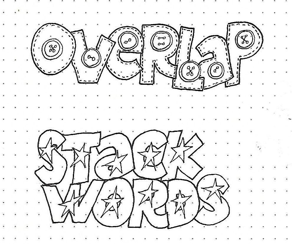
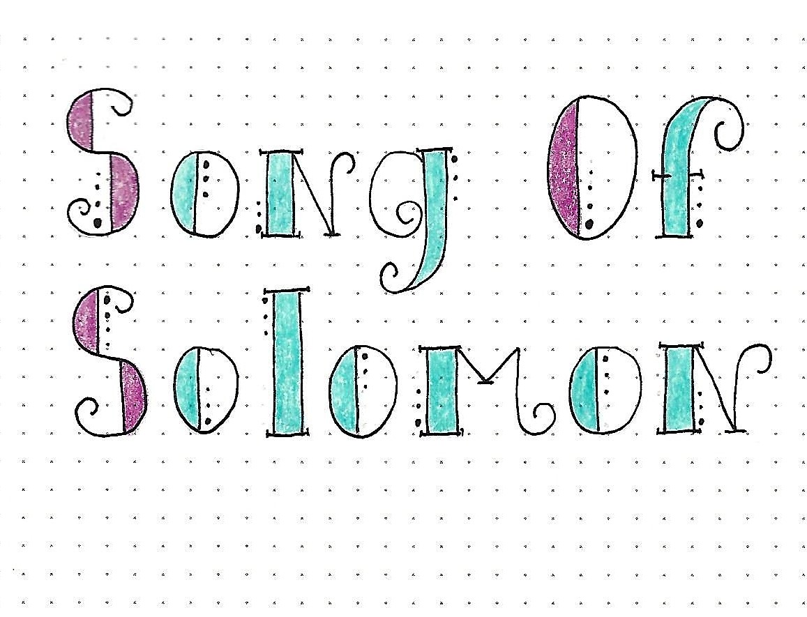
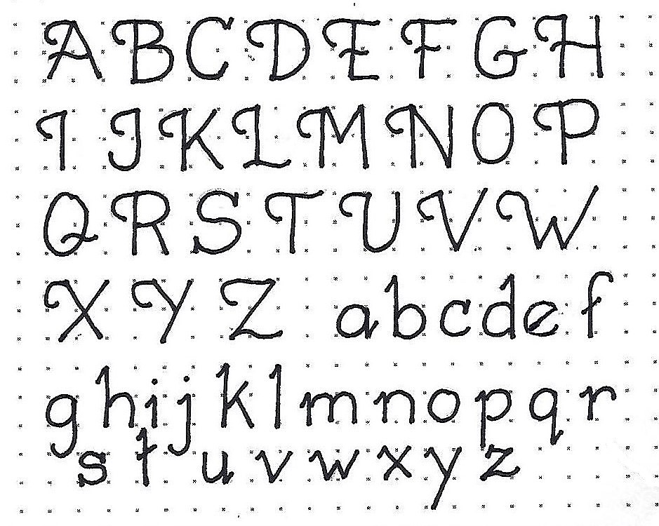
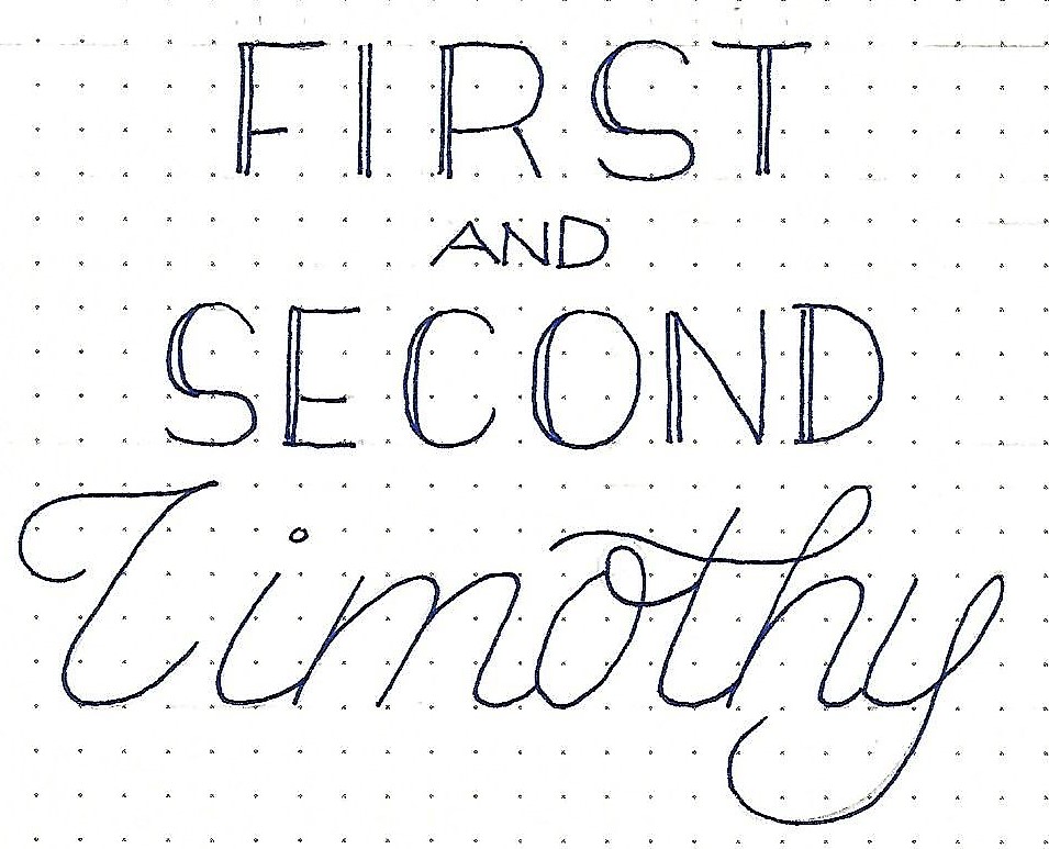
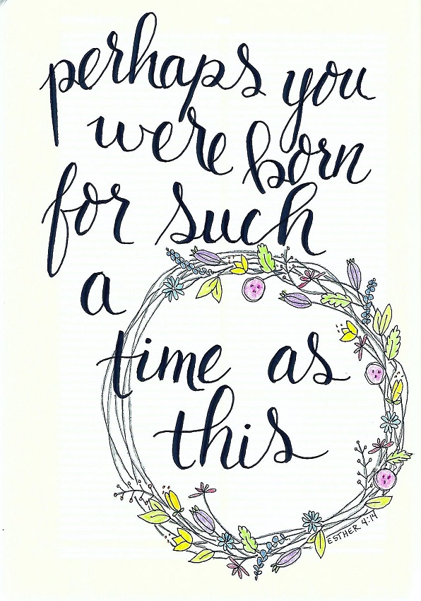
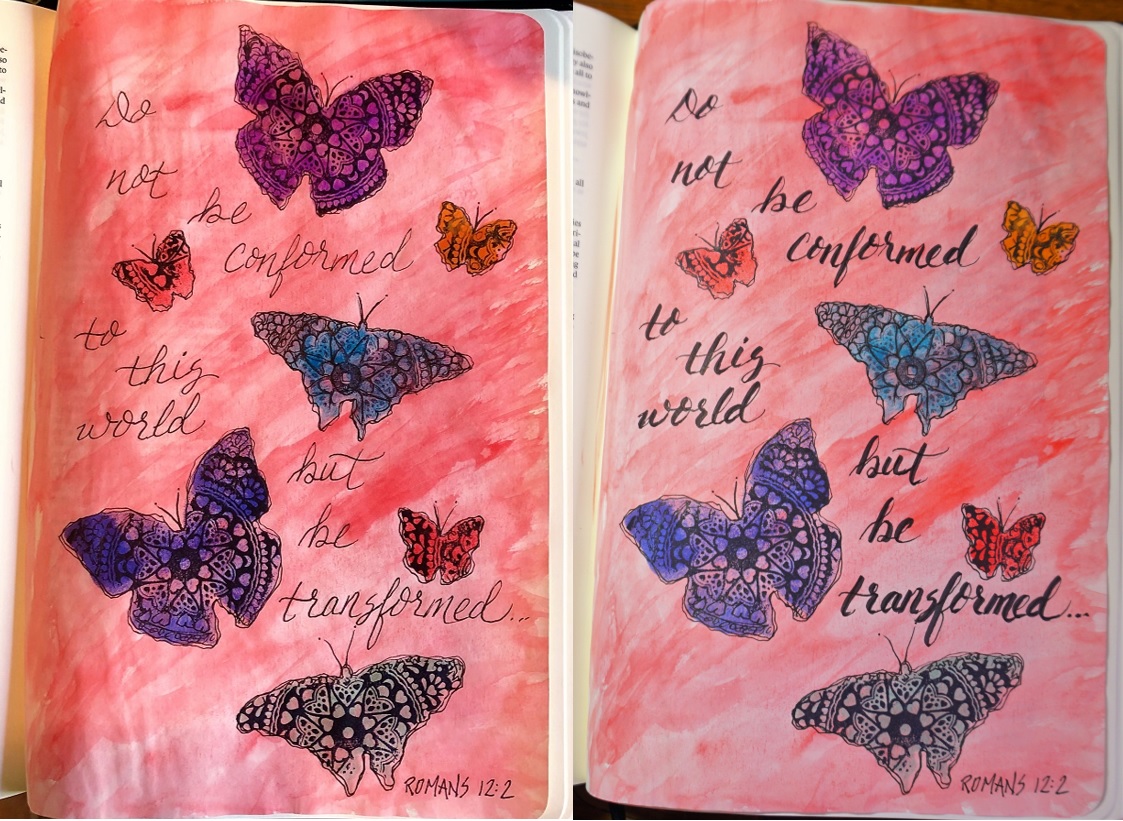
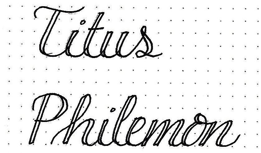
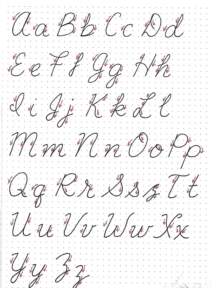
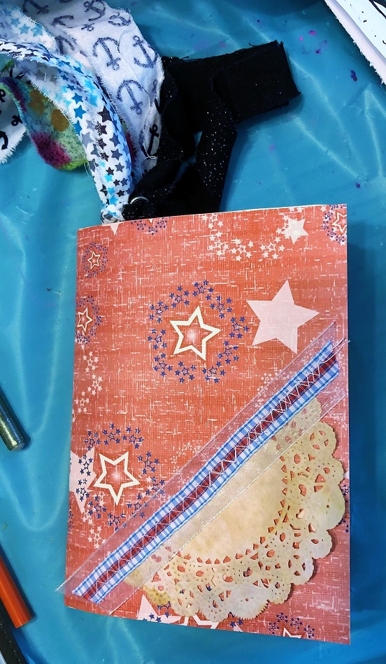
Topic: Bible Journaling
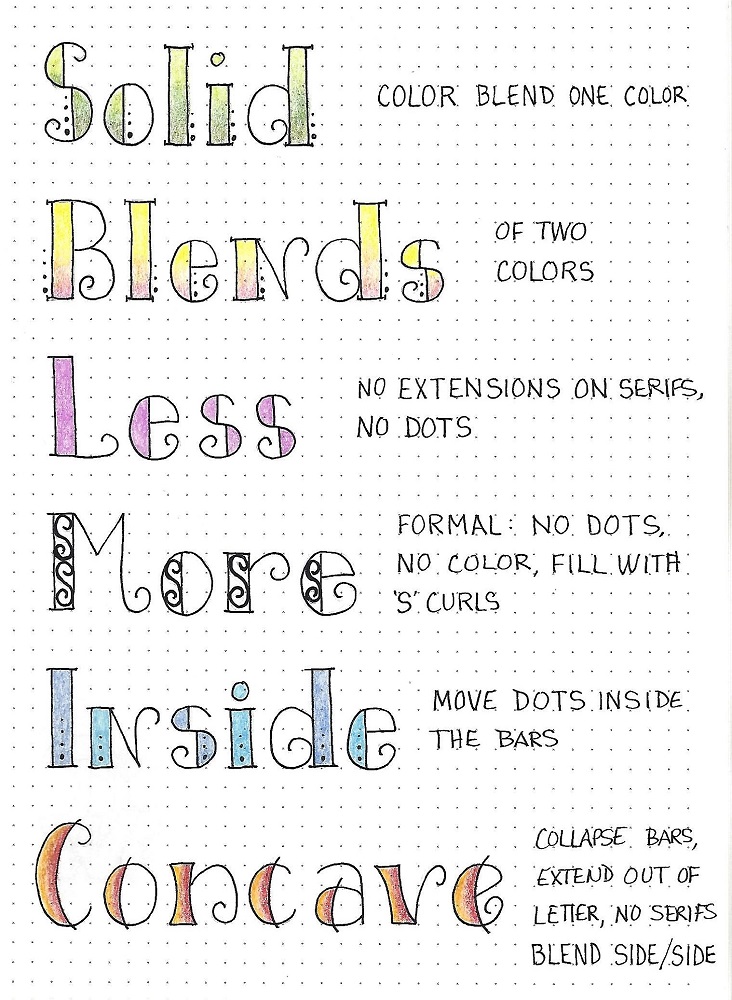
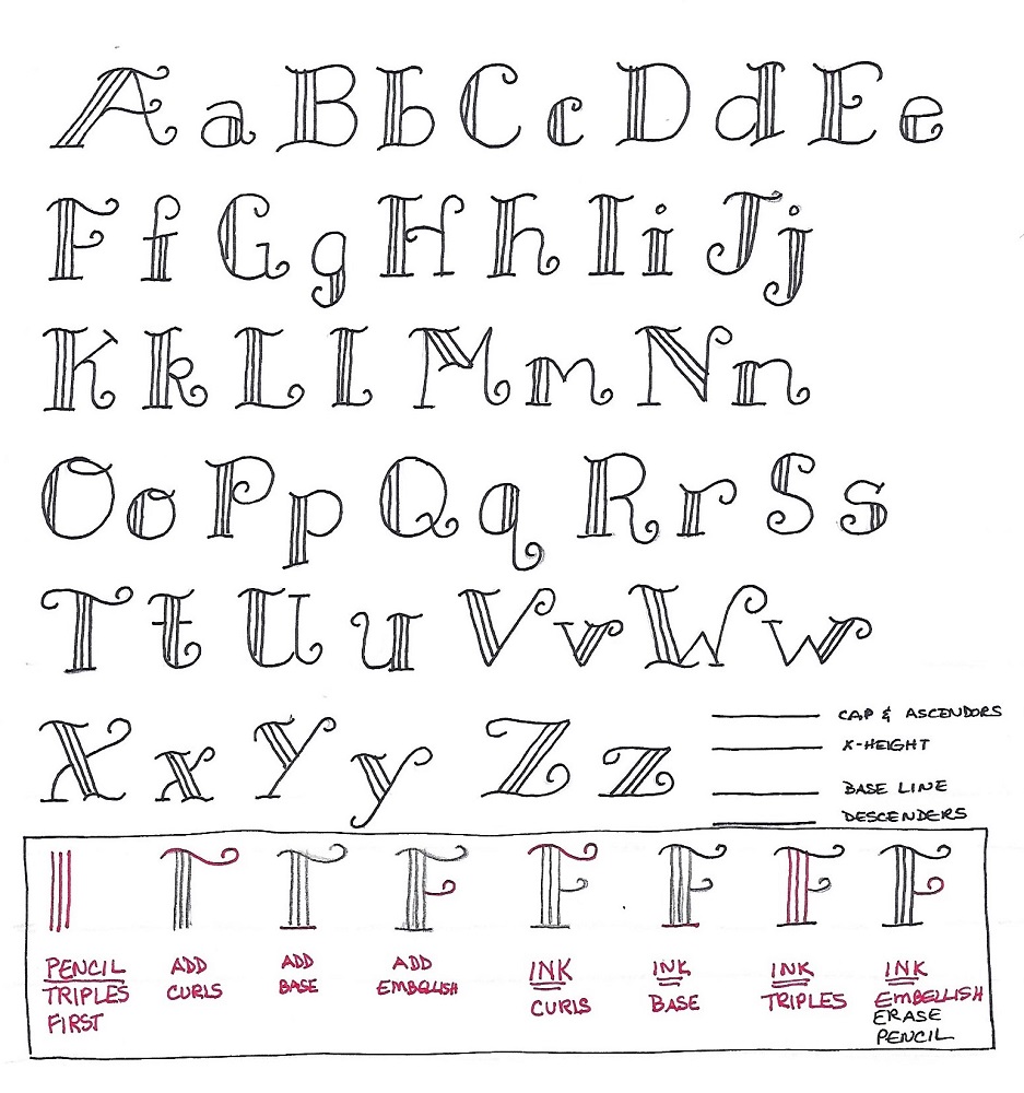
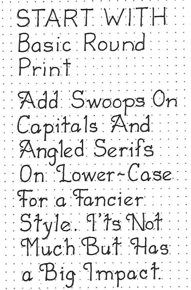
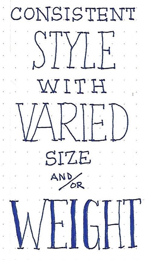
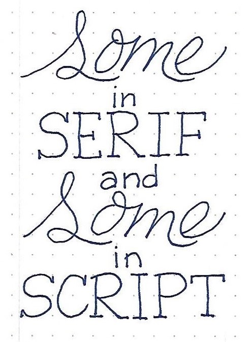
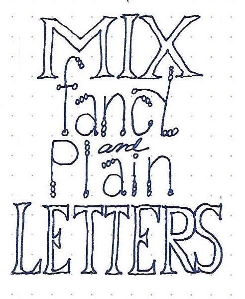
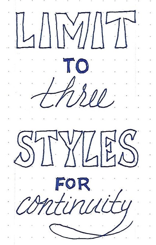
The consistent look of this lettering is all in the details. It looks deceptively simple but it does take careful attention to get it just right:
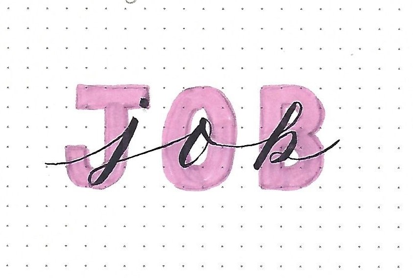
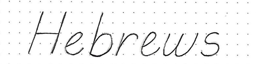
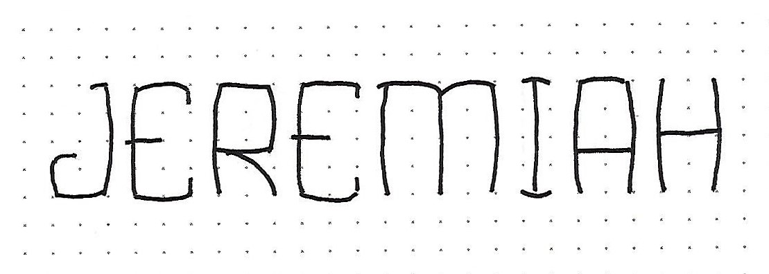
JEREMIAH: Day #1 – Bulging Rectangles – Intro
Getting the curved sides for these letters ‘just right’, is not as hard as one might think – thankfully.
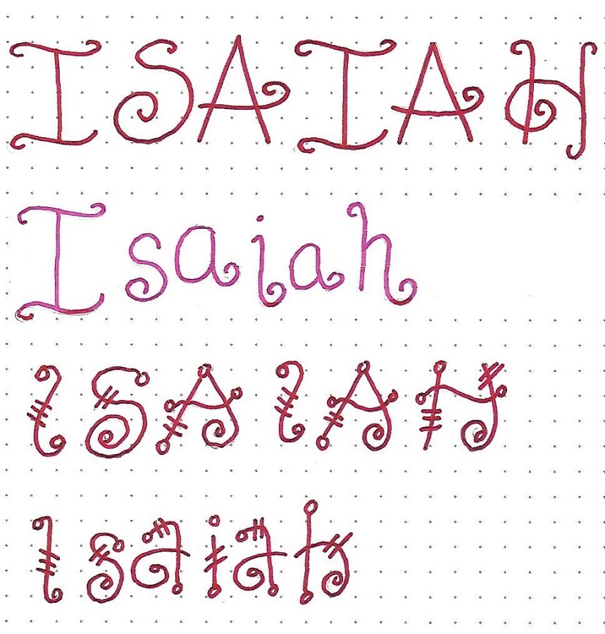
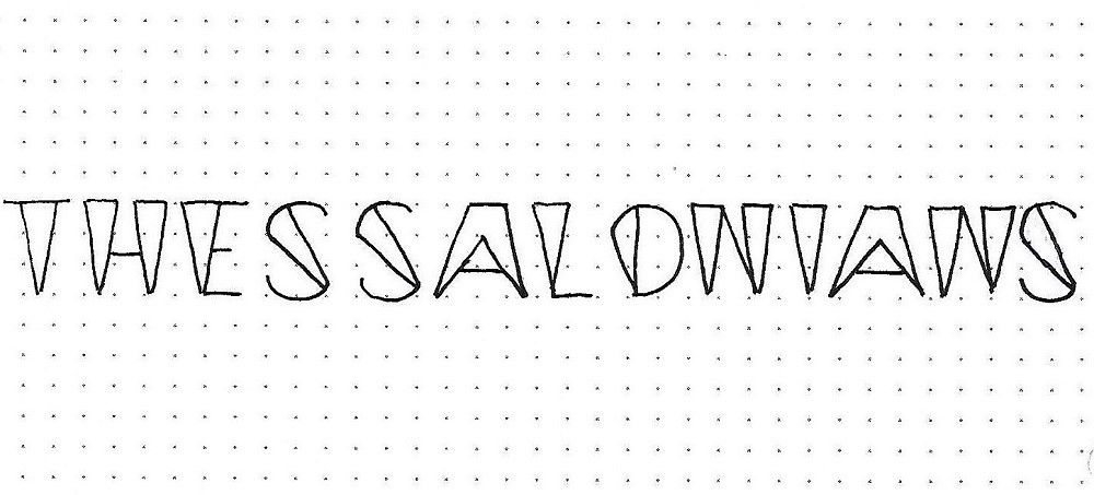
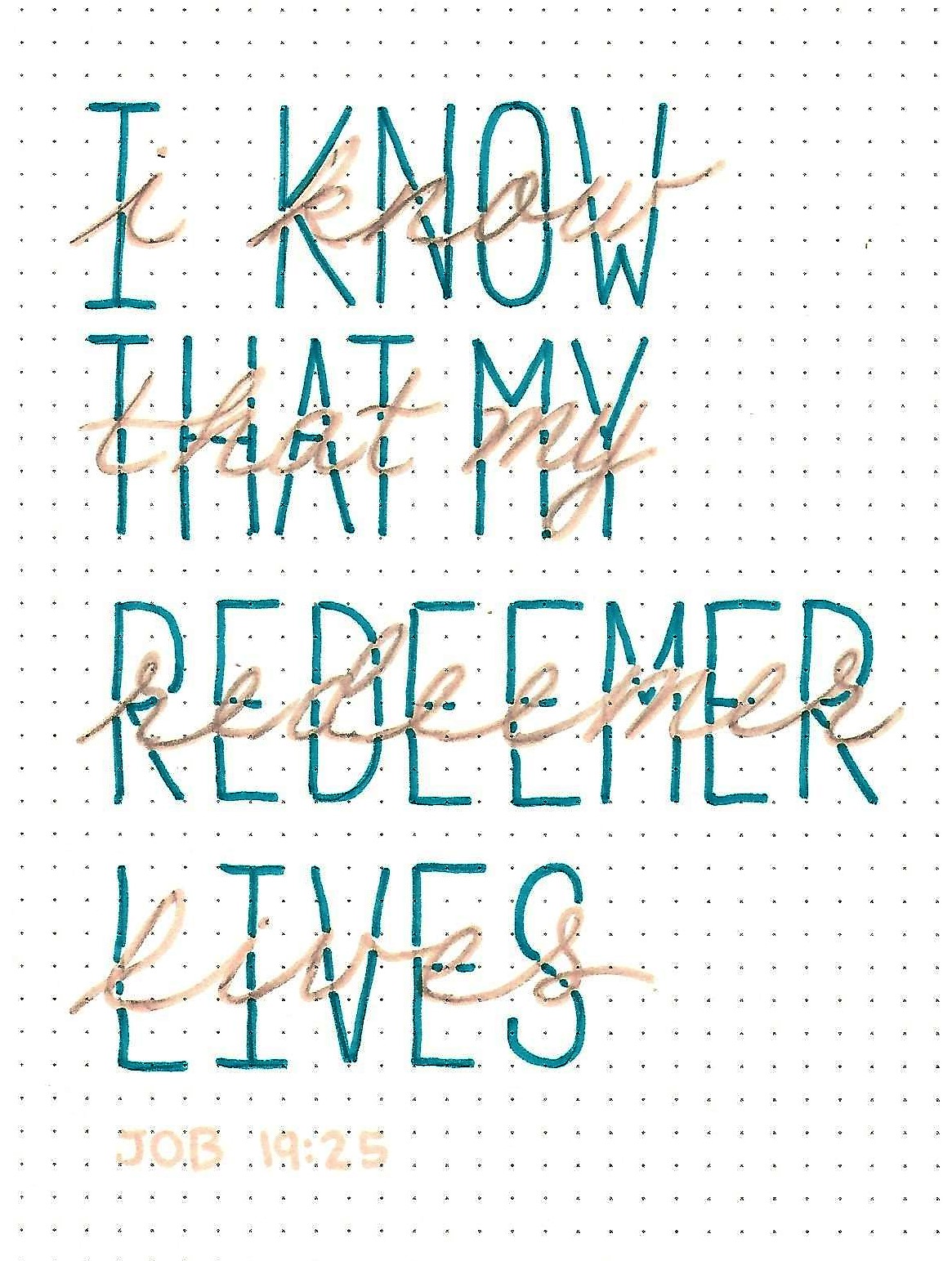
Begin by using a pencil and making a box for each letter. Most will be two units wide by four units tall. (the letter ‘I’ is one unit wide while the ‘M’ and ‘W’ are four units wide.) Then draw the letter shape by making the corner start just on the inside of the dot and bulge to the outside of the dots and back into the corner on the inside of the dot. Repeat for all lines.
Note that there are a few straight lines (crosspieces on ‘E’, ‘A’ and ‘H’) and a few overhangs (center of ‘E’ and upper left of ‘M’). Tomorrow we’ll see more of these but these will get you through this introductory word.
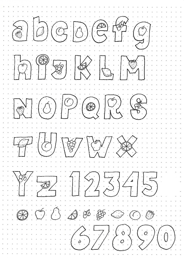
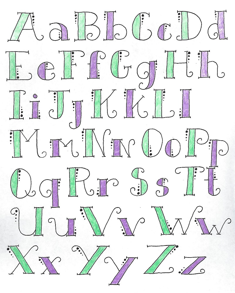
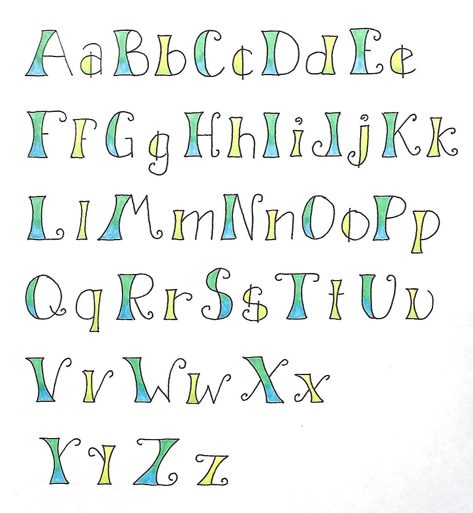
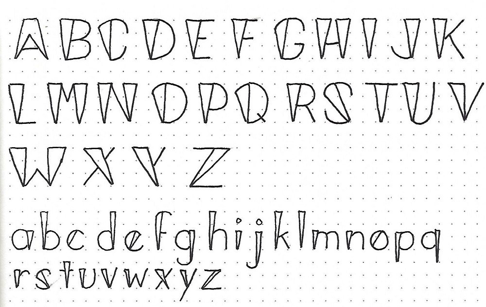
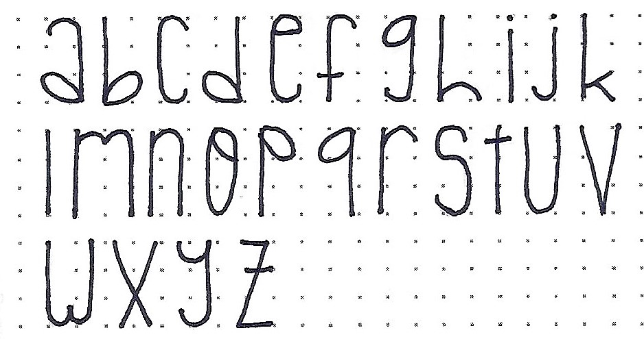
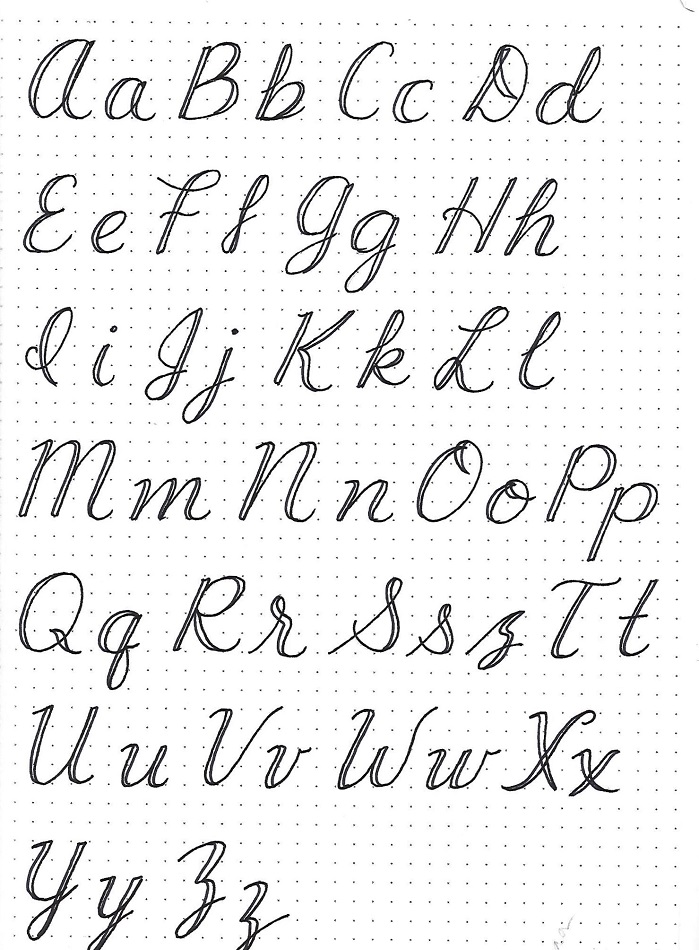
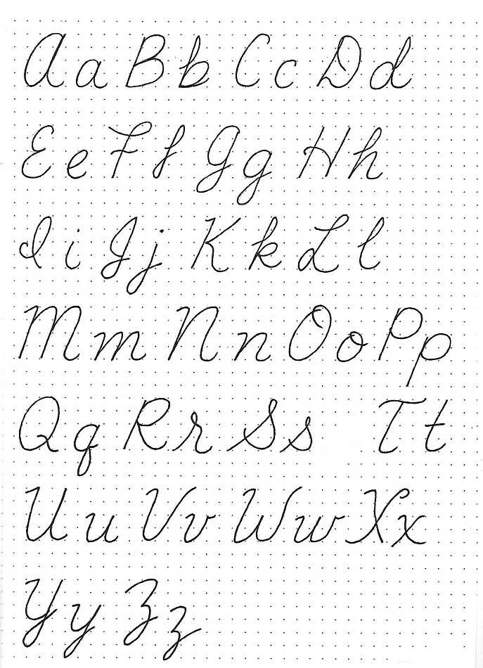
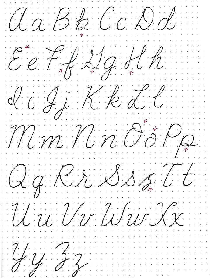
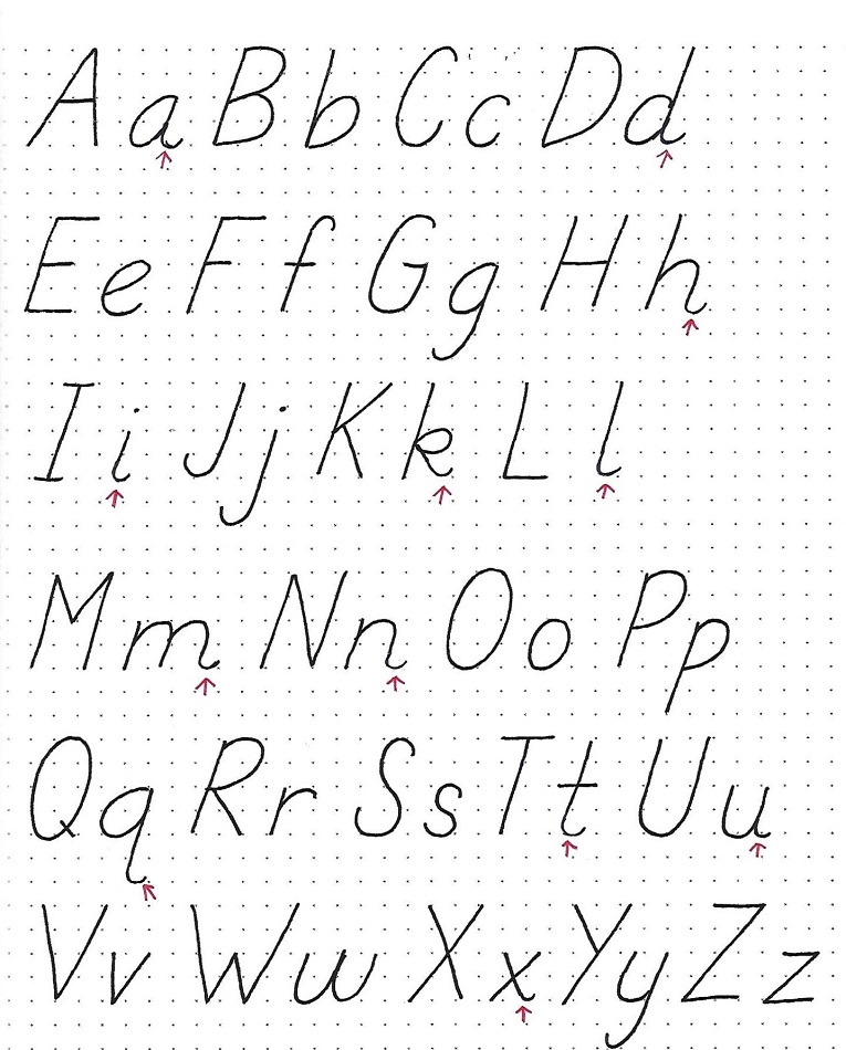
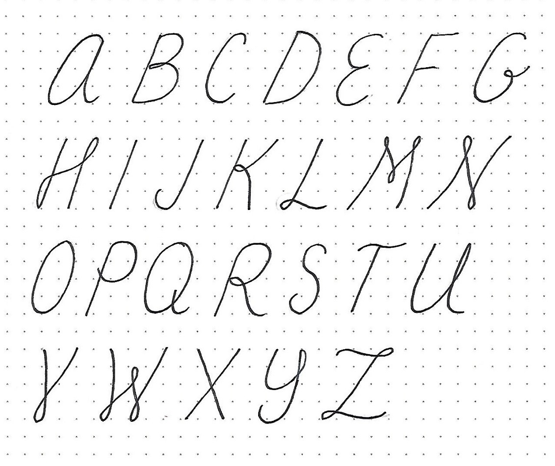
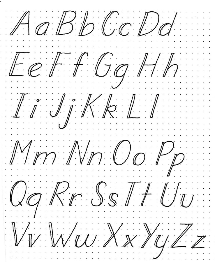
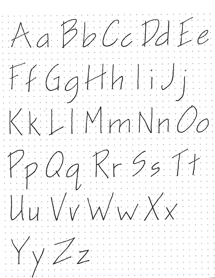
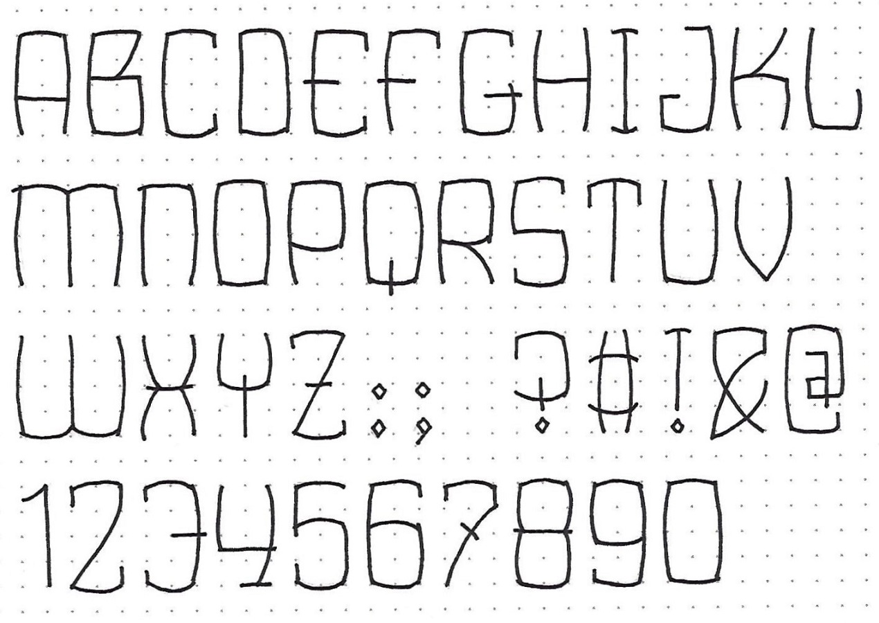
JEREMIAH: Day #2 – Bulging Rectangles – Alphabet 1
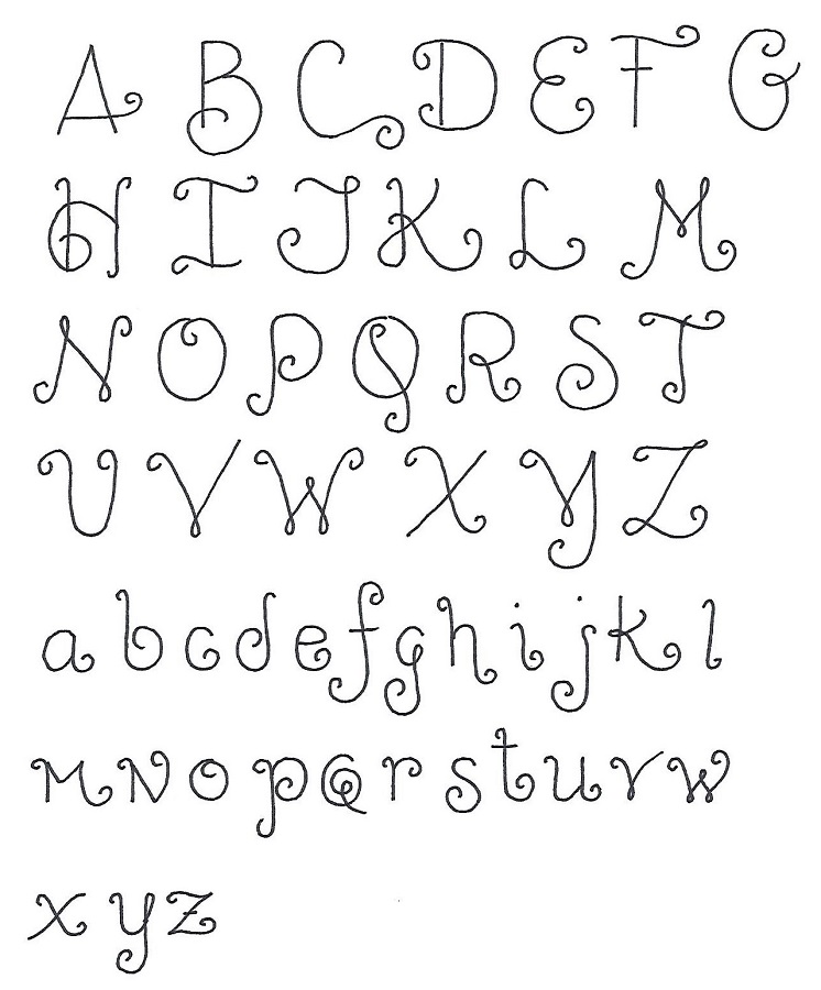
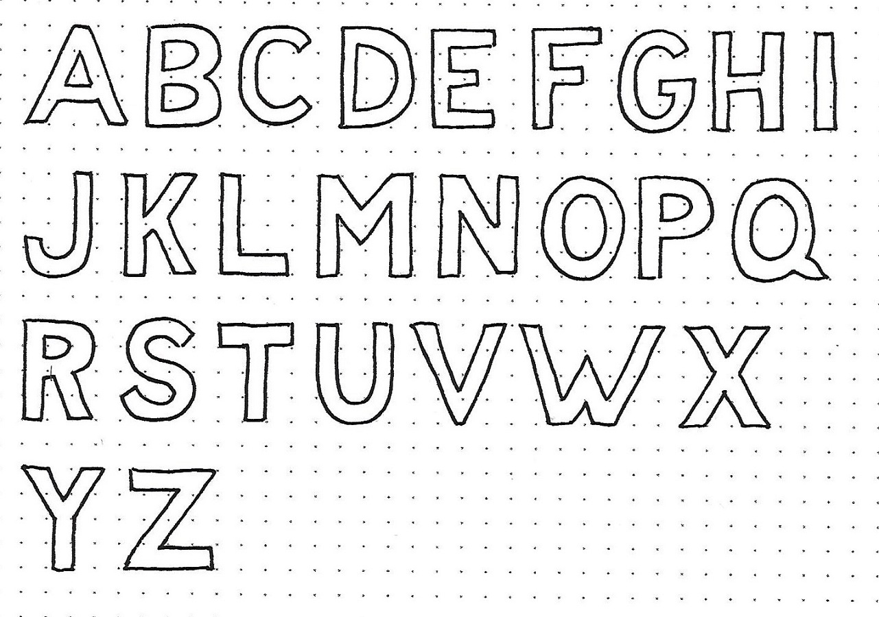
Review of the process of making the Bulging Rectangles Font: Begin by using a pencil and making a box for each letter. Most will be two units wide by four units tall. (the letter ‘I’ is one unit wide while the ‘M’ and ‘W’ are four units wide.) Then draw the letter shape by making the corner start just on the inside of the dot and bulge to the outside of the dots and back into the corner on the inside of the dot. Repeat for all lines.
Note that there are a few straight lines (crosspieces on ‘A’, ‘B’, ‘E’, ‘F’, ‘G’, ‘H’, ‘J’, ‘X’, and ‘Z’ plus uprights on ‘D’, ‘I’, ‘M’, ‘Q’, ‘T’ and ‘Y’) There are a few overhangs (center of ‘E’, ‘F’, ‘G’, ‘Q’, ‘X’, ‘Y’ and ‘Z’ plus the upper left of ‘M’ and ‘N’).
Because of the unique construction of this set of letters you’ll need to match them with numbers and punctuation. So those are included as well. Study those for the straight lines, and overhangs that make them fit with the alphabet.
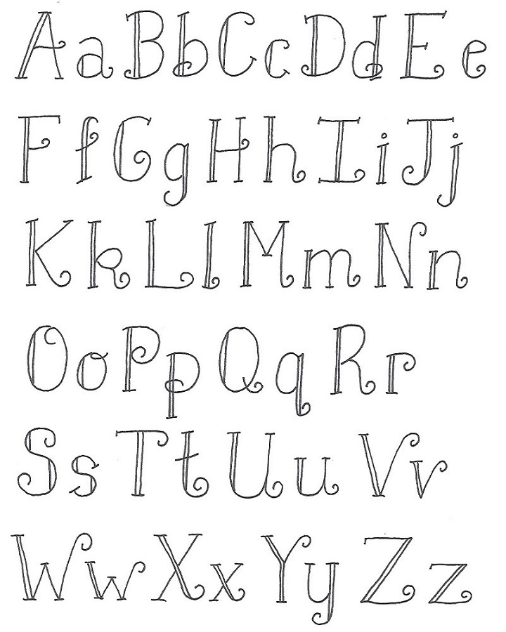
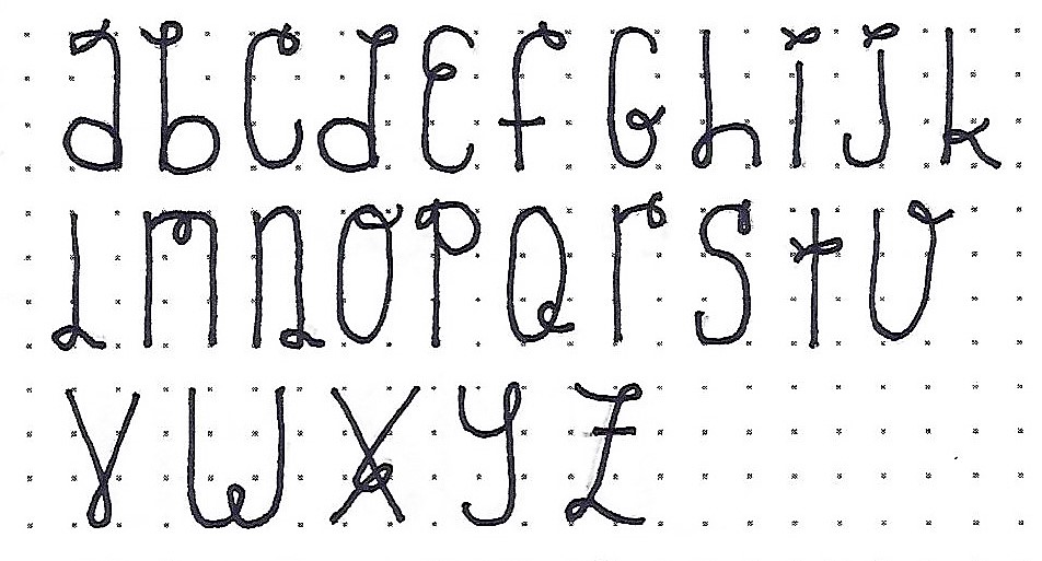
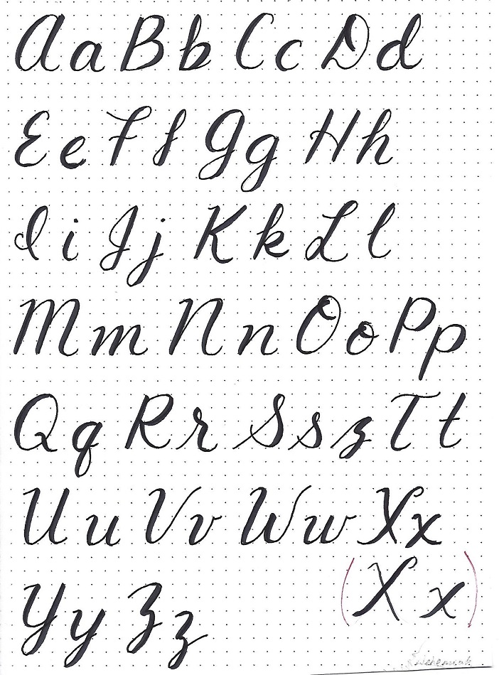
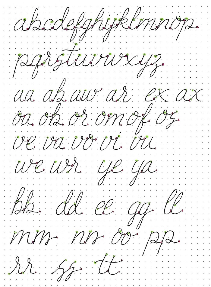
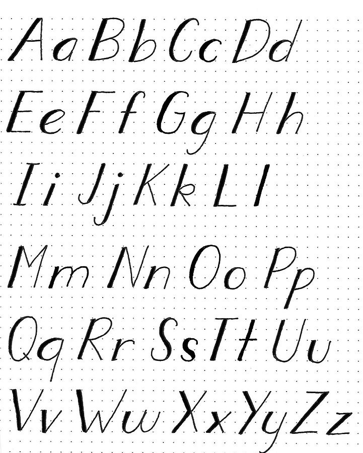
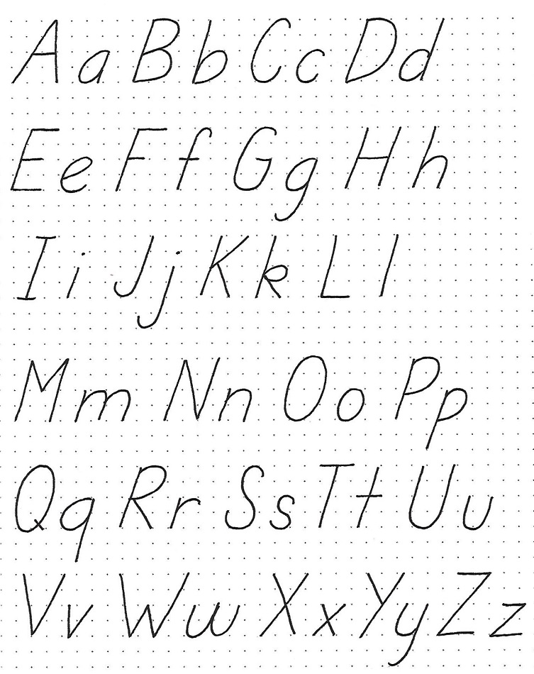
JEREMIAH: Day #3 – Bulging Rectangles – Alphabet 2
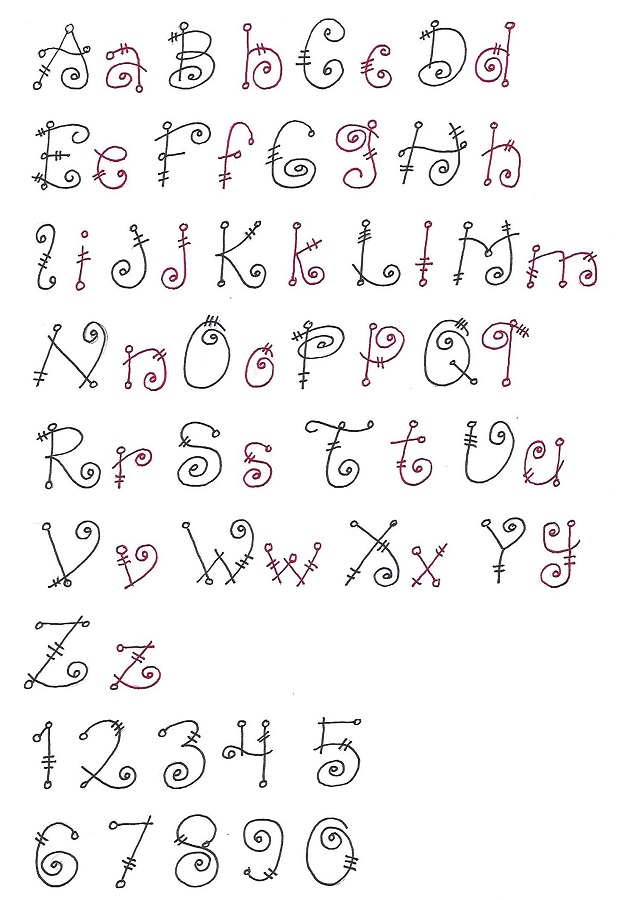
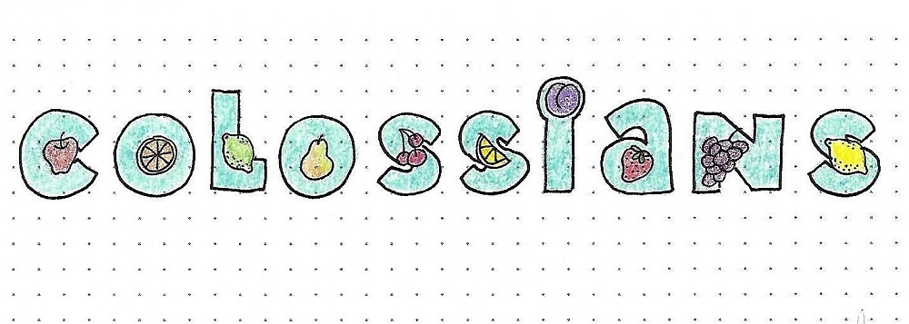
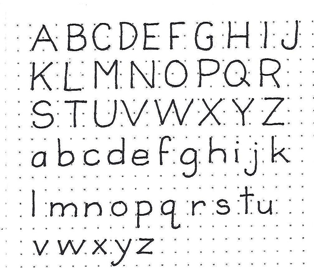
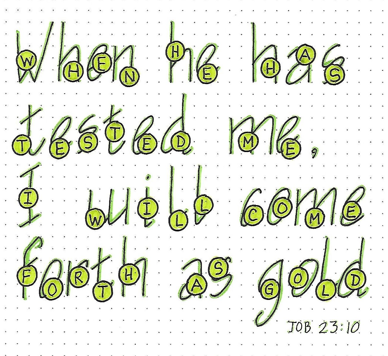
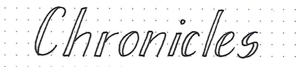
I wanted you to have something to use as a lower-case with the main alphabet so I developed a similar bulging half-size font. After I put this together, I realized that it works very well on its own as well.
The general shaping is done the same as on the larger font but the size of the letters is 2x2. The exceptions are, again, the ‘I’ at 1x2 and the ‘M’ and ‘W’ at 3x2.
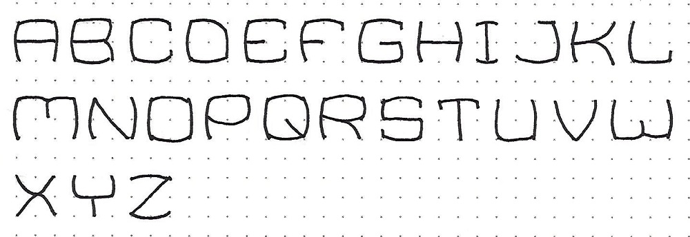
JEREMIAH: Day #3 – Bulging Rectangles – Alphabet 2
I wanted you to have something to use as a lower-case with the main alphabet so I developed a similar bulging half-size font. After I put this together, I realized that it works very well on its own as well.
The general shaping is done the same as on the larger font but the size of the letters is 2x2. The exceptions are, again, the ‘I’ at 1x2 and the ‘M’ and ‘W’ at 3x2.
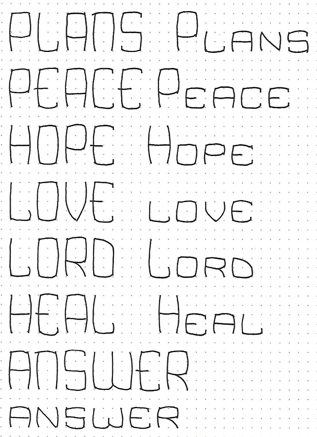
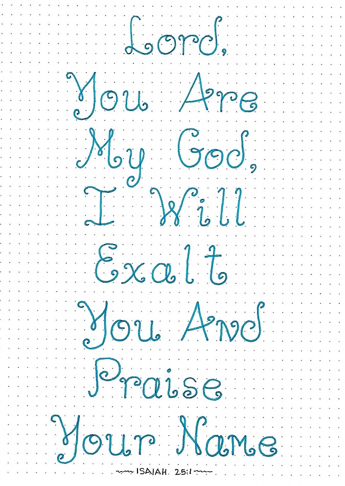
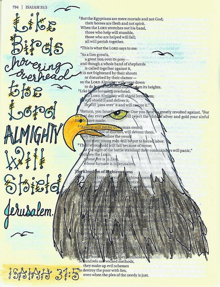
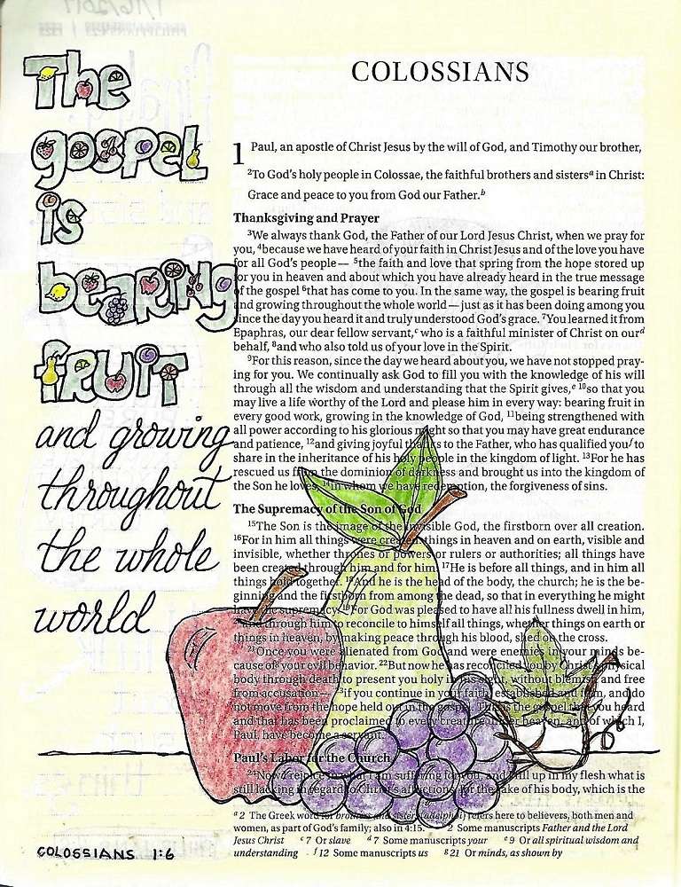
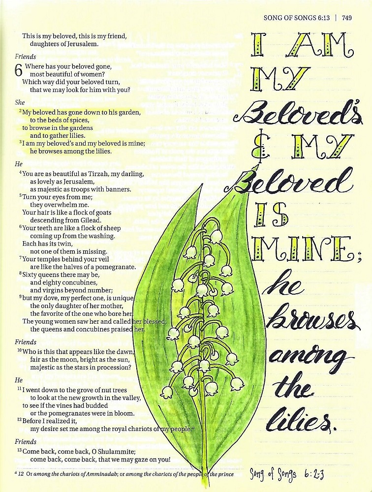
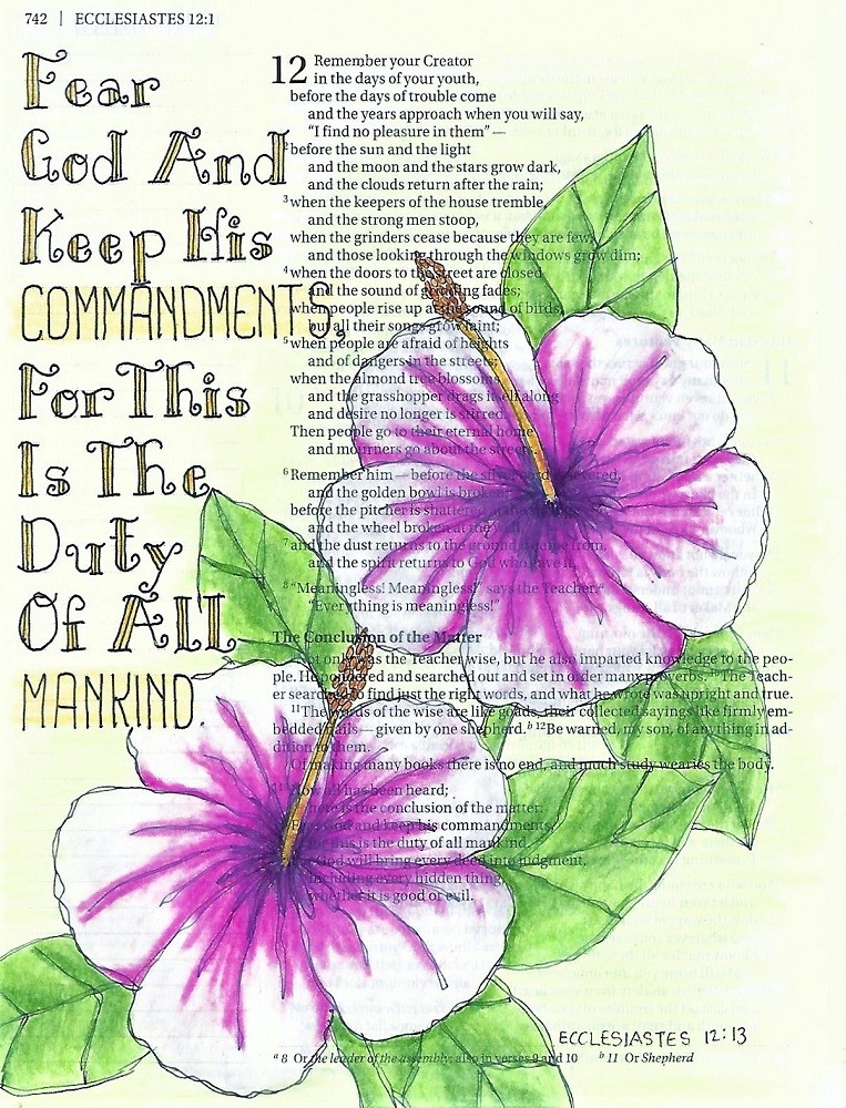
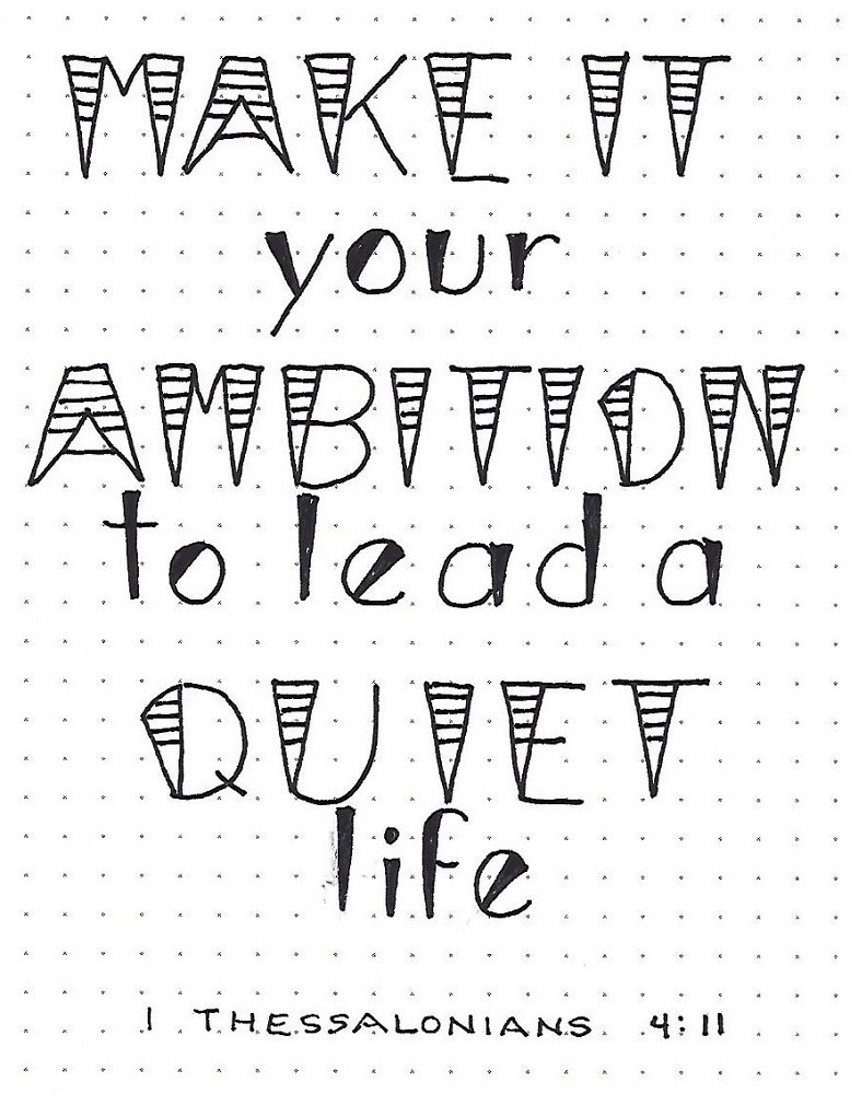
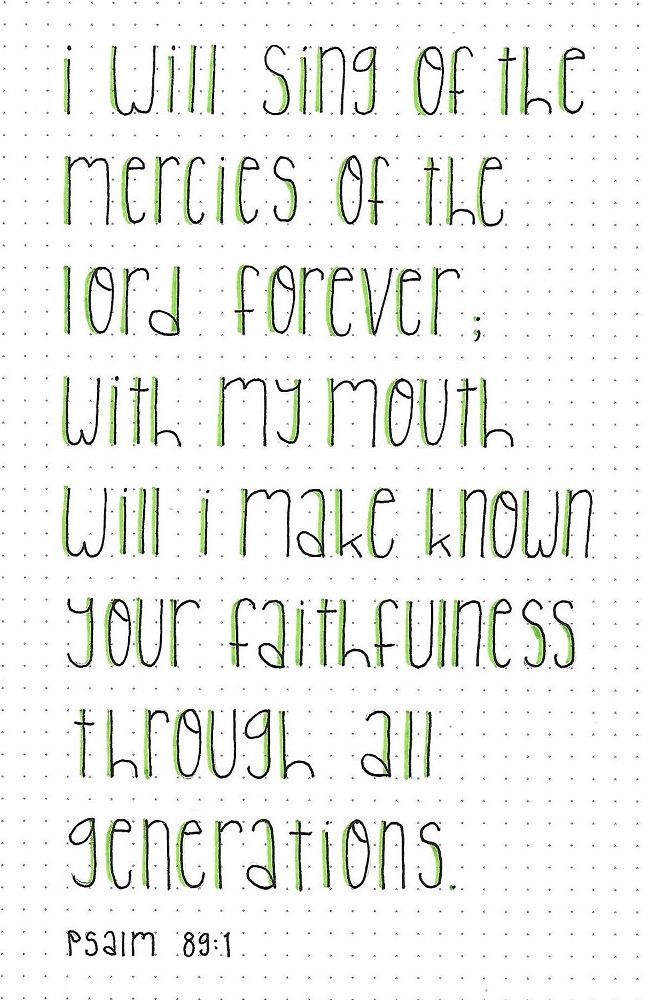
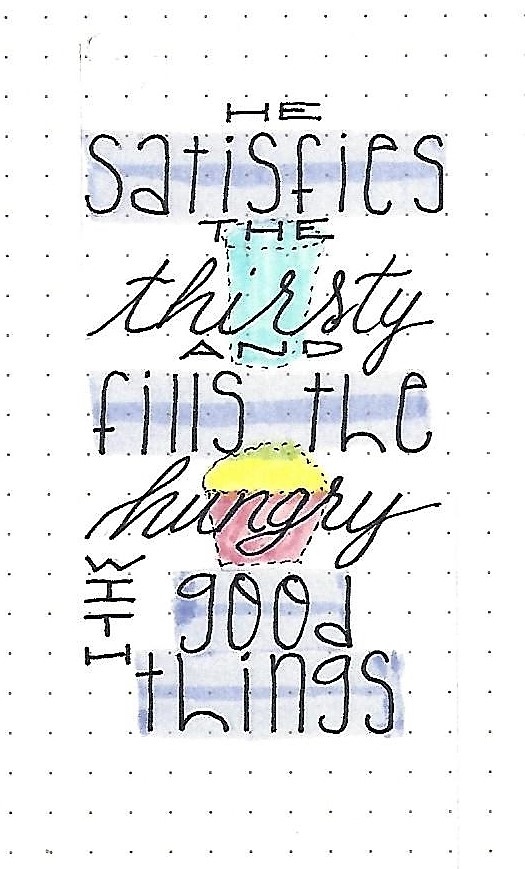
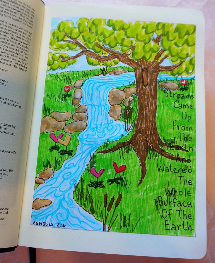
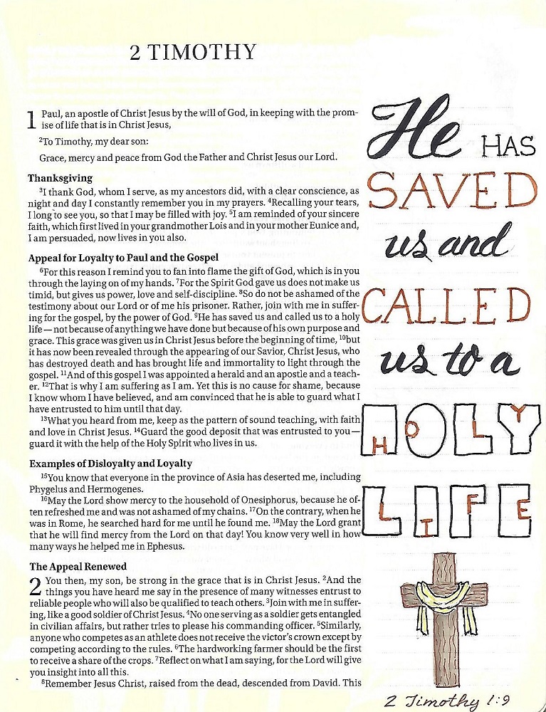
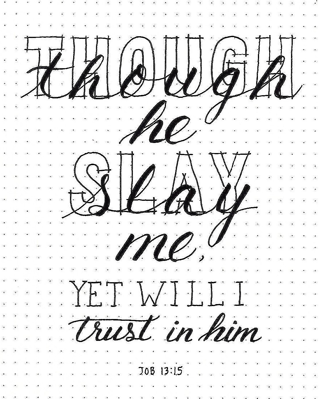
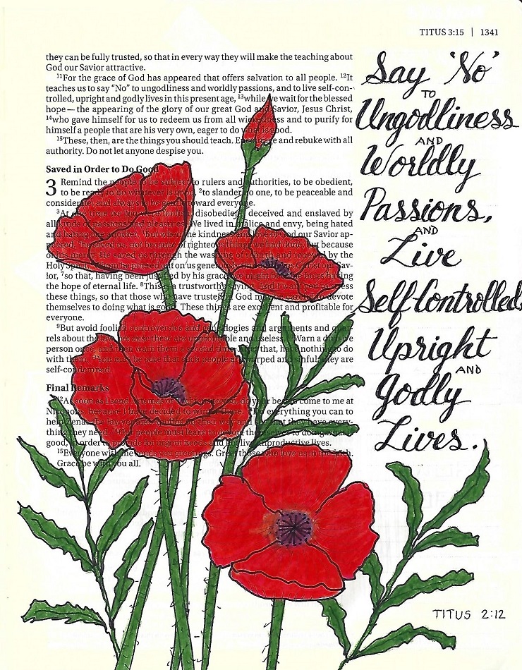
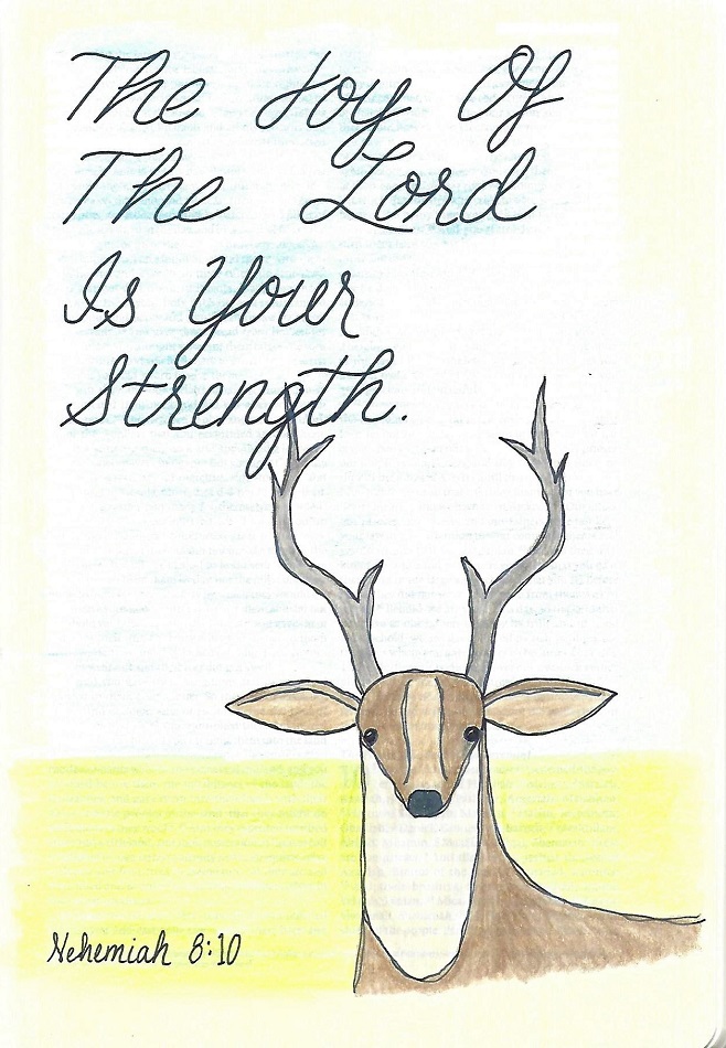
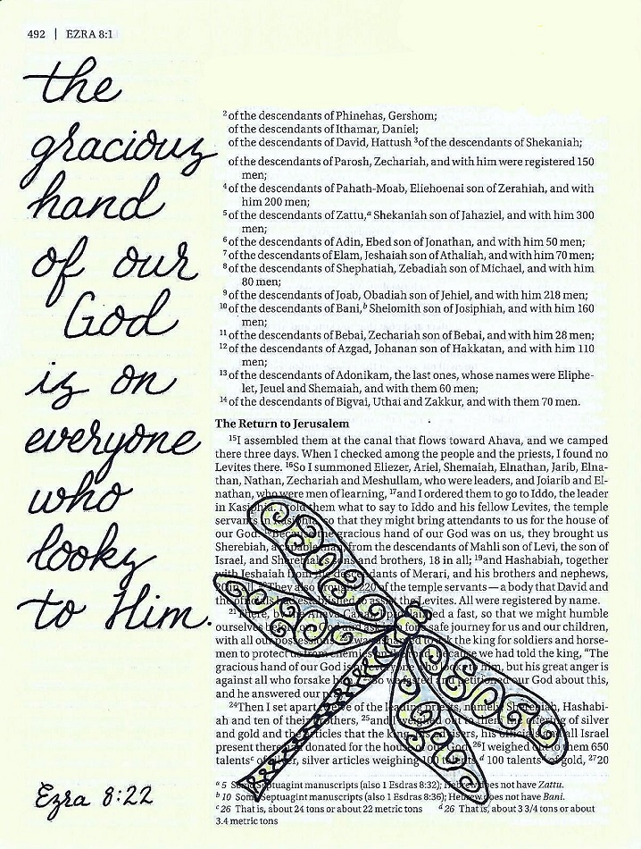
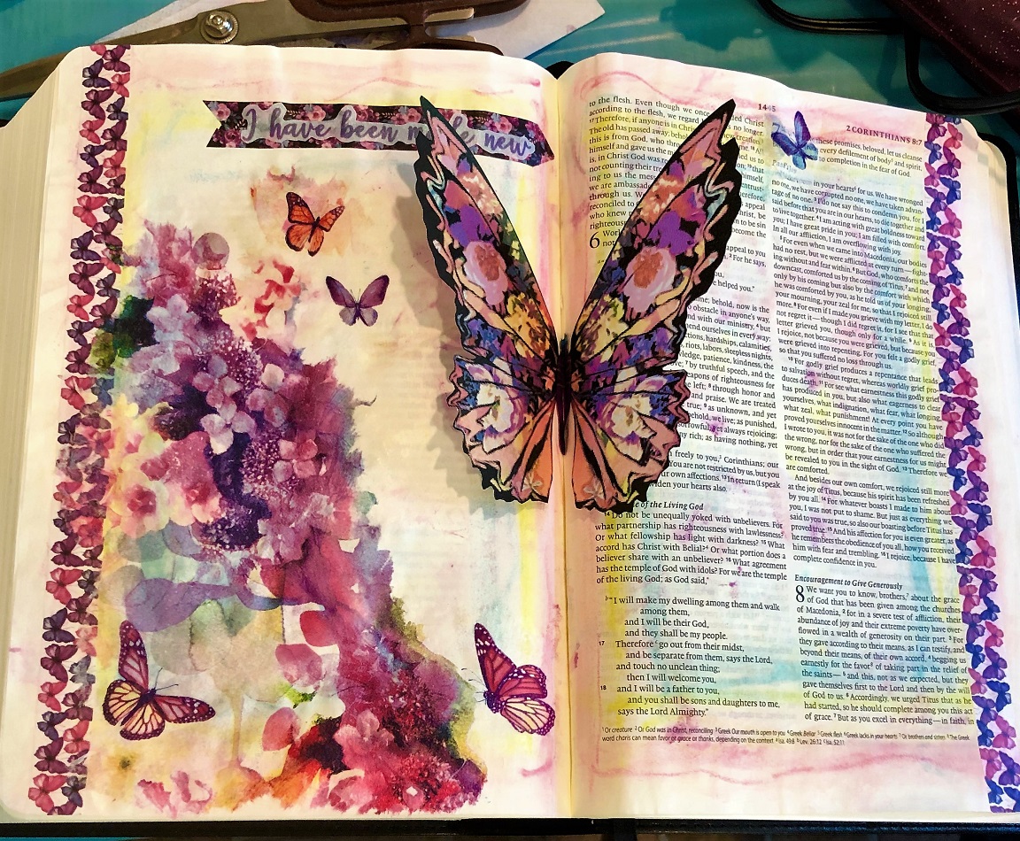
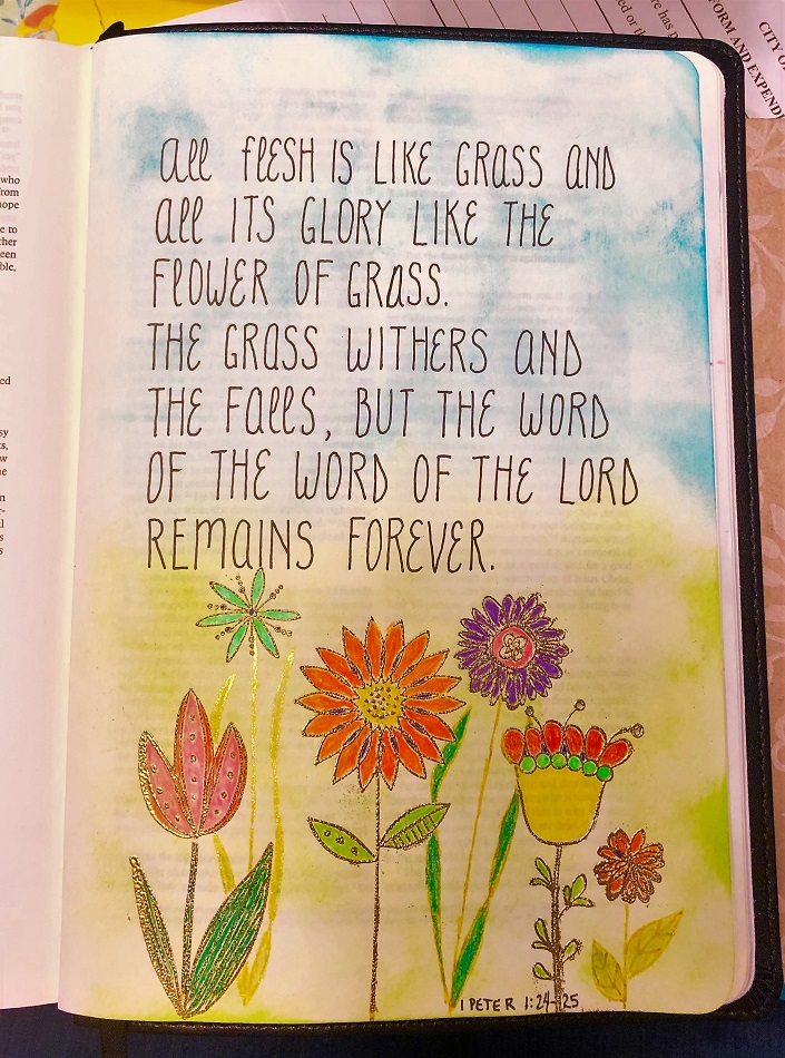
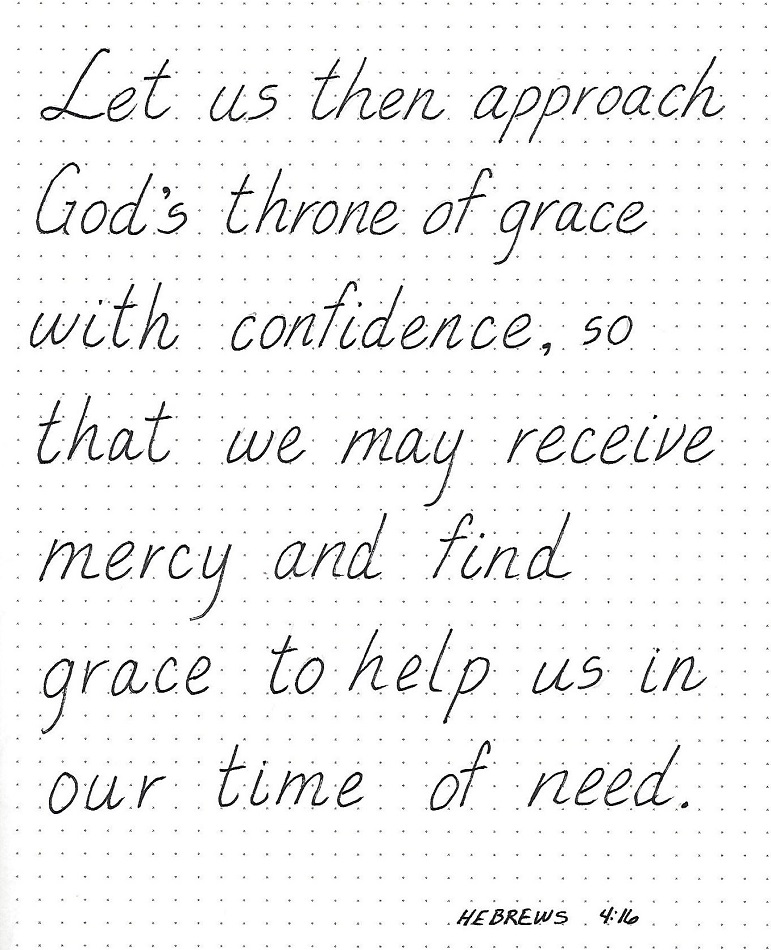
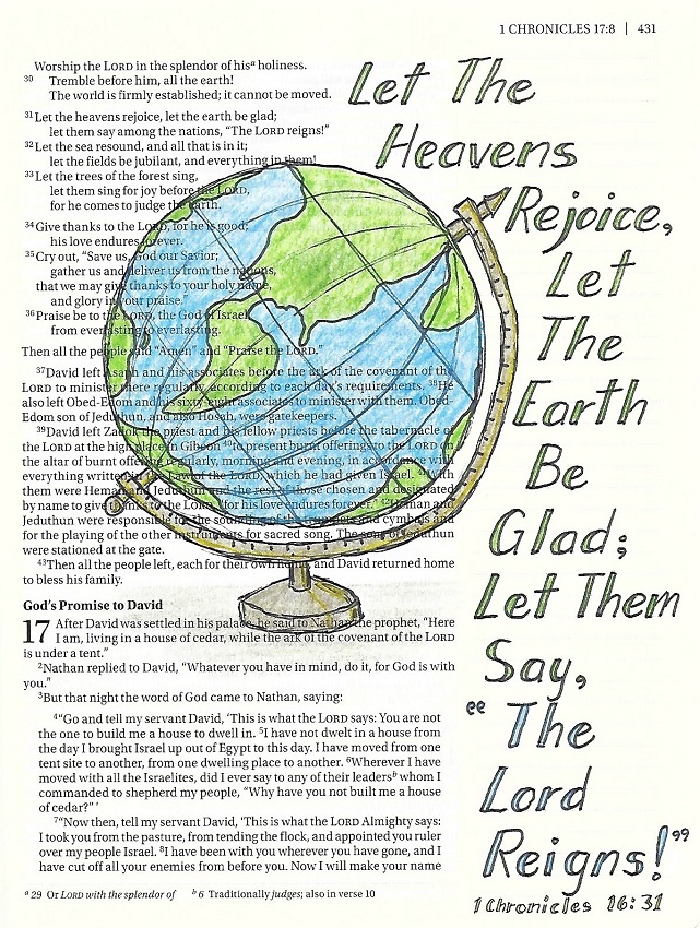
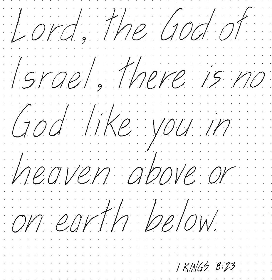
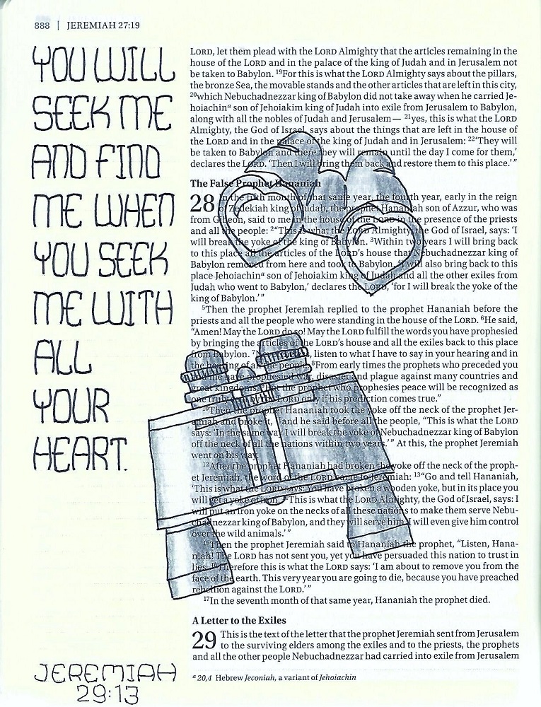
JEREMIAH: Day #5 – Bulging Rectangles – Bible Page
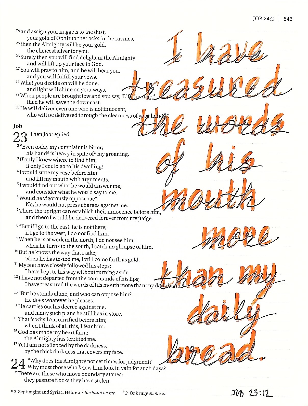
Use either, or both, of the alphabets to journal a scripture in Jeremiah in your Bible. I had a fairly short block of text to write so I was able to use the taller letters quite effectively.
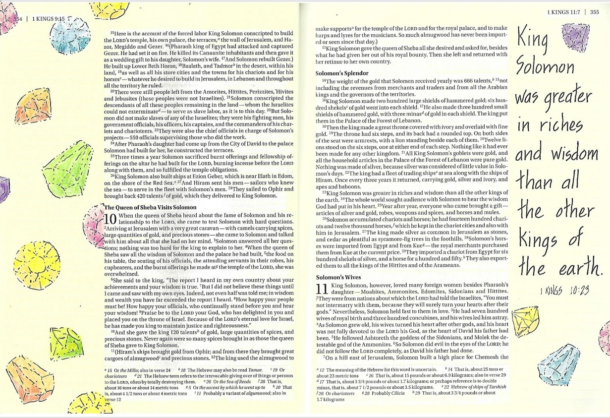
The shape of these letters made me think of how you could hold them in two hands (especially the M and W) so that led to the pairing them with the binoculars from the Drawing Room.
I did use the smaller letter set for the scripture reference at the bottom of the page.
Wrapping up another week of lessons! Keep practicing.
Ddd