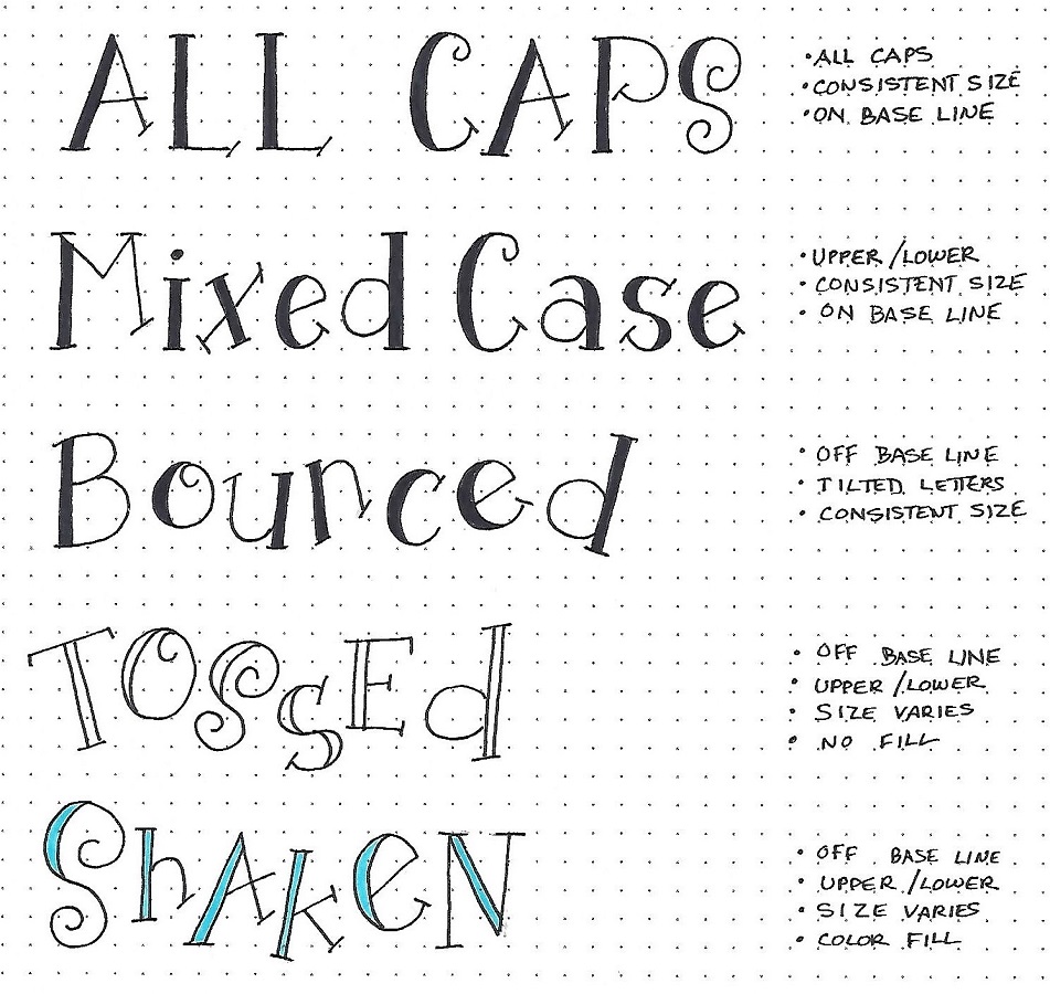
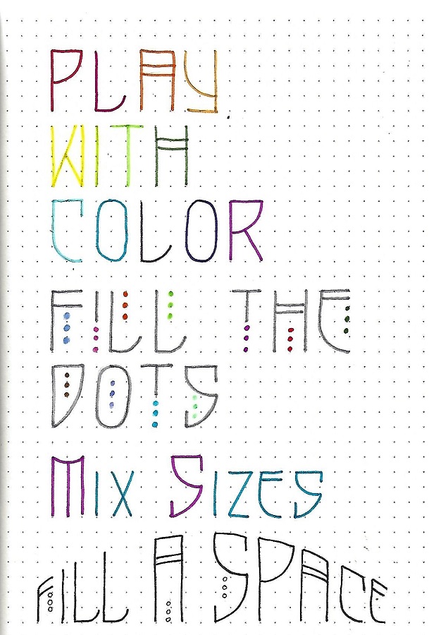
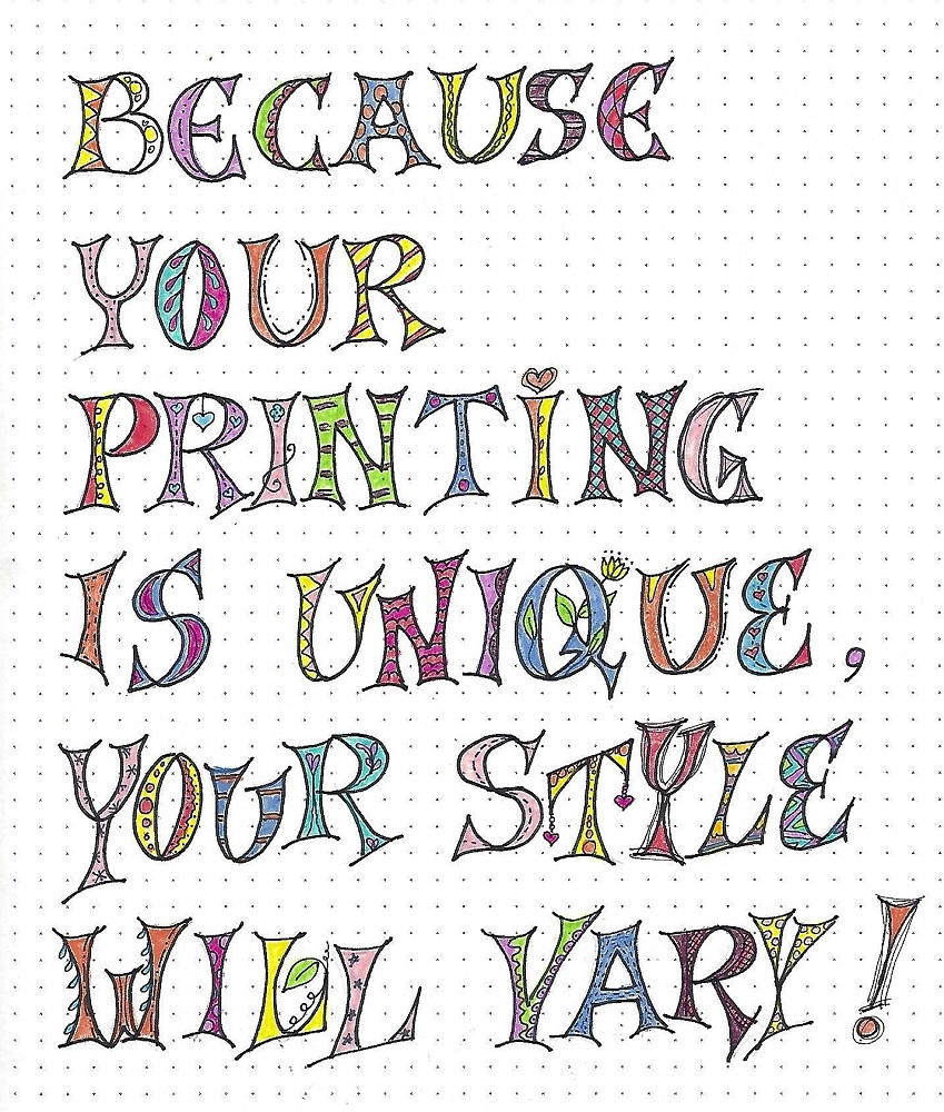
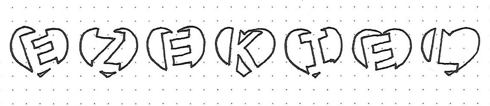
Topic: Bible Journaling
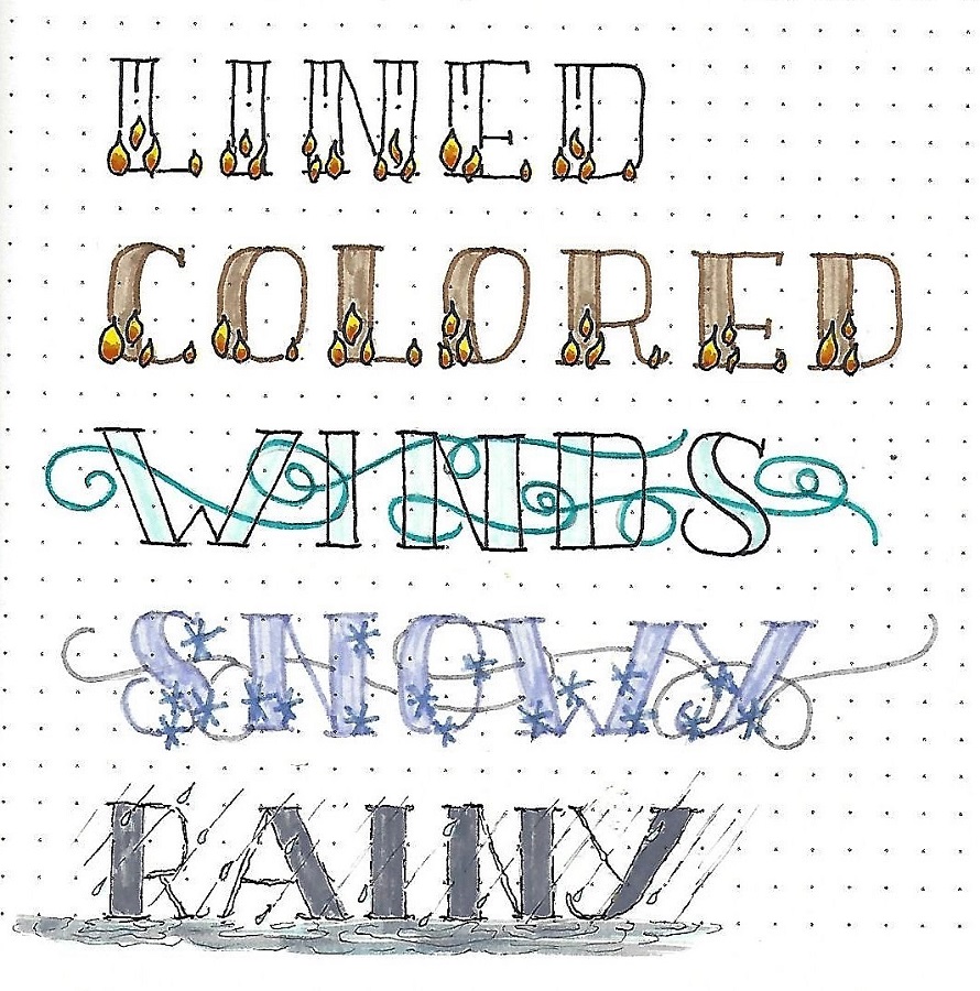
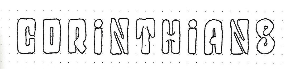
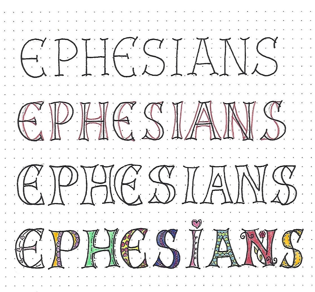
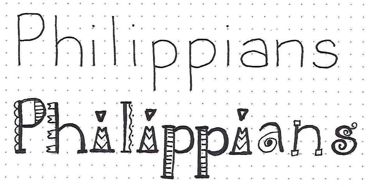
Yep, it's more lettering! This is a more formal style so I called it 'Tuxedo'!
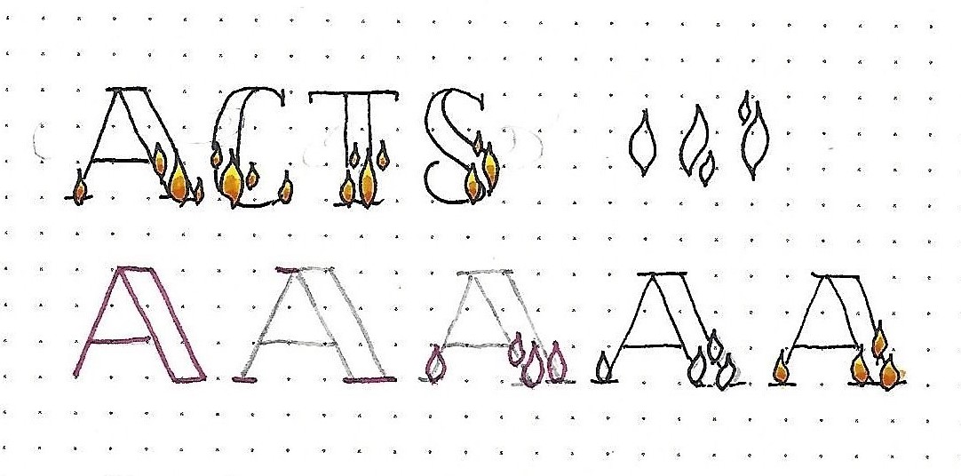
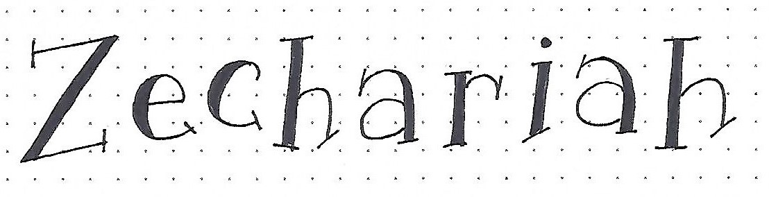
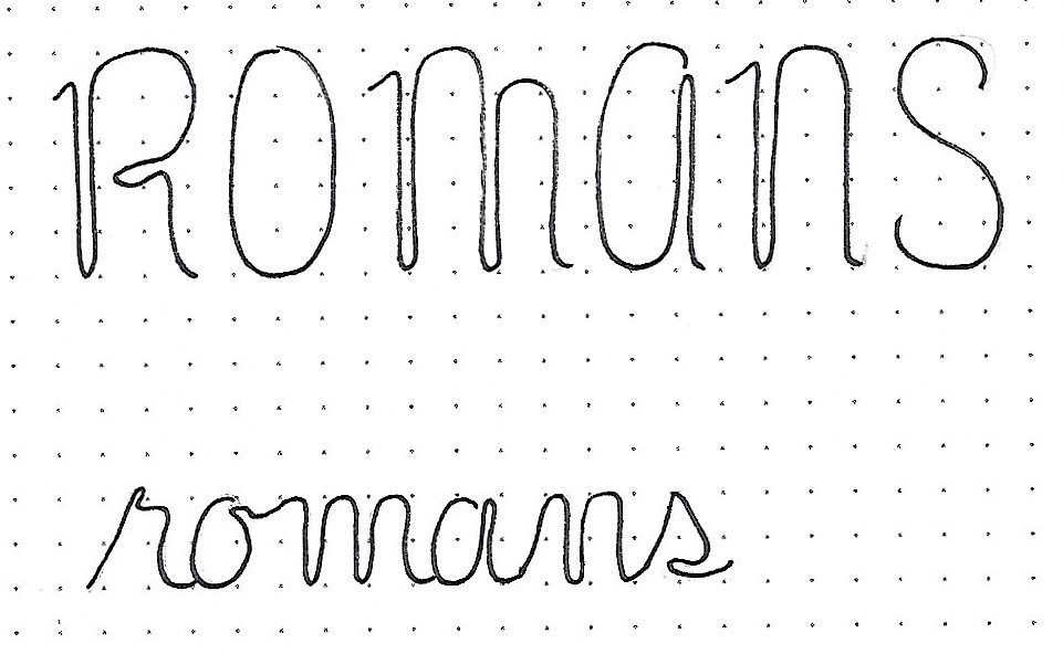
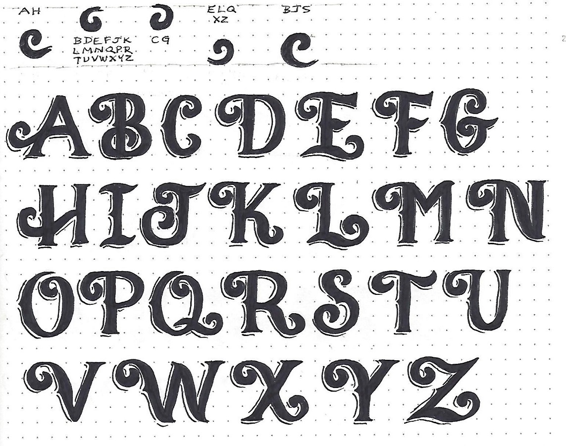
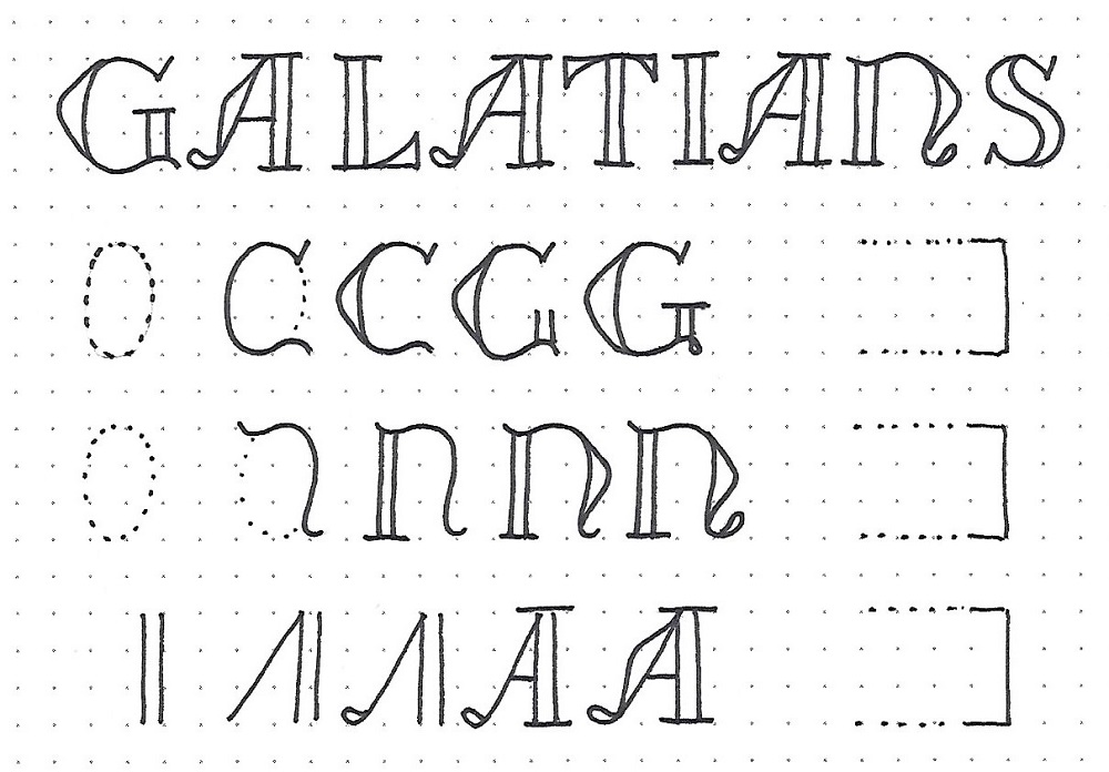
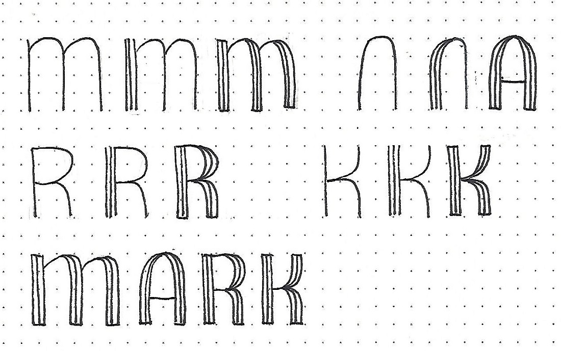
MARK: Day #1 – Tuxedo – Introduction
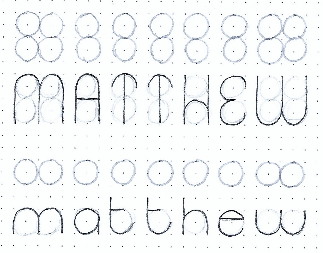
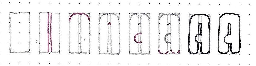
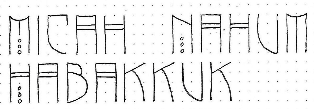
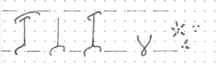
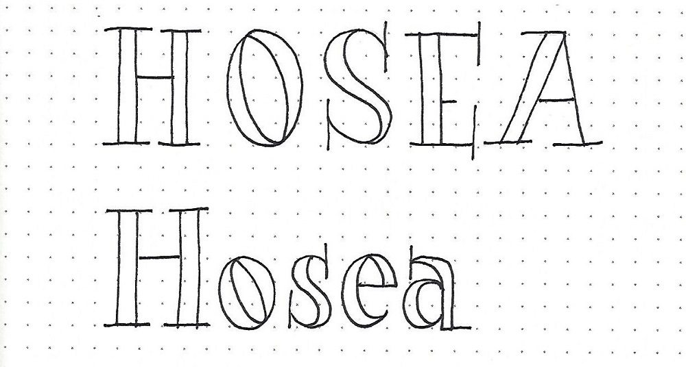
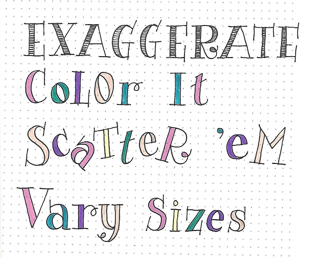
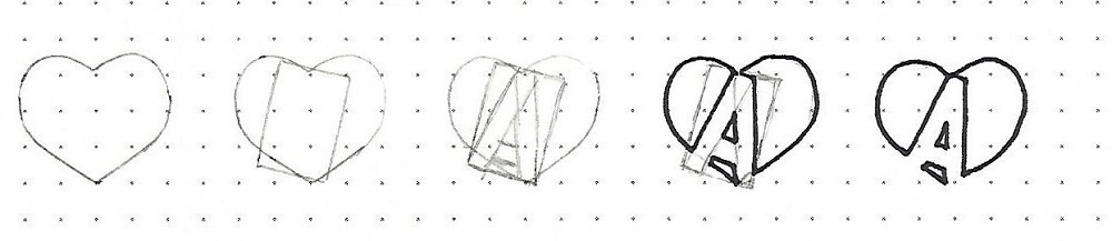
These letters are based on a 4-unit height and are drawn in three steps, which are demonstrated on each of the 4 letters in the c2c book of the week.
First, draw a basic shape for your letter. Second, draw a close line in both sides of that line on the verticals. Third, complete the rest of the letter in the same manner.
NOTE: The horizontal lines do not get the pinstripes and the curves are merged into a single line.
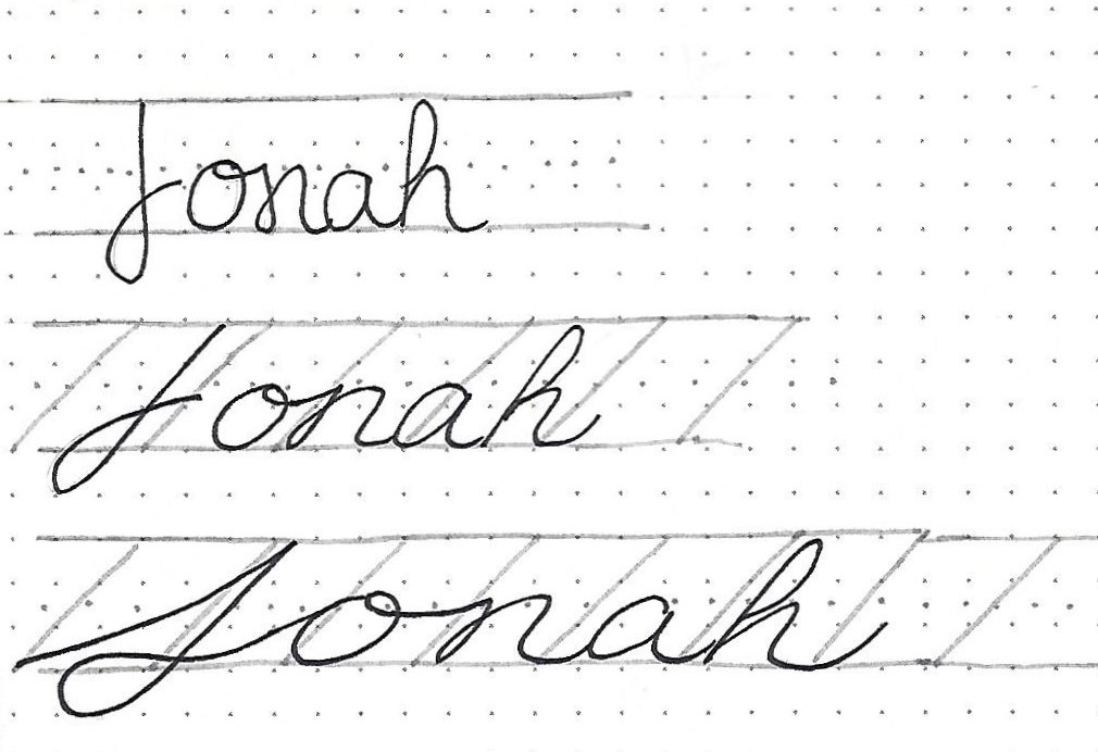
Practice writing this one word following the steps given. The best way to do this is to pencil in all your base letters for the whole word, phrase or sentence. Then go through with ink and draw the multiple lines on all the letters. Erase your pencil when the ink is dry.
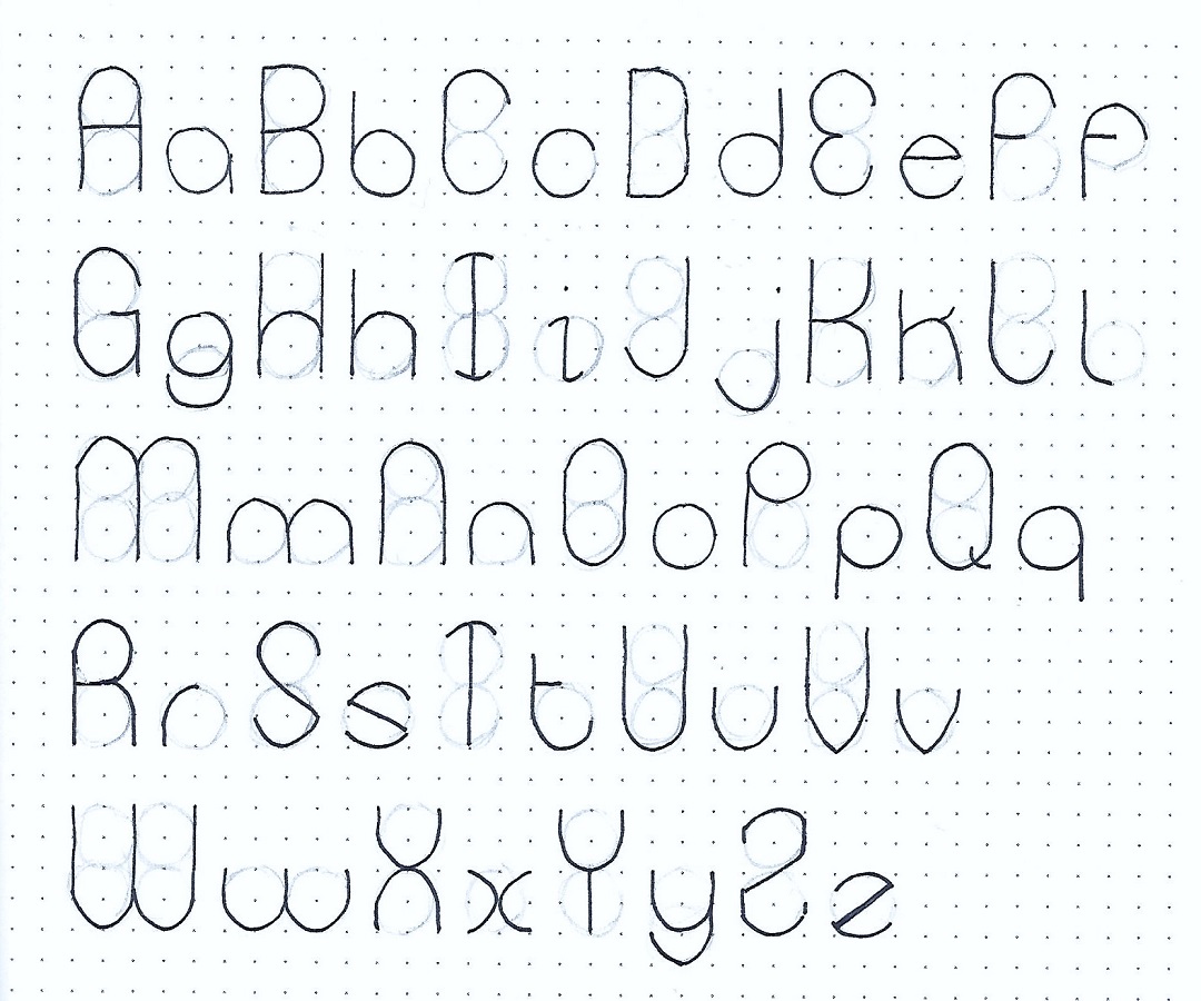
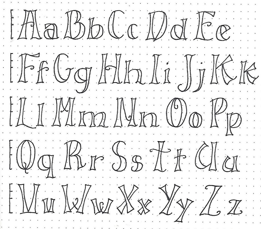
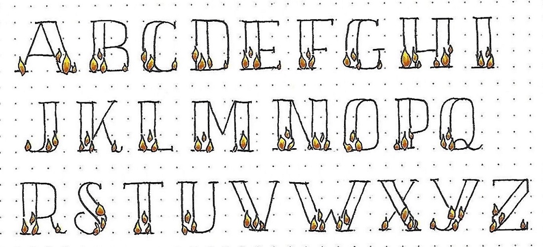
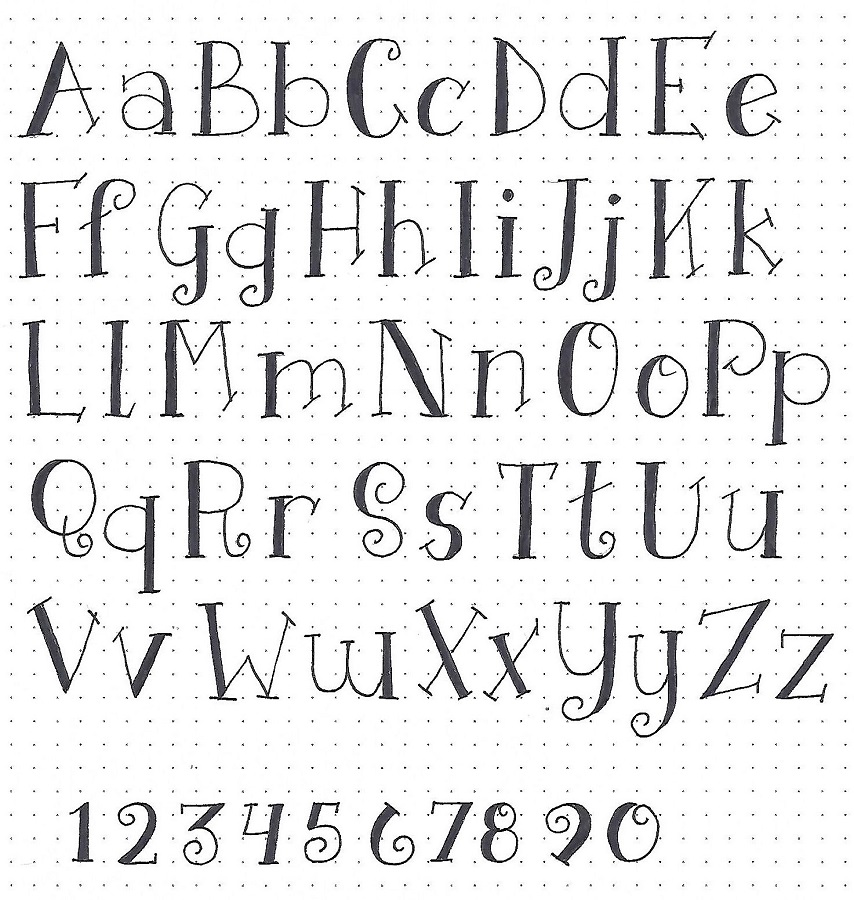
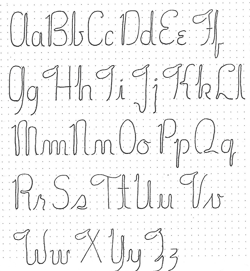
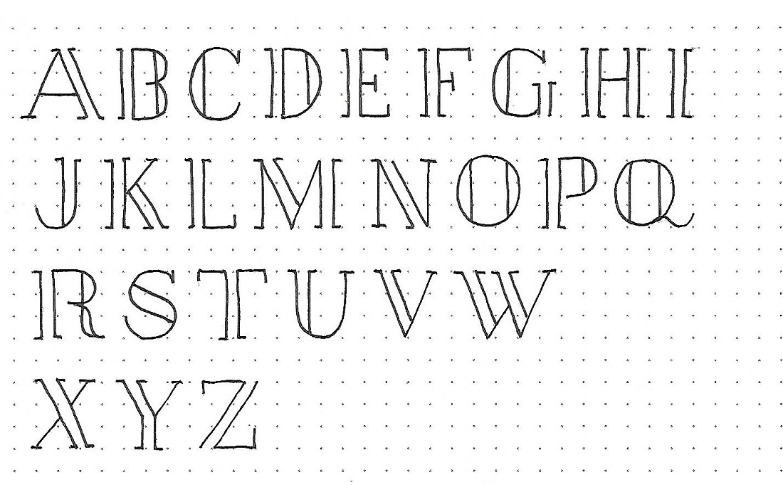
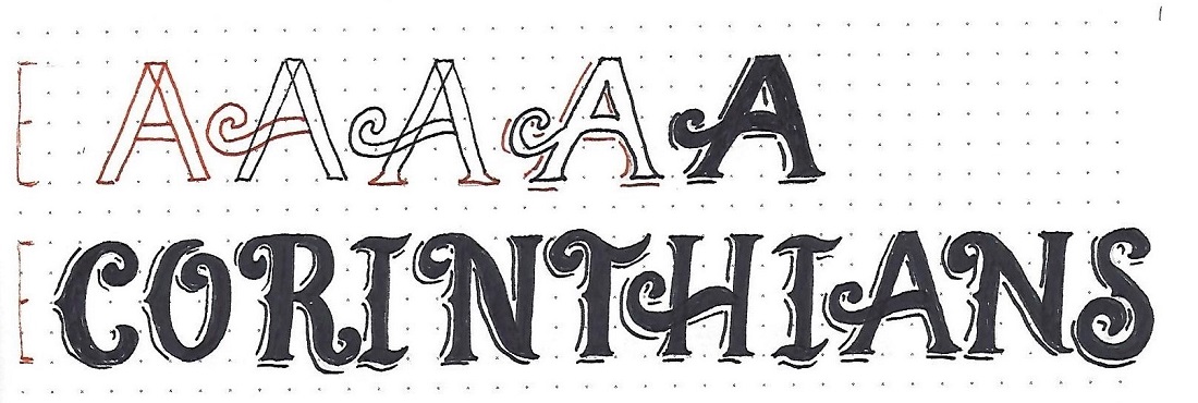
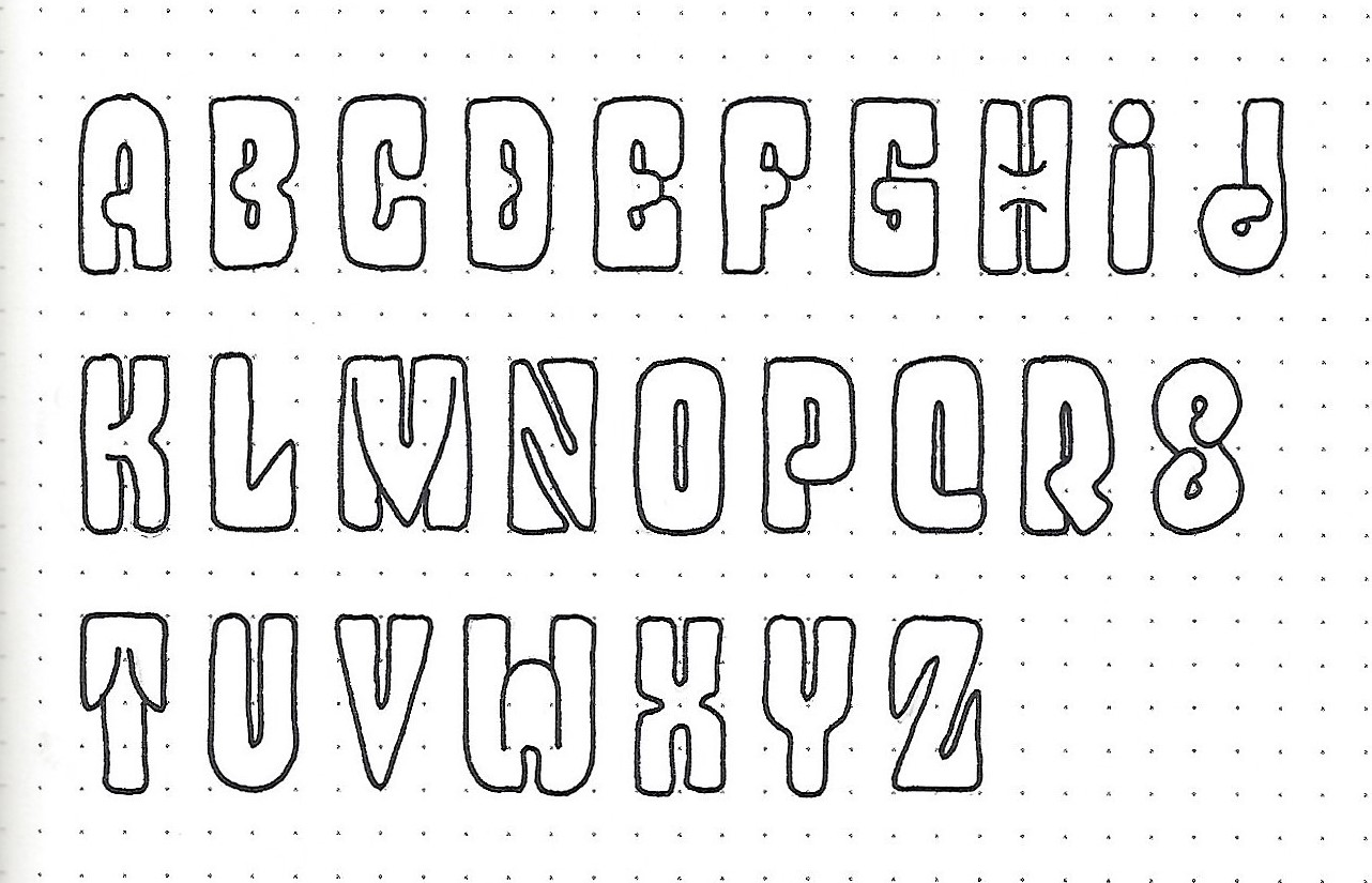
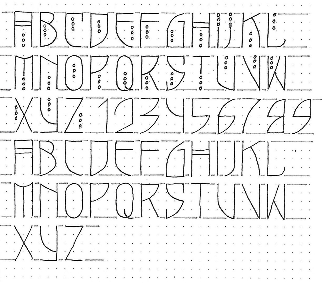
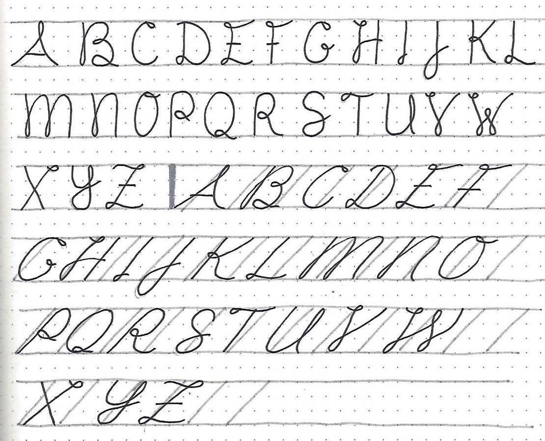
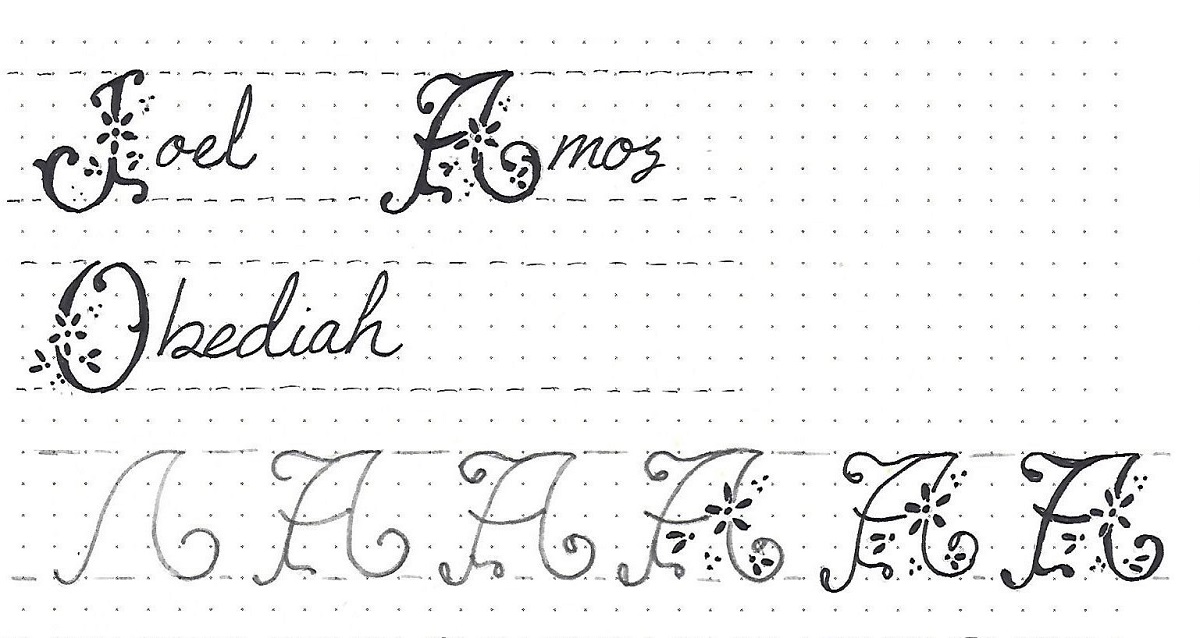
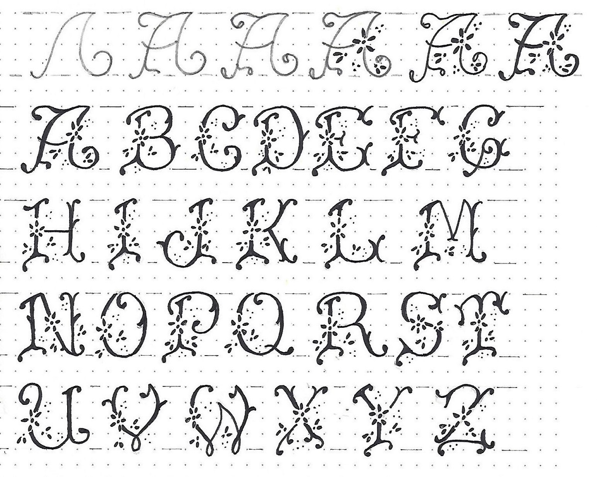
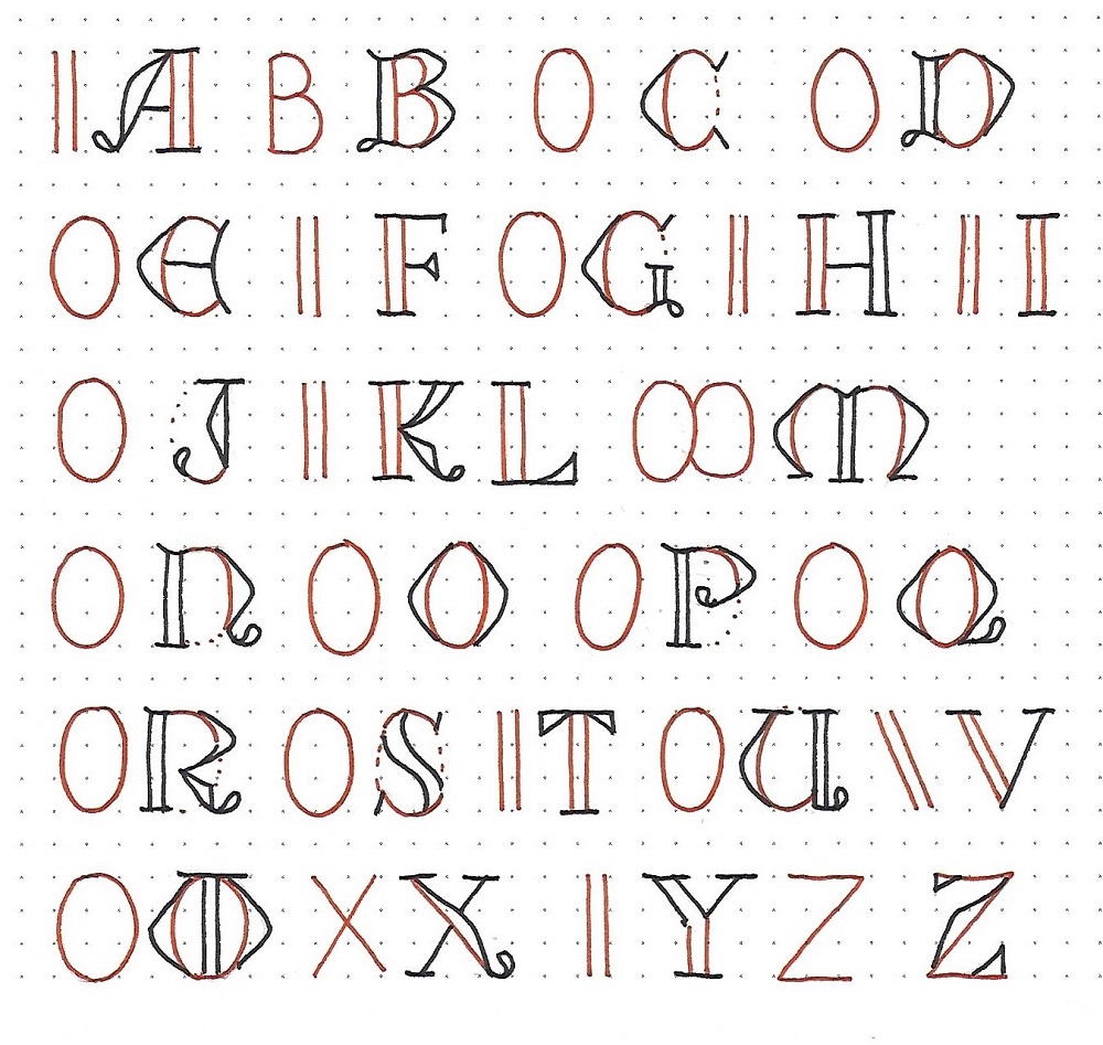
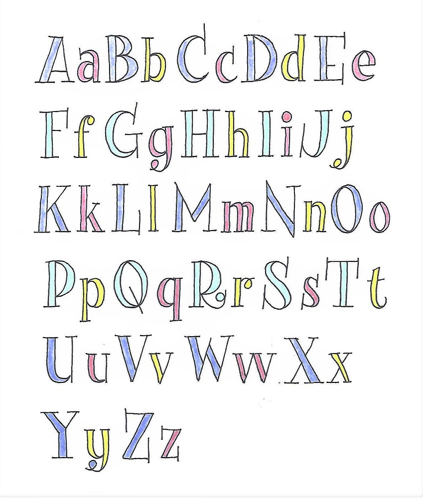
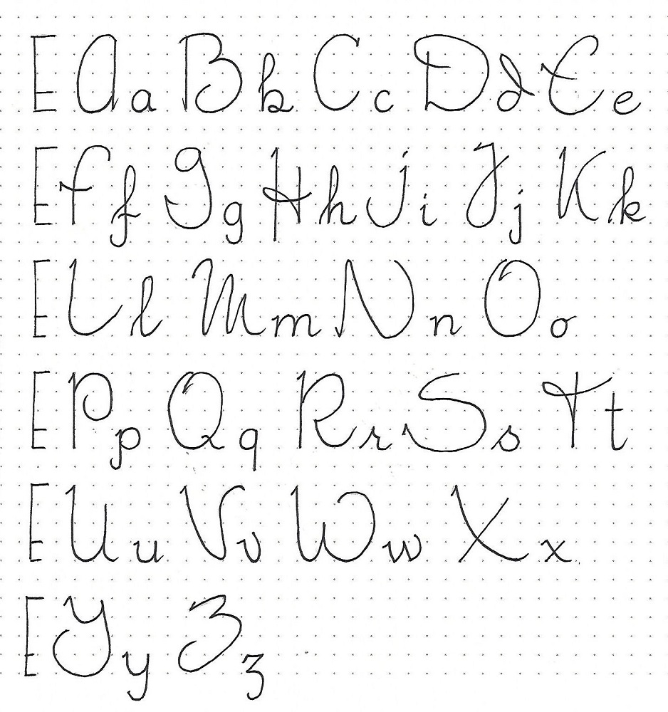
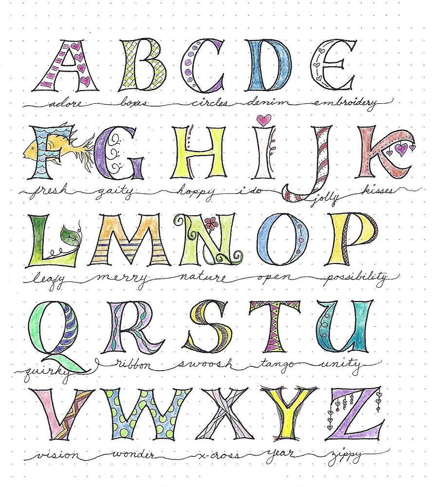
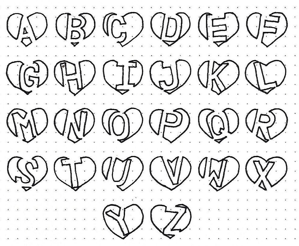
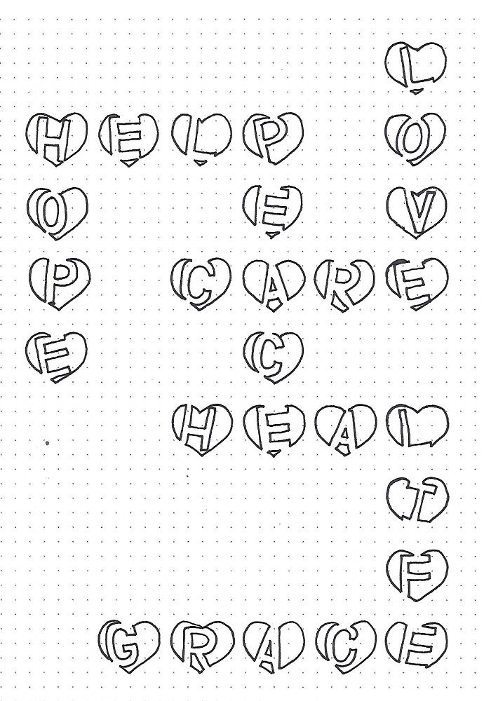
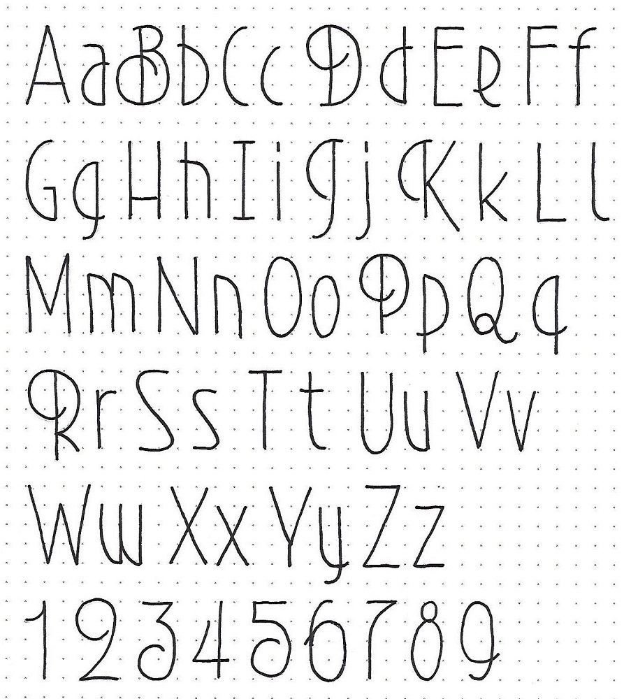
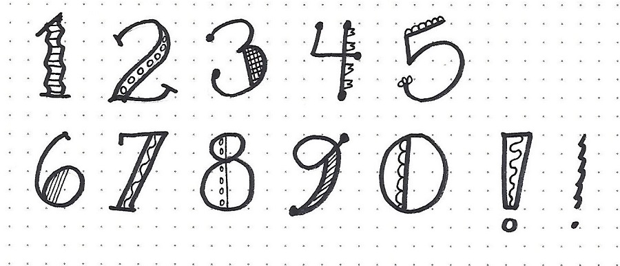
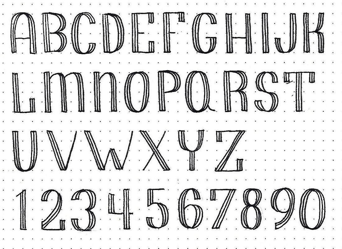
MARK: Day #2 – Tuxedo – Upper-Case Alphabet
You can practice the step by step method for writing out this upper-case alphabet today. I would complete each line separately and then go on to the next one.
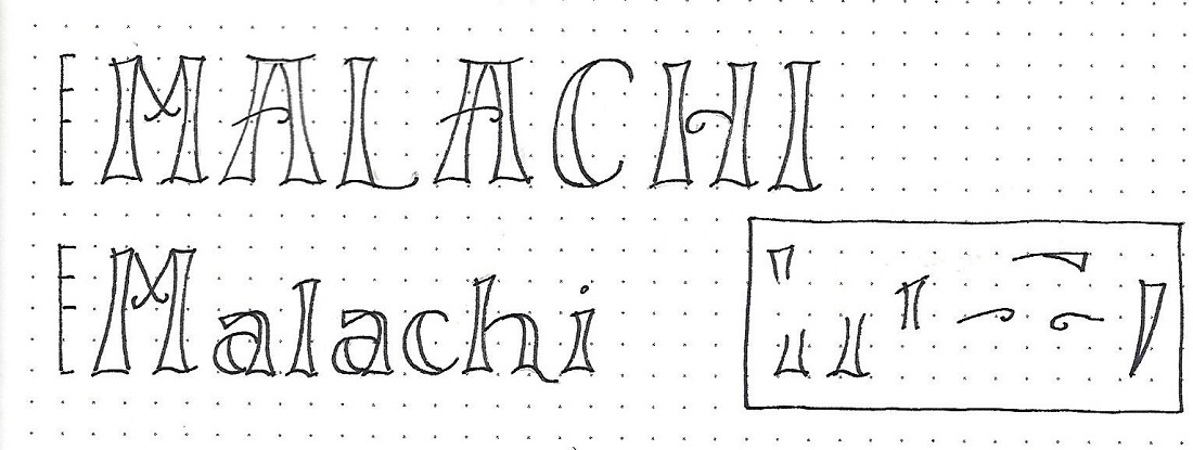
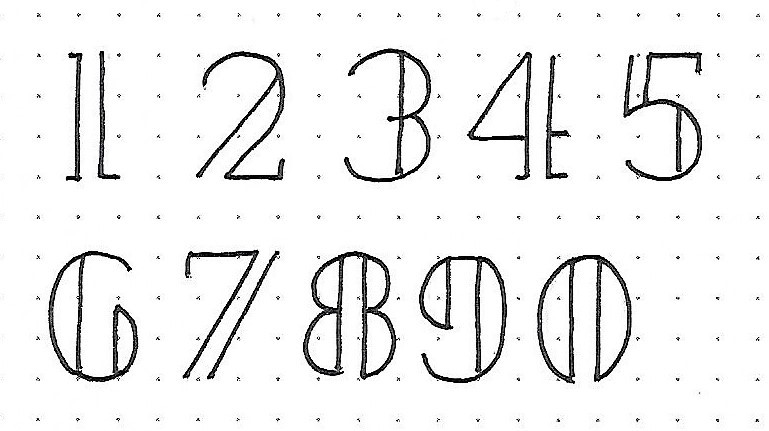
I have provided a set of numerals that coordinate with the alphabet, as well.
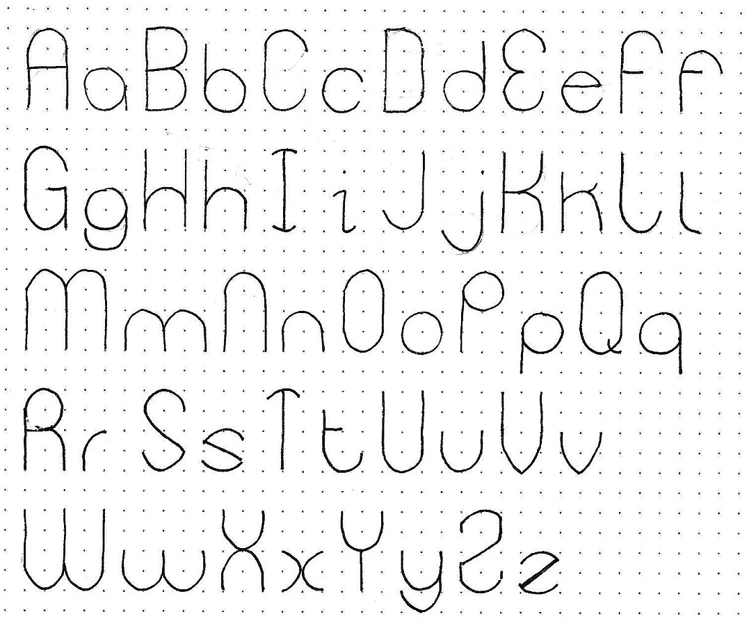
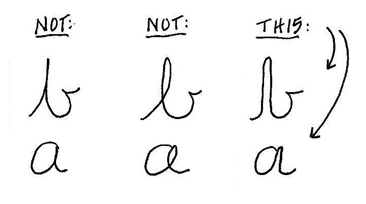
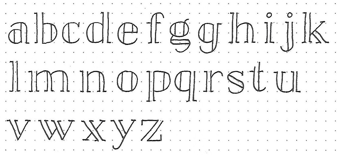
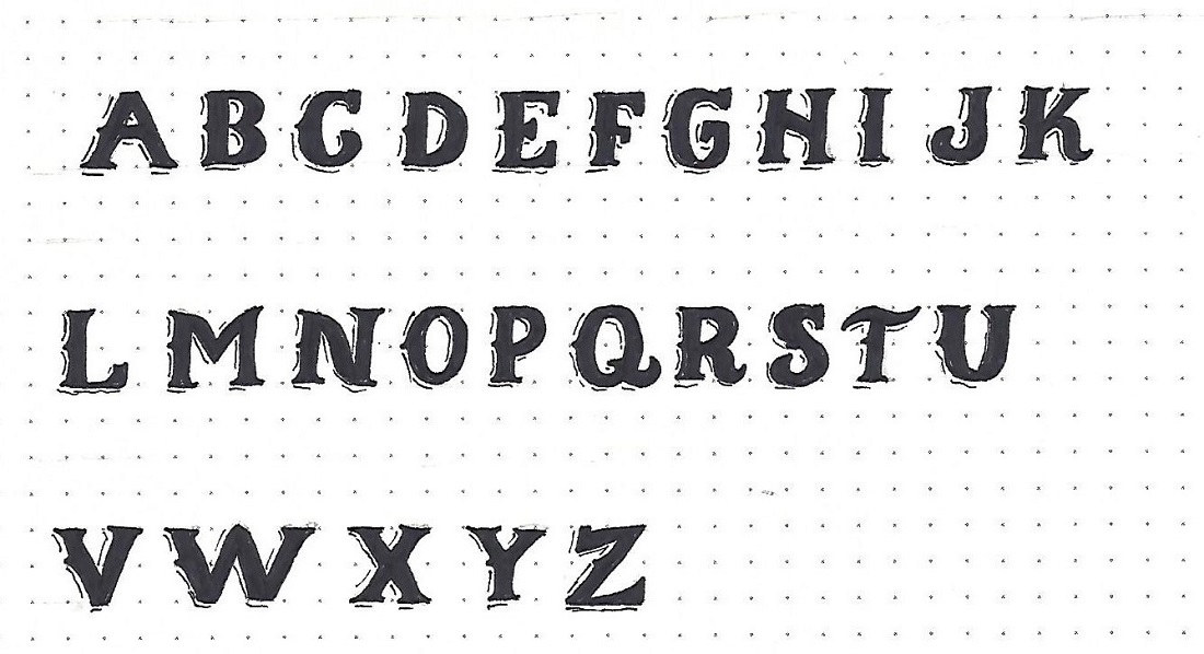
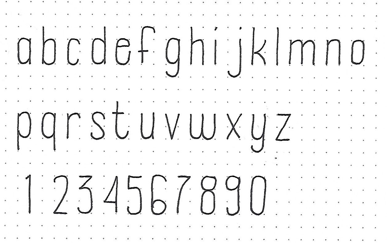
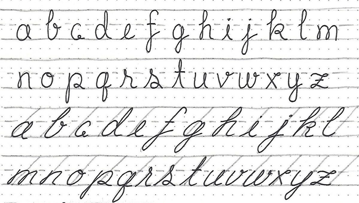
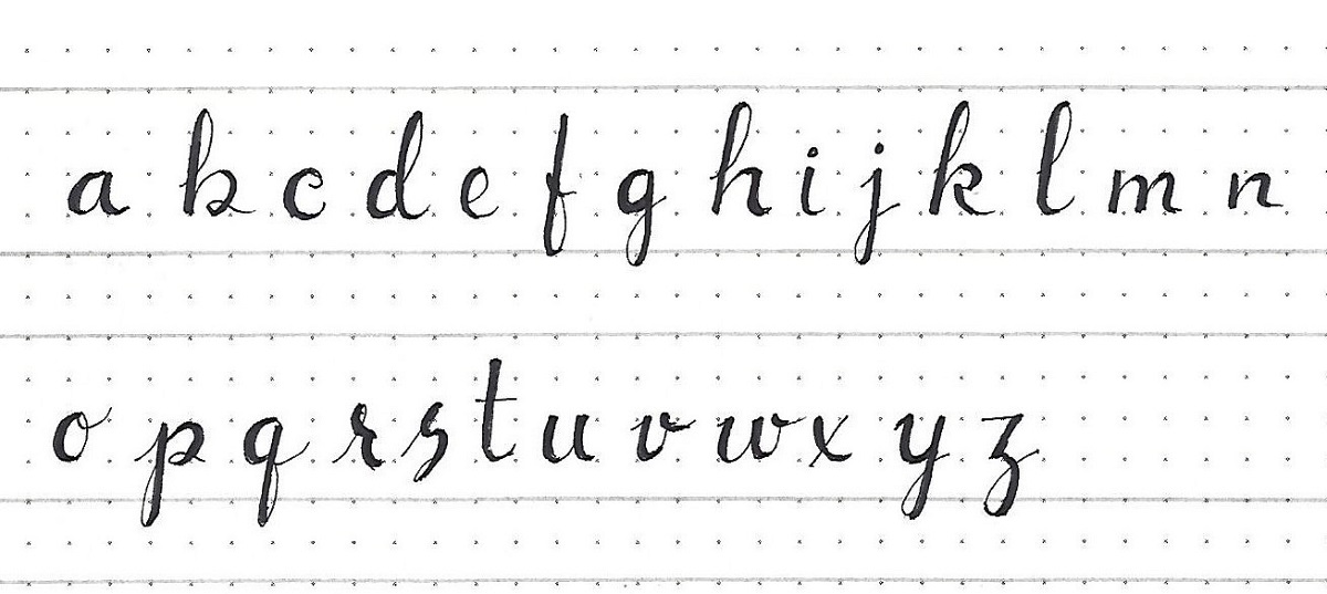
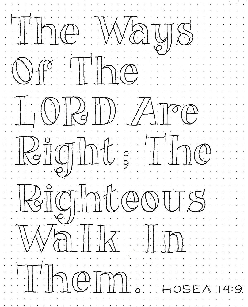
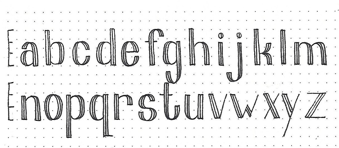
MARK: Day #3 – Tuxedo – Lower-Case Alphabet
Yep, we have a lower-case alphabet for this font, too. The letter height (4 units) is divided into thirds and the x-height falls at the 2/3 mark. The descender is 2 units.
Make sure you make your tuxedo lines the same distance as you did on the upper-case.
Like the upper-case, the verticals, whether straight or curved, have the lines while the horizontals have only one line. The curves are tapered just like the upper-case letters were.
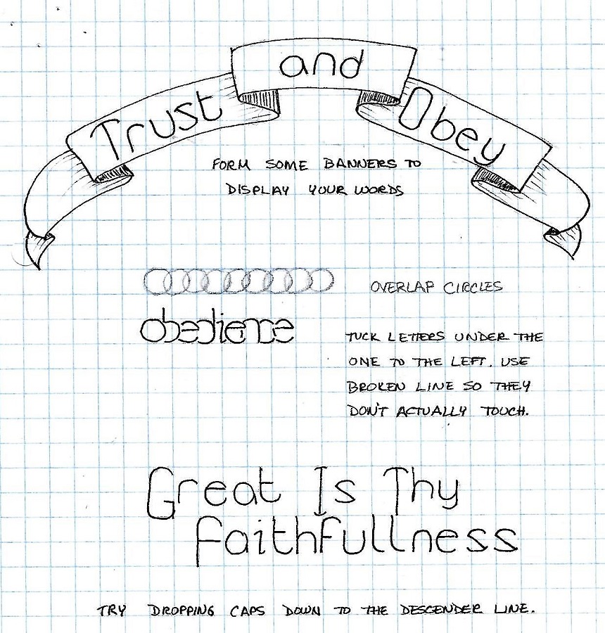
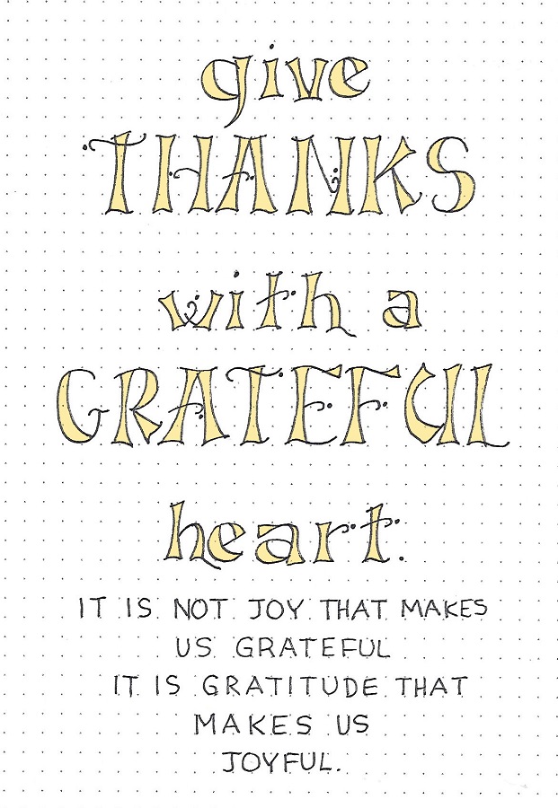
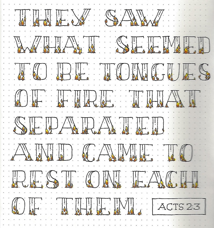
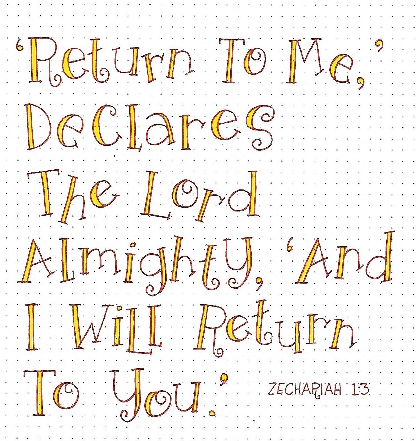
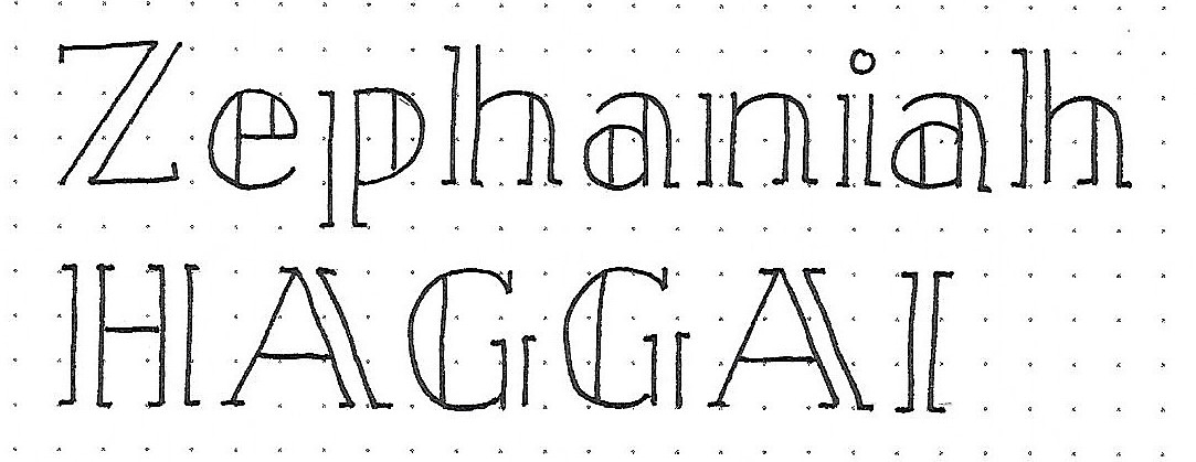
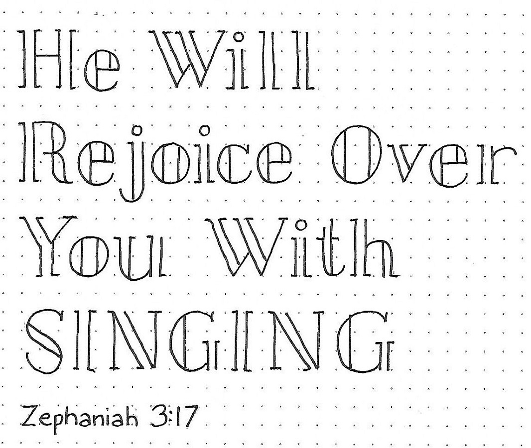
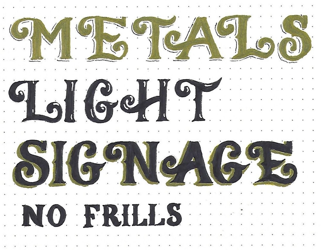
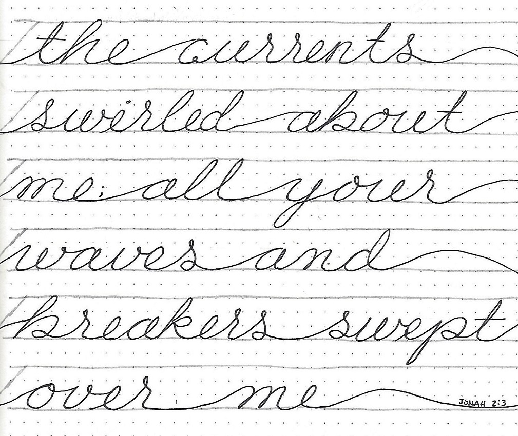
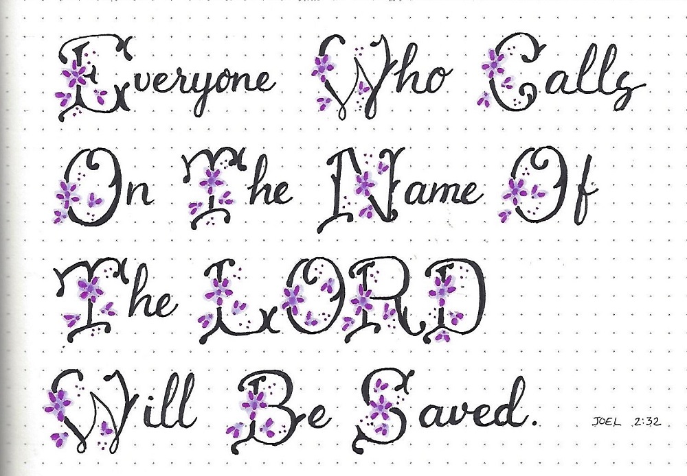
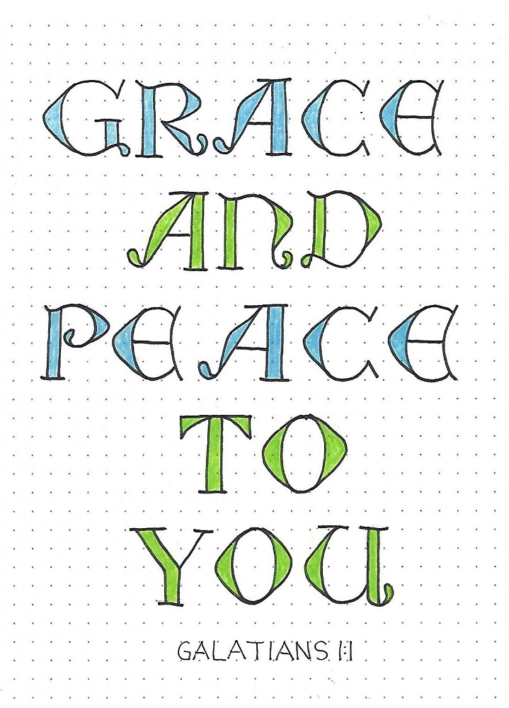
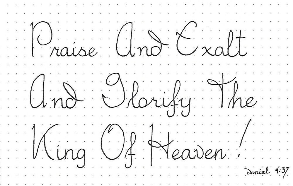
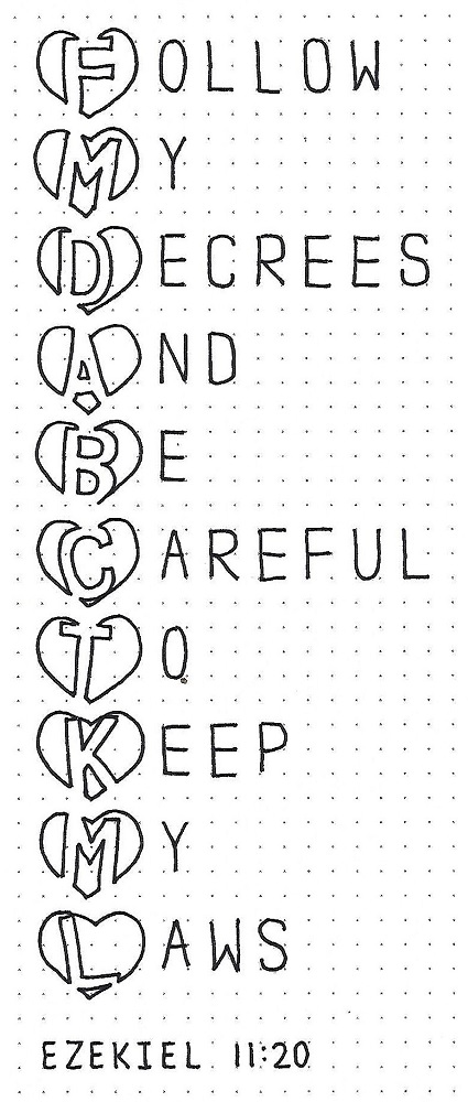
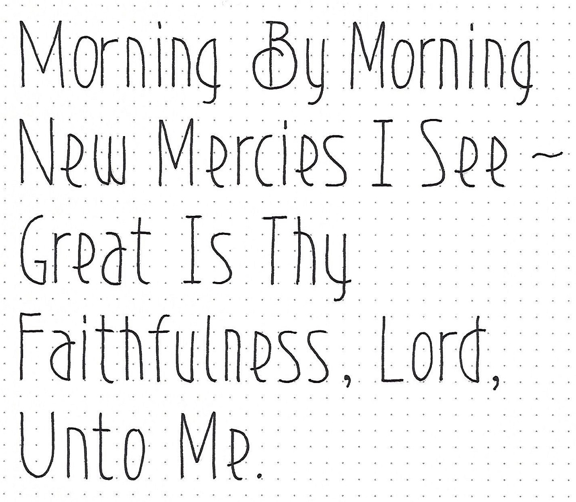
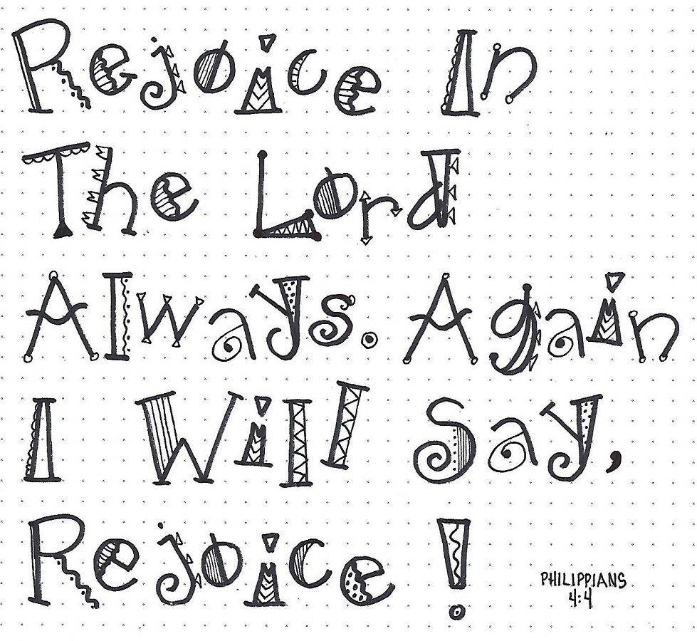
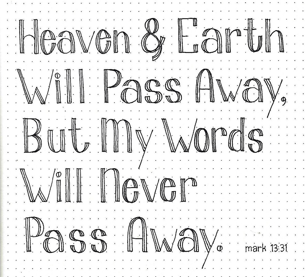
MARK: Day #4 – Tuxedo – Scripture Writing
Today, select a verse of scripture to letter using the Tuxedo Font. Use a mix of upper- and lower-case letters.
I am aware that getting the x-height at 2/3 f a 4-unit height will be a challenge. To overcome this, draw in penciled guidelines for the top, baseline and x-height before you begin.
Work on either one line at a time or the whole piece as you proceed through the steps (rather than one letter at a time). This will help you maintain consistency.
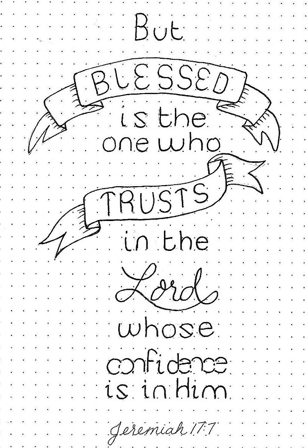
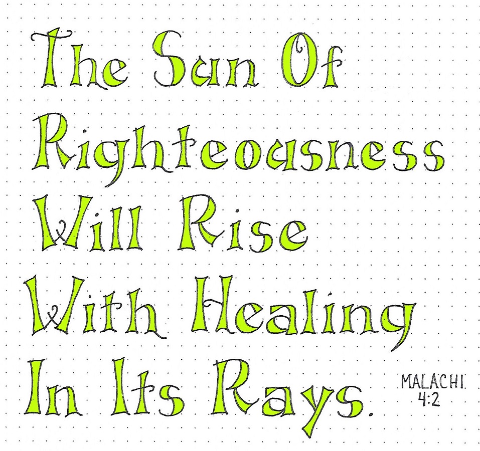
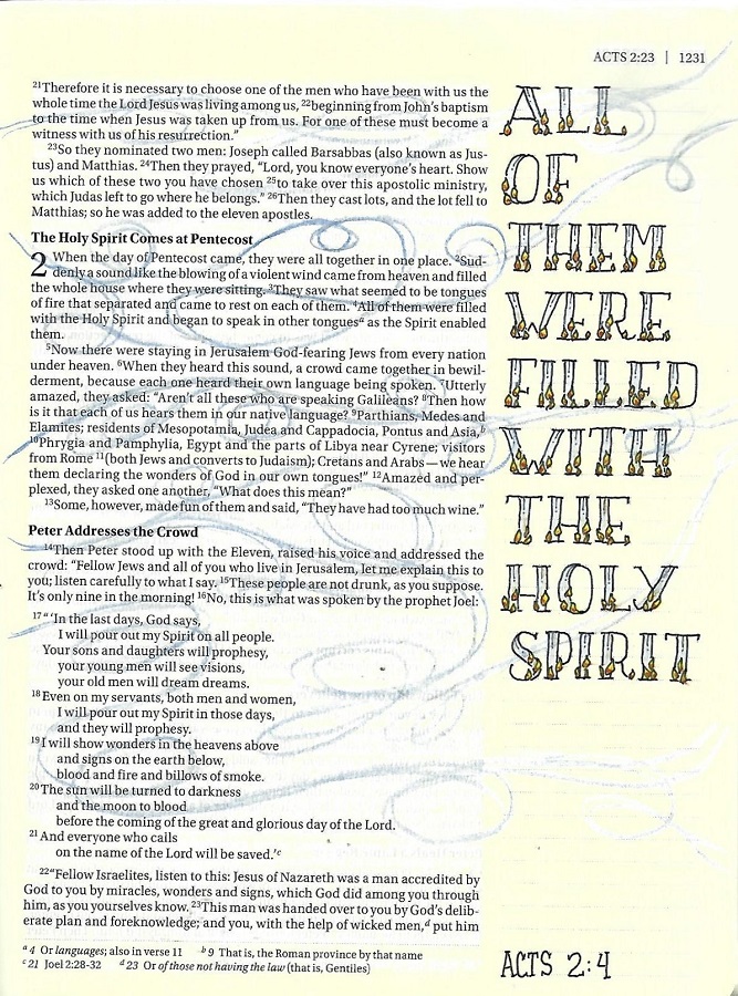
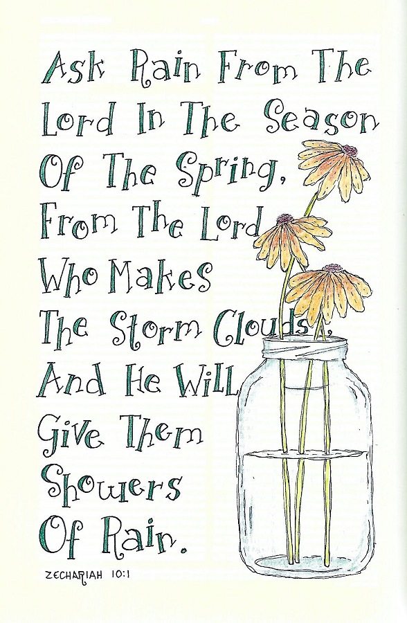
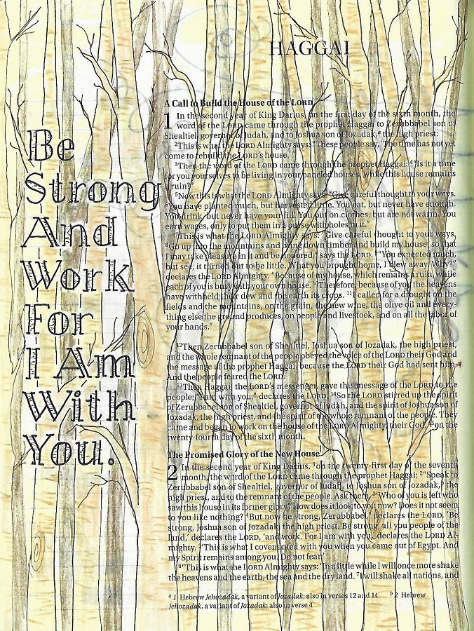
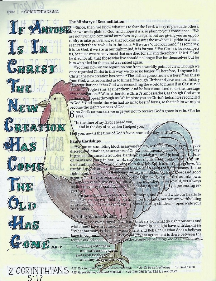
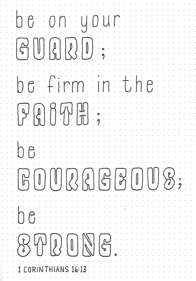
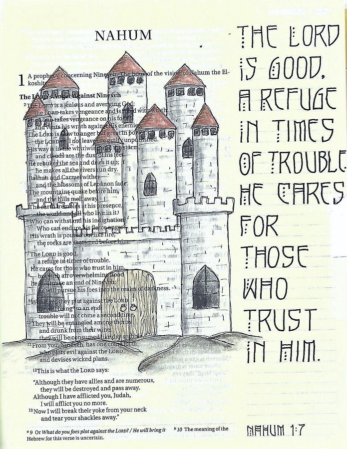
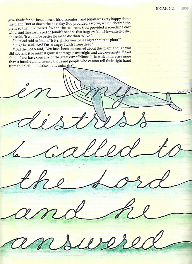
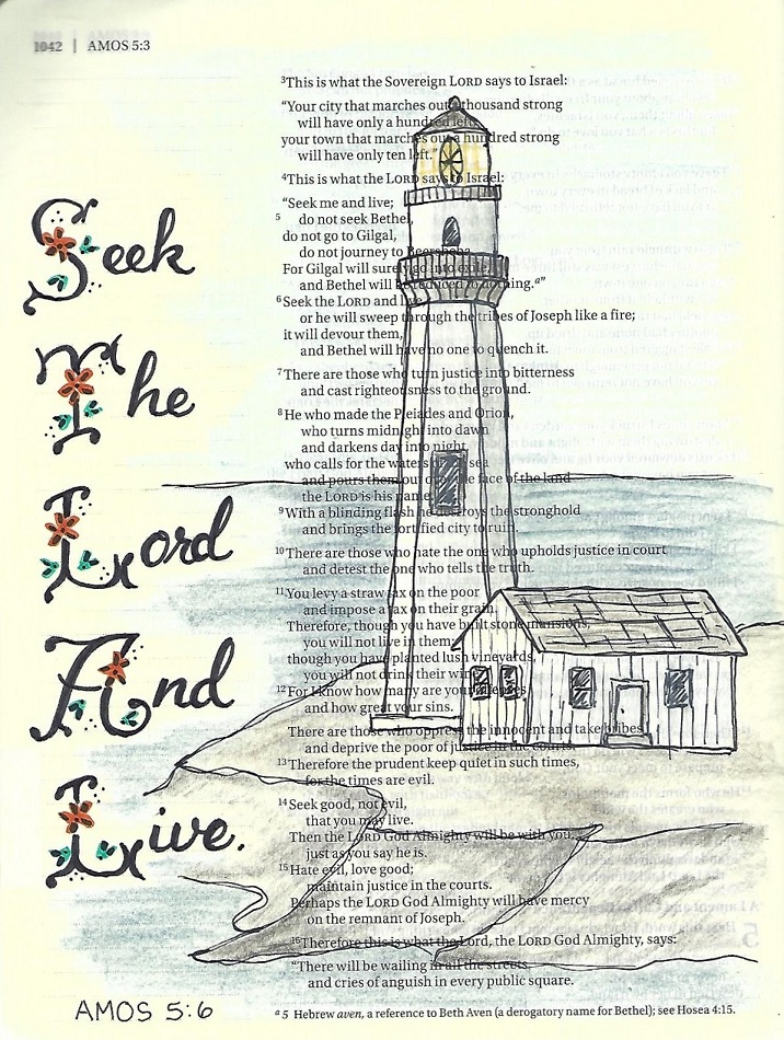
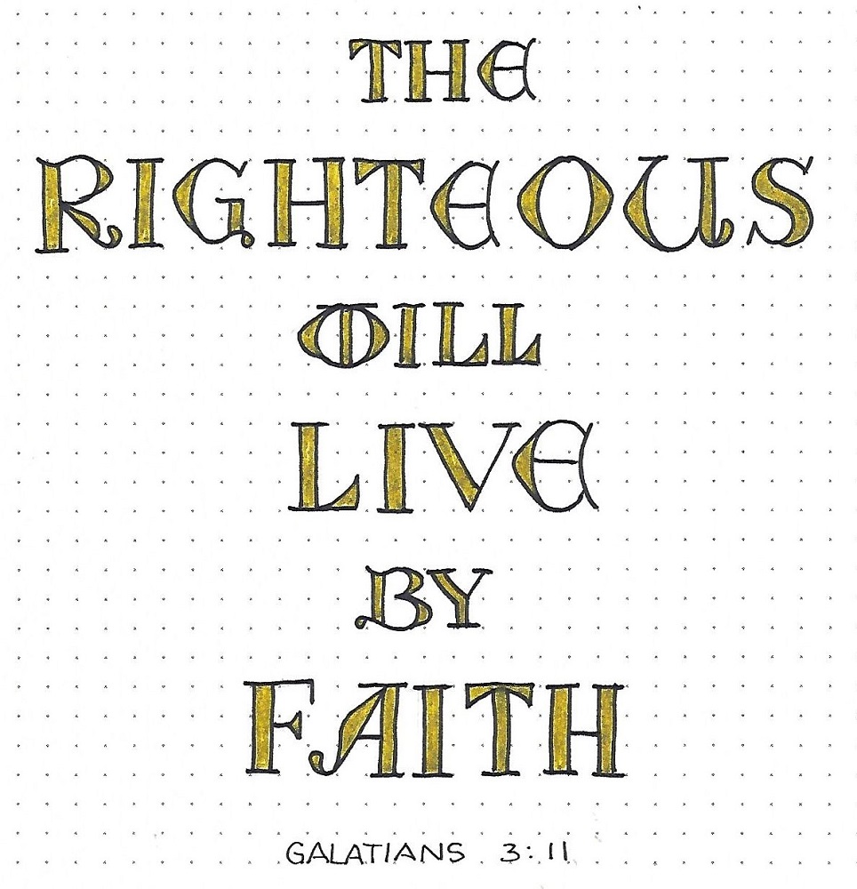
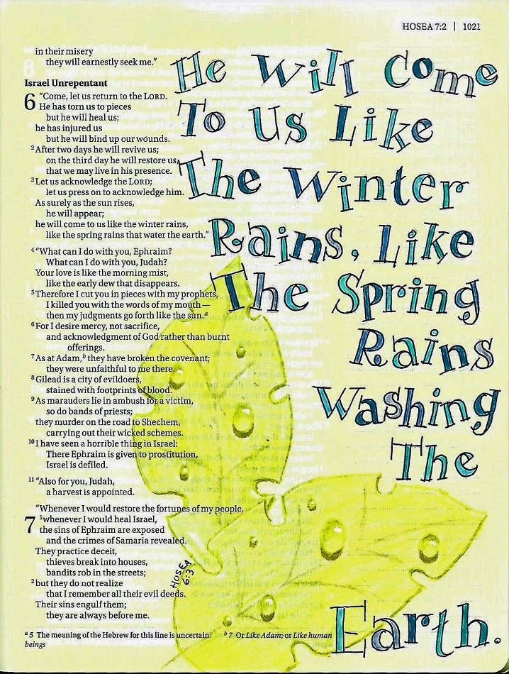
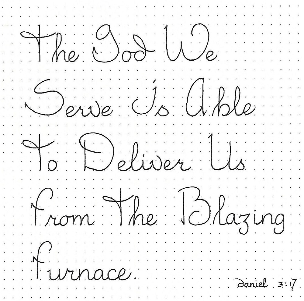
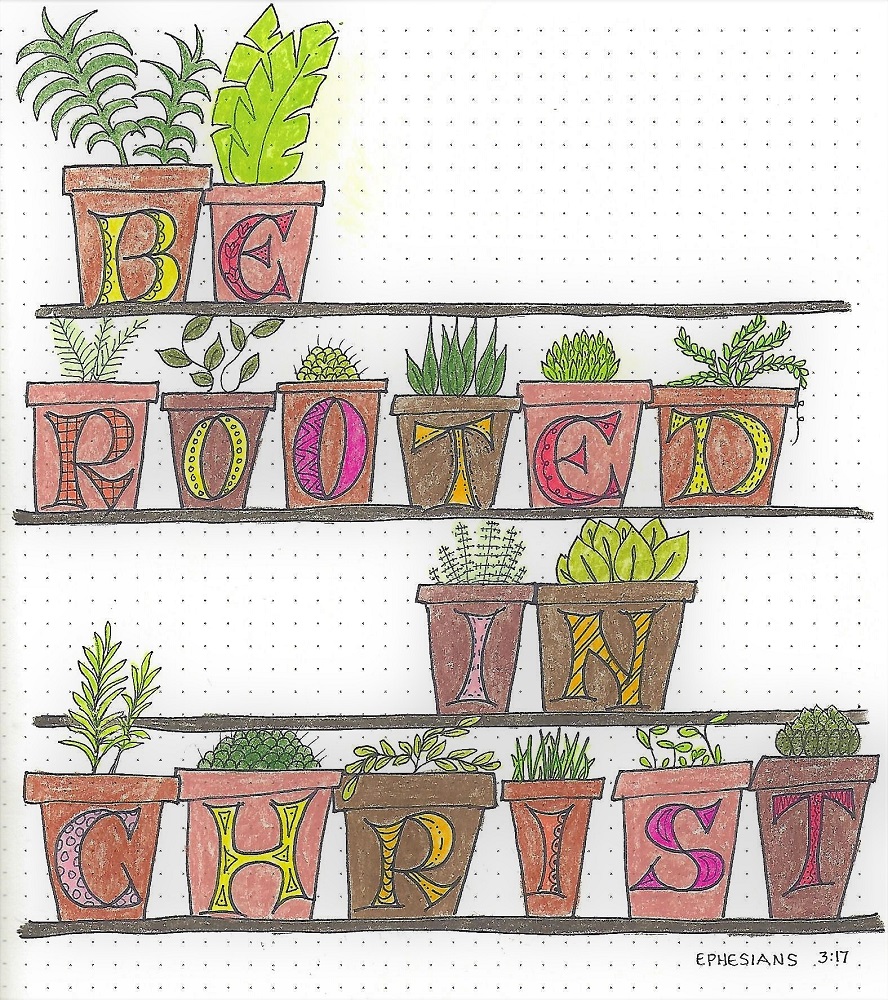
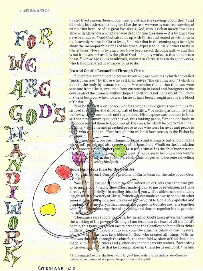
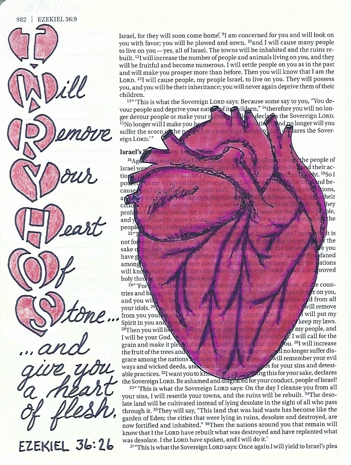
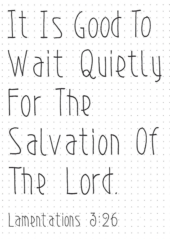
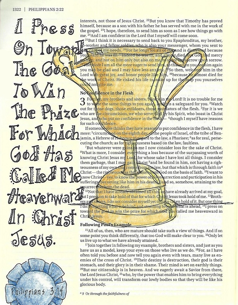
MARK: Day #5 – Tuxedo – Bible Page
For my bible page I used a full-letter height of 2 units (the lines marked in my margin). I drew very light guidelines in pencil for the baseline, letter height and x-height (2/3 of letter height).
I worked on the whole phrase at the same time through the steps. After inking and erasing the pencil, I used colored pencils to fill in the letters.

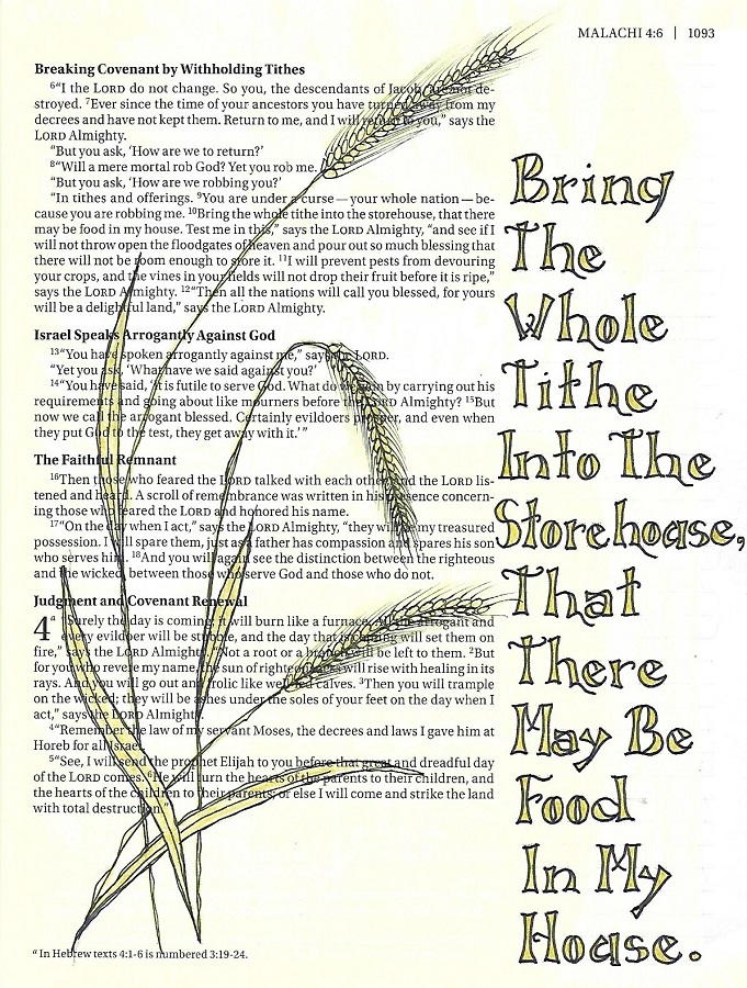
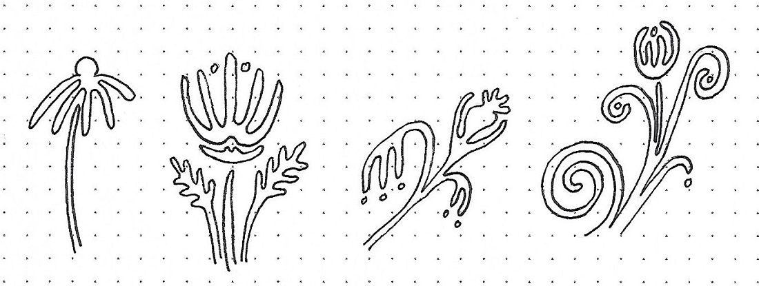
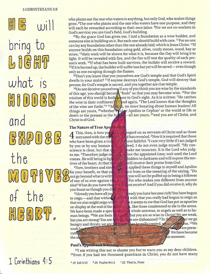
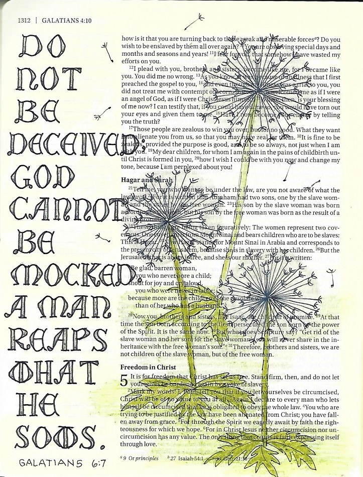
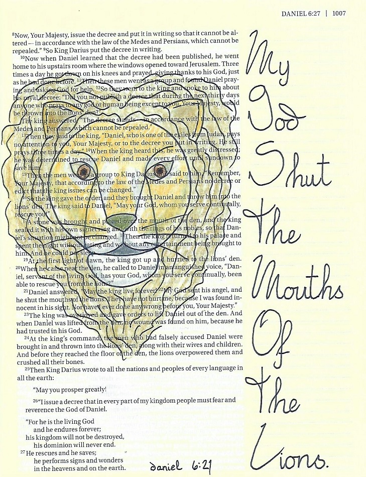
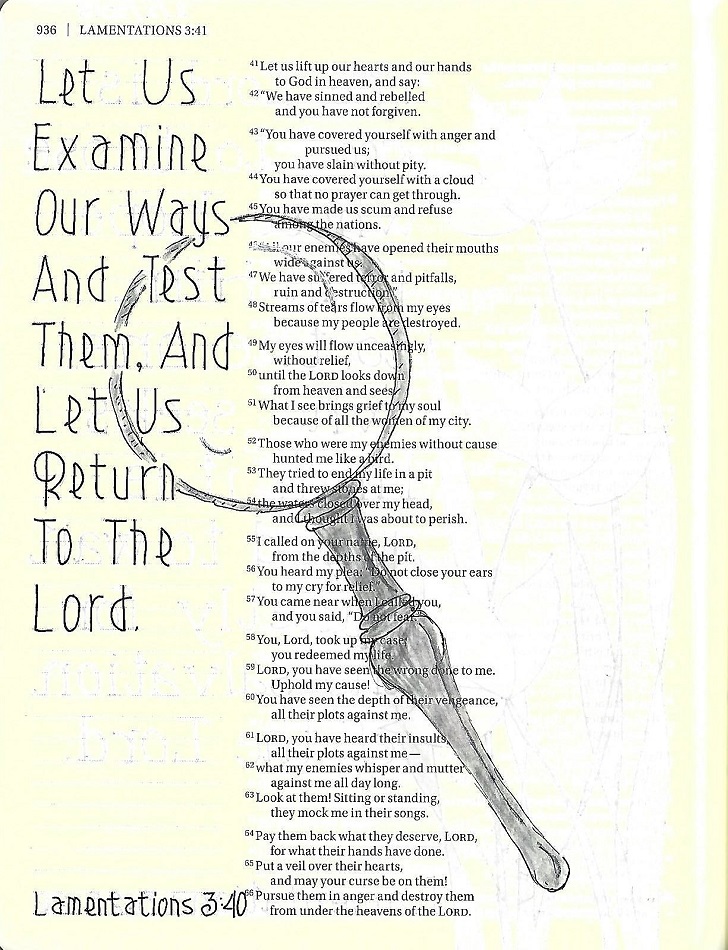
The drawing room tutorial for the week did not fit with my selected verse for lettering so I drew this lily instead, to decorate the page.
Ddd